





Google Gemini sidebar redesign: what the teardown reveals
Google is testing a Google Gemini sidebar redesign inside the Android Google app, and the clearest evidence of it currently lives in unreleased code rather than a public update. A teardown published today found Google app version 17.73.15 running a rearranged sidebar, with the New chat button relocated to the bottom right and the account switcher removed from view entirely, according to Android Authority. The same build also carries a reworked animation for the Gemini overlay, the panel used to summon Gemini from anywhere on the phone.
This applies specifically to Gemini as accessed through the Android Google app. Nothing confirms whether any of it reaches the standalone Gemini app, iOS, or a wider Android rollout, and Android Authority activated the layout by digging through a teardown, meaning it's testing-only code rather than something the public can trigger right now.
Two things are confirmed at this point: the interface elements exist in the app's code, and Google hasn't announced them, committed to a timeline, or explained what they're for (Android Authority). Everything else, including whether any of this ships broadly, is still open.
This is the newest entry in a broader Google Gemini UI update that Android Authority has been tracking in app code for months, though nothing confirms these findings share a single coordinated release with the earlier experiments covered below.
Google app Gemini sidebar changes you might see first
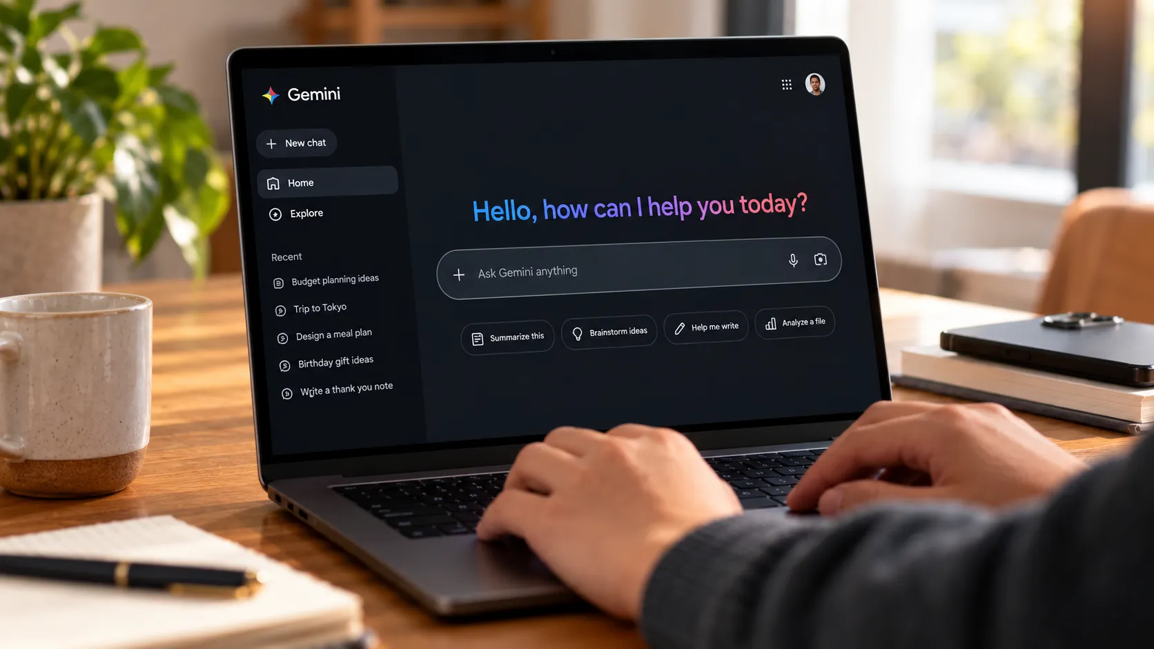
The headline change is where the Gemini new chat button lives. It currently sits near the top of the sidebar, but the tested layout moves it to the bottom right, a position Android Authority says could improve Gemini one-handed chat access.
Settings shifts to the bottom left in the same layout. The account switcher disappears from the sidebar altogether in this build, and it's unclear whether Google relocated it elsewhere in the app or cut it from that surface entirely (Android Authority).
A new Shortcuts section also shows up at the bottom of the sidebar in the tested build. It adds options to check search history and erase the last 30 minutes of it, giving users a faster way to clear recent activity without digging through menus (Android Authority).
Side by side, the tested sidebar trades a top-anchored layout built around New chat and the account switcher for a bottom-anchored one built around New chat, Settings, and Shortcuts. It's a real change pulled from app code, not a mockup, but it's not a design Google has committed to shipping.
The Gemini overlay animation gets a longer sequence
Triggering the Gemini overlay today produces a dot-like pattern across the bottom of the screen. The version found in the teardown stretches that into a longer sequence, opening with the same dots and closing with a glow that spreads across the bottom edges of the display (Android Authority).
Google hasn't explained the change, and the teardown doesn't clarify whether it signals a new processing step, ties to a specific feature, or amounts to a cosmetic refresh (Android Authority). There's nothing to test here since the sequence isn't live outside the teardown build.
An older teardown points to a bigger interface overhaul
A separate, earlier teardown of Google app version 17.52.12.sa.arm64, roughly two and a half months before the sidebar findings surfaced, uncovered a wider set of experiments touching chat organization, notifications, and search filters (Android Authority). That August report said none of the changes were live at the time, and nothing available confirms whether any have advanced toward a public rollout since. The two teardowns were documented separately, in different builds, months apart, so treat them as related research threads rather than one project.
That August build showed Google testing a dedicated Pinned section above Recents, pulling important conversations out of the regular chronological list so they're easier to find again (Android Authority). In the same build, chat search appeared to be moving into the sidebar header, a change Android Authority flagged as potentially making that specific action harder to reach one-handed, even as other tweaks make starting a new chat easier.
A proposed Notifications section also turned up, though it loaded empty throughout testing. Completed tasks already trigger a Gemini notification, but once dismissed, there's currently no clear way to find it again inside the app; a dedicated section could eventually surface completed tasks, Gemini Briefs, and similar activity, though Android Authority noted this wasn't functional during testing and remains unconfirmed.
Recents filters were also in testing, covering Unread, Ready, Needs attention, and In progress. Android Authority's own reporting, not a Google statement, suggests the latter two are likely tied to Gemini Spark tasks, a connection the outlet frames as inference rather than something Google has confirmed.
The same teardown showed a Customize section taking shape for Spark, built around a Discover tab for browsing skills and apps, though nothing ties that broader organization work to the November redesign specifically (Android Authority). Google was also testing a way to hide Gemini's four-point star icon from the status bar, likely routed through Android's own notification settings rather than a toggle built into Gemini itself. Android Authority connects this to Google's wider push for status bar control, something it previously spotted in an Android Canary build, and was explicit that there's no telling if or when any of it rolls out.
Where Gemini Spark fits, and what's still unverified
Google introduced Gemini Spark in May as a 24/7 personal AI agent built on Gemini 3.5 and the Antigravity harness, describing it as a tool meant to help manage digital tasks without constant prompting (Google Blog). At the time, Google said Spark would roll out to trusted testers that week, with a beta planned for U.S. Google AI Ultra subscribers the following week, and that available features would vary by subscription tier and region.
That announcement is now nearly six months old, and nothing in the available research confirms what Spark's rollout looks like today or whether it has moved past limited testing. The May post proves Spark exists and that Google planned a narrow beta; it doesn't prove most readers currently have access, and it doesn't prove the Recents filters, Pinned section, or Notifications area from the August teardown were built specifically for Spark. That link is Android Authority's inference from the filter names, not something Google has confirmed.
Anyone without confirmed Google AI Ultra access shouldn't assume Spark-adjacent sidebar changes apply to them based on the May announcement alone. The feature set Google described was tiered and regionally limited from the start.
What Android Google app users should do now
There's nothing to install or enable based on these findings. The sidebar layout and overlay animation come from the active November teardown; the Pinned section, Notifications area, and filter experiments come from the separate August teardown; Google hasn't acknowledged either set.
Anyone who relies on the visible account switcher, one-handed chat search, or a way back to dismissed task notifications should stick with the current layout for now. None of those workflows have a confirmed replacement yet.
Watching official Google app release notes beats chasing a specific APK version number. Code surfacing in a teardown shows testing, not a release commitment, and testing can rely on server-side flags that never reach a public build at all. Until Google says otherwise, treat this as an in-progress experiment worth tracking, not a redesign worth planning around.






Comments
Be the first, drop a comment!