


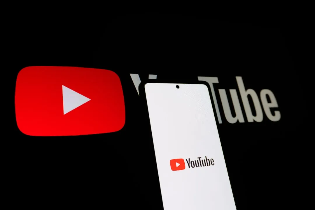
YouTube's latest interface overhaul has sparked a digital uprising, with users expressing everything from bewilderment to outright fury over recent changes in the world's largest video platform. What started as YouTube's celebration of its 20th anniversary in April has evolved into a comprehensive transformation affecting every corner of the user experience—and the community response tells a complex story of progress clashing with preference.
The rollout strategy has been anything but uniform, creating a fragmented user experience that's adding fuel to the controversy. The smart TV redesign finally launched in December after months of testing, while desktop and mobile users have been grappling with their own dramatic interface shifts. But here's what's really driving the heated discussions: widespread issues that have caused upload dates and Subscriptions tabs to mysteriously vanish across both mobile and desktop platforms for some users. These aren't simple aesthetic adjustments—they're fundamental changes to how millions consume and navigate content daily, and users need practical strategies to adapt.
What's actually changing in the new design?
Let's break down what you're encountering when you open YouTube these days, because understanding the changes is the first step to mastering them. The most visible transformation centers around the video player interface, which now features translucent, pill-shaped buttons and a more minimalist aesthetic. YouTube's strategy here is clear: the redesigned player aims to make icons and UI elements obscure less content, theoretically maximizing your video viewing area.
Here's the reality check—many users find the new playback controls appear broken at first glance due to their large, expansive appearance. The disconnect between intention and perception creates an adjustment period that varies significantly by platform and user type.
PRO TIP: If the new desktop controls feel overwhelming, focus on the central play/pause area and give yourself a week to adjust. Most users report the interface feels more natural after consistent use, despite initial resistance.
For smart TV users, YouTube has implemented a more thoughtful reorganization that actually improves navigation logic. Video titles now appear at the top of the screen, while all buttons are grouped together along the bottom bar by intention. The design follows a clear hierarchy: the middle section houses the most-used controls like Previous, Pause, and Next, while channel-related controls occupy the left side and interaction buttons like Like, Dislike, and Comment sit on the right.
Beyond visual changes, YouTube has introduced genuinely new functionality. Two new controls have been added: a Multiview option for live sports content and a Display Mode for YouTube Music or Premium subscribers. These features represent YouTube's push toward more interactive, premium experiences that could significantly enhance your viewing if you know how to access them.
Why are users frustrated and what can you do about it?
The backlash reveals deeper issues than simple resistance to change, and understanding these pain points helps you navigate the transition more effectively. Users on Reddit are desperately seeking ways to roll back the changes, though no such option exists. This level of community frustration signals genuine usability concerns that require practical workarounds.
User complaints fall into two distinct categories that require different adaptation strategies. On the aesthetic front, the new desktop UI feels visibly messy and paradoxically takes up more screen real estate while trying to appear less intrusive. The visual noise increases rather than decreases, particularly for desktop power users accustomed to precise control over their viewing experience.
The functional disruptions present more serious challenges for daily YouTube users. A widespread glitch or aggressive A/B test has caused upload dates and the Subscriptions tab to vanish for many users across both mobile and desktop platforms. Standard troubleshooting methods like clearing app cache or rebooting devices have failed to restore these missing elements, suggesting these changes are server-side rather than local glitches.
PRO TIP: If you've lost upload dates or your Subscriptions tab, try accessing YouTube through different browsers or apps. Some users report seeing missing features in the mobile app when they're gone from desktop, or vice versa.
The removal of upload dates is particularly problematic for users trying to assess the relevance of news content or avoid misinformation. For content creators and news consumers, this creates genuine challenges in verifying content freshness and relevance. Consider bookmarking trusted news creators directly and checking their channel pages for chronological uploads when date stamps disappear.
Are there improvements worth embracing?
Despite widespread criticism, several updates deliver genuine value for users willing to explore new features. The new threaded comments system, which supports up to three levels of replies, has been appreciated by users who compare it favorably to Reddit's comment structure. This system makes conversations easier to follow by keeping replies neatly grouped, which significantly improves the experience for anyone following complex discussions or educational content conversations.
YouTube has also introduced engaging interactive elements that demonstrate thoughtful user experience design. Custom like button animations now change based on content type, with music videos displaying animated musical notes and sports content showing game-related visual cues. These contextual touches add personality and help reinforce content categories while you're engaging with videos.
The creator-audience relationship benefits from meaningful new communication tools. Voice replies allow creators to respond to comments with 30-second audio messages, adding a more personal touch to creator-audience interactions. For viewers who value authentic creator connection, this feature offers a more intimate way to receive responses from favorite channels.
Utility improvements address long-standing friction points. The process of adding videos to playlists and Watch Later queues has been streamlined to be more visual and intuitive, making content organization notably smoother for regular users who rely on playlists for learning, entertainment, or content curation.
Understanding YouTube's strategic direction
These changes reflect YouTube's calculated evolution toward an algorithm-optimized platform that prioritizes engagement over user control. Industry observers note Google's gradual movement away from the subscription model toward a discovery-based approach similar to TikTok. This shift explains why features that support intentional content discovery are being de-emphasized in favor of algorithmic recommendation systems.
The platform is evolving from a tool for broadcasting to an environment of interactive connection, where the interface manages attention rather than competing for it. This philosophical transformation affects how you should approach content consumption and creation strategies on the platform.
The business rationale behind these changes becomes clear when examining performance metrics. Internal testing shows the updated user experience increases average attention retention by 6-9%, which translates directly to advertising revenue and creator monetization opportunities. For YouTube, these changes are succeeding exactly as intended, even when users resist them initially.
The platform's measurement philosophy is shifting fundamentally. The platform is moving toward a model where success metrics focus on the quality of interaction and depth of connection rather than merely view counts. YouTube's new interface functions as a sensor that records behavioral cues to feed into recommendation algorithms, making user experience increasingly intertwined with data collection for algorithmic optimization.
Adapting to YouTube's new reality
The current controversy highlights a fundamental shift in how digital platforms balance user preferences against business objectives, and successful adaptation requires understanding both perspectives. The reaction from the community has been swift and cynical, reflecting eroded trust between the platform and its power users. However, the usage data suggests different experiences across platforms and user types.
Interestingly, platform-specific reception varies significantly. Most complaints focus on desktop experiences, while mobile and TV users report fewer issues with the new design. This disparity suggests that YouTube's mobile-first design philosophy may be working for their primary user base, even if it alienates desktop power users who prefer granular control.
The rollout continues to be inconsistent, with some features appearing on certain LG smart TVs while remaining absent for other users. This fragmented deployment indicates YouTube is still refining these changes based on user behavior data and performance metrics, which suggests the worst friction points may be smoothed over time.
For Casual Viewers: Focus on discovering the improved playlist functionality and threaded comments. These features enhance the viewing experience without requiring significant behavior changes.
For Content Creators: Adapt your engagement strategy to leverage voice replies and the new comment threading system. Monitor how algorithm changes affect your content distribution and adjust upload timing and engagement tactics accordingly.
For Power Users: Consider alternative ways to track content freshness, such as directly visiting creator channels or using RSS feeds for subscriptions when the Subscriptions tab is unavailable.
Bottom line: YouTube is transforming from a platform designed around user control to one optimized for algorithmic engagement and retention. This shift toward algorithm-first design isn't temporary—it represents the future of how we'll consume digital media. While the controversy may fade as users adapt, understanding and working with these changes rather than against them will determine your success on the platform going forward.
The key is recognizing that these updates prioritize engagement depth over navigation control, community interaction over individual curation, and discovery over intentional search. Whether you embrace or resist these changes, they're reshaping the fundamental relationship between viewers, creators, and the platform itself.


Comments
Be the first, drop a comment!