


The Pixel Launcher's search bar has been on quite a rollercoaster ride lately, and what started as an apparent bug has turned into an unexpected lesson about user interface psychology. When Google's Android 16 QPR3 March update removed the Material 3 Expressive design elements from the search bar, many users discovered they actually prefer the cleaner, more minimalist look that emerged.
What actually changed in the search bar design?
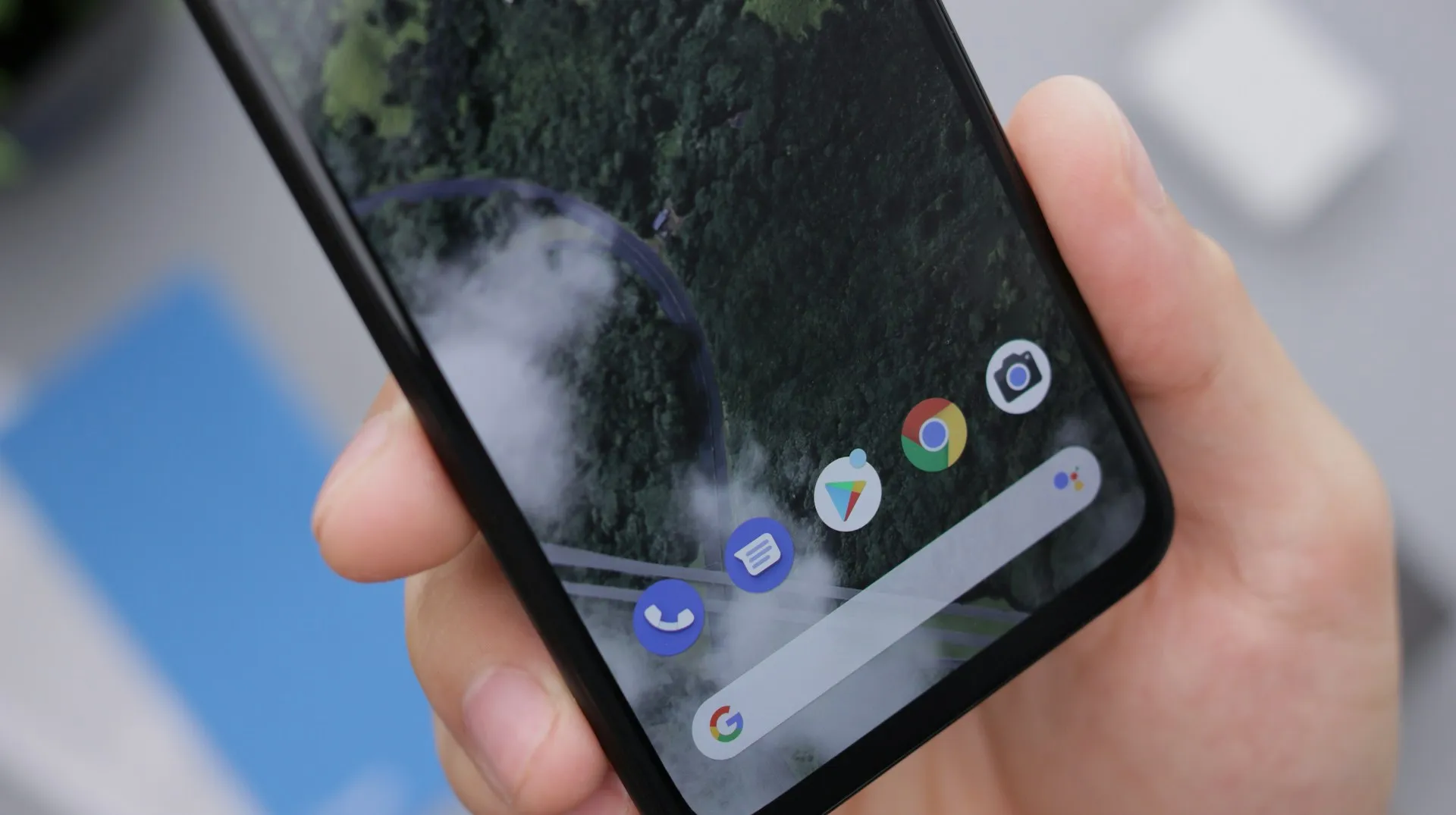
Let's break down what actually happened to transform this familiar interface element. Previously, the search bar showcased Material 3 Expressive styling where the Google logo, microphone, and Lens lived in their own container, with the AI Mode shortcut appearing in a separate circle to the right. This design philosophy emphasized visual hierarchy—each element had its own space within a pill-shaped container featuring Material You's signature lighter background.
The current iteration consolidates everything into a single container, bringing the AI Mode shortcut alongside the microphone and Lens icons. While this creates a more compact layout, it does introduce what some consider visual crowding with three icons positioned side-by-side, according to 9to5Google. But here's where it gets interesting: this "step backward" actually aligns the Pixel Launcher with the Google app's Search homescreen widget.
The real game-changer here is the enhanced customization that came with this design shift. Users can now long-press the search bar to modify the AI Mode shortcut, choosing from options like Live, Translate, Song Search, Weather, Sports, Dictionary, Homework, Finance, Saved, and News This addresses years of user feedback requesting more control over their launcher experience—proving that sometimes functional improvements matter more than aesthetic sophistication.
Why users are embracing the minimalist approach
Here's where the story gets really interesting: the user response has been overwhelmingly positive, challenging everything we thought we knew about effective interface design. Many Pixel owners are actively celebrating the streamlined appearance, finding it less cognitively demanding than the previous Material 3 Expressive version. The visual separation that design experts praised apparently felt excessive to people who just want to search for things quickly.
Users don't study their home screens—they glance, tap, and move on. The original Material 3 Expressive design, while technically sophisticated, introduced visual complexity that created friction in these split-second interactions. When your primary goal is launching an app or starting a search, additional visual elements become noise rather than helpful guidance.
The timing of this change tells us even more about Google's design process. The fact that this modification initially appeared in Android 17 Beta 1, was reverted in Beta 2, then resurfaced permanently in Android 16 QPR3, suggests Google was carefully measuring user behavior and satisfaction metrics. This wasn't accidental—it was data-driven design iteration in action.
The minimalist preference also makes sense given that the search bar is now powered by the Google app rather than the Pixel Launcher itself. Since December, when Pixel Launcher search functionality was replaced by the Google app experience visual consistency between these interfaces became not just aesthetically logical, but technically necessary for a seamless user experience.
The bigger picture: Google's search integration strategy
This search bar evolution reveals Google's broader vision of unified search experiences across the Android ecosystem. By treating the search bar as part of the Google app ecosystem rather than a Pixel-specific feature, Google is essentially democratizing the search experience—bringing Pixel devices in line with other Android phones while potentially sacrificing some of the unique Pixel magic for universal functionality.
This strategic shift signals something significant: Google is prioritizing feature consistency over device differentiation. While this might disappoint users who valued Pixel's distinctive interface elements, it creates opportunities for more robust, universally supported features. When a function works the same way across all Android devices, Google can invest more heavily in its development and maintenance.
The enhanced customization options for the AI Mode shortcut represent Google's compromise between simplification and personalization. By allowing users to tailor this frequently accessed feature to their specific workflows—whether for translation, weather checks, or entertainment searches—Google acknowledges that modern users expect both simplicity and control, according to 9to5Google. It's a sophisticated approach: simplify the visual design while expanding functional flexibility.
The deliberate testing approach—appearing in beta builds, being reverted, then returning in stable releases—demonstrates Google's commitment to evidence-based design decisions rather than internal preference or design trends, as reported by 9to5Google.
What this means for Pixel's future design direction
The positive reception of this "design regression" offers valuable insights into the psychology of daily device interaction. It demonstrates that users often prefer functional clarity over visual sophistication—a lesson that could reshape how Google approaches interface design across the entire Android ecosystem and Pixel experience.
This success might encourage Google to audit other areas where Material 3 Expressive elements could be streamlined without losing essential functionality. The key insight here is understanding the difference between interfaces people admire and interfaces people actually want to use every day. Sometimes these are the same; sometimes they're not.
The consolidation of search functionality under the Google app umbrella suggests we're likely to see further integration of Google services into core Android experiences. While this might mean losing some Pixel-specific features that made these devices feel special, it could result in more robust, reliable functionality that benefits from Google's full ecosystem support.
Looking ahead, this evolution highlights the ongoing tension between design innovation and practical usability. The challenge for Google will be maintaining visual polish and brand identity while prioritizing the seamless, friction-free experiences that users actually prefer in their daily interactions with their devices. This search bar story suggests that when forced to choose, users will pick functionality over form—a lesson worth remembering as Android continues to evolve.


Comments
Be the first, drop a comment!