


Google Workspace App Icon Redesign: What Changed and Why
Google has begun rolling out its Google Workspace app icon redesign on the web, with updated icons now appearing in the app launcher and Chrome's New Tab page. The changes cover Gmail, Drive, Docs, Sheets, Slides, Calendar, Chat, Meet, Keep, Vids, Forms, Voice, and Tasks, 9to5Google reported this week. Android and iOS apps remain on the old design, with no timeline announced for mobile.
The rollout lands as Google I/O gets underway today, where Google could announce further visual changes to its ecosystem, The Verge noted. The icons were leaked last month before the wider rollout began, The Verge reported.
Where the new Google Workspace icons are visible and where they're not
The first wave is web-only. New icons are live in the app launcher accessible from most Google properties and in Chrome's New Tab page, 9to5Google reported. They've also appeared on the individual homepages for Keep, Docs, Sheets, Slides, Vids, Forms, and Sites, though favicons remain unchanged and the logos inside the document editors themselves have not yet been updated, 9to5Google noted.
Mobile is untouched. Neither Android nor iOS apps have received the new icons so far, 9to5Google confirmed.
That gap matters more than it might seem. Critics have pointed to a crowded phone home screen as where the old icons cause the most friction a place where users scan fast and similar-looking app icons sit side by side, as Android Police argued earlier this month. The web launcher is a reasonable starting point, but it's not where the design gets its real test.
The strategy the redesign appears to walk back
The previous Workspace icons shared the same four brand colors, similar shapes, and a consistent layout across every app. On their own, the icons weren't confusing. The problem appeared when they sat next to each other: the shared design language made it genuinely difficult to find the right app at a glance, Android Police argued earlier this month. As that piece put it, the icons are technically different, but not distinct enough to recognize which one you're tapping.
The four-color palette had become a signature. Every app looked unmistakably Google, which was presumably the point but brand coherence and quick recognition turned out to be pulling in opposite directions, Android Police noted. Consistency works when it helps you recognize something instantly. Here, it was doing the opposite.
The redesign appears to respond directly to that criticism. The requirement to include all four brand colors has been dropped for nearly every app, with Gmail now the main exception, 9to5Google reported. Everything is more distinct in terms of color and shape, container treatments have been removed across most apps to allow for larger and more unique icons, and the new designs are expected to scale better across tablets and foldables, Android Police reported in late April.
The gradient and glow aesthetic isn't a departure for Google overall. Gemini, Maps, and Google Photos already use similar treatments, Android Police noted in late April, which suggests the Workspace update is a convergence toward an existing house style rather than something new. Every updated icon now features a gradient that fades from lighter to darker tones, mirroring the treatment applied to the redesigned Google logo about a year ago, The Verge reported. The subtle layering gives the eye something to latch onto faster, Android Police noted, which is a meaningful functional argument for what might otherwise read as a purely cosmetic choice.
The redesign is also connected to a broader platform shift. With the introduction of Material 3 Expressive as part of Android 16 QPR1, Google gave Android a significant visual overhaul, and the updated app icons appear to follow those same new guidelines, Android Police reported in late April. Google has made no official public statement explaining the redesign's specific goals or confirming that connection, so treat the relationship as a well-supported reading of the evidence rather than confirmed intent.
Whether the shift actually improves recognition is unresolved. Switching to single dominant colors could help users distinguish apps at a glance, or it could create new confusion for users who relied on the familiar rainbow pattern as their recognition cue, The Verge acknowledged. No usability data has been published.
The most significant changes, and what they reveal
The updates aren't uniform, and the unevenness is telling. Apps that critics have found hardest to distinguish got the largest overhauls. Apps with already-distinct visual identities changed far less.
Meet and Chat are the most dramatic cases. Meet abandoned its multi-color treatment and switched to yellow as its dominant color; Chat moved to green, Android Police reported in late April. Both apps had previously shared enough visual DNA with Gmail and Calendar that telling them apart quickly was a real challenge. Calendar similarly shifted toward a single dominant hue, The Verge reported, making the whole communication cluster Gmail, Meet, Chat, Calendar more distinguishable from one another. These are the icons where the old approach caused the most day-to-day friction, and they received the most substantive redesigns.
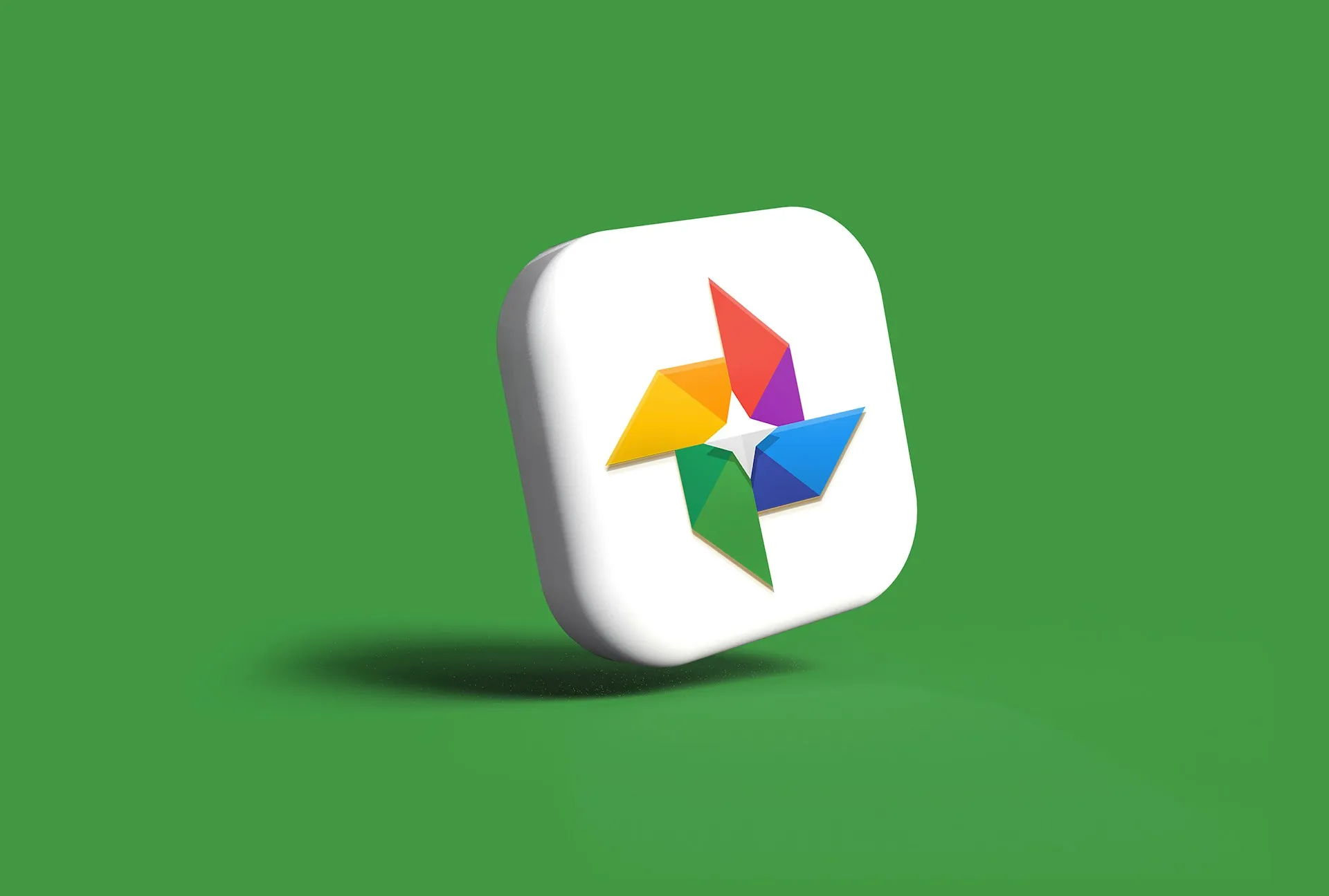
Shape changes matter too, and several are worth noting. Keep lost its surrounding rectangular container entirely, becoming a standalone yellow light bulb rather than a glyph framed inside a box, The Verge noted. It's a simple change, but it gives the icon a far stronger silhouette. Drive received one of the more thorough overhauls: rounded corners replaced sharper geometry, and a small red accent in the bottom-right corner was removed, The Verge reported. Dropping the shared container treatment across multiple apps lets icons fill more visual space and read as more distinct shapes, 9to5Google noted.
Docs, Sheets, and Slides broadly kept their existing colors and visual approach, making them among the more restrained updates in the set, The Verge noted. Sheets and Slides did pick up one quiet but logical change: both icons switched from portrait to landscape orientation, reflecting how the apps are almost always used, The Verge reported. It's the kind of detail that nobody notices until it's fixed.
The pattern that emerges is targeted rather than wholesale. Apps that caused the most confusion got new color identities and more distinct silhouettes. Apps that were already reasonably recognizable got surface-level polish and a gradient coat. That's a different kind of redesign than a full brand refresh it looks more like triage applied to a specific, well-documented usability complaint.
What Google I/O may clarify
Google has made no official public statement explaining the redesign's goals or its relationship to Material 3 Expressive and Android 16 QPR1. With Google I/O underway today, the event may provide more context on the mobile timeline and any broader design direction, The Verge and Android Police both noted.
The redesign's core premise that more visual differentiation between icons translates to faster, more reliable recognition is plausible but unverified. The Verge flagged the genuine risk that users who navigated by the old rainbow cues may find single-color icons harder to place, not easier. That's not a trivial concern; habit-based recognition is hard to disrupt cleanly.
The actual test arrives when these icons land on Android. That's where the design rationale faces its real conditions: a phone home screen, a user scanning fast, a row of Google apps sitting side by side. Until then, this is a course correction that's visible in a browser tab but hasn't yet faced the circumstances that made the old icons a problem in the first place.


Comments
Be the first, drop a comment!