



Google Wallet card stack design problem: cards look alike
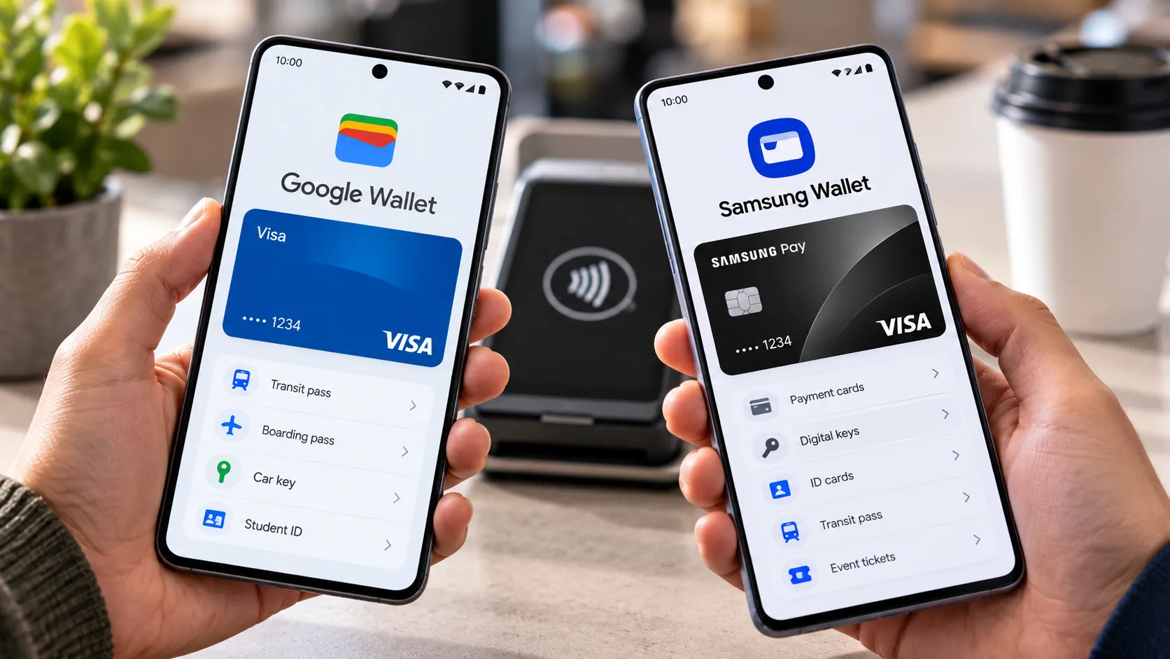
Google Wallet is rolling out a vertically stacked card redesign on Android, and it has quietly created the Google Wallet card stack design problem: a layout that makes similar cards nearly impossible to tell apart. The server-side update, spotted since mid-September and now reaching more phones, swaps the old horizontal carousel for a scrollable vertical stack, according to 9to5Google. Along the way, Google hid the card numbers and nicknames that used to make picking the right card a glance instead of a guess, Samsung Magazine reported today.
For anyone carrying a single saved card, little changes. But anyone with two or more cards from the same bank is running straight into the problem: those cards now look identical in the stack, separated only by a system-assigned color, per Samsung Magazine. Google built an interface meant to make tapping the right card faster, then left out the detail that tells a user which card is actually right.
How the new Google Wallet card stack works
The old carousel showed one card at a time with a sliver of the next peeking in from either side, and swiping sideways cycled through the rest. The new layout, which echoes Apple's Wallet app according to Samsung Magazine's commentary, shows one full card on the homepage with just a sliver of the next card visible above it. Tapping or swiping down opens a fuller, scrollable view showing most of each card in the stack, 9to5Google reported yesterday.
From there, tapping a card selects it for tap-to-pay. Reordering cards and setting a default still happens through "Manage payment methods," and that part hasn't moved. What has moved is card details and transaction history, now sitting behind a new settings gear icon in the top-right corner instead of being visible on the card itself, the same 9to5Google report noted, an extra step compared with the old design.
None of this is a finished rollout. The redesign started appearing roughly three weeks ago and is delivered server-side rather than through an app update, so there's no version number to check and no toggle to flip, per 9to5Google. Reports over last weekend skewed toward international users, and 9to5Google confirmed two days ago that the layout had reached several of its own test devices, a sign Google is pushing it wider. Current reporting hasn't pinned down a device requirement, a region list, or any way to trigger the change manually. It just shows up.
Why Google Wallet's stacked cards are hard to tell apart
Here's where the redesign runs into trouble. With numbers and nicknames hidden, two cards issued by the same bank render as the same design with only a different system color separating them, Samsung Magazine reported today. The app also displays cards one at a time now, with the lower portion of each card staying covered by the next one in the stack until it's selected, according to the same report.
The complaints aren't confined to one corner of the internet. Samsung Magazine noted that users have been posting about the problem on Reddit and directly in Google's own support forum, frustrated that cards which used to be distinguishable at a glance now look the same. None of that reporting attaches a number to it; not how many accounts carry multiple cards from the same issuer, not how often someone actually taps the wrong one. What it does establish is that the problem is real and repeatable for people in that situation, not a one-off glitch.
There is a workaround, and it undercuts the redesign's own stated purpose. Pulling a card to the side reveals its identifying details, but that only happens after an extra swipe, Samsung Magazine reported, the same gesture-heavy interaction the stacked layout was supposed to replace. Needing to swipe anyway just to confirm which card is which cancels out the speed the new tap-based list was built to deliver, for exactly the users who have more than one card to sort through.
Credit where it's due: 9to5Google's testing found the stacked list genuinely nicer for one-handed use, particularly when frequently used cards sit near the bottom, since reaching them no longer means swiping across an entire carousel. That's a real improvement. It just doesn't help if a user can't tell which card they're reaching for in the first place.
What's confirmed, what Google hasn't said, and why it matters
Tapping the wrong card at checkout is usually a minor inconvenience, a quick correction and a second tap. But when two cards look identical and the only way to check is an extra swipe, the odds of grabbing the wrong one go up, especially for anyone paying in a hurry. That's a reasonable risk to flag given what's already confirmed about the design, not a documented case of anyone being double-charged.
What's missing from the public record matters just as much. Neither 9to5Google nor Samsung Magazine's reporting references a statement from Google acknowledging the issue, a timeline for a fix, or a setting that restores the old carousel or forces card details to display in the stack. That silence doesn't confirm none of that exists, only that it hasn't surfaced in coverage so far.
Samsung Magazine's commentary expects the issue to get addressed eventually, though it admits uncertainty about how, since the current card layout doesn't leave obvious room for numbers or other identifying text. One idea floated: working a card's name or last four digits into the top of the design instead of hiding it behind a swipe. The same commentary doubts Google will abandon the new layout and revert to the old carousel, and found it hard to justify the change at all compared with other Wallet features added recently, like airline ticket and driver's license support or Gemini integration.
How to identify cards in Google Wallet for now
If the stacked design has reached a phone, treat card position and color as hints, not confirmation. A card's spot in the stack can shift as defaults change, and color alone won't separate two cards from the same bank. Swipe or tap into a card to check its details before paying, especially for anything that shares a bank and design with another card in the wallet.
Setting a default card doesn't solve this. A default only determines what shows up first; it does nothing for the moments a different, similar-looking card needs to be chosen deliberately instead, and those are exactly the moments this redesign makes harder, not easier.
This is still a partial rollout, delivered quietly and inconsistently since mid-September, so plenty of Android users haven't seen the new stack yet. If it hasn't shown up, there's nothing to change yet. If it has, and more than one card from the same issuer sits in that wallet, don't trust the stack at a glance until Google adds the missing identifiers back. Verify first, tap second.



Comments
Be the first, drop a comment!