


Google New App Icons Rollout: Gmail, Drive & Calendar Redesigned for Clarity
Google is working on a sweeping redesign of its Workspace app icons, and the Google new app icons rollout covers everything from Gmail and Calendar to Drive, Meet, Chat, Docs, Sheets, and Slides. The goal, according to sources who provided images to 9to5Google last month, is blunt: make apps that currently blur together on a crowded home screen identifiable by sight alone. The Verge and Android Police covered the leaked designs shortly after.
The problem being addressed is one that Android Police laid out plainly earlier this month: Gmail, Calendar, Drive, and Photos share the same four colors, similar shapes, and a very consistent design language, so they blur together on any crowded home screen. Google, the outlet argued, optimized for branding over usability. A consistent suite identity, reinforced by Material You, came at the cost of being able to tell apps apart quickly. The redesign is aimed at correcting that.
What's confirmed, what isn't, and when this might happen
The gradient design language itself has been in motion for a while. The Verge reported last month that Google started rolling it out selectively in late 2025, beginning with the Google "G," Gemini, Photos, and Maps. The Workspace overhaul covers a much larger app set, and 9to5Google describes it as a complete redesign rather than an incremental update.
What's missing is any official word from Google on timing or scope. Android Police noted last month that Google I/O 2026 is the most likely venue for a formal announcement, though that remains speculation. Which apps go live first, on which platforms, and for which user cohorts has not been addressed in any reporting. Google has not said when the rollout will happen.
The leaked assets themselves suggest the project is well along. 9to5Google's report came from sources familiar with the matter, and both The Verge and Android Police treated the images as credible. What still doesn't exist on the record is a release date, a phased rollout plan, or a platform priority order.
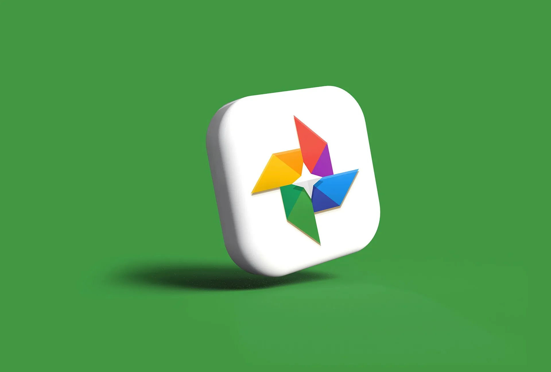
What the Google new app icons rollout changes for Gmail, Calendar, and Drive
The single biggest structural change is the end of the four-color mandate. Previously, every Workspace icon drew equally from Google's brand colors, red, blue, yellow, and green, which made each app feel like a variation on the same template. 9to5Google reported last month that requirement has been dropped. Each app now gets one dominant color, with others reduced or removed entirely.
The specific shifts: Meet switches to yellow as its primary color, Chat moves to green, Calendar returns to a solid primary blue and drops its four-color exterior container, and Drive loses red entirely, keeping only the green, yellow, and blue that correspond to Docs, Sheets, and Slides. Android Police argued the revised designs should let users tell apps apart without reading their labels, something the old system couldn't reliably deliver.
Gmail changes the least, and deliberately so. The familiar "M" envelope shape stays; it's slightly more rounded and clearly red-dominant. 9to5Google noted that Gmail is the only new icon that still carries all four Google colors, albeit in much smaller proportions. Android Police called that the right call, since Gmail is one of the most recognizable apps in the Workspace suite. The apps that shift most dramatically are the ones that were hardest to distinguish before: Meet gets an entirely different look, and Android Police singled it out as the most visually changed icon in the leaked set.
The page container is gone, and that matters more than it sounds
Most previous Workspace icons placed a symbol on top of a white document background, a shared rectangular container that enforced visual consistency across the entire suite. That container also capped how large the core symbol could appear and contributed to the uniformity that made individual apps hard to distinguish. 9to5Google reported it has been removed for the majority of apps.
Without the container, each icon's core symbol expands, develops a stronger silhouette, and reads as a distinct shape rather than a smaller element inside a shared frame. Android Police noted the redesigned icons should scale better on tablets and foldables, where larger surfaces previously made the visual sameness more pronounced, not less.
Calendar is a notable case. 9to5Google described the new design as returning to an older skeuomorphic reference, evoking a flip-style calendar object, with the four-color exterior container gone and solid blue taking its place. It's a sharper, more readable shape than what the current icon delivers at small sizes.
Orientation changes for Sheets, Slides, and the document apps
Docs, Sheets, and Slides previously shared portrait-oriented document shapes that looked nearly identical at small sizes. The new designs shift Sheets, Slides, Forms, Sites, and Keep away from that portrait orientation, according to The Verge. Many move to landscape, which is how spreadsheets and presentations actually appear when you use them. Android Police made the same point about horizontal orientation for Sheets and Slides specifically, describing it as how they should always have been.
The logic is straightforward: an icon that reflects the shape of what's inside it communicates something useful before the user taps it. A landscape-oriented Sheets icon tells you it's a spreadsheet app. A portrait-oriented one tells you it's a document app, which is exactly the confusion the old system created.
What the gradients actually do
Across all the new icons, color transitions move from near-pastel shades into more saturated primaries, and layering creates depth the previous flat treatment didn't have. The Verge noted the overall look is softer, with rounder corners and gradients that gently shift from almost pastel into Google's primary colors. Android Police described the functional effect earlier this month: subtle gradients and layering give certain elements more visual weight, which gives the eye something to latch onto faster. The icons no longer feel flat or uniform.
That faster visual scanning is what separates icons that look better from icons that actually work better. Android Police framed it simply: the goal is tapping the right app on the first try, without a delay. The design choices here are aimed at that outcome, not at winning a design award.
The AI angle, and what Google hasn't confirmed
One thread runs past the usability story. 9to5Google interpreted the gradient treatment as a signal of AI-powered features, noting it matches the same visual language already applied to Gemini, the Google G, Photos, and Maps. The Verge passed that reading along as 9to5Google's interpretation, not a confirmed Google position. Google has not publicly addressed whether the gradient pattern is meant to function as a deliberate AI indicator across its product line.
If it does, the icon overhaul looks less like a usability correction and more like the opening move in a broader visual system, one that uses a shared design language to signal where AI has been built in. Google I/O is the next moment for that question to get an answer, along with whatever rollout details Google chooses to share officially. Until then, the usability argument is supported by the reporting; the AI signal theory remains an editorial reading from one outlet that the others have noted but not confirmed.


Comments
Be the first, drop a comment!