


Gemini Live App Redesign: What Changes for Android Users
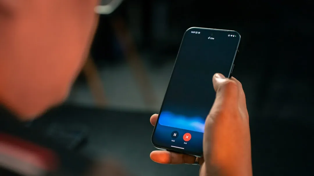
Google is testing a Gemini Live app redesign on Android that replaces the fullscreen takeover with a layout anchored to the Gemini app's homepage, 9to5Google reported last week. The redesign surfaces mute, camera sharing, and transcript controls that were previously hidden behind gestures, making them visible and tappable in a pill-shaped container at the bottom of the screen. Google app beta version 17.14 users are widely seeing the update. Google has not announced the same visual update for Search Live, its voice-and-camera search feature inside AI Mode.
Search Live now reaches more than 200 countries and territories, per Google's global expansion announcement last month. Several controls the Gemini Live redesign is now making visible were already present in Search Live from launch. The two products don't share a visual design, but a look at which specific controls each one exposes, and how, shows where Google has been consistent across both and where Search Live's interface still lags behind what the Gemini Live redesign demonstrates.
What changed in the Gemini Live fullscreen interface
The shift is from fullscreen to homepage-anchored. Activating Gemini Live previously replaced everything on screen with a dedicated session view. In the redesign, the Gemini app's homepage stays intact beneath the active conversation, while a pill-shaped container at the bottom handles the session and displays the blue waveform, according to 9to5Google. The top bar changes to "Live with Gemini" and gains a transcript button beside it.
The controls inside the pill container are the more significant change. Camera sharing sits on the left, screen sharing beside it, microphone muting on the right. All visible, all tappable. To exit, tap the keyboard icon or use the system back gesture.
That's a real improvement over what came before. Google had previously tested a more minimal layout with just camera sharing and the keyboard icon. Muting required double-tapping the waveform, a hidden gesture with nothing on screen to indicate it existed, per 9to5Google. The revised approach, as the report describes it, is "more obvious" which sounds like faint praise until you consider that users who never discovered the double-tap gesture simply couldn't mute mid-session.
The redesign currently applies only to the Gemini app on Android beta. The overlay version of Gemini Live, which floats on top of other apps, is unchanged for now but will also be redesigned to match the in-app experience, 9to5Google reports. No timeline has been given for that change.
The practical reason for moving away from fullscreen is straightforward. A session that takes over the entire display becomes an obstacle the moment a user needs to check something else mid-conversation: a map, a message, a photo. Keeping the interface on the homepage means the conversation stays reachable without forcing a choice between the AI session and everything else on the phone. It's the difference between an assistant that stays in the room and one that locks the door behind it.
Where Search Live already reflects the same logic
Search Live hasn't received this visual update, but three specific controls the redesign now makes prominent in Gemini Live were already present in Search Live from launch.
The transcript button is the clearest case. Search Live launched with it in June 2025, letting users tap through from audio to a text view and continue asking questions by typing, per Google's original launch post. The Gemini Live redesign is now surfacing that same button more prominently in the top bar. The control isn't new across these products; what's being standardized is how easy it is to find.
Background operation is another shared capability, though it works differently between the two. Search Live has been able to keep running while a user switches to another app since its June 2025 launch, as Google described at launch. That's only useful as a feature if the interface doesn't require constant foreground attention to remain active. The homepage-anchored layout in Gemini Live's redesign solves exactly that problem for the Gemini app context: the session stays accessible without demanding exclusive focus.
The Lens entry point is a third parallel. In Search Live, users already in Google Lens can tap a Live option at the bottom of the screen to shift directly into a back-and-forth voice conversation about what the camera sees, per Google's expansion announcement last month. Camera context flows into conversation without ending the Lens session and without a mode change. That's the same principle behind promoting camera sharing to a visible, first-class control in the Gemini Live redesign: make camera access obvious enough that users actually reach for it.
To be clear about what the evidence does and doesn't support: both products share transcript access, background-friendly interaction, and Lens-to-Live camera handoff. What the evidence does not support is any announced plan to give Search Live the same visual treatment the Gemini Live redesign introduces. Parallel design decisions are not a declared roadmap.
Why the Search Live comparison matters now
Scale changes what counts as acceptable in interface design. Search Live now operates across more than 200 countries and territories, powered by Gemini 3.1 Flash Live, a model Google describes as delivering "even more natural and intuitive conversations" and as "inherently multilingual," meaning users can speak with Search in their preferred language, per the global expansion post. Last month's rollout extended support to Bengali, Gujarati, Kannada, Malayalam, Marathi, Odia, Tamil, Telugu, Urdu, and additional Indian languages, per a separate Google India announcement.
A user in Bengaluru pointing a phone camera at a broken appliance should not have to stumble across a hidden double-tap gesture to mute mid-conversation. At a user base measured in hundreds of countries, that kind of undiscoverable control isn't a minor friction point. It's a barrier for anyone encountering the product without prior familiarity with its quirks, which is most first-time users, in most of those markets.
The Gemini Live redesign establishes a concrete answer to what "obvious" looks like for a live AI interface: mute, transcript, and camera sharing on screen, not buried in gesture documentation. Search Live currently has those same underlying capabilities; the question is whether it gets comparable surface-level clarity. The overlay version of Gemini Live is next in line for the visual update, and it's reasonable to watch whether Search Live follows after that.
Google hasn't said. But the Gemini Live fullscreen interface change sets a visible baseline, and Search Live is now the larger product by geography. Getting the controls right there is where it matters most.


Comments
Be the first, drop a comment!