


Google's been busy tweaking Android Auto's media player interface over the past year, and the latest chapter in that story might surprise you: the wavy progress bar that briefly appeared is now vanishing from users' dashboards. After months of testing a Material 3 Expressive design with an animated, undulating progress indicator, reports suggest Google is pulling back the feature, leaving drivers and Android enthusiasts wondering what went wrong—and what comes next.
Here's what you need to know: Android Auto's media player has been through several design iterations recently, from a revamped layout that moved controls to new positions in version 16.0 to experiments with wavy progress bars discovered in version 15.9.6551. But as quickly as these changes rolled out, some are now being reversed. The wavy bar, which aligned with Google's Material 3 Expressive design language, appears to be disappearing before it reached widespread availability. To understand why this seemingly minor UI element became problematic, we need to examine how Android Auto's unique constraints clash with smartphone design principles—and why what works brilliantly on a Pixel phone can fail dangerously on a dashboard.
What changed—and when it changed
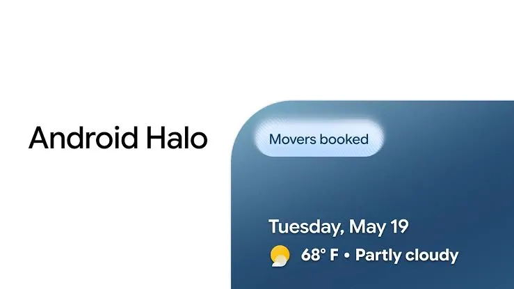
Android Auto 16.0 began rolling out to beta users earlier this month before hitting the stable track with version 16.0.660224. That update brought a redesigned media player first previewed at Google I/O 2025 last May, relocating the play/pause button to the bottom left corner with track controls alongside it. The new layout appeared in apps including Spotify and Pocket Casts, with Spotify also displaying updated Material You theming that matched album art.
Around the same time, evidence emerged of a wavy progress bar meant to replace the traditional flat-line indicator. This thicker, undulating bar animated as audio tracks progressed, bringing visual continuity from Pixel phones into the car. This visual consistency with Pixel phones suggested Google was prioritizing brand coherence—but in-car interfaces face constraints that don't exist on handheld devices, where users control viewing duration and aren't operating heavy machinery. The feature was spotted in Android Auto v15.9.6551, suggesting it was nearing public release. Yet despite the code being present, the wavy bar was never officially released to the public.
Now, users who briefly saw the wavy progress bar during beta testing phases are reporting that it's vanishing from their systems. The feature's server-side control mechanism explains both the sudden appearance and equally sudden disappearance. Unlike traditional app updates that roll out predictably, server-side flags allow Google to enable or disable functionality remotely, activating features for specific user cohorts—then pulling them instantly when data reveals problems. In this case, early metrics and user reports (readability and control issues) appear to have contributed to Google disabling the feature rather than an aesthetic enhancement.
Why the wavy bar is disappearing: safety meets aesthetics
The Android Auto community has identified several reasons why the wavy progress bar is being pulled, and they all converge on one fundamental issue: what looks delightful on a phone can become dangerous on a dashboard. The most prominent explanation centers on readability and compatibility issues that surfaced during real-world testing. Some users experienced text rendering problems in multi-window card interfaces, where Maps and a music app appear side by side. A light-colored filter applied to album art conflicted with white text, creating low-contrast labels that failed the quick-glance test drivers need.
The wavy bar amplified this problem because it combined two controversial elements: background color changes (static) plus animation (dynamic). While it added visual flair and personality compared to the flat design, the animation introduced dynamic contrast changes as the wave moved across different background regions—multiplying the readability problem across time. Users who tolerated previous design changes rebelled when the animation drew eyes to the progress bar—a secondary UI element—when drivers' attention should remain on the road or focus on primary controls.
There's also broader context about Android Auto's recent design turbulence. Earlier this year, Google tested a Material You-based interface featuring background colors that matched the phone's wallpaper. That change upset users due to its bland appearance, prompting Google to test a return to album art backgrounds. Hidden options in version 15.2.653604 allowed reactivation of the older media player background with blurred album art, suggesting the company was responding to negative feedback about personalization without practicality.
The animated nature raised accessibility concerns beyond aesthetics. Users with vestibular disorders or motion sensitivity could experience discomfort from peripheral motion while driving. Unlike phone interfaces where users can look away, dashboard displays remain in the driver's field of view. The wavy bar's animation created visual events requiring cognitive processing, potentially extending glance duration beyond safe limits as drivers tracked the movement to estimate playback position—exactly the kind of distraction automotive interfaces must avoid.
How Android Auto updates actually work—and why rollbacks happen
This update architecture created the perfect conditions for the wavy bar's quiet disappearance. Because the feature existed only as activated code rather than a forced interface change, Google could monitor performance metrics in real-time and make rapid decisions based on actual safety data. Many Android Auto features are controlled by server-side flags and hidden settings, allowing Google to enable or disable functionality remotely. Features typically reach a fraction of users initially in the beta channel before rolling out more broadly via staged rollouts, facilitating gradual A/B testing ahead of broader deployment. Google's staged rollout system typically exposes features to 1-5% of users initially, expanding to 50% within weeks if metrics remain stable. The wavy bar never reached that 50% threshold—suggesting early data flagged serious concerns.
The platform's complexity compounds these challenges. Android Auto's projection experience depends on the phone app, vehicle head unit capabilities, and individual media apps. While the wavy bar ought to be adaptable across most vehicles without necessitating head-unit updates, real-world testing across hundreds of vehicle models and screen configurations reveals edge cases that look perfect in development but fail in deployment. Different screen shapes, resolutions, and DPI settings mean a design that looks perfect on one head unit might be illegible on another—and animation only magnifies these inconsistencies.
Rollbacks aren't uncommon in this environment, and they provide instructive parallels. Earlier this year, Android Auto 15.2 introduced a bug where the music player widget became unreadable. The issue appeared tied to Android Auto's upcoming light theme, with the light version of the music player being turned on by default with no way to switch to the dark version. The wavy bar may have encountered similar issues, but with higher stakes: while the light theme bug affected readability in one mode, an animated progress bar creates readability challenges that shift dynamically as the wave moves—making it harder to diagnose and fix across diverse hardware configurations. Users could fix the problem by leaving the beta program or uninstalling updates, but bugs like this are inherent to beta releases. The wavy bar's rollback likely resulted from similar data patterns that made continuing the experiment too risky.
What this means for drivers and developers
For drivers, the wavy bar's disappearance reveals a crucial lesson: automotive UI must prioritize information hierarchy over aesthetic consistency. The feature failed not because it was ugly, but because its animation drew attention to the progress bar—a secondary UI element—when drivers' eyes should remain on the road. Google has been developing a cross-app template and enhancing app-switching while making icons, labels, and seek behaviors consistent, but that standardization process involves recognizing when visual flourishes cross the line from enhancing to endangering. The play button should always be where you expect, the scrubber should work consistently across services, and visual flourishes should retain good taste and legibility across many head units—but achieving that balance requires accepting that some smartphone design principles simply don't translate to automotive contexts.
This hierarchy principle directly impacts developers working with Android Auto's media templates. At Google I/O 2025, the company introduced new "MediaPlaybackTemplate" tools, empowering developers to create more customizable and harmonized music interfaces within Android Auto. The wavy progress bar was likely a key visual component of these broader improvements, adding polish to the updated templates. The wavy bar's rollback suggests Google is refining these MediaPlaybackTemplate tools to enforce safety-first constraints—potentially adding new guidelines around animation duration, motion frequency, or dynamic contrast ratios that prevent future features from encountering the same issues.
The rollback also highlights why automotive safety research must guide design decisions. Human factors research from groups like the AAA Foundation for Traffic Safety and NHTSA points out that off-road looks of more than two seconds raise crash risk significantly, making readability and contrast non-negotiable. The NHTSA's two-second threshold explains why the wavy bar's animation proved problematic: each wave cycle created a new visual event requiring cognitive processing, potentially extending glance duration beyond safe limits. This isn't abstract theory—it's the difference between a driver catching a hazard and causing a collision. Glanceable interfaces, expected color behavior, and reduced distraction outweigh aesthetics in the automotive context, and the wavy bar's disappearance proves Google takes that principle seriously enough to reverse course when data shows a feature doesn't meet those standards.
What to expect next—and what you can do now
So where does this leave you, sitting in your car, wondering if that progress bar will ever wave again? Based on the wavy bar's failure mode, expect Google's next attempts at visual expressiveness to focus on static rather than animated elements—perhaps more sophisticated color gradients or depth effects that add visual interest without creating motion-based distraction. Users should expect more expressive visuals and potential additional features like updated cast support and media player redesigns in future updates, but those changes will likely arrive more cautiously, with extensive safety testing before reaching the stable channel.
If the album art return does stick, expect iterative polishing: contrast improvements for card text, further tweaks to icon size and spacing, perhaps even an option in Display settings to toggle between "Wallpaper colors" and "Album art". A toggle would be a realistic middle-ground that respects both Material You purity and driver preference—giving users control without compromising safety for those who need maximum contrast.
Google has the technical building blocks to solve the contrast issues that likely doomed the wavy bar. Android already uses luminance-based adjustments in parts of system UI—applying this same logic to animated elements could enable future dynamic progress indicators that maintain readability across the wave's motion. When the wavy bar template arrives—if it arrives—expect it to reach beyond music into podcasts and audiobooks, where a more dynamic scrubber can provide cues for chapter breaks or long-form progression. Considering automotive safety guidelines as well as Android accessibility settings, motion will likely be subtle and respect reduce-motion preferences in order to not distract, ensuring that the feature serves practical needs rather than purely aesthetic goals.
For now, drivers should keep their Android Auto app updated and monitor the Play Store for new versions. Given that Android Auto's projection experience depends largely on the phone app and server flags, expect the wavy bar to roll out slowly if it returns; it may even be released piecemeal for select apps and users. If you're experiencing bugs or readability issues, reporting them through the app's feedback channels directly influences these server-side decisions. The wavy bar's rollback likely resulted from user reports flagging specific readability scenarios—your input shapes which experiments continue and which quietly disappear. Consider checking community forums like r/AndroidAuto for workarounds and contributing your own observations. Features like this one are locked behind server-side flags and hidden settings, so your feedback can directly influence whether a feature stays, goes, or gets refined based on real-world driving conditions rather than laboratory testing.
The bottom line: design evolution meets real-world constraints
The wavy bar's disappearance crystallizes a fundamental tension in automotive UI design: the same visual dynamism that makes smartphone interfaces delightful can make dashboard interfaces dangerous. Google's rollback suggests the company is prioritizing this distinction over design language consistency—a maturation that could reshape Android Auto's evolution and set important precedents for other automotive software platforms. Google's ongoing effort to bring consistent, polished design language from Android phones into vehicles is admirable, but cars are not phones. Personalization matters in the car, but legibility and context matter more.
Google is learning that lesson through data: the wavy bar likely generated metrics showing increased glance duration, reduced task completion rates, or higher error rates in split-screen scenarios. These quantifiable safety impacts override aesthetic goals, proving that the company's decision-making process values driver safety above brand consistency—exactly as it should. Ever since the Coolwalk redesign, Android Auto has been heading towards a consistent language that will work on phones, tablets, and dashboards, but that journey involves recognizing when consistency must yield to context-specific requirements.
If Google can get contrast right and stop the UI from feeling clinically dead, Android Auto might find a style as expressive yet perfectly serviceable on the road. Until then, expect more experiments, more rollbacks, and—crucially—more opportunities for users to shape outcomes through feedback. The wavy bar's fate was decided by real-world usage data, not design committee preferences. Every bug report, every forum post, every moment of driver frustration feeds into Google's decision calculus about which experiments become features and which quietly disappear. The wavy bar may be gone for now, but the conversation about how to make Android Auto both beautiful and safe is just getting started—and you have a voice in how that conversation unfolds.


Comments
Be the first, drop a comment!