


Android 3D Emojis Explained: Why Delivery Matters More Than Design
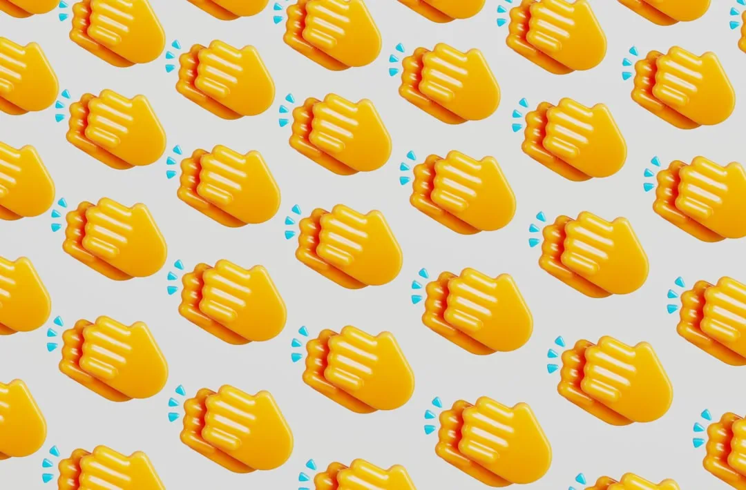
Google last week unveiled Noto 3D at The Android Show: I/O Edition, a ground-up rebuild of its entire Noto Color Emoji set into what the company's emoji lead Jennifer Daniel described on Instagram as "hand-modeled 3D emoji" that are "actually true 3D objects," according to Emojipedia. All roughly 4,000 designs were rebuilt by hand. Pixel phones get them first, with a broader rollout across Google products planned for later in 2026, per Google's announcement.
The questions Google left unanswered are the ones that actually determine whether most Android users ever see any of this.
What "true 3D" means for a font-based system
Emoji are fonts. Each maps to a Unicode code point, and the visual result depends on how a given platform's rendering stack interprets that code point which is why a thumbs-up looks different on an iPhone than on a Pixel, as Google has explained. Same character, different font.
Noto 3D is the fifth major aesthetic incarnation of Google's emoji set, Emojipedia notes. Previous overhauls swapped artwork and updated color palettes. The claim this time is structural: genuine three-dimensional geometry, rendered as objects rather than drawings.
That distinction carries real delivery risk, and Microsoft's experience illustrates why. When Microsoft announced its 3D Fluent emoji overhaul in July 2021, what actually shipped to Windows 11 users that November was a flat 2D version. The 3D designs relied on the COLRv1 color font format, which at the time lacked the broad app and browser support needed for a universal rollout, Emojipedia reported. The 3D version was confined to Microsoft Teams while Windows itself received the flatter fallback. It wasn't until early 2025, following wider COLRv1 adoption across applications and browsers, that the 3D Fluent set became the default experience for most Windows users and 2D versions still persist in some apps and text input fields.
Google has not disclosed what rendering format powers Noto 3D, or how the designs will behave in older apps, text fields, and cross-platform messaging threads. Whether it faces the same constraint Microsoft did depends on technical details it hasn't shared.
Why Google's Noto 3D emoji are harder to ship than they look
Pixel phones are confirmed first. The broader Google rollout follows later in 2026, per Google's blog. Android 17 is expected to launch in June or July 2026, which would put Pixel users on a plausible path to having the new designs by World Emoji Day on July 17 though Google has not confirmed that target, Emojipedia noted.
Getting emoji onto Pixel devices is the straightforward part. Reaching the rest of the Android ecosystem is where Google's history gets relevant.
Until 2022, an estimated 96% of Android users couldn't see newly released emoji in the year they debuted. Updates were bundled into full OS upgrades, which meant anyone running an older Android version simply couldn't display the new characters just blank boxes. Google fixed this in 2022 by decoupling emoji updates from OS upgrades: apps using Appcompat, the compatibility layer widely deployed across Android, could then receive new emoji without requiring a system upgrade, according to Google.
That mechanism, built around the emoji2 library, was a genuine infrastructure improvement. The open question is whether it can carry Noto 3D's rendering requirements. If the 3D format demands COLRv1 support or a comparable advanced rendering capability, the Appcompat path may not be sufficient without updates to both the library and the apps that use it. Google hasn't addressed this.
Three further questions remain unanswered, per Emojipedia: whether Noto 3D replaces the existing Noto Color Emoji font outright or ships alongside it as a parallel font; whether non-Pixel Android devices receive it at all; and whether the animated emoji set gets a matching 3D treatment. For users not on Pixel hardware which is most Android users globally those answers determine whether this redesign is something they'll ever encounter in practice.
The font architecture question is more consequential than it sounds. A replacement font means Noto 3D becomes the system default wherever it's supported. A parallel font means apps, browsers, and messaging platforms each have to opt in, which historically produces fragmented results across the contexts where the same user communicates daily.
Beyond aesthetics: a possible fix for cross-platform confusion
The redesign may also do something beyond changing how emoji look. Emojipedia flagged that the Noto 3D set could contain structural changes to select designs adjustments to what an emoji depicts, not just its rendering style, though Google has not confirmed this, per Emojipedia.
The context: the Unicode Consortium's Emoji Subcommittee Research group has been running a multi-phase audit of emoji designs across vendors, identifying cases where the same code point renders as meaningfully different objects on different platforms, Emojipedia reported. When a monarch butterfly is drawn as a generic butterfly, or a pickle rendered as a cucumber, or a meteor depicted as a comet, the sender and recipient may be looking at functionally different images without realizing it. The cross-platform gap isn't just aesthetic it's communicative.
Emoji 18.0, due for approval in September 2026, includes specific recommendations targeting the clearest examples of this kind of divergence, according to both Emojipedia's overhaul coverage and its design convergence review from four months ago. It's possible that Noto 3D incorporates some of those corrections ahead of Emoji 18.0's formal release, meaning the aesthetic overhaul could simultaneously address cases where Android's emoji have historically conveyed unintended meanings though the research frames this as a reasonable inference, not a stated intention.
Samsung's One UI 8.5, which has begun rolling out globally, already includes support for Unicode's latest emoji recommendations and revised designs, per Emojipedia. The broader Android manufacturer ecosystem is already moving toward convergence. Noto 3D, if it incorporates ESR corrections, could put Google's own designs in alignment with that direction for the first time.
What to watch
The rendering format is the central unknown. That's what determines whether Noto 3D delivers as a genuine system-wide upgrade or lands the way Microsoft's 3D Fluent set initially did impressive in a controlled environment, fragmented everywhere else.
The first concrete signals will come from Android 17 release notes and developer documentation. Two things are worth tracking closely: whether Google updates the Appcompat and emoji2 libraries to support Noto 3D's rendering requirements, which is the mechanism that would push the new designs beyond Pixel to the wider Android ecosystem; and whether Google confirms a font replacement or a parallel font, since that choice determines how consistently these emoji appear across the apps, browsers, and messaging platforms where most communication actually happens.
Until those details surface, Noto 3D is an impressive design announcement with a distribution story still to be written.


Comments
Be the first, drop a comment!