


You know that moment when you watch the tech industry follow a design trend and wonder if it's genuine innovation or just the domino effect in action? That's exactly what's happening with Android 17 and the broader Google ecosystem right now. We're looking at what could be the most significant shift in Android's visual identity since Material Design first launched, and it's fascinating to see how market forces are pushing even Google to reconsider their carefully crafted design philosophy.
What makes this particularly intriguing is that we're witnessing a real-time case study in how design influence flows through the mobile ecosystem. While Google has spent years developing research-backed Material Design principles, the market reality shows manufacturers consistently gravitating toward Apple's aesthetic choices—and Android 17's leaked changes suggest Google might finally be ready to meet that demand while staying true to their functional-first approach.
Why Android manufacturers keep chasing Apple's design language
Here's what's fascinating: while Google develops Material 3 Expressive with extensive user research and systematic design principles, Android OEMs consistently prioritize Apple's aesthetic and functional choices over Google's own design direction. This isn't just about following trends—it's about market dynamics that run deeper than surface-level aesthetics, revealing fundamental tensions in how Android's ecosystem actually functions versus how Google envisions it should work.
The pattern is undeniable and surprisingly rapid. When Apple introduced the Dynamic Island, Android manufacturers didn't wait for Google to create an official response. Apple transforming the iPhone's camera cutout into an interactive Dynamic Island led Android OEMs to follow suit with features like Realme's Mini Capsule and similar features in Xiaomi's HyperOS and Samsung's One UI updates. The same rapid adoption happened with Liquid Glass—Android OEMs quickly copied the Liquid Glass design introduced by Apple at WWDC for their Android skins.
But here's where the business incentives create real problems for users: Android manufacturers skip creating official APIs for features like Dynamic Island or Live Activities, coding functionality themselves instead. This approach prioritizes speed-to-market over ecosystem coherence, resulting in features that look impressive in marketing materials but create fragmented experiences in daily use. OEMs' customization results in a system where their own apps work seamlessly with features like Dynamic Island clones, but third-party apps often cannot access or integrate with these features.
The fragmentation undermines the very thing that makes Apple's approach work so well. The lack of official APIs causes inconsistency, making third-party apps like Spotify or Google Maps unable to access or display information in custom notification areas or lock screen widgets. It's like having a beautiful new highway system where only certain vehicles are allowed to drive on the premium lanes—the infrastructure exists, but the lack of standardization prevents the ecosystem-wide benefits that make these features compelling in the first place.
What makes Liquid Glass so influential?
Understanding Liquid Glass requires looking beyond the visual tricks to grasp why this particular design system has captured the imagination of manufacturers worldwide. This isn't just about making things look pretty—it's a fundamental rethinking of how interface elements relate to each other and to the content beneath them, with a sophistication that goes well beyond typical aesthetic trends.
Liquid Glass is a layered surface system that keeps backgrounds perceptible while maintaining content stability, functioning as a complete material system rather than just eye candy. The genius lies in how the design creates a floating functional layer for primary navigation structures like tab bars and sidebars, visually separating them from underlying content through dynamic depth effects that feel both natural and technologically advanced.
What's particularly clever is how Apple has structured the system's variants to balance aesthetics with functionality. Apple provides two primary variants: regular focusing on legibility with stronger blurring, and clear prioritizing immersion and transparency. This gives developers flexibility while maintaining consistency—something that's been missing from the Android manufacturer implementations we've seen so far, where each OEM creates their own interpretation without regard for cross-app compatibility.
The psychological appeal runs deeper than technical implementation. Liquid Glass derives its name from blending glass transparency with fluid motion, creating interfaces that feel tactile and dimensional rather than flat and purely digital. When you interact with a Liquid Glass element, it doesn't just respond—it behaves like you'd expect real glass to behave when touched or moved, tapping into our instinctive understanding of physical materials in ways that feel both familiar and futuristic.
However, this pursuit of physical realism creates practical challenges that demonstrate why Google's more systematic approach has merit. The design can affect legibility when multiple translucent elements stack on top of each other, which is exactly the kind of real-world usability issue that Google's research-driven methodology typically avoids. The question becomes: does the emotional appeal justify the potential functional compromises?
Android 17's radical Quick Settings transformation
Google's response appears focused on functionality over pure aesthetics, which honestly feels refreshing given all the visual noise around Liquid Glass adoption. The leaked changes to Android 17's Quick Settings represent the kind of practical innovation that Android has always done well—taking a real user pain point and solving it with systematic thinking rather than flashy visuals.
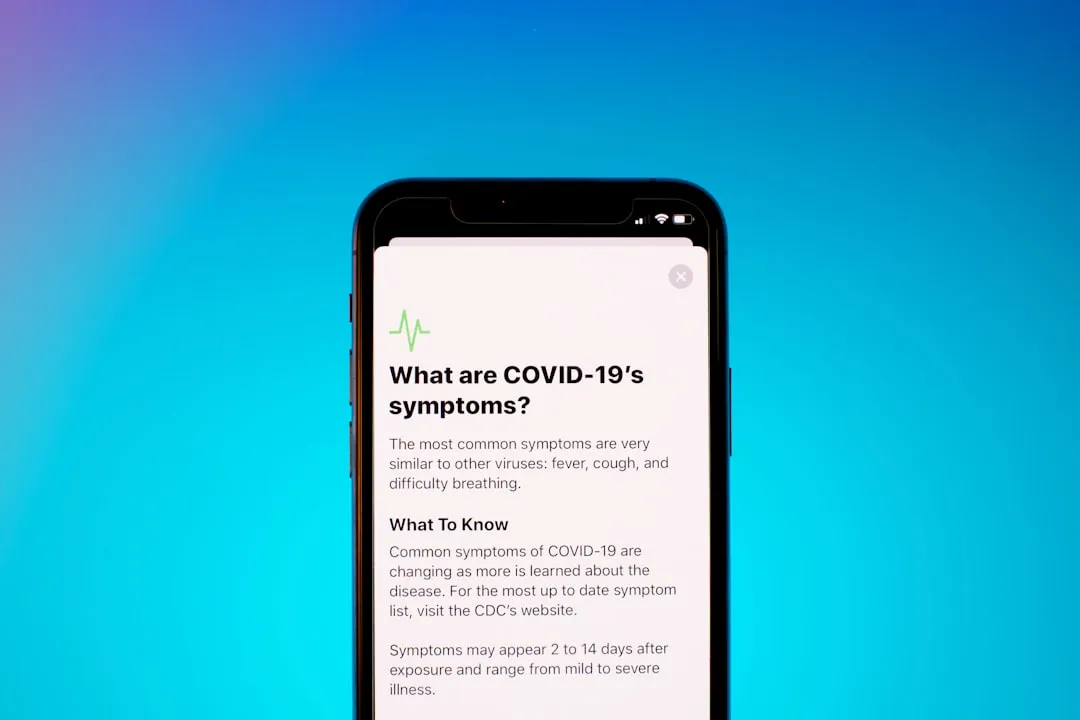
Android 17 testing reveals a split layout where swiping from the left edge shows only notifications, while swiping from the right brings up Quick Settings. This addresses a fundamental usability issue that's been bugging Android users for years without anyone really articulating why it felt clunky. Currently, Android's notification shade and Quick Settings share the same crowded space, forcing users through a two-step process to access system toggles that should be immediately available.
Think about how often you pull down your notification shade just to toggle Wi-Fi or adjust brightness, only to realize you need to pull down again to get to the actual toggles. It's one of those small friction points that adds up over hundreds of daily interactions, and it represents exactly the kind of systematic usability thinking that distinguishes Google's approach from the more aesthetically-driven changes we're seeing elsewhere.
The improvements extend beyond layout optimization to address specific user complaints that Google actually listened to. Android 17 could bring back separate Wi-Fi and mobile data toggles, undoing Android 12's controversial combined Internet toggle that users found confusing despite Google's well-intentioned attempts to simplify connectivity management. Regular Pixel phones may get this as an option, allowing users to choose between classic combined view and the new separate layout.
What's particularly smart is how Google is handling device diversity without forcing one-size-fits-all solutions. The split view will be mandatory on large screens like the Pixel Fold, suggesting Google recognizes the interface needs to adapt to different form factors based on practical considerations rather than aesthetic consistency across all devices.
Here's what makes this approach potentially brilliant: brands like Samsung and Xiaomi already use a similar approach, so Google would make this official in Android itself. Instead of fighting manufacturer customizations, Google could actually improve ecosystem consistency by providing official APIs and standardized behavior that third-party apps can properly integrate with—exactly what's been missing from the Liquid Glass copying we've seen.
Bottom line: Google is testing layouts that load faster and give users one-tap access to essential functions. That's the kind of practical innovation that makes a real difference in daily usage, regardless of what visual style wraps around it.
How Material 3 Expressive stacks up against the competition
While manufacturers chase Liquid Glass, Google has been developing its own response that's grounded in research rather than aesthetic trends—and the difference in approach becomes striking when you examine the methodologies behind each system. Where Apple's Liquid Glass emphasizes immediate visual impact and physical metaphors, Google's Material 3 Expressive represents a more systematic approach to solving interface problems through evidence-based design.
Material 3 Expressive focuses on creating emotionally impactful user experiences, building on extensive research involving 46 studies and over 18,000 participants worldwide. That's not just impressive—it's the kind of systematic approach that typically leads to interfaces that actually work better in real-world conditions across diverse user populations and usage scenarios. This research foundation means Material 3 Expressive isn't just guessing at what feels good; it's building on documented evidence about what actually improves user outcomes.
The technical improvements reveal a sophisticated understanding of interface psychology. The system introduces over thirty-five expressive geometries and expands the shape scale to 10 corner-radius values, giving designers much more flexibility while maintaining the systematic consistency that Android is known for. But these aren't arbitrary choices—each geometric option serves specific functional purposes in helping users understand hierarchy, navigation, and content relationships.
The philosophical difference becomes especially clear when you examine motion systems and their underlying purposes. Motion in Material 3 Expressive is a core design system, unifying animation behavior through tokenized, physics-based models. Instead of just making things look fluid for aesthetic reasons, Google has created a framework where animations serve specific functional purposes—helping users understand spatial relationships, providing meaningful feedback, and reducing cognitive load during complex interactions.
Material 3 Expressive places usability and performance at the center, using expressive tokens, motion, and dynamic color to improve navigation and reduce cognitive load. The system feels more vibrant and emotionally engaging than previous Material Design iterations without sacrificing the clarity and functional consistency that makes Android interfaces genuinely usable across different apps and contexts.
Google's approach has already begun rolling out with impressive practical results. Material 3 Expressive debuted on eligible Pixel devices with Android 16's QPR1 update in September 2025, bringing spring-based motion systems and richer color palettes to the platform. Users are experiencing features like shape-morphing transitions, improved dynamic theming, and more customizable system UI elements that actually enhance functionality rather than just providing visual novelty.
Where does this leave Android's identity?
The tension between Google's systematic design approach and manufacturers' Apple-inspired customizations creates a fascinating paradox that reveals deeper truths about how design innovation actually spreads through competitive ecosystems. We're watching two completely different philosophies compete in real-time across the same platform, with real users caught between research-backed functionality and market-driven aesthetics.
Liquid Glass represents a bold, system-wide reinvention of Apple's visual language, while Material 3 Expressive builds strategically on Material Design's foundation with added flexibility and personalization. The comparison reveals a fundamental tension in modern design: flair versus function, spectacle versus clarity. But what's fascinating is how Android 17's potential changes suggest Google may have found a way to resolve this tension rather than simply choosing sides.
What's interesting is how Android 17's approach might actually bridge these competing philosophies rather than forcing a choice between them. By potentially embracing visual trends that manufacturers are already implementing while maintaining focus on functional improvements, Google could be acknowledging that fighting the aesthetic battle is less productive than channeling market forces toward better user experiences. The Quick Settings overhaul exemplifies this strategy perfectly—whether it incorporates Liquid Glass visual elements or not, the core focus remains on solving real usability problems that affect millions of daily interactions.
The strategic implications extend beyond just visual design to fundamental questions about platform control and ecosystem coherence. Google is testing layouts that load faster and give users one-tap access to essential functions, suggesting that Google's primary concern isn't winning aesthetic debates but ensuring Android remains genuinely functional across an increasingly diverse ecosystem of devices and manufacturers.
Here's what I think will actually happen: Android 17 will likely incorporate some Liquid Glass-inspired visual elements while maintaining Material Design's functional principles and systematic approach to user experience. The split-screen Quick Settings approach demonstrates Google's willingness to make significant interface changes when they serve clear functional purposes and address documented user pain points. If Liquid Glass elements can be implemented without sacrificing usability—and crucially, with proper API support that allows third-party developers to integrate seamlessly—it could actually strengthen Android's ecosystem consistency rather than fragment it further.
The real question isn't whether Android will embrace Liquid Glass influences—that ship has arguably already sailed given manufacturer adoption patterns. Instead, it's whether Google can maintain Android's core identity as a functional, customizable, and developer-friendly platform while adapting to market pressures that consistently favor Apple's design directions. Based on what we're seeing with Android 17's systematic approach to Quick Settings improvements and the evidence-driven rollout of Material 3 Expressive, it looks like Google is finding ways to evolve without losing what makes Android uniquely valuable to both users and developers.
That balance between market responsiveness and principled design thinking? That's going to define not just Android's next chapter, but potentially influence how design innovation spreads throughout the broader technology ecosystem. And honestly, watching Google navigate these competing forces while maintaining their commitment to functional, research-backed design is going to be one of the most interesting developments in mobile interface design we've seen in years.

Comments
Be the first, drop a comment!