


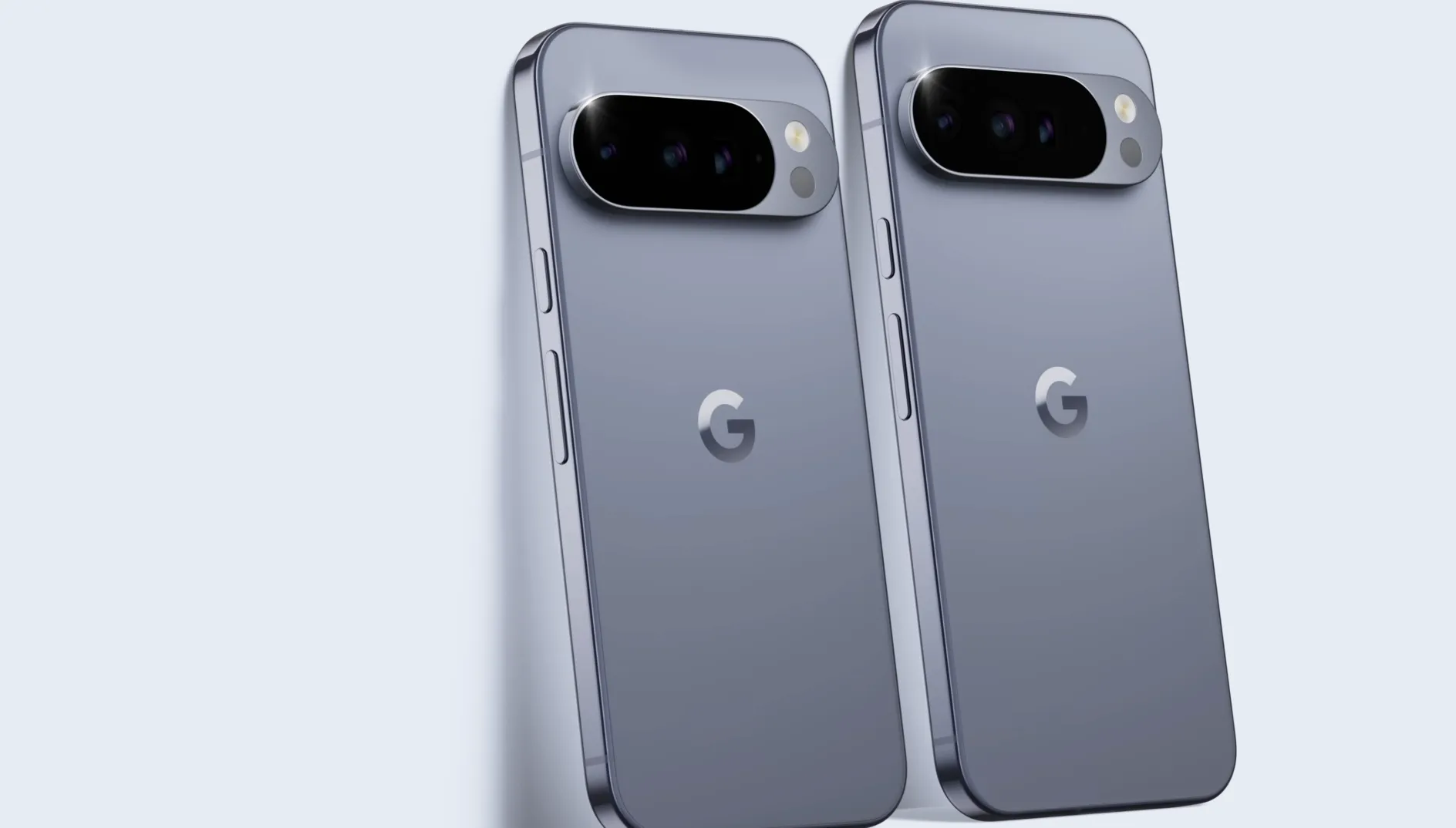
Google's been busy tinkering with its Phone and Contacts apps lately, and the latest round of changes involves a feature called Calling Cards—basically, full-screen photos that pop up when a contact rings you. The concept is solid: personalize your incoming-call screen with images, custom fonts, and colors so you instantly know who's calling.
But the rollout didn't go entirely smoothly. According to Android Authority, the company is now tackling the most common gripe users had about the feature. Meanwhile, Google is also refining the Phone app's interface with a cleaner Material 3 Expressive design, removing clutter from the Call Screen settings. Let's break down what Calling Cards are, where Google stumbled, and what's coming next.
What exactly are Calling Cards?
Calling Cards let you assign a full-screen image to any contact in your phone book, transforming the incoming-call screen from a plain name and number into a visual experience. You can pick photos from your gallery, snap a new one, or pull from Google Photos. Beyond the image, you can customize the contact's name with different fonts, sizes, and colors, giving each card a distinct look.
Android Authority notes that the feature began rolling out widely in version 188 of the Phone app, and it's inspired by iOS's Contact Posters—though with a key difference. On iOS, you set your own Contact Poster so others see it when you call them. On Android, you set Calling Cards for each of your contacts individually, controlling how they appear on your device.
This approach gives you full control over your call screen, avoiding the awkwardness of someone else's questionable photo choices showing up on your phone. While iOS Contact Posters have generally been well received, there are reports of people using contextually inappropriate pictures that appear on others' phones and can create issues. Google's implementation sidesteps that problem entirely by putting customization power in your hands rather than the caller's. You have to set up Calling Cards for each of your contacts individually, and you cannot set up your own Calling Card to share with others, Android Authority confirms.
The problem: where do I find this thing?
Here's where Google hit a snag. Calling Cards live in the Phone app's settings, not in the Contacts app where most users intuitively expect them. PhoneArena reports that many Android users wanted to manage Calling Cards the same way iOS users handle Contact Posters—from the Contacts app. Instead, you had to dig into the Phone app's settings menu to access the main Calling Cards management screen, according to Android Authority.
This disconnect between user expectation and actual functionality became the biggest complaint about the feature. It's a classic case of feature placement not matching user mental models. When you think about customizing how a contact appears, your brain defaults to the Contacts app—that's where all the other contact information lives, after all. Android Authority explains that many users expected Calling Cards to be part of the Google Contacts app, but the feature is actually housed in the Google Phone app.
Google's solution? Rather than moving the entire feature, the company is adding a shortcut in the Contacts app that funnels users directly to the Calling Cards screen in the Phone app. The shortcut will reportedly appear in the Organize tab of Google Contacts, making it easier to stumble upon without hunting through menus. It's a smart compromise that keeps the feature where it technically belongs while surfacing it where users naturally look.
What's changing under the hood
In a teardown, Google Contacts version 4.72.5.862509763 contains code for this new shortcut, according to PhoneArena, though the feature hasn't rolled out publicly yet. When it does, tapping the shortcut will open the same Calling Cards management interface found in the Phone app. Android Authority managed to activate the shortcut early, confirming that tapping the option opens the Calling Cards management screen in the Google Phone app.
This is a clever bridge between two apps that each have over a billion installs on the Play Store. Users default to Contacts for anything related to their address book and identity, so surfacing Calling Cards there makes logical sense. At the same time, the Phone app is getting a Material 3 Expressive refresh for the Call Screen settings, bringing a card-based UI that looks less cluttered, as spotted by Android Authority in version 208.0.864581421.
An older animation at the top of the display has been removed, streamlining the overall look. Thanks to the card-based UI, the Call Screen settings look nicer and less cluttered. The Phone app has been revamped with Material 3 Expressive for the most part, but some settings sub-menus still used the older UI—Google is working to bring the new design language to these remaining sections.
Why this matters for the broader Android experience
This shortcut addition is more than a usability tweak—it's a case study in how Google balances feature placement across its ecosystem. Keep the core functionality in the right app, but expose entry points where users naturally look. This approach typically lifts feature engagement without adding maintenance complexity. It also gives Google cleaner data on how many users view, create, and edit their Calling Cards, informing future personalization features, Find Articles adds.
The Material 3 Expressive updates rolling out alongside the shortcut reflect Google's ongoing effort to unify its design language across Android, ahead of the Android 16 QPR1 launch. The redesigned Phone app now includes a merged Home page combining Recents and Favorites, a permanent Keypad tab, and a larger End Call button, according to Android Authority.
Your favorite contacts are prominently displayed at the top of the page, while your call history is listed below them, Android Authority reports. The Keypad has also graduated from a floating action button into its own permanent tab, Android Authority confirms—a change that makes frequent dialing tasks more accessible. These changes haven't rolled out broadly yet, but expect a gradual release via app updates and server-side flags once internal testing wraps.
What to watch for next
If you're running recent versions of Google Contacts and Google Phone, keep an eye on the Organize tab in Contacts for a new Calling Cards entry. Check Call Screen settings for the streamlined, card-based look that signals the Material 3 Expressive update has landed on your device.
The shortcut and refreshed UI are dormant behind the scenes for now, present in code but not yet live. A server-side flag or staged rollout will flip the switch once testing concludes, Find Articles notes. Google's been spotted working to address other shortcomings as well, Android Authority mentions, so this may not be the last tweak to Calling Cards.
Users on recent versions of Google Contacts and Google Phone should see the changes first, with wider availability to follow. The rollout is happening in phases, according to Android Authority, so if you don't have it yet, you just have to be a bit patient. Android Authority adds that Google says Phone app users worldwide will now see the new Calling Card feature when they update the app to version 188 or later.
Bottom line: the fix is in progress, and the feature should become far more discoverable once the shortcut goes live. It's a reminder that even well-designed features need to meet users where they already are, not force them to learn new paths through unfamiliar menus.


Comments
Be the first, drop a comment!