


Android 17 Beta 3 introduced visible blur and frosted-glass effects in the widget picker and app launch transitions, while Android 17 Beta 4 has since arrived as Google's last scheduled beta. The broader direction became clearer in Android Canary 2605, which shows Google testing blur across more Pixel system UI surfaces, but the stable Android 17 scope is still not fully confirmed. What remains unclear is how much of the broader Canary blur treatment will reach the stable Android 17 release, a later QPR update, or OEM skins that Google does not control.
One distinction matters upfront. Android 17 Beta 3 delivered blur in two confirmed places: the widget picker and app launch transitions. Android 17 Beta 4 has since arrived, with the standard beta track still more limited than Android Canary 2605, where 9to5Google says blur now appears across the volume slider, full volume panel, power menu, and Pixel Launcher menus.
Google put its rationale on record in May 2025 when it launched Material 3 Expressive, describing blur as creating "a sense of depth, so the motion feels lightweight and you're able to stay aware of the apps you're using in the background," per the Google Blog. Whether the execution backs that up across a varied Android ecosystem remains an open question as Android 17 moves from Beta 4 toward stable release and Canary builds test broader Pixel UI changes.
Android 17 blur changes: what Beta 4 confirms and what Canary 2605 suggests
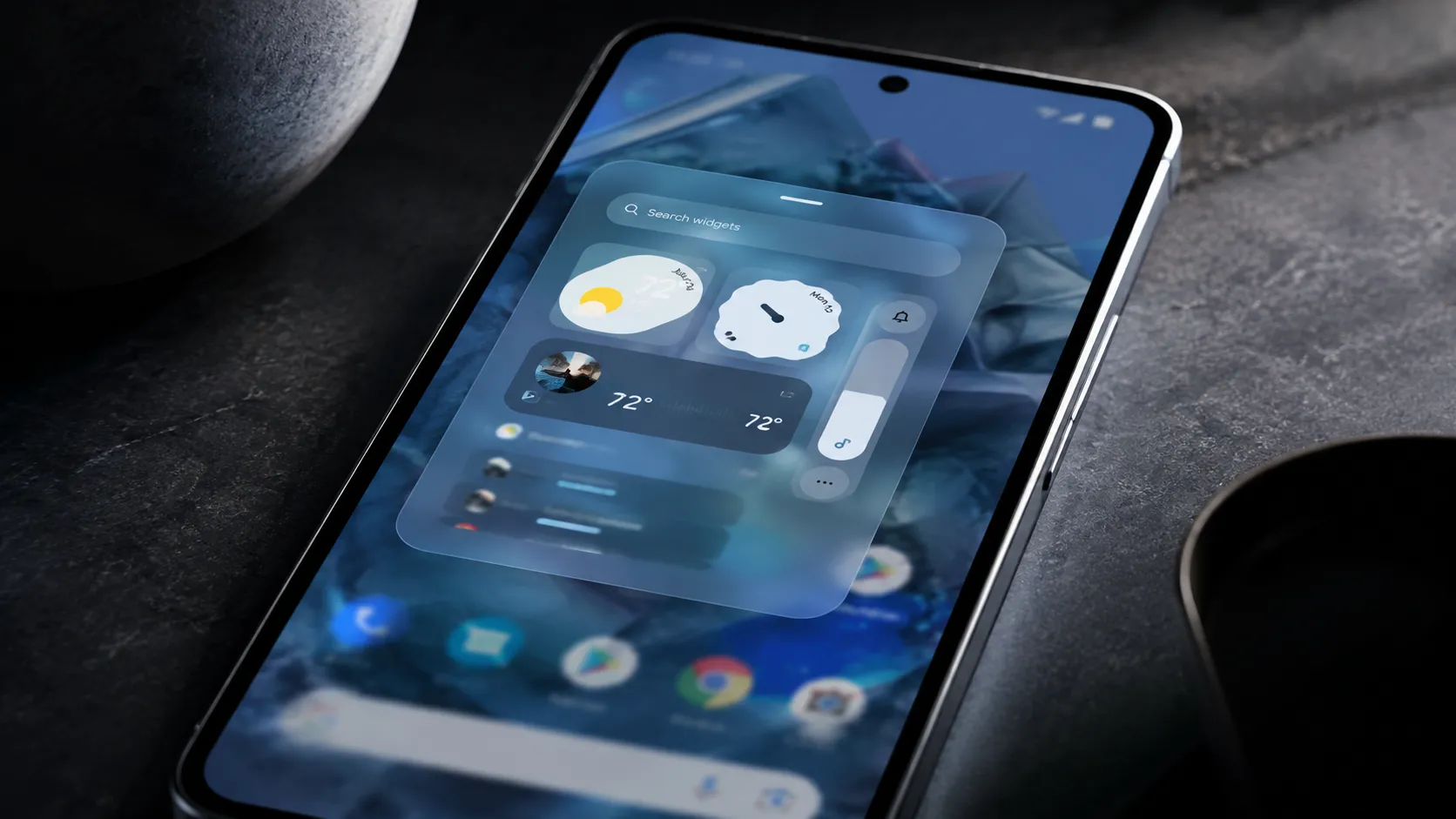
The clearest confirmed change is the widget picker. Its background has shifted from a flat color to a real-time blur, letting users make out their homescreen wallpaper and icons underneath. The effect applies to both the per-app sheet and the full app list, 9to5Google reported in late March.
App launch animations have also been reworked. In previous releases, the wallpaper stayed static as an app opened. In Beta 3, it blurs as the app takes over the screen, a transition that signals depth and layering rather than a flat swap, 9to5Google observed.
For most people who eventually receive Android 17, these changes are likely to register as a change in feel more than function. In Android Canary 2605, 9to5Google says that softer, more layered treatment now appears in additional Pixel system UI surfaces, including the volume slider, full volume panel, power menu, and Pixel Launcher menus.
Earlier leaks pointed to blur treatments for the power menu, volume picker, and full-screen sheets. Those surfaces still are not broadly part of the standard Android 17 Beta 4 track, but Canary 2605 makes clear that Google is testing the broader blur rollout beyond earlier leaks. Whether those changes ship in stable Android 17, Android 17 QPR1, or a later update remains unconfirmed.
Why blur is a design system argument, not a visual trend
Blur's presence in Android 17 isn't a standalone design choice. It's the latest expression of a direction Google has been building toward since Material 3 Expressive launched in May 2025, when Google described it as "one of our biggest updates in years" and framed the redesign around making devices feel fluid, personal, and glanceable, according to the Google Blog.
Within that system, blur carries a specific job. Google's own framing positions it as a spatial signal: by keeping content behind a surface partially visible, the interface communicates layering and context without forcing users to mentally track where they are in the app stack. The effect is meant to make navigation intuitive, not just prettier.
Material 3 Expressive also brought springy animations, dynamic color themes, responsive components, and expanded typography customization, per the Google Blog. Blur is one piece of a coordinated design language. Android 16 established that vocabulary in the notification shade and Quick Settings; Android 17 shows Google testing how much further that treatment can extend across the OS.
Three problems Google still has to solve
Performance. This remains an open question. Real-time blur can add graphics overhead, but the available reporting does not yet include benchmark figures on frame rates, battery draw, or thermal behavior across mid-range or older hardware. Whether the effect degrades gracefully on third-party OEM hardware, or gets disabled entirely, is not answered by the current beta.
Accessibility. Accessibility remains a real concern because translucency and motion effects can affect users with low vision, contrast sensitivity, or vestibular sensitivity. Android Authority previously reported that Google was adding a "reduce blur effects" setting to address readability issues caused by Material 3 Expressive blur. What remains unclear is exactly how that control applies across every Android 17 and Canary blur surface. No accessibility organization feedback has been reported in the coverage cited here, and there's no published inventory of which user controls apply to which blur surfaces. That's not a secondary concern at the scale Android operates.
OEM fragmentation. Android's diversity is genuinely one of its strengths, but it also means blur will be interpreted differently by every major skin. One UI, OxygenOS, and HyperOS each have their own design languages and their own incentives to modify or strip system-level aesthetics. Whether frosted-glass effects reach the majority of Android users, rather than staying a Pixel distinction, depends entirely on decisions Google doesn't control.
What to watch before stable release
The open question is not whether Google is expanding blur in Android 17-era builds. That direction is visible. The question is whether the rollout holds together outside Google's own hardware.
Three things will tell the story. First, consistency: does blur appear reliably across all the surfaces Google has signaled, ncluding the power menu and volume picker that remain outside the standard Android 17 Beta 4 track, as 9to5Google noted? Patchy coverage at stable release would suggest an incomplete rollout, not a finished one.
Second, accessibility controls: whether existing reduce-motion, high-contrast, or reduce-blur settings fully suppress translucency effects will determine how responsibly the feature has been implemented before it ships, per Android Authority.
Third, OEM behavior. Samsung, OnePlus, Xiaomi, and other Android manufacturers can adopt, reinterpret, or minimize Google's system-level aesthetic choices inside their own skins. That will determine whether Android 17's blurry aesthetic becomes a broad Android look or remains most visible on Google's Pixel devices. Google's direction is clearer than it was in Beta 3, but the wider ecosystem has not confirmed it yet.

Comments
Be the first, drop a comment!