


Android Auto's music controls redesigned: what changed and why
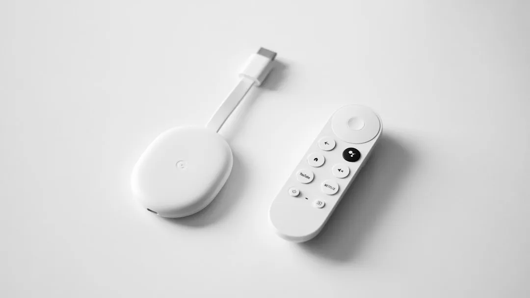
Google pushed a change to Android Auto's media playback interface this week, reorganizing the now-playing screen in ways that are hard to miss on a morning commute. Skip buttons moved. Album art got bigger. Secondary controls shifted off the primary view. No Play Store update triggered it, and nothing on your end needs to be installed, configured, or fixed.
That's the core. The rest explains what specifically moved, why some drivers see it and others don't, and what the timeline looks like for the holdouts.
What actually changed on the playback screen
The redesign affects the primary now-playing screen, which is the one Android Auto drivers interact with most. Based on user-documented observations from r/AndroidAuto this week, the layout shifted in three concrete ways.
The skip controls moved. Previously, skip-back and skip-forward sat flanking the central play/pause button in a compact horizontal cluster. In the updated layout, the skip-forward button in particular drew widespread comment for landing in a position that breaks from the old grouping, enough that drivers who reach for it on reflex are hitting pause instead. That's the friction point generating the most reports.
Album art now fills more of the screen on compatible head units. The older treatment used a smaller inset display; the new layout pushes toward a fuller, more prominent presentation that takes up a larger share of the available canvas. On head units with larger displays, the difference is noticeable enough that some users initially assumed their streaming app had pushed its own update.
Shuffle and repeat controls moved off the primary view into a secondary position. They're still reachable without leaving the now-playing screen, but they're no longer immediately visible on first glance. For drivers who regularly toggle shuffle mid-drive, that's a change in muscle memory, not just aesthetics.
What didn't change: the controls themselves. Nothing was removed. Every function that existed before still exists. The redesign is spatial, not functional, though the distinction matters less when you're looking for the skip button at 60 miles per hour.
These details come from community-documented observations on r/AndroidAuto rather than a confirmed screenshot breakdown from 9to5Google or Android Authority. If either outlet publishes a detailed visual comparison this week, treat that as more authoritative than what's described here. The specific UI details above reflect the preponderance of consistent user reports, but this is preliminary reporting, and the specifics should be verified against primary coverage when it lands.
Why a music app update didn't cause this
Android Auto doesn't let individual music apps design their own playback layouts from scratch. Google provides standardized media session templates that govern where controls sit, how album art displays, and where secondary functions like shuffle and queue land. Spotify, YouTube Music, Pocket Casts, and most other major audio apps build their Android Auto interfaces on top of those templates rather than constructing fully custom layouts.
When Google updates the templates, any app relying on them inherits the new layout automatically. No developer action, no app update, nothing to install. The change propagates from Google's infrastructure to eligible devices, which is why it surfaced mid-week for drivers who hadn't touched a single setting and saw no version number change to explain it.
The "Android Auto media playback" template architecture is also why the same Spotify session looks different across two cars parked side by side. It's not Spotify that changed. It's the layer Spotify sits on top of.
Google has not issued a public statement confirming the rollout mechanism or scope. The server-side characterization is based on the pattern: reports are widespread, consistent across users on different app versions, and unaccompanied by any Play Store update. That's the signature of a server-side flag, not an app-version-gated change. The characterization is reasonable but not yet confirmed by a primary source.
Why your controls might look different from the driver next to you
Two people running identical Android Auto versions on identical phones may be seeing completely different interfaces right now. Two separate explanations account for that, and mixing them up is where most of the confusion in forum threads originates.
The first is rollout pacing. Google expands server-side updates in waves rather than flipping a switch for all users simultaneously. Android Auto has followed this pattern with prior interface updates, where the gap between earliest and latest recipients stretched from several days to a couple of weeks. If your controls look unchanged, you're earlier in the queue. That's expected staged-deployment behavior.
There's not much you can do to accelerate it. Receipt of server-side changes is largely passive. Clearing the Android Auto cache, checking for a Google Play system update, or manually opening the app haven't produced confirmed results in community testing. Staying on the current Android Auto app version is worth doing regardless, but it's not a shortcut. Based on the pace of comparable Android Auto rollouts documented in r/AndroidAuto over the past year, full expansion typically completes within a few weeks of the first wave.
The second explanation is how individual apps were built. Apps using Google's standard media session templates pick up the new layout the moment the template update reaches their device. Apps with custom playback interfaces built outside those templates look exactly as they always have, and will continue to until their developers ship an update adopting the revised design.
A reliable way to tell the difference: if every media app in Android Auto shifted at once, that's the template rollout landing on your device. If one app changed and another didn't, you're likely looking at an app-level implementation difference, not a gap in your rollout status. The two situations have different timelines and different resolution paths.
For context on which major apps fall into which category: YouTube Music, as a Google product, typically adopts template changes quickly. Spotify has historically run its own implementation timelines, and at least some users report it still showing the older layout as of this week, though whether that reflects a custom interface or simply a later rollout receipt isn't confirmed. 9to5Google and Android Authority are the right places to check for app-specific confirmation once they publish.
What each type of driver should expect
If your layout already changed: Nothing to do. The new arrangement is the intended one. The skip button repositioning is the sharpest adjustment, and for most drivers that resets within a few days of regular use.
If your layout looks the same as always: The update hasn't reached your device yet. Based on community-documented timelines for comparable Android Auto server-side rollouts, that typically means somewhere in the next few days to two weeks. No confirmed action accelerates delivery.
If your apps are inconsistent, some with the new layout, some without: That's the template distinction in real time. Apps still on the old layout are either running custom interfaces or operating on their own developer adoption schedules. Google typically surfaces template spec changes through the Android Developers documentation and changelog, which is where developers track what needs updating. Those gaps close through normal app release cycles, not through anything a user can do.
The version of Android Auto worth having regardless of any of this is the current one, available through the Play Store. It's not a confirmed factor in rollout timing, but it's sensible housekeeping and eliminates one variable if something does behave unexpectedly.
For the most current and sourced breakdown of the specific UI changes, check 9to5Google and Android Authority for coverage published this week. Where their reporting on specific elements differs from what's described here, defer to them.

Comments
Be the first, drop a comment!