Update (Fall 2020): Samsung's version of Android 11 is already in its testing phases! One UI 3.0 is expected to hit recent flagship Galaxy devices towards the end of this year, so check out the new list of features:
Samsung's Android 10 update goes by the name of One UI 2, as it's the sequel to last year's Android 9-backed One UI. After their early 2019 update finally shook the stigma of TouchWiz, it's important that Samsung follow it up with an equally impactful update for 2020.
This update will soon be rolling out to the Galaxy S9, Note 9, Galaxy S10, and Note 10. Other devices may get it in the future, and the Galaxy S20 will ship with this firmware. Suffice it to say it's an important update, so let's dive into what's new.
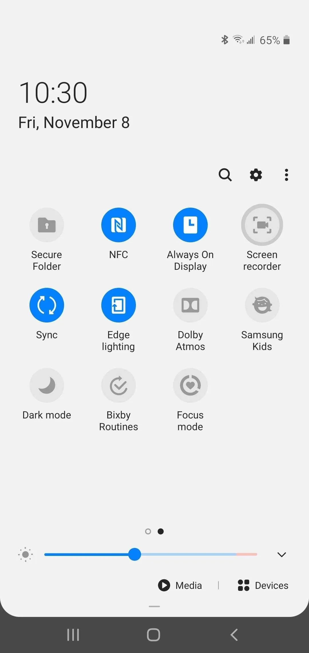
1. Better Screen Recording
Samsung introduced a dedicated screen recorder on the Note 10 which finally made recording your screen a straightforward process. With One UI 2, this feature has made its way to other Galaxy devices like the S10, which means we no longer have to rely on Game Launcher or other third-party apps for screen recording. Check out the link below for more information on this process.


2. More Quick Settings Tiles Per Page
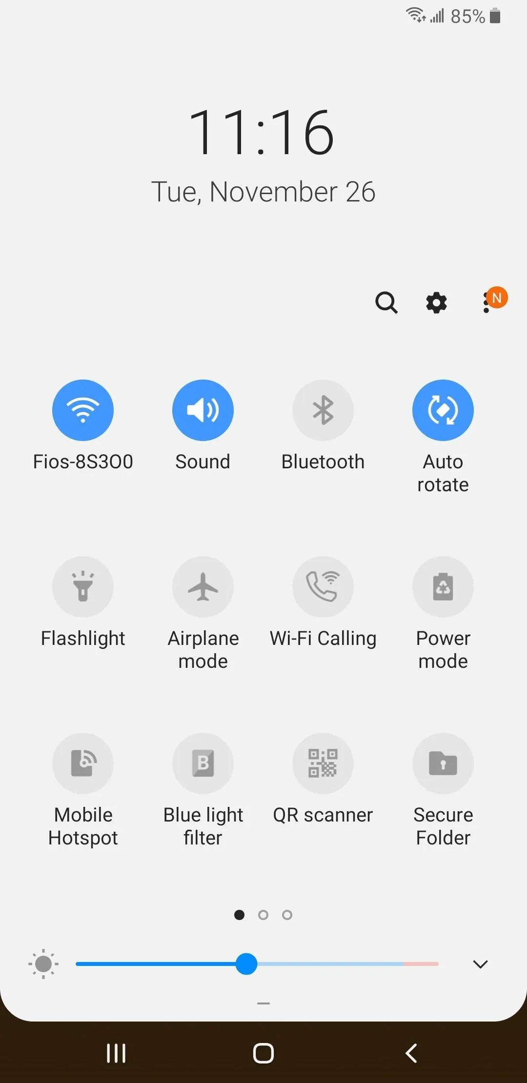
Compared to One UI, the Quick Settings panel on One UI 2 shows more Quick Settings tiles when fully expanded — 16 vs. 12. To accommodate this, the clock and date at the top of this menu are now left-justified and much smaller.


3. Access Media & Connected Devices from Quick Settings
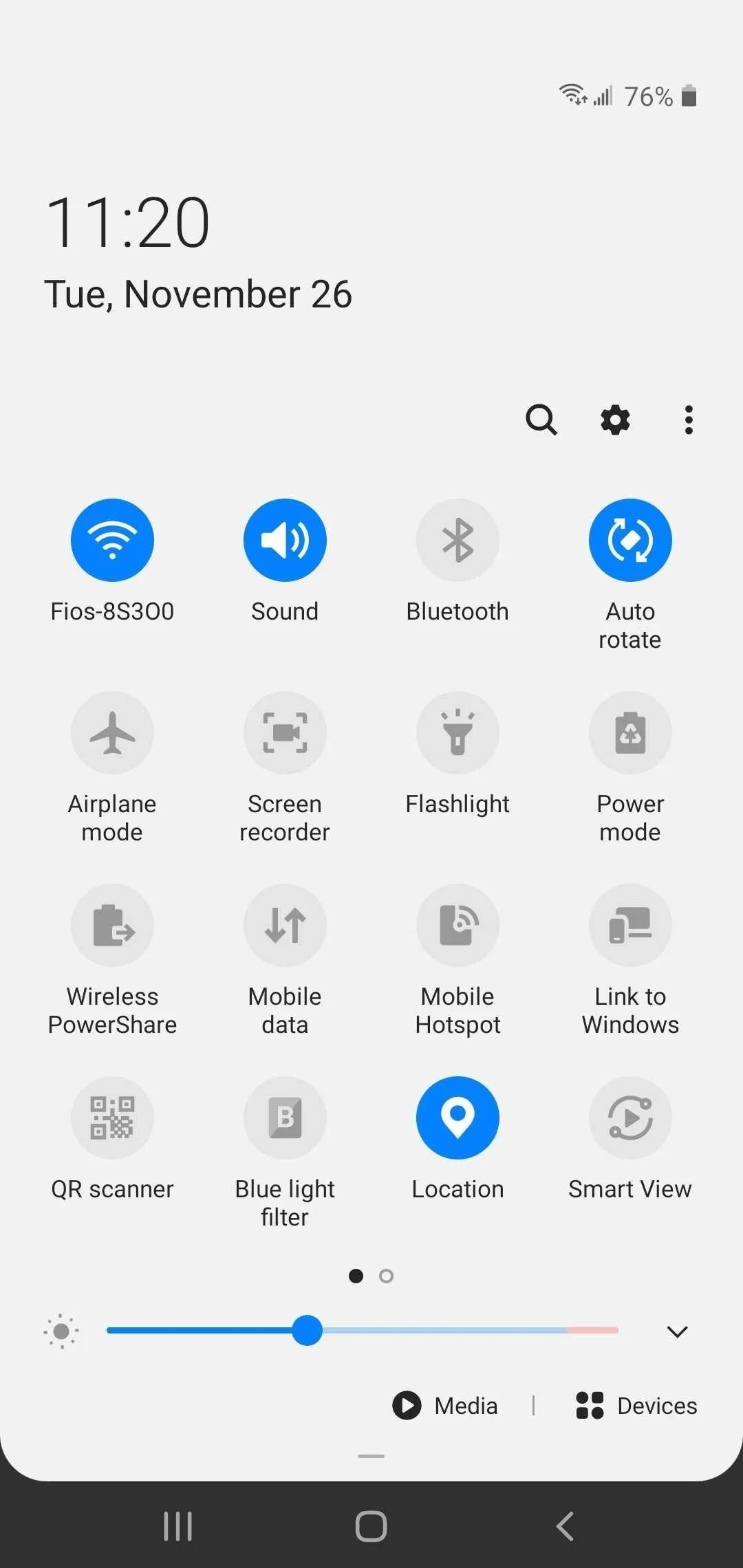
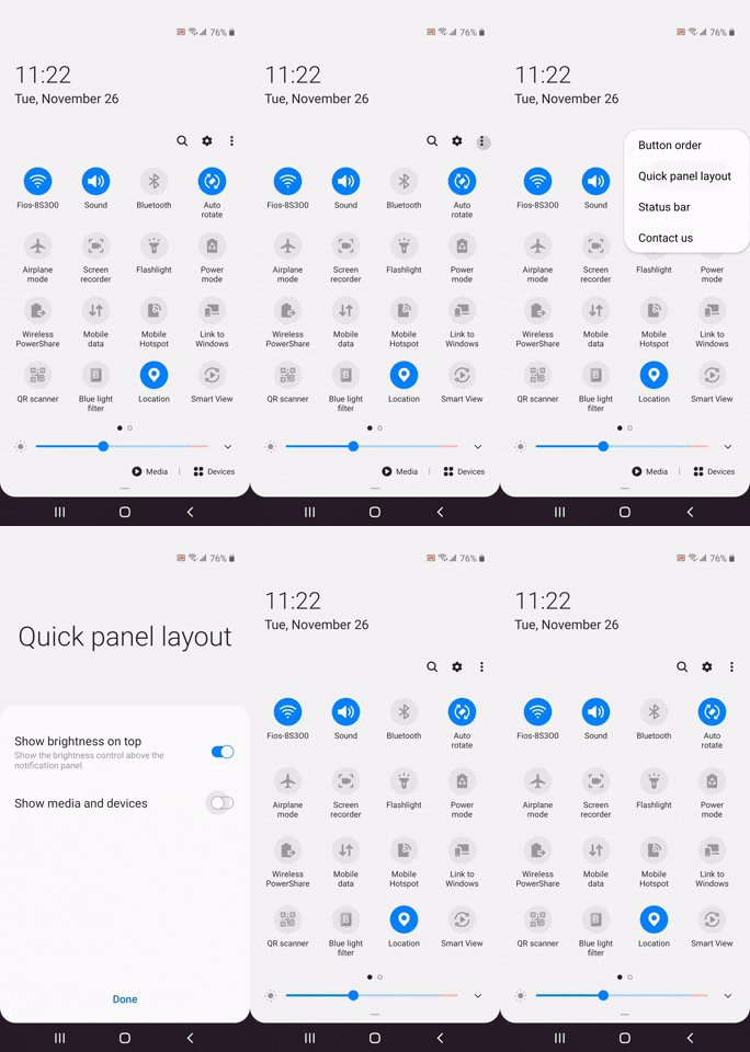
At the bottom of One UI 2's Quick Settings panel, you'll find two new buttons: "Media" and "Devices." These give you faster access to music and videos, along with external devices connected to your Galaxy. Of course, you can opt to hide the buttons if you don't need them by disabling the toggle for "Show media and devices" from within the new "Quick panel layout" menu.



4. Quick Settings Don't Open When You Tap a Notification
Previously, when your lock screen was set to show only notification icons, tapping on an alert icon on your lock screen not only expanded notifications, it also (pointlessly) revealed the Quick Settings panel. With One UI 2, performing the same action no longer pulls up Quick Settings — instead, it only shows your alerts.
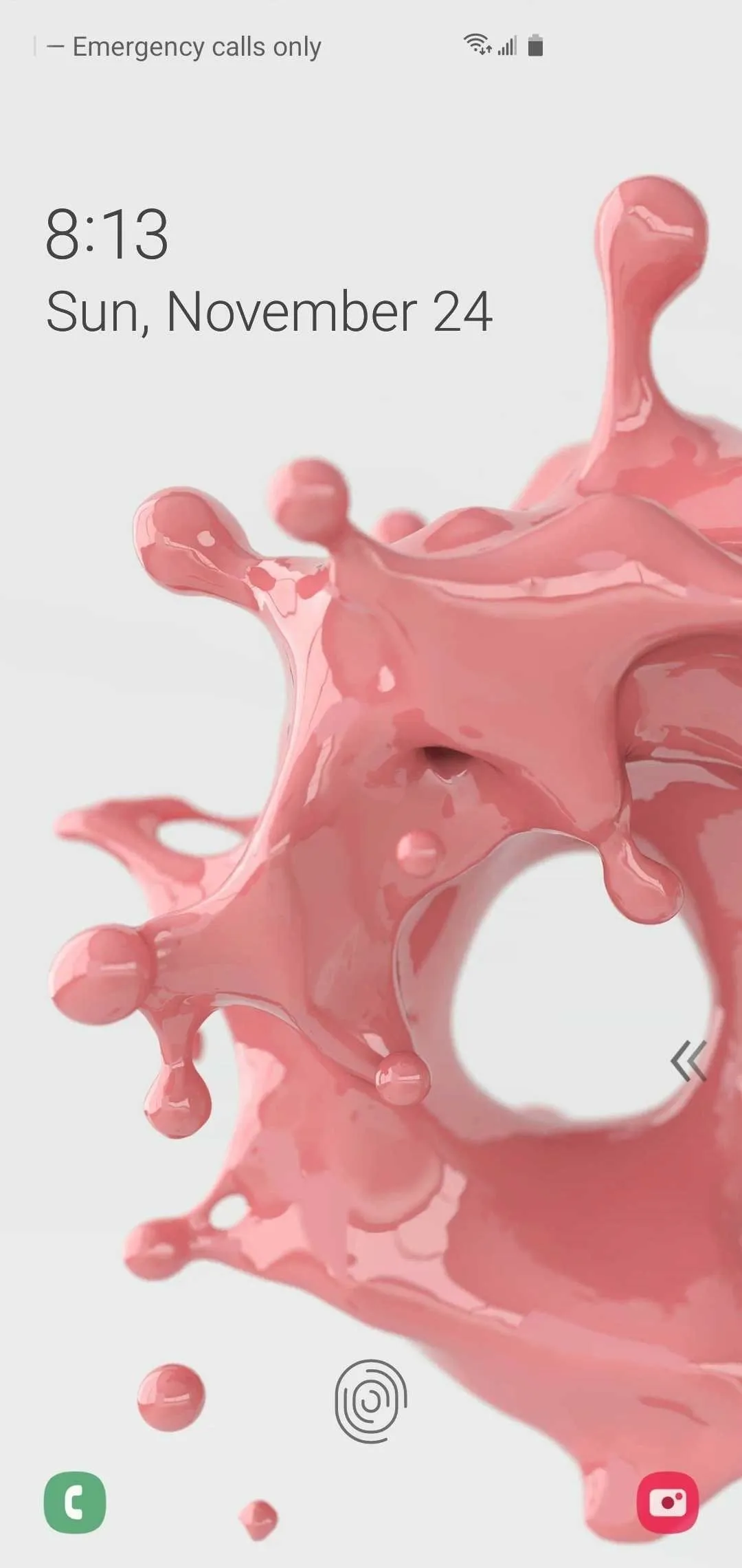
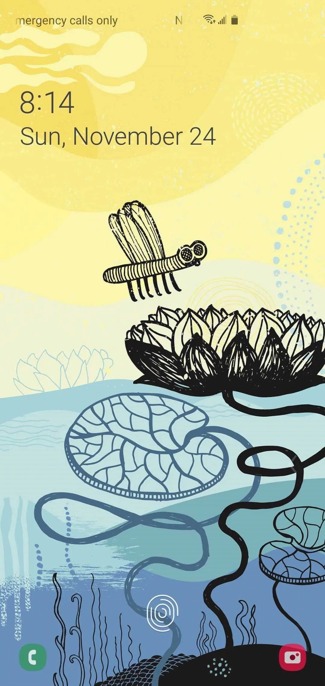
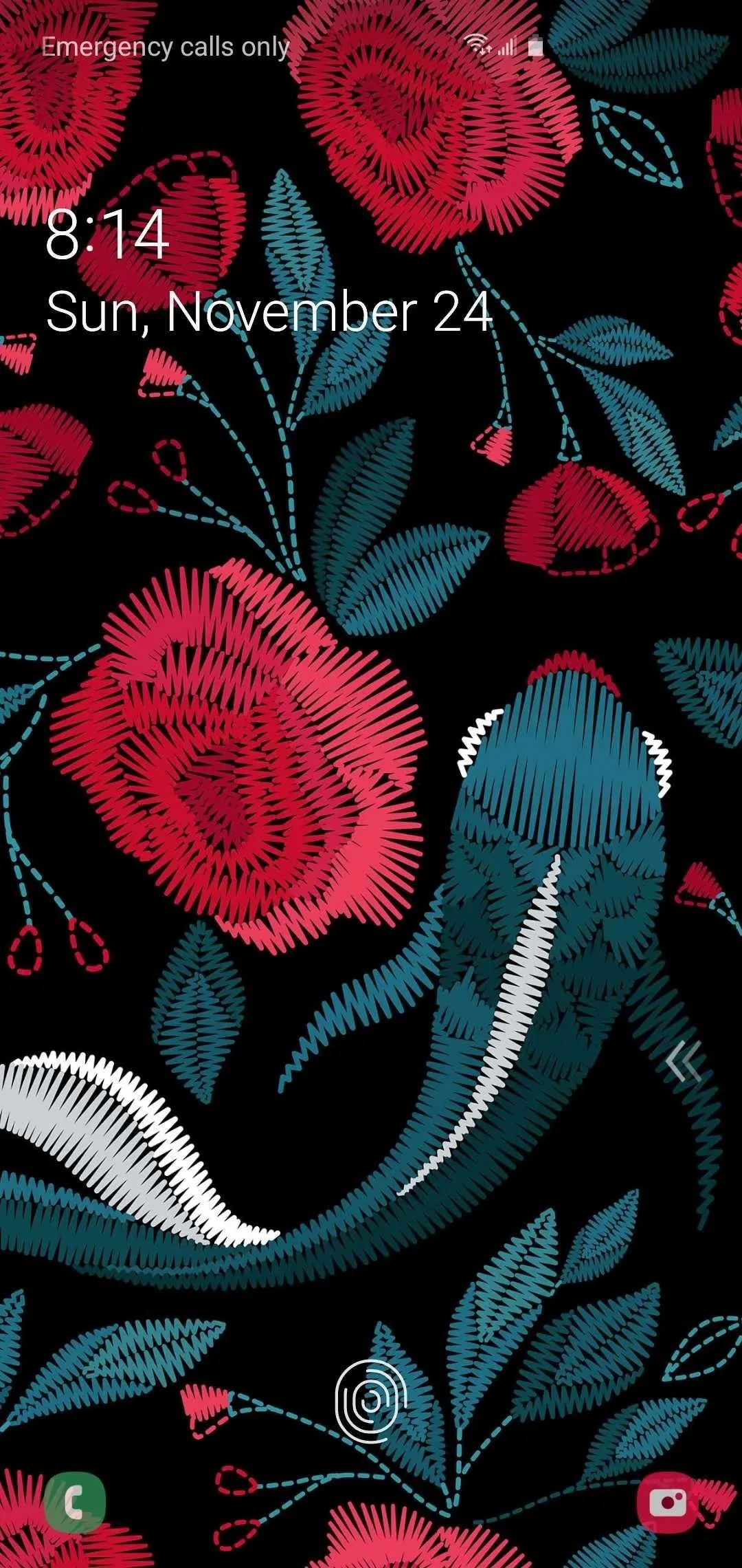
5. Lock Screen Elements Are Easier to View
The lock screen has received a subtle update on One UI 2, which focuses on readability when set against varying backgrounds. As seen on the images below, it will automatically detect dark and light backdrops and adjust the text and icon colors to either light or dark for better visibility.


6. Notifications Separated into 2 Sections
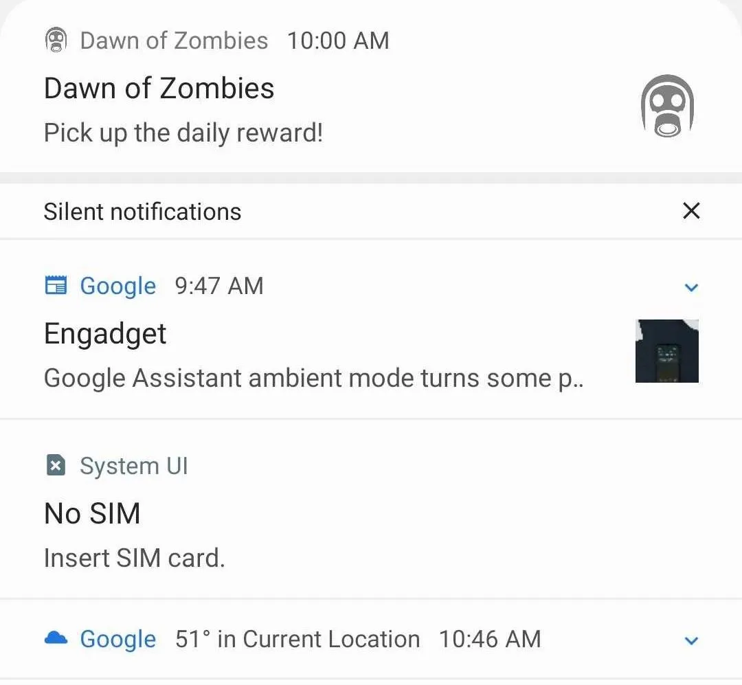
Notifications have been split in two categories on One UI 2, with any notifications you've silenced falling under the aptly named "Silent notification" section. Regular notifications like incoming texts, missed call, and other app alerts appear above the new section.
7. Incoming Call Cards Can Be Resized
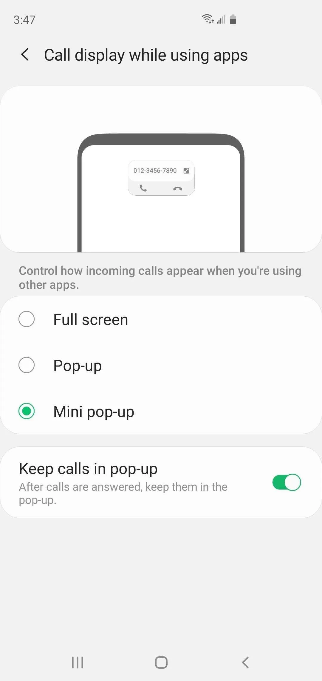
One of the handy features to come out of One UI was the ability to make incoming phone calls show as a popup card to reduce distractions while doing other things like chatting or browsing the web on your Galaxy. One UI 2 further expands on this feature, and now lets you adjust its size to better suit your needs, which can be done within the "Call display while using apps" page inside the Phone app's settings.


8. Relocated Controls for Samsung Internet's 'Find' Feature
The "Find" feature in Samsung Internet is a handy way to search for specific words in a page, though accessing the arrows to jump between results was a bit cumbersome due to their location. This has been fixed on One UI 2, which relocated the arrows along the bottom-right corner of the screen for significantly easier access.


9. Samsung Internet Has a New Mode to View Open Tabs
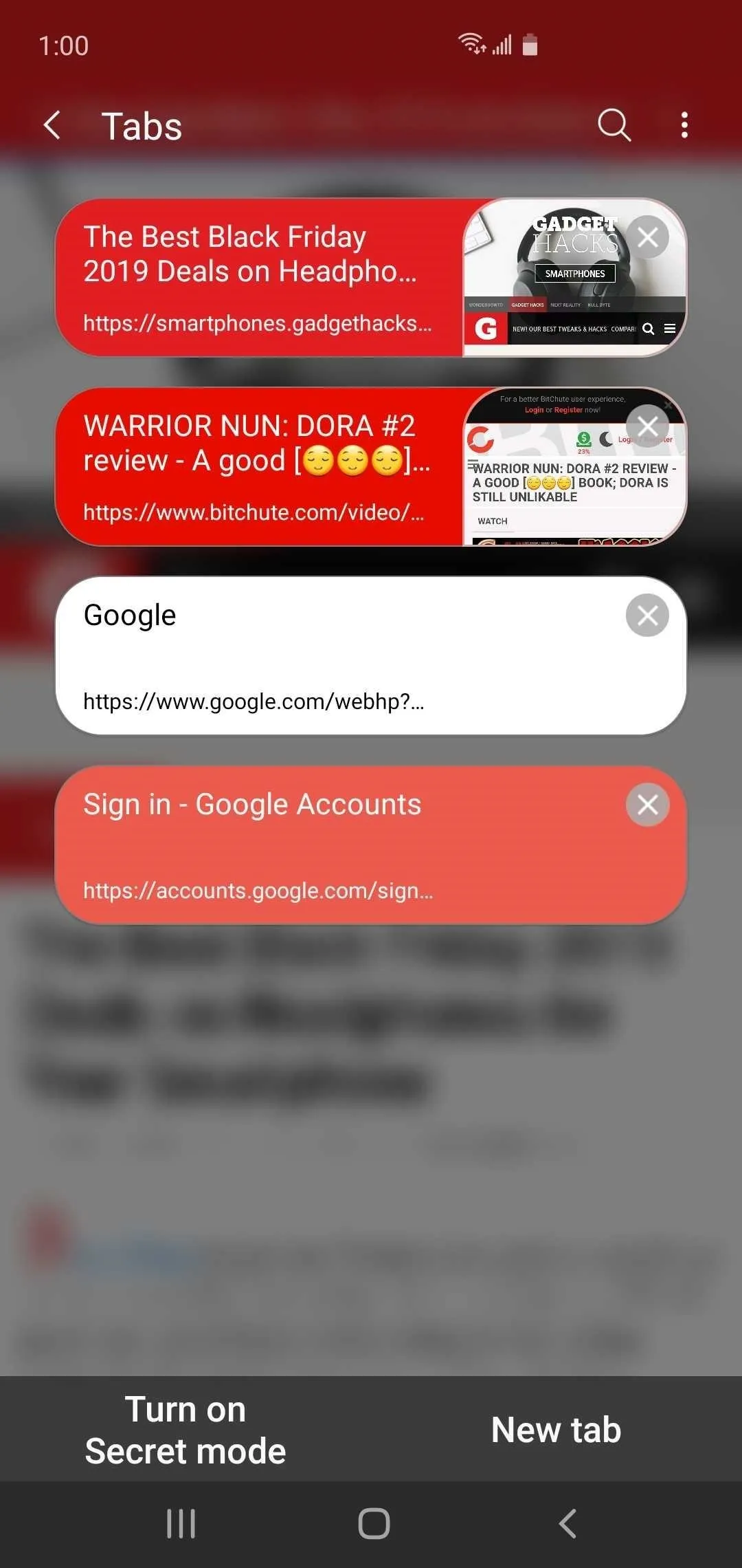
Besides the standard open tab cards, One UI 2 now also gives you the ability to set open tabs to show up as smaller banners that appear as a vertical list inside Samsung Internet for easier viewing. You can easily set either "Card view" or "List view" by hitting the three-dot menu button on the upper-right of the "Tabs" page and selecting either one from the menu prompt.


10. Cleaner Camera UI
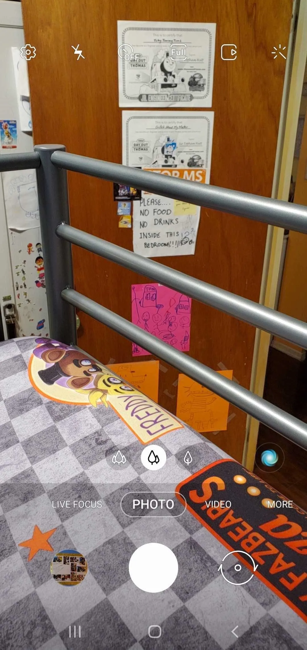
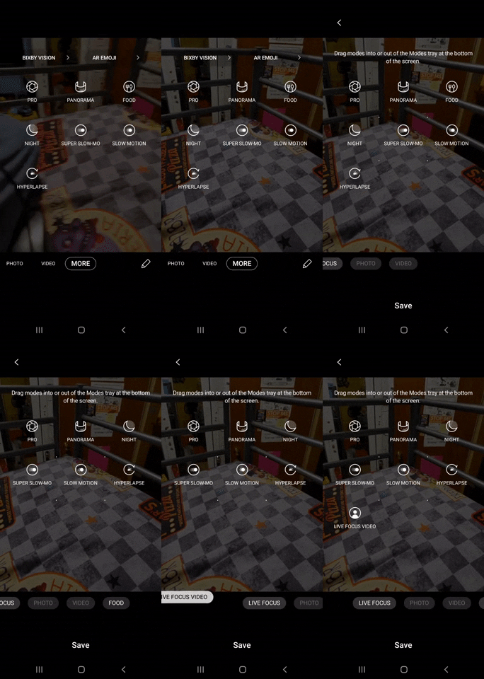
One UI 2 has made the Camera app more streamlined. Compared to One UI, the new Camera interface has noticeably fewer controls, and has hidden "Pro," "Panorama," "Food," "Night," "Super Slo-Mo," "Slow Motion," and "Hyperlapse" camera modes, along with "Bixby Vision" and "AR Emoji" inside the "More" section.
If you frequently use one of the now-hidden camera modes, however, you can easily add it back on to the main panel simply by long-pressing on the desired camera mode and dragging it onto the tab bar at the bottom. You can also perform the reverse to hide "Live Focus" and "Live Focus Video," but not for "Photo" and Video."


11. Slow Motion Selfies
The iPhone 11's Slofie feature brought slow motion selfies into the mainstream, and Samsung has followed suit with One UI 2 by adding slow motion recording to the Galaxy's front camera. Using Slow Motion Mode on the front camera works exactly the same way as the rear shooter: just pick Slow Motion Mode and hit the record button with the Camera app in selfie mode.
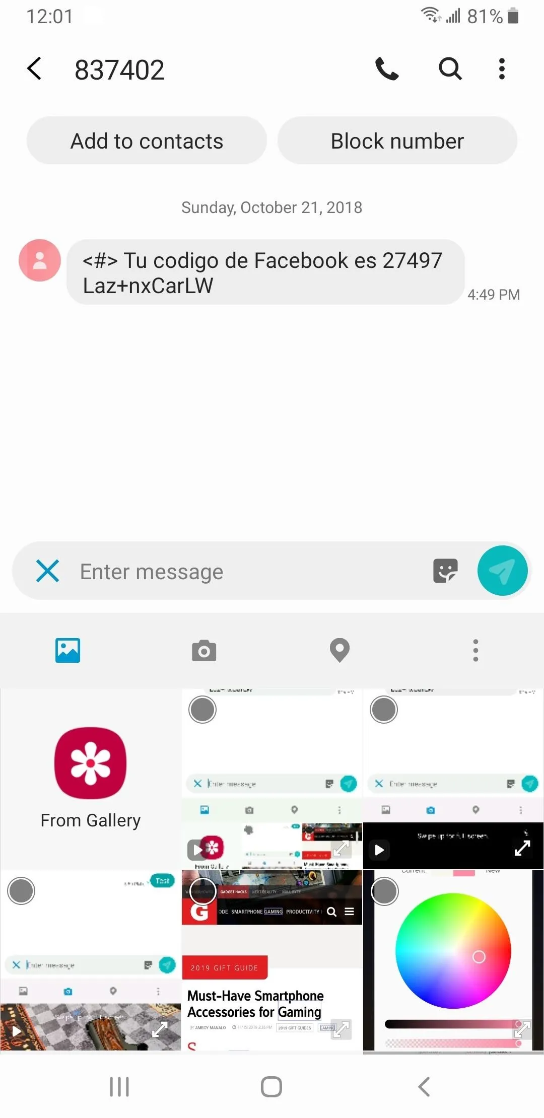
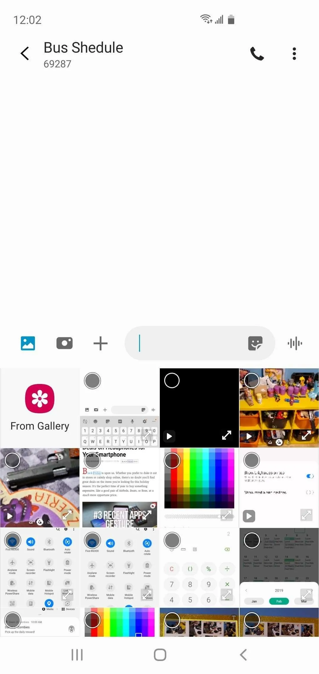
12. It's Easier to Attach Photos & Videos in Samsung Messages
The option for retrieving photos or videos from the Gallery or taking new ones using the Camera in One UI's Messages app was fairly hidden. You had to tap the "+" button inside the text field and make your media app selection from there. This has been done away with on One UI 2 — both the Gallery and Camera now have their own dedicated buttons for instant access.


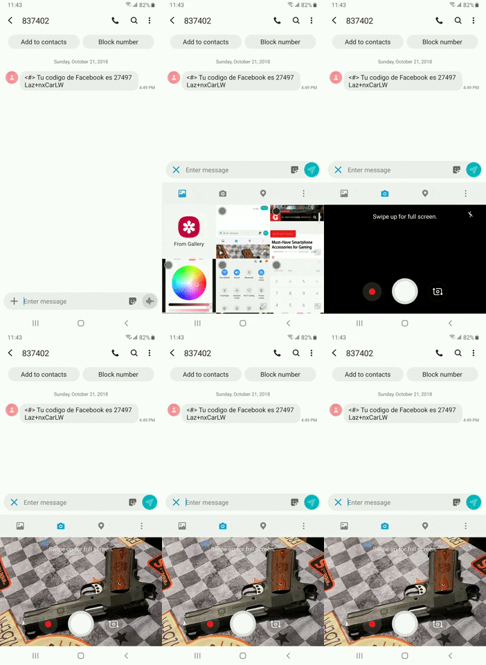
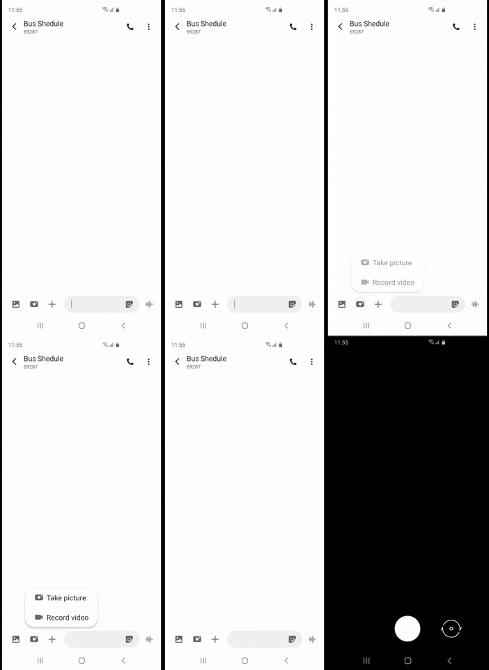
13. Camera Opens in Full When Accessed in Samsung Messages
Taking a new photo or video from inside Samsung Messages was a little convoluted on One UI, as the camera viewfinder opened only along the bottom half of the screen and required you to swipe up to reveal it in full. Thankfully, this has been fixed on One UI 2, and you can now launch the Camera app in full courtesy of the dedicated camera button.


14. Simplified Roaming Clock List in Always on Display
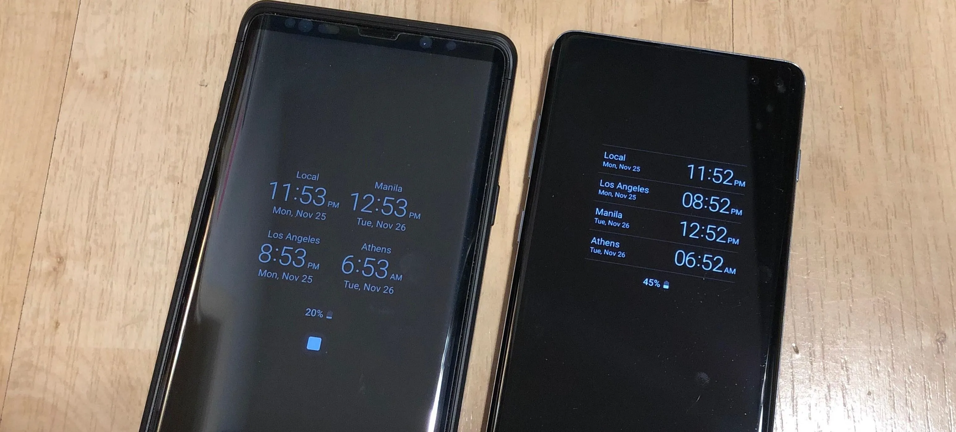
On One UI 2, the Roaming Clock option that enables you to display multiple time zones is now displayed as a vertical list. This makes the feature more compact in appearance, and gives you more space to add more time zones, and easily compare times thanks to their vertical alignment.
15. Automatic Screenshot Cropping
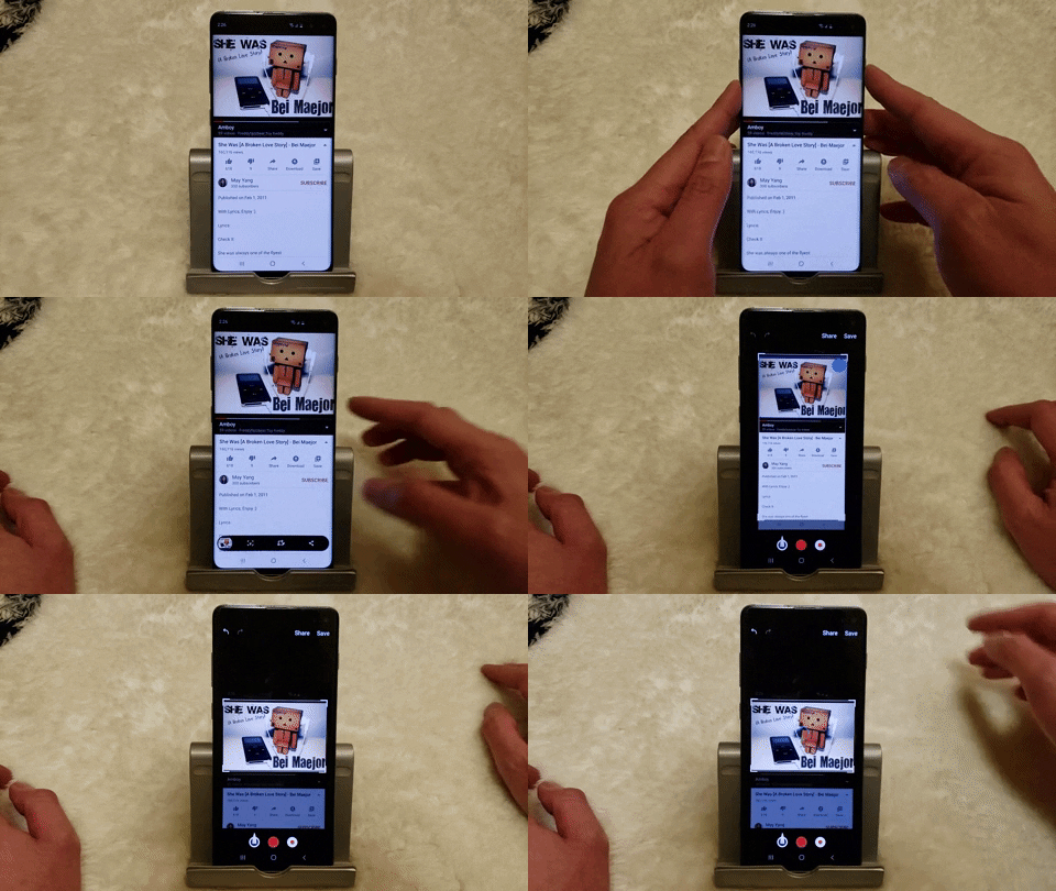
When you take a screenshot now, One UI 2 automatically detects and highlights images within the screenshot for instant cropping. Be sure to check out the link below for a quick guide on how this new feature works.
16. Bixby Home Now Samsung Daily
Similar to the Google Feed on many Android phones, Bixby Home gives you quick info like news, weather, and game recommendations. This home screen page is now called Samsung Daily on One UI 2, and it's been slightly revamped with a more organized layout and less interface clutter.
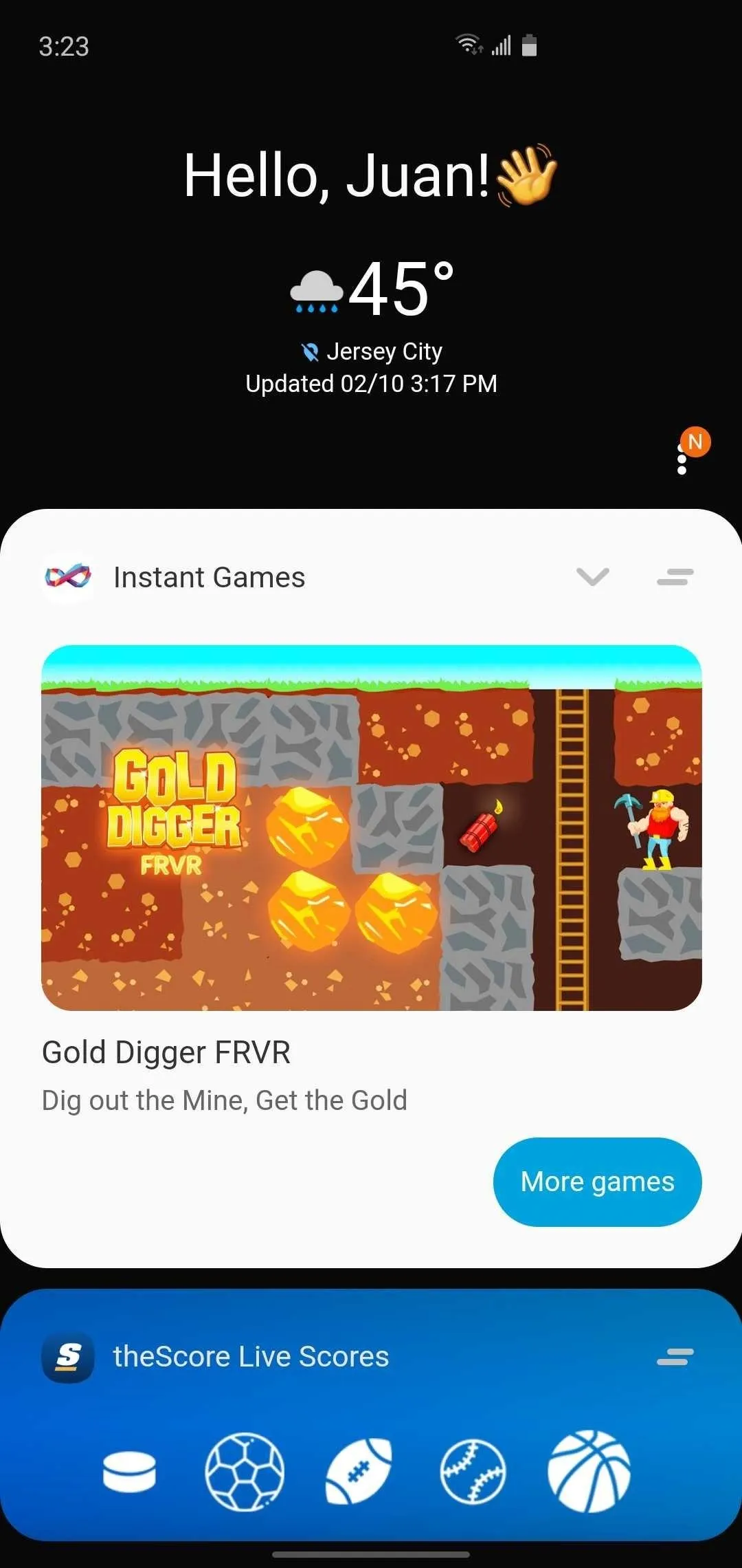
Samsung Daily on One UI 2.
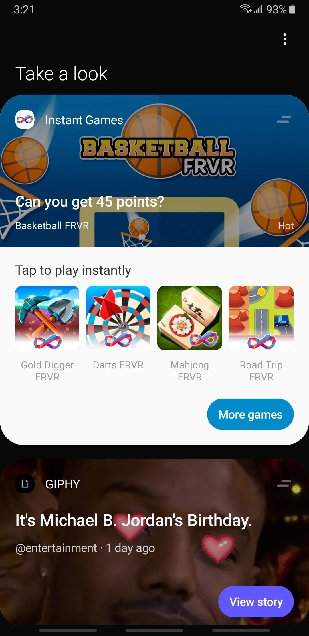
Bixby Home on One UI.

Samsung Daily on One UI 2.

Bixby Home on One UI.
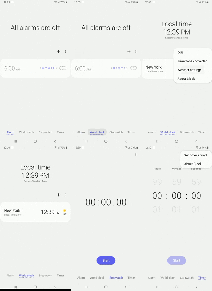
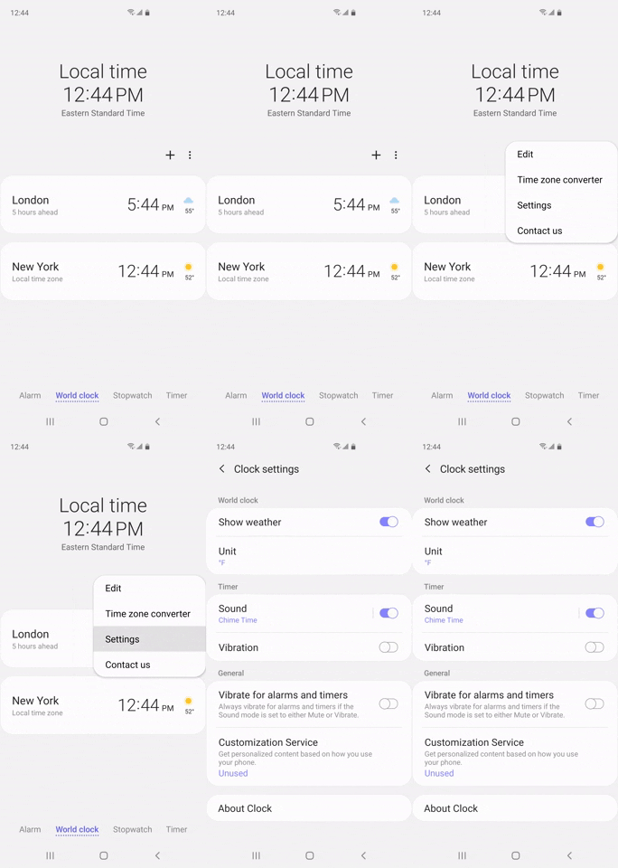
17. Clock App Improvements
Setting options for various elements like the timer or stopwatch meant having to navigate to different tabs in the Clock app on One UI. This has been remedied in One UI 2, as all the settings have been simplified and put together into one single menu for a streamlined experience.


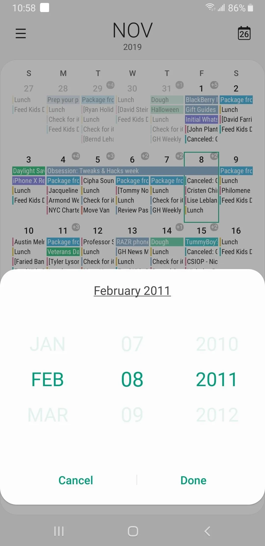
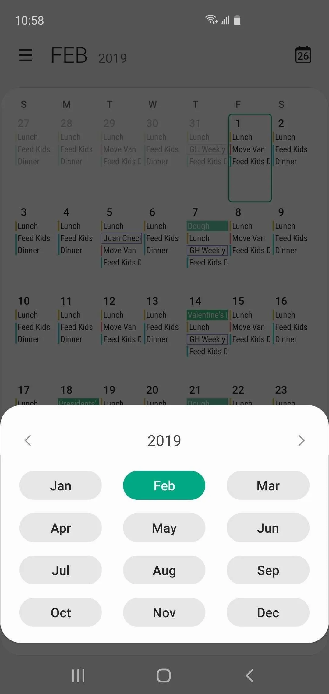
18. Easier Month & Date Selection in Samsung Calendar
Jumping back or ahead to a specific month or year inside the Calendar app got significantly easier on One UI 2, thanks to the new menu prompt that plainly list the months along with the year up top. Now, all you have to do is swipe sideways along the top of the card to go to your desired year, and simply tap on the target month to instantly open its calendar.


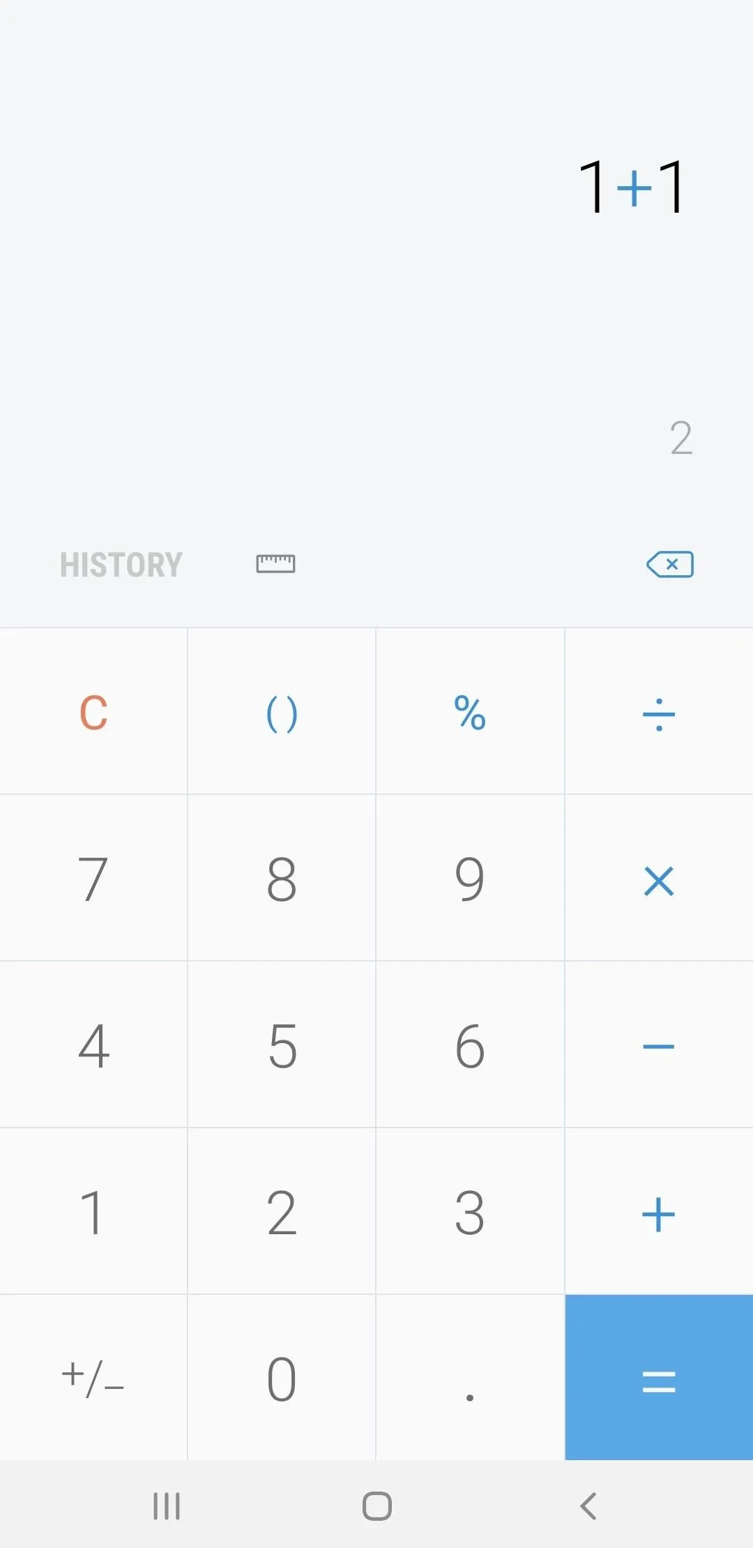
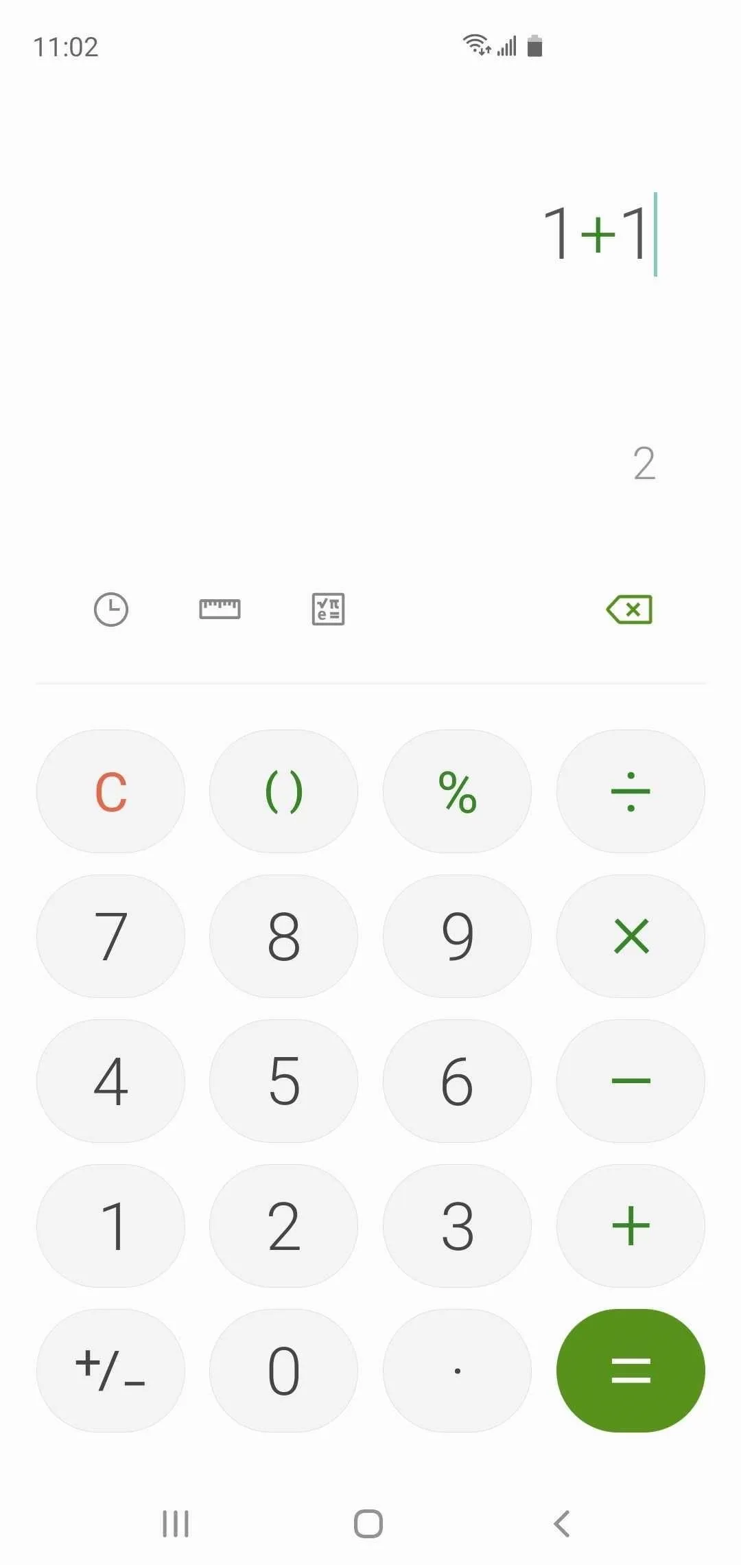
19. Redesigned Calculator
The Calculator app has gotten a facelift on One UI 2, and now features rounded buttons to bring it closer to the rest of the system design-wise. Beyond that, the app also has a dedicated scientific calculator button, along with a redesigned "Unit converter" that does away with the popup menu so you quickly choose between different units along the top without the need to go back to the main calculator interface.


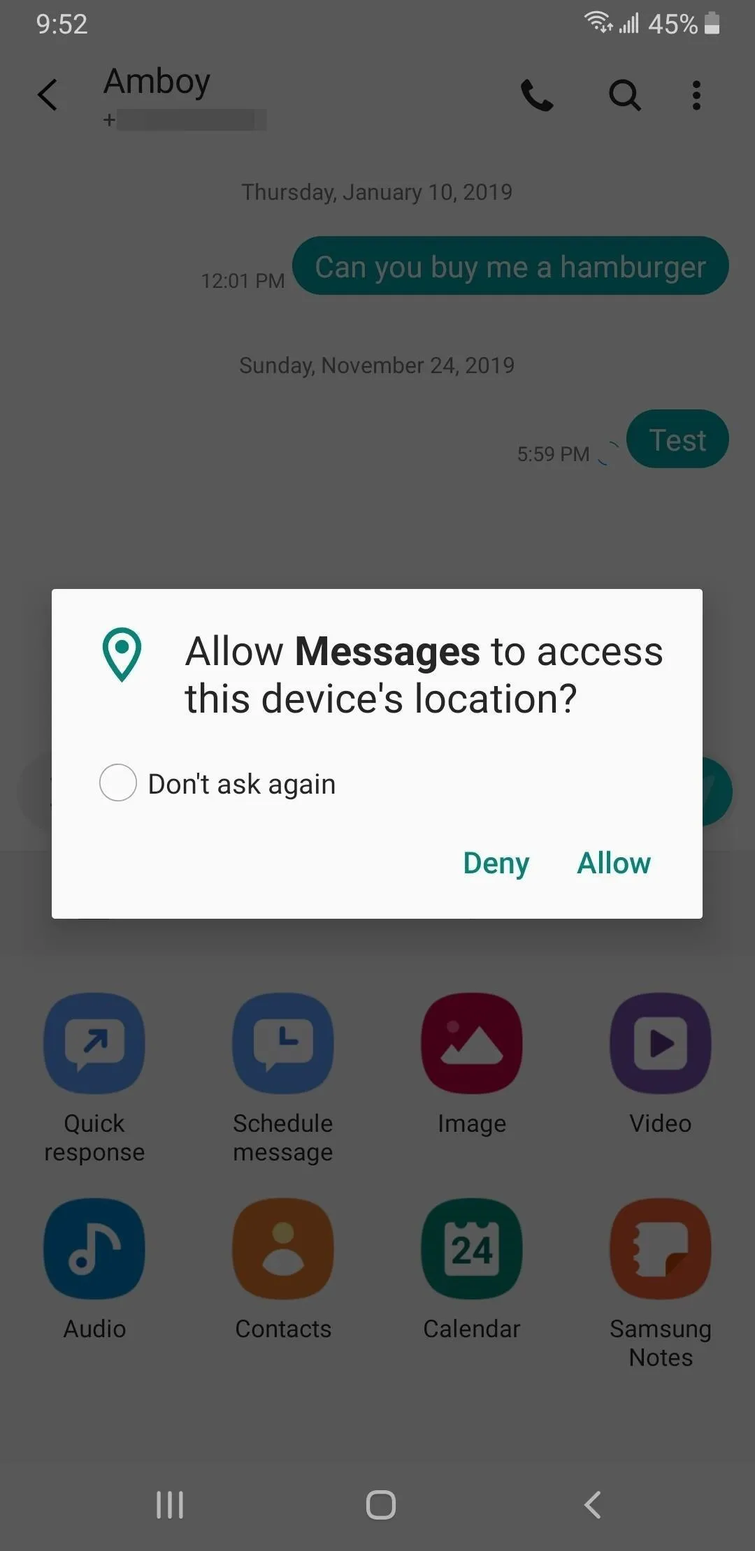
20. Less Obtrusive Permission Prompts
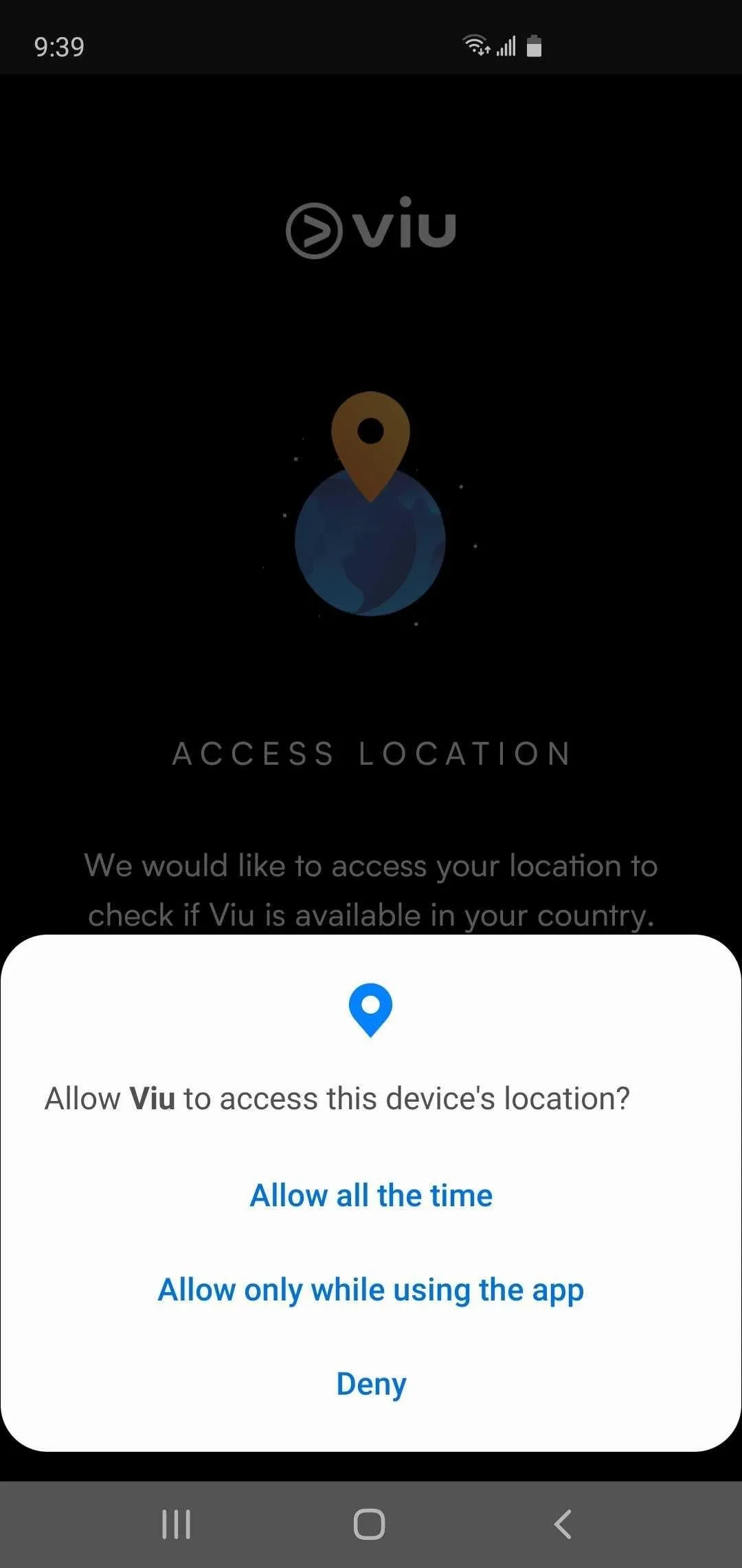
The permission prompt received no love with One UI, and appears totally out of place with the rest of the Galaxy's system. One UI 2 has finally addressed this, and has not only given the prompt a makeover that blends it in with the rest of the interface, but also made it appear from the bottom of the screen.
Location permission prompts now have a third option besides allow and deny: the ability to allow access only while you're using the app in question. But this is an Android 10 feature rather than a One UI 2 feature.


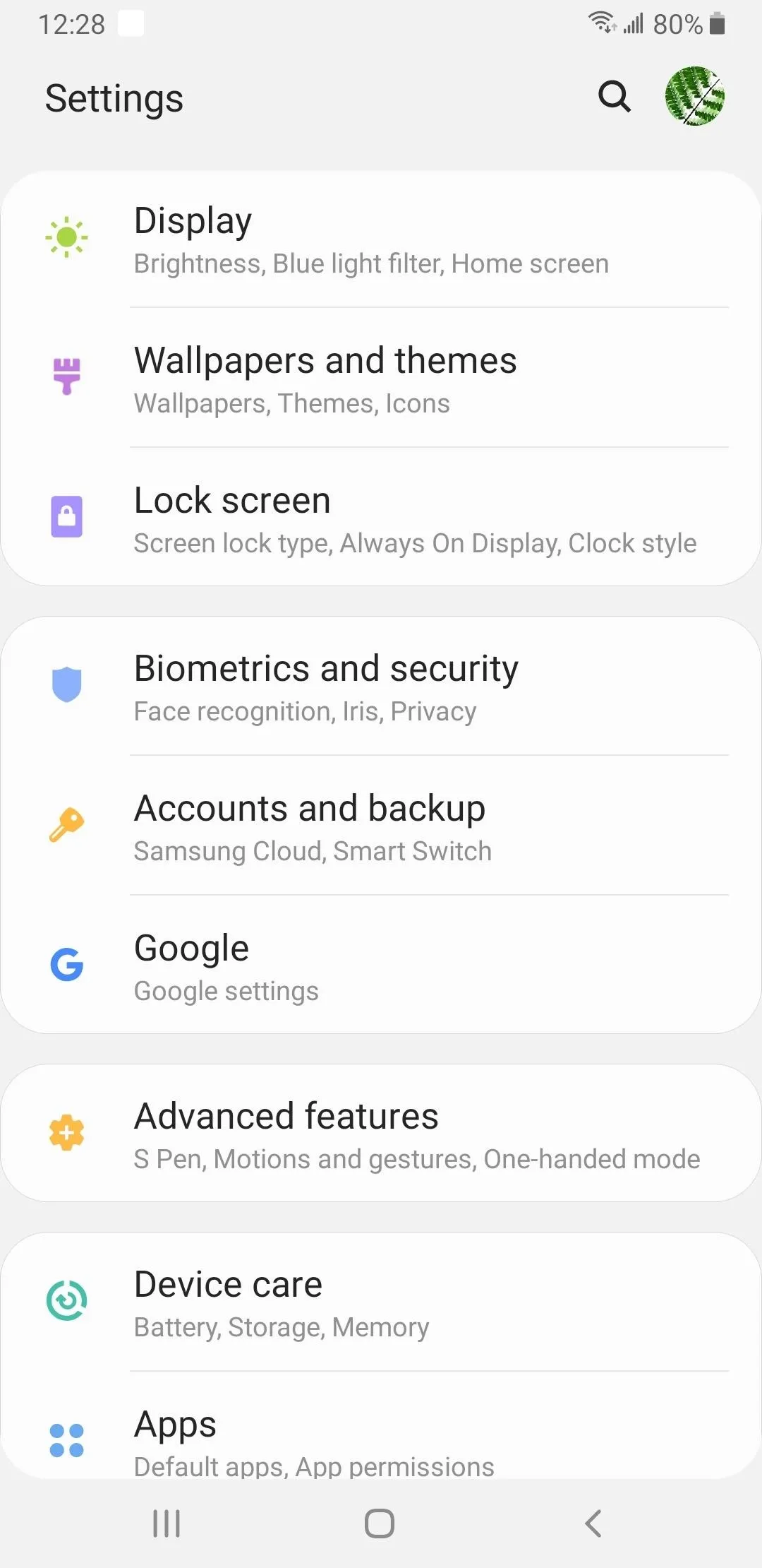
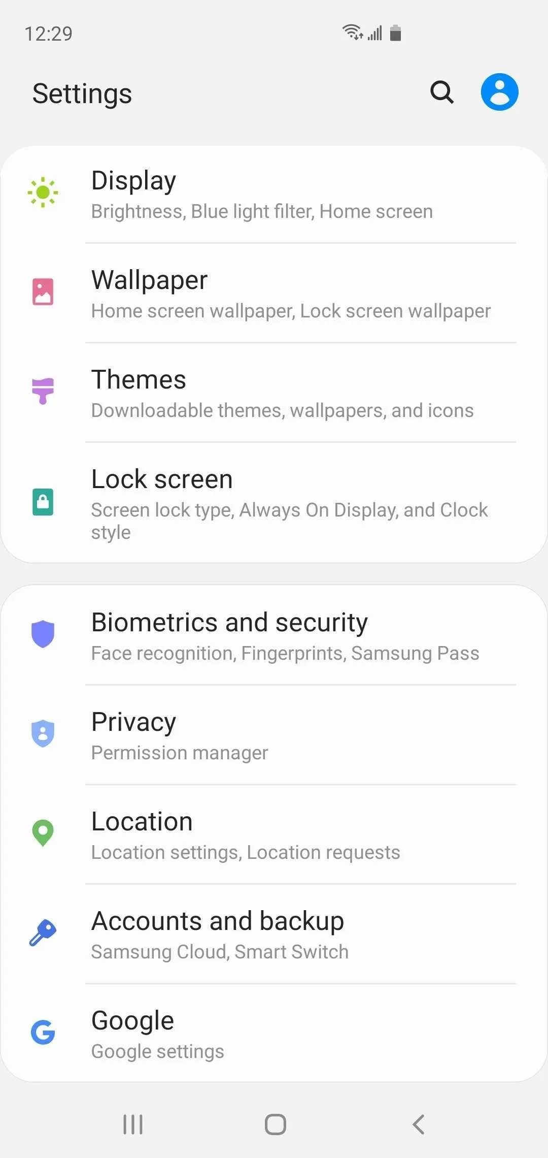
21. Revamped Settings
On One UI 2, numerous options have been separated into their own categories inside the Settings app to make navigation more streamlined. For example, "Wallpaper and themes" has been broken down into two sections ("Wallpaper" and "Themes"), while "Privacy" and "Security" have been separated from "Biometrics and security" and placed front and center within the main page of the Settings app.


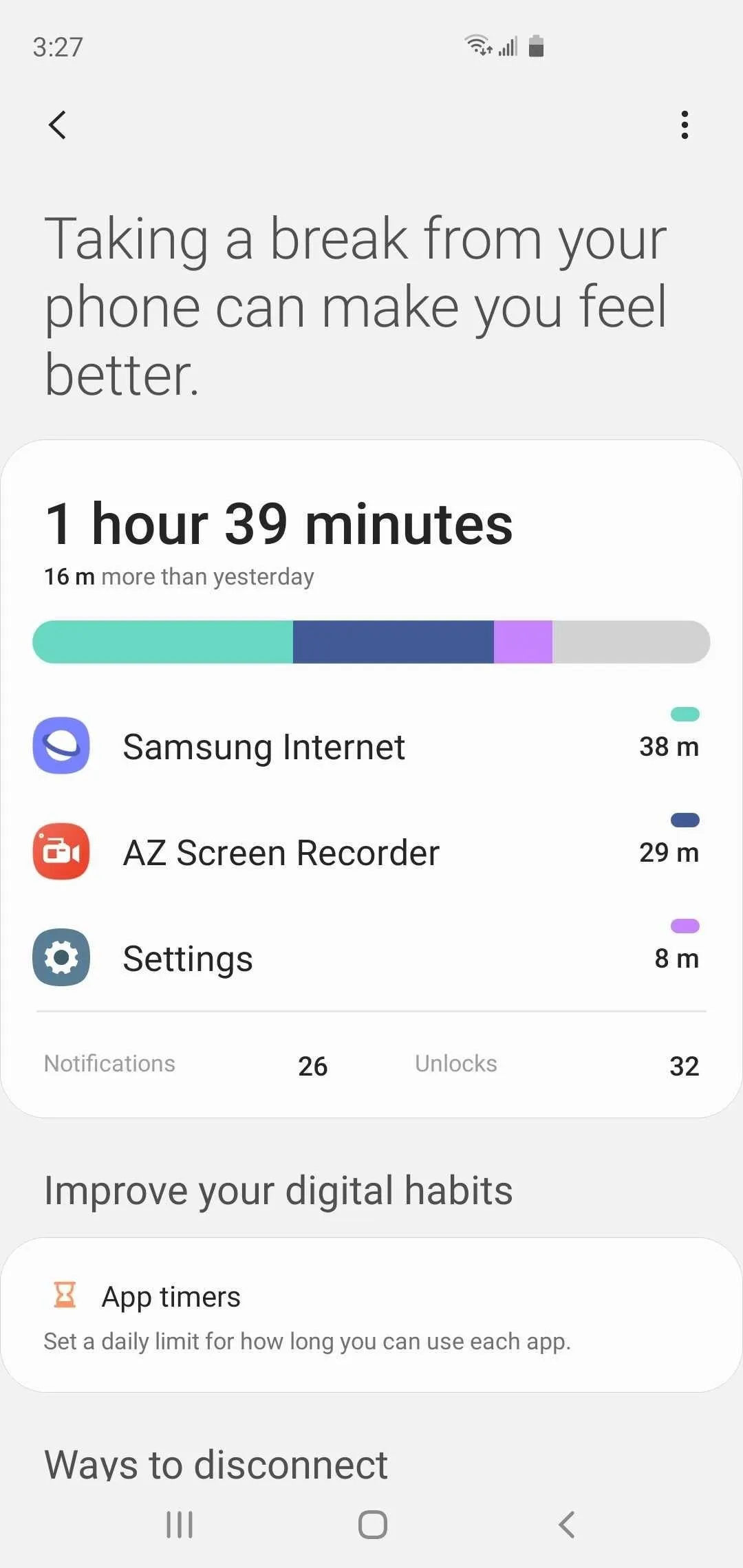
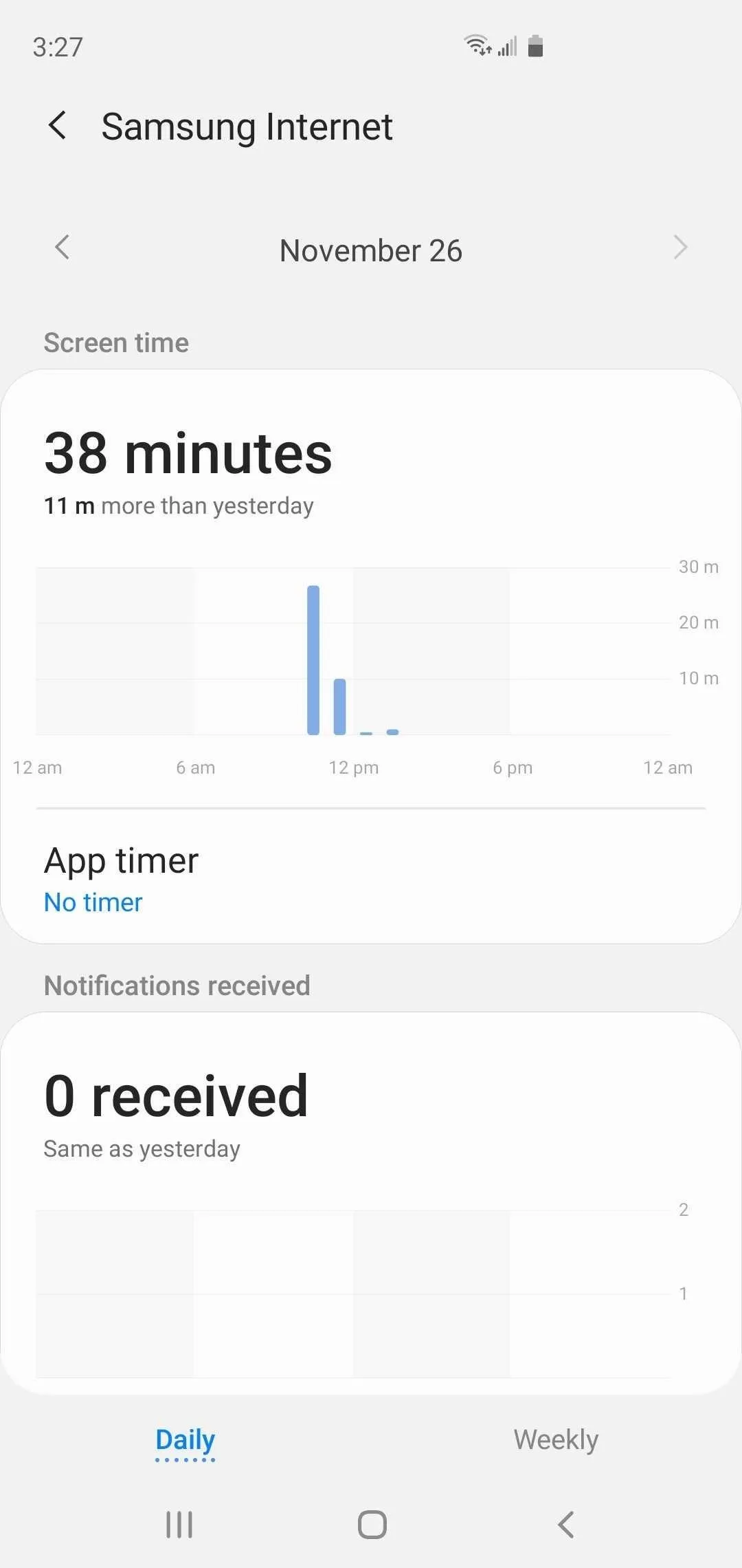
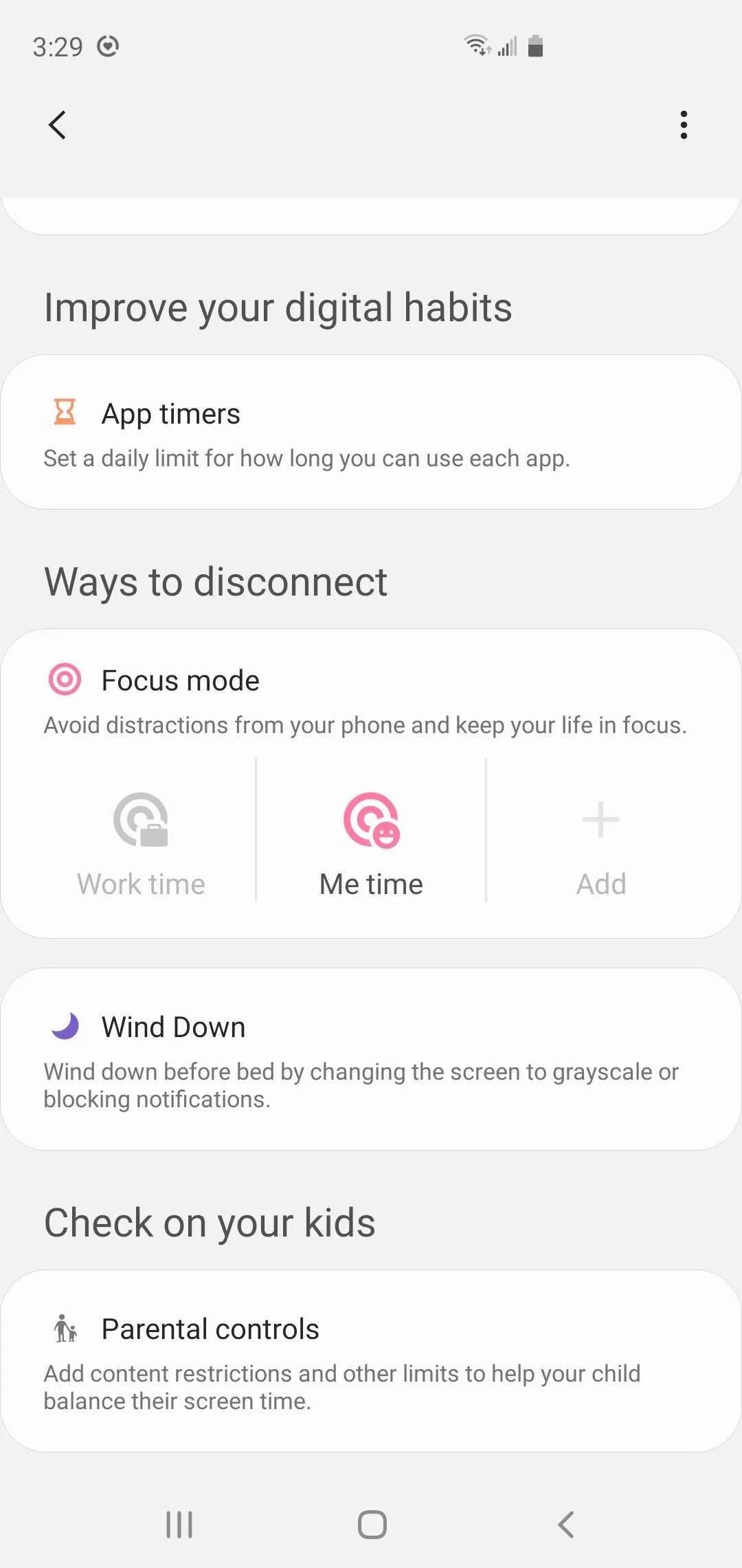
In addition, there's now a section dedicated to "Digital wellbeing & parental controls" which contains a dashboard summarizing your smartphone usage. Besides that, the new section also houses the new "Focus mode," "Wind Down," and "Parental controls" features to help ensure peak productivity.


22. Choosing a Wallpaper No Longer Takes You to the Galaxy Store
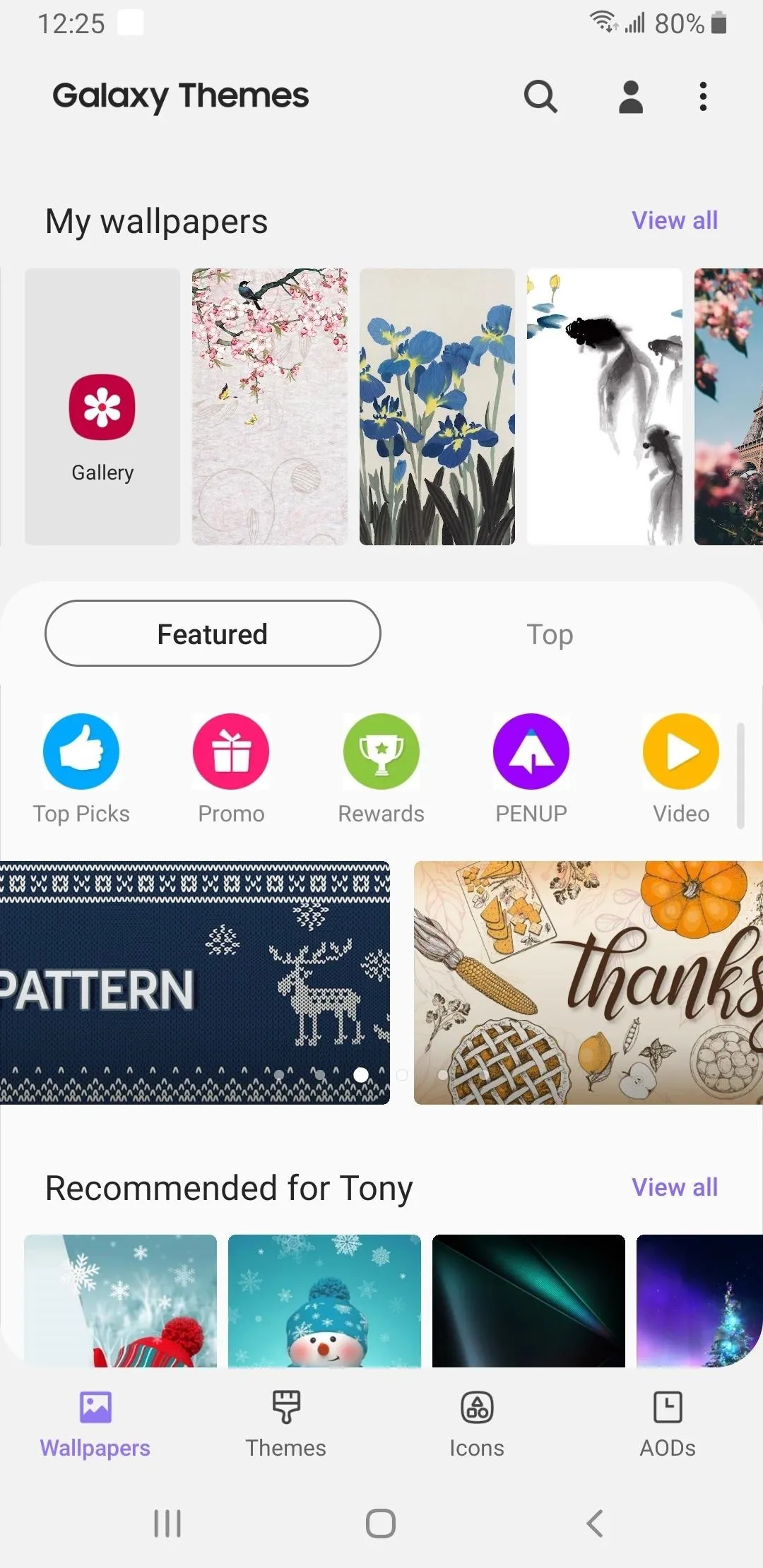
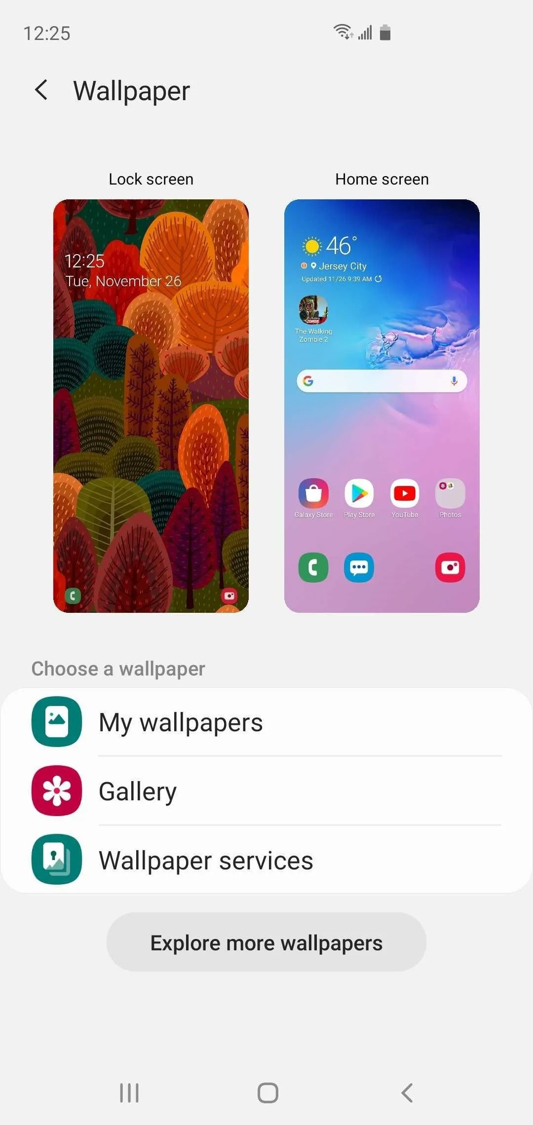
Being redirected to the Galaxy Store just to pick a wallpaper is one of the more annoying aspects that Galaxy users had to live with — until One UI 2. With the latest firmware, accessing the new standalone "Wallpaper" menu inside Settings now takes you to a simplified settings page where you can easily preview and set wallpapers sourced from "My wallpapers," "Gallery," and more, though you can still head to the Galaxy Store by tapping "Explore more wallpapers."


23. Streamlined Device Care Menu
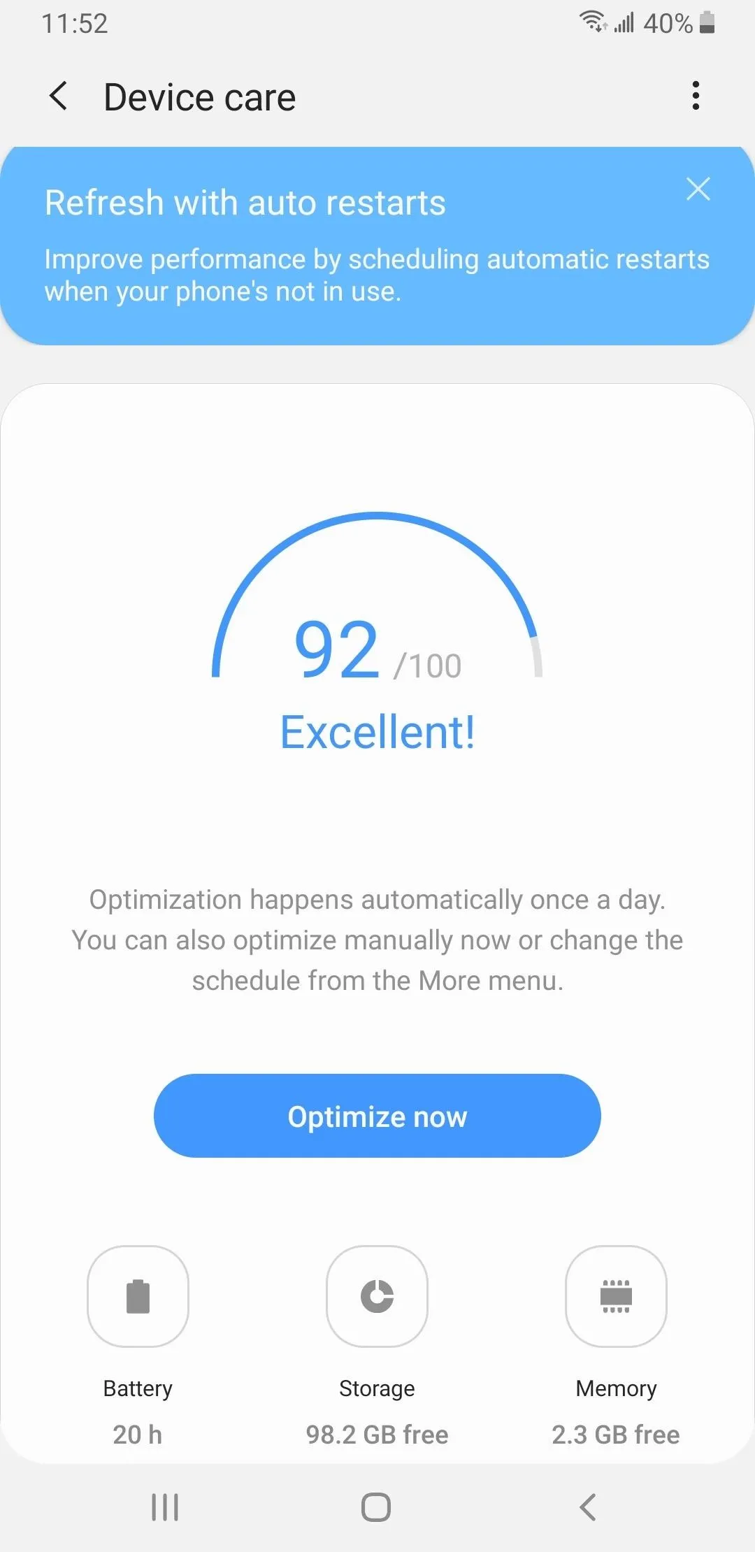
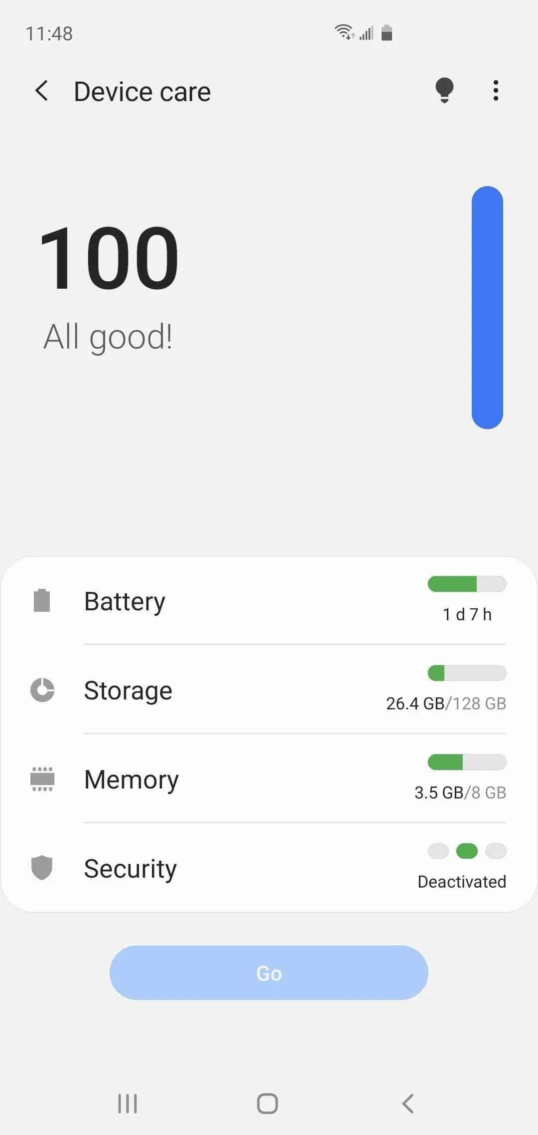
The "Device care" menu within Settings has been redesigned on One UI 2, and has complied elements like "Battery," "Storage," "Memory," and "Security" into a simple list for a neater appearance. Best of all, Device care has now has a dedicated menu containing device optimization tips that can be accessed anytime via the light bulb icon on the top-right, which is a marked improvement over One UI's automated tips that appeared each time you opened the page.


24. Auto Optimization Now Deletes All Background Apps
The Auto optimization feature first introduced in One UI gave you the ability to schedule when to free up your Galaxy's memory and storage, though recently used apps were excluded from the process. On One UI 2, the function now completely closes all background apps — regardless of the time they were last accessed — thanks to the "Close apps to free up memory" toggle that's enabled by default.
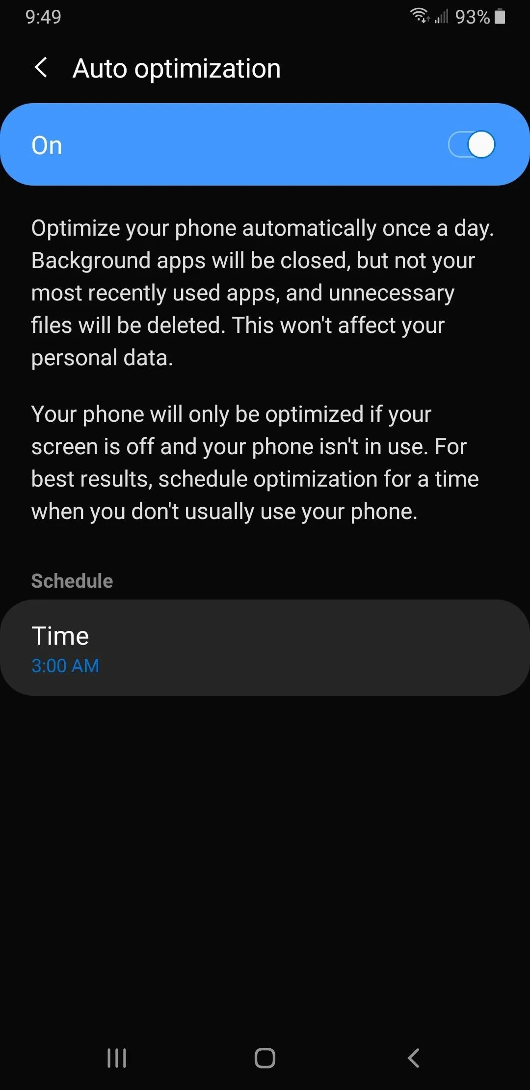
Auto optimization menu on One UI.
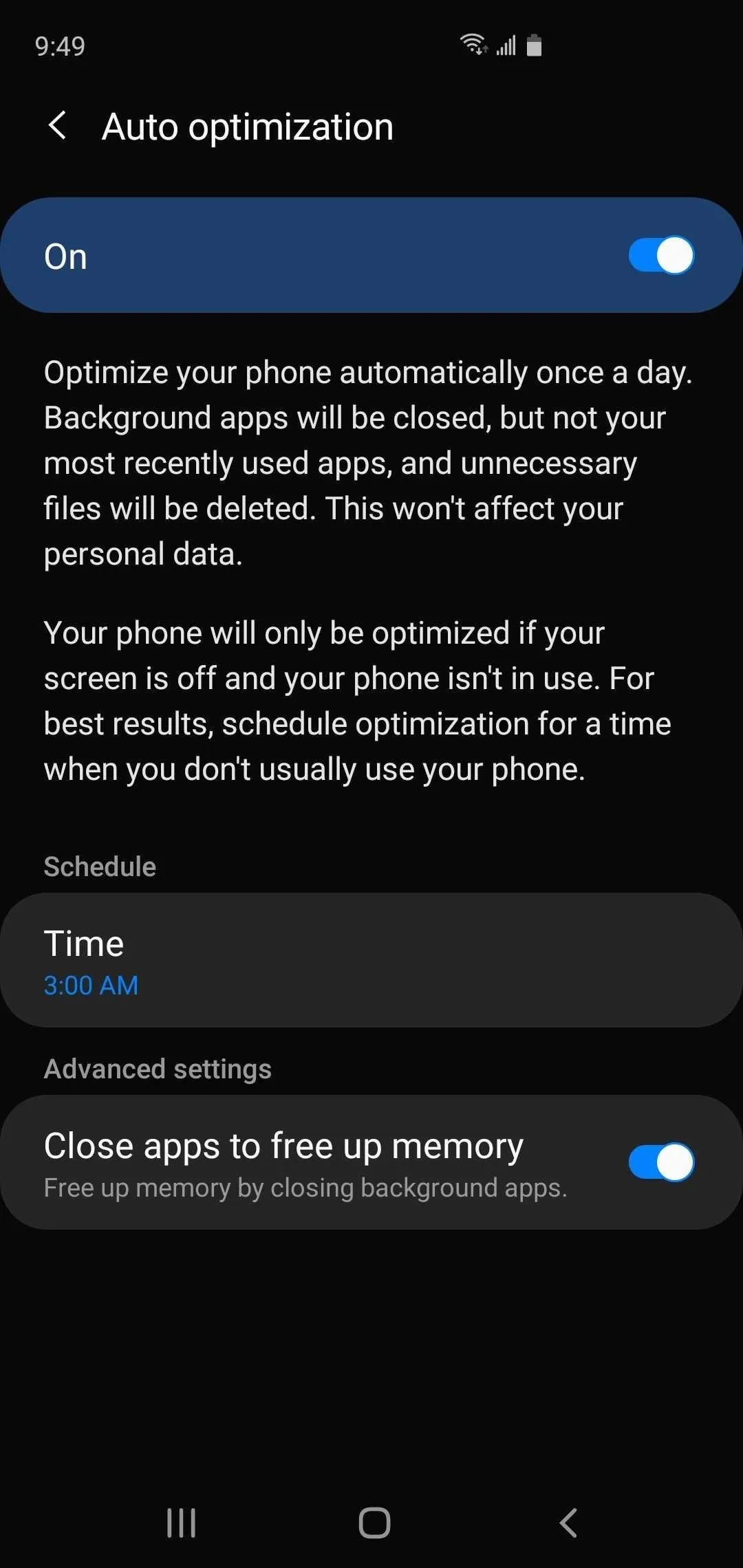
The same menu on One UI 2.

Auto optimization menu on One UI.

The same menu on One UI 2.
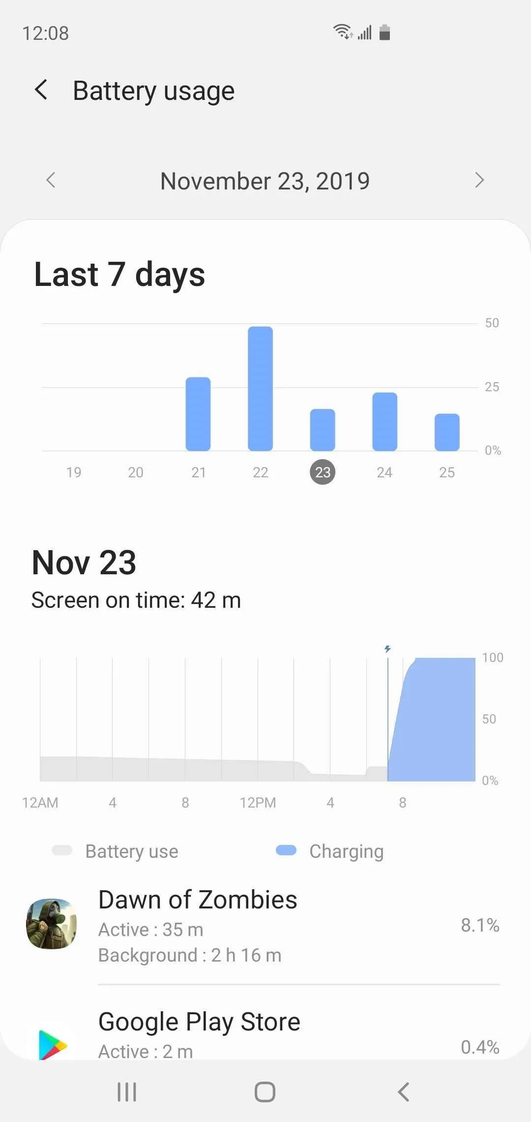
25. Battery Usage Provides More Detail
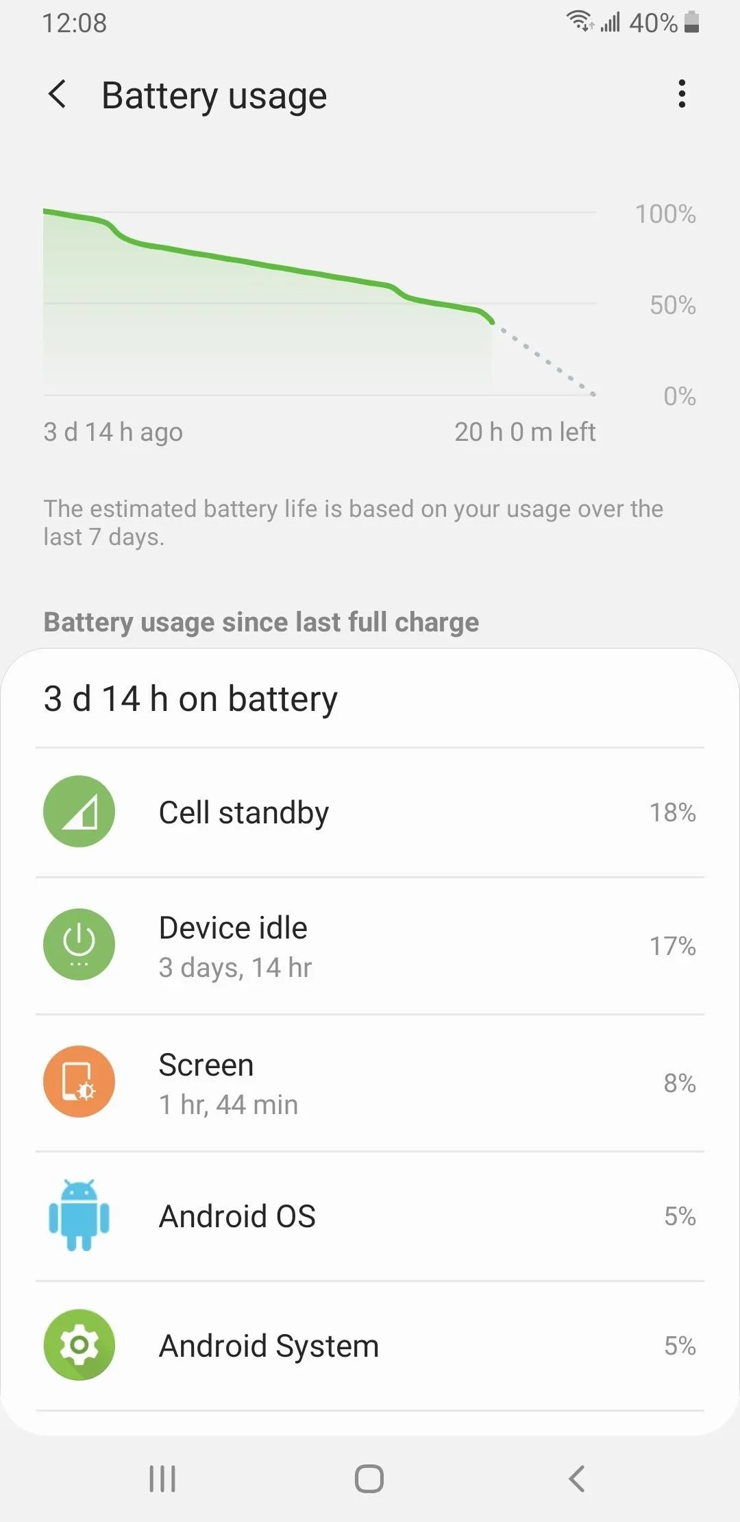
On One UI 2, the "Battery" menu found inside "Device care" in Settings features a redesigned layout that's easier to understand. Upon selecting the now-prominent "Battery Usage" tab, you'll also be greeted with a more detailed summary page that shows the usage stats for the last seven days, as opposed to usage from when it was last charged.


26. Simplified Color Picker Function
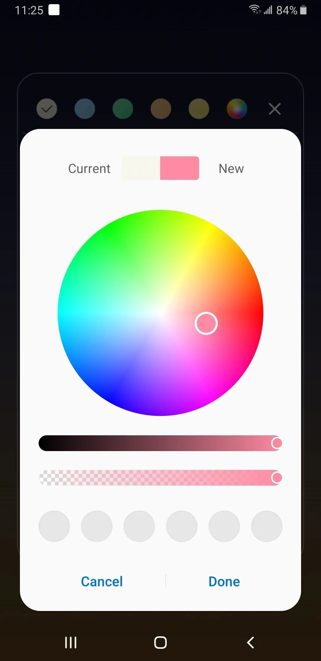
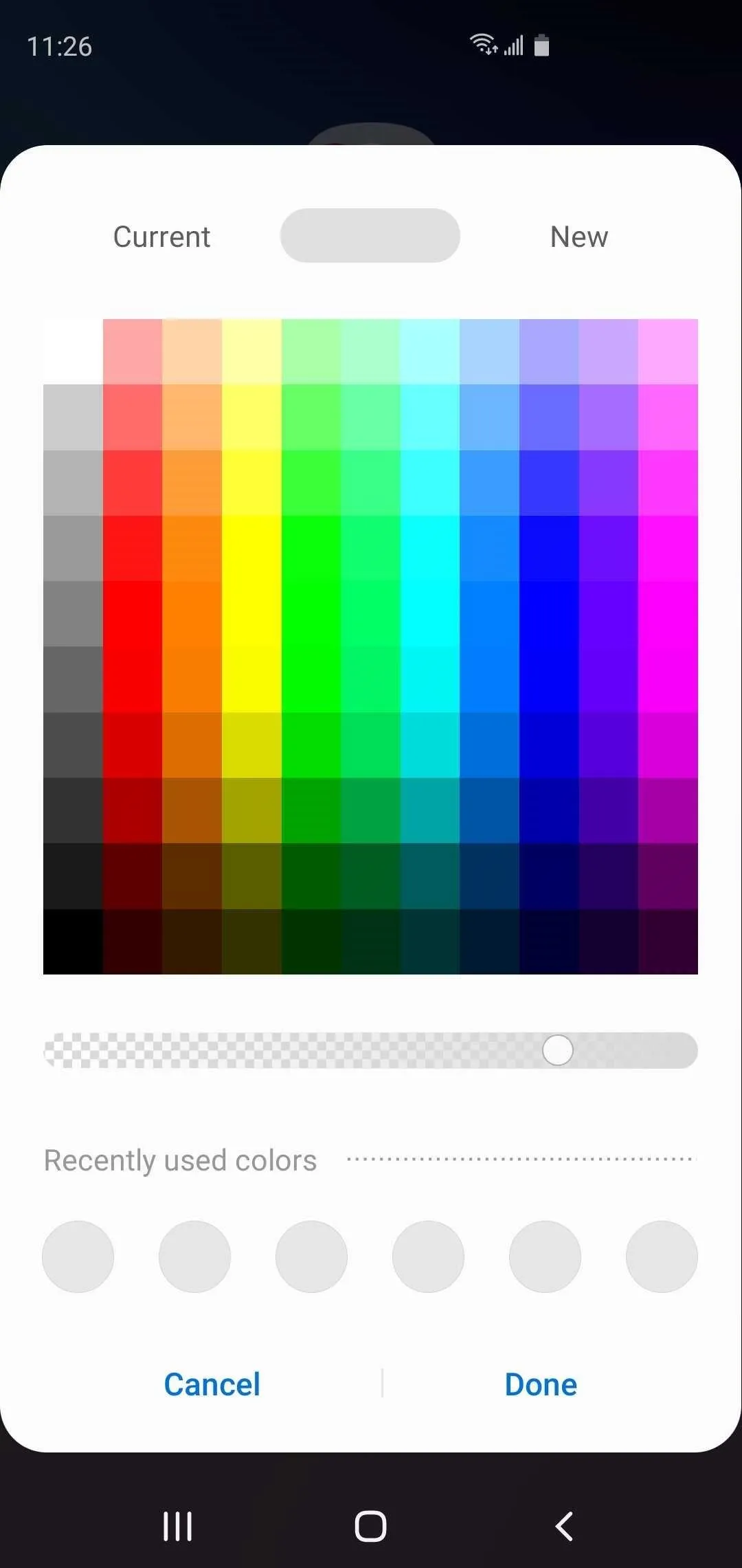
On One UI, colorizing system elements like your home screen folders yielded a full RGB color wheel that often made color selection time consuming. This process has been simplified on One UI 2, and the color wheel has been replaced with more intuitive color table along with a single shade adjustment bar to make the process quick and easy.


27. Improved Cursor Controls
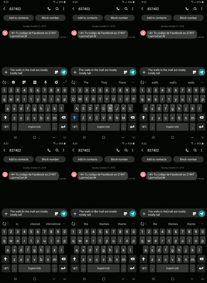
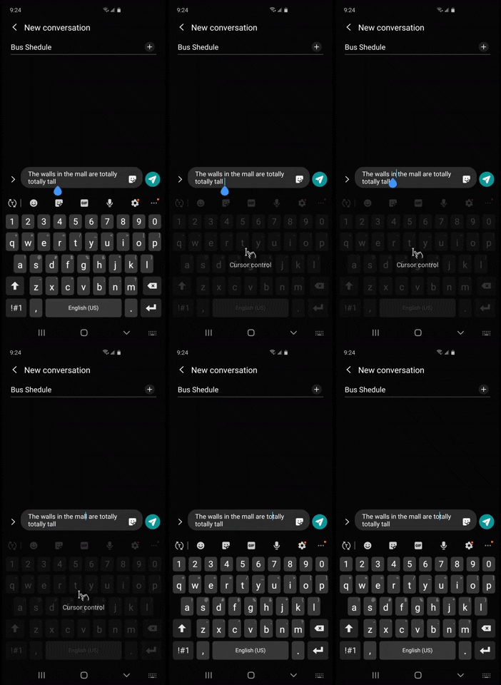
Before One UI 2, the keyboard-based "Cursor control" functionality had to be manually enabled by digging deep inside the Settings app. This feature has been streamlined on One UI 2, and besides being enabled by default, using the feature now also grays out the keyboard for less confusion, and is significantly smoother for more control over the cursor.


28. Simplified One-Handed Mode
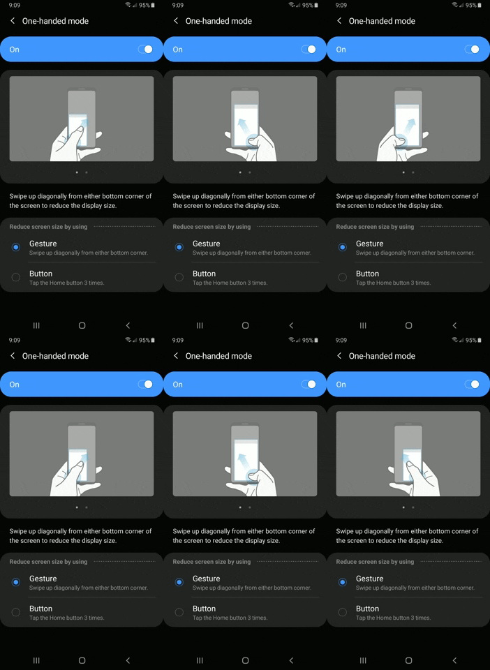
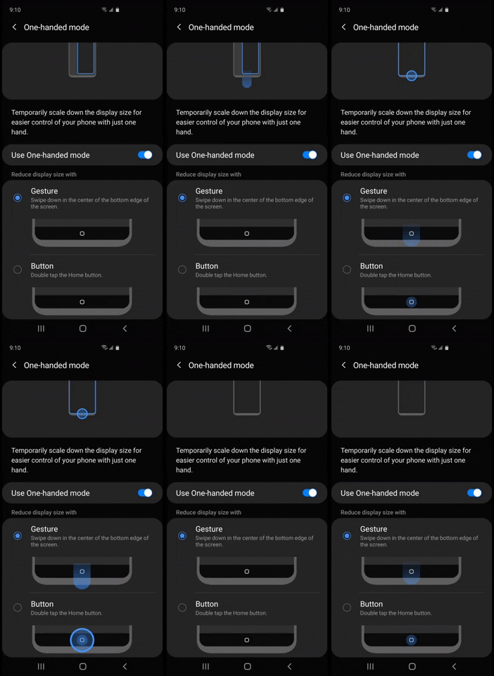
One-handed mode can be a very useful if you have smaller hands, and before Samsung's Android 10-based update, you had a choice between swiping diagonally from either the bottom corners or triple-tapping on the home button to enter the mode. One UI 2 made the process more intuitive — now you can either swipe down from the bottom-center of the screen, or double-tap the home button.


29. Set Limits to Reverse Wireless Charging
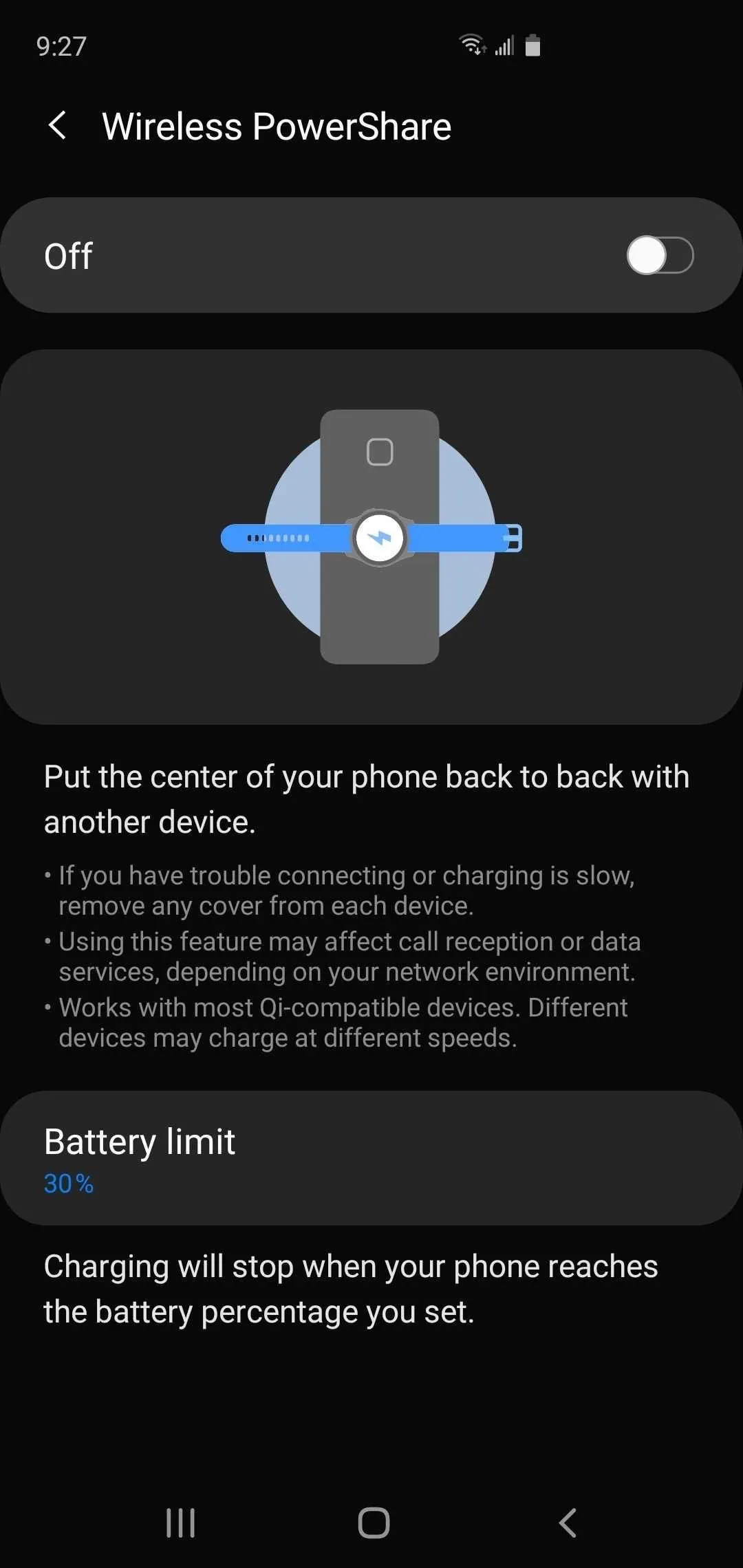
The Wireless PowerShare feature found on the S10 and Note 10 series can come in handy when you need to charge other devices in a pinch, but it gave you no control over when to automatically stop sharing, and only cuts off when your battery goes down to 30%. With One UI 2, you now have the ability to fine-tune the feature, and can set the cutoff from 30% all the way up to 90%.
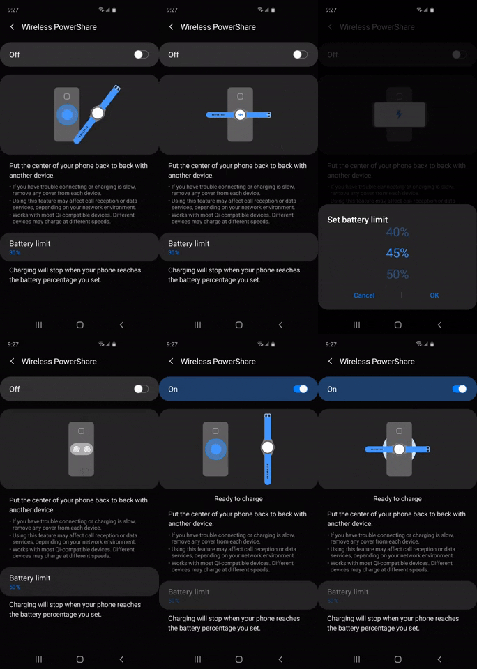


30. More Lock Screen Shortcuts Available
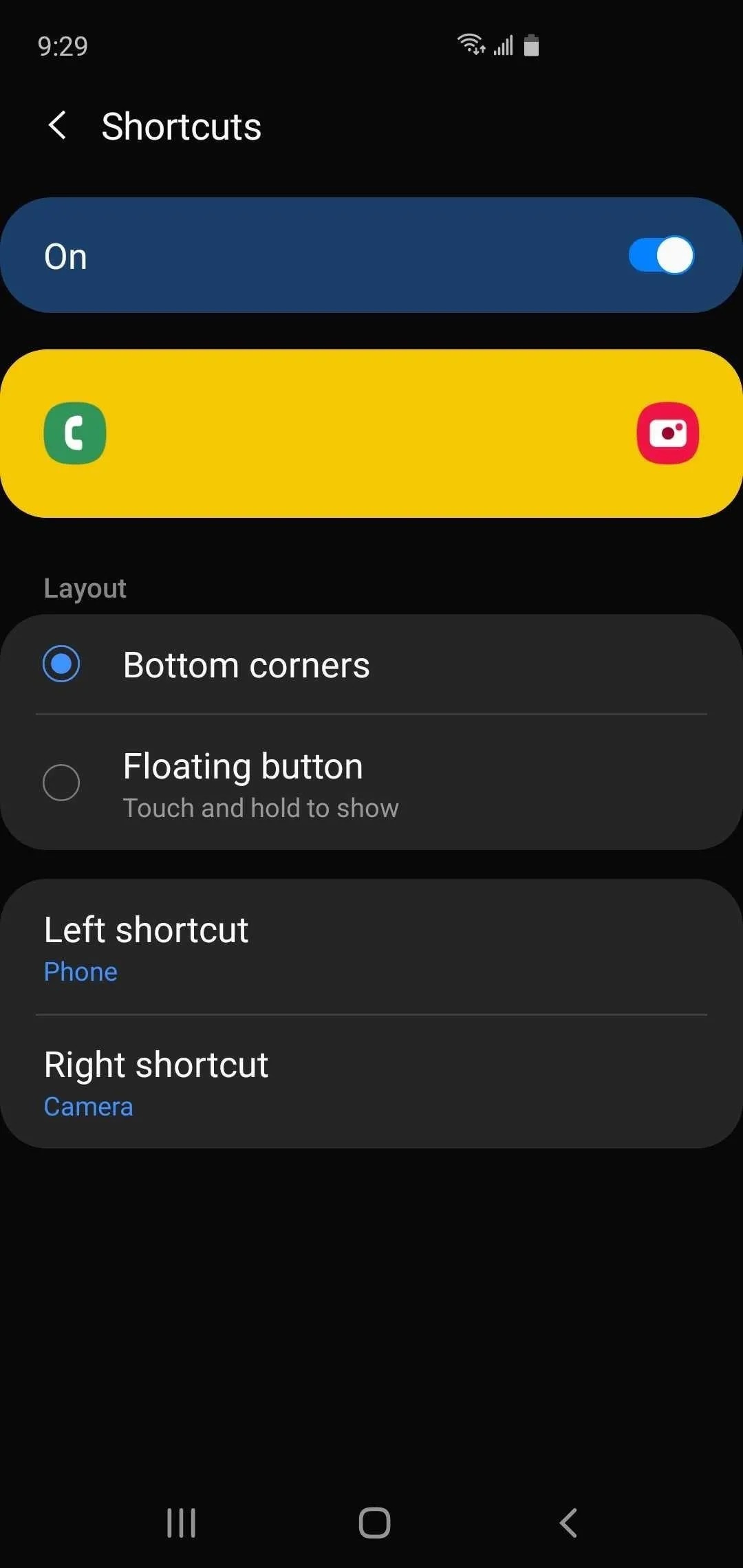
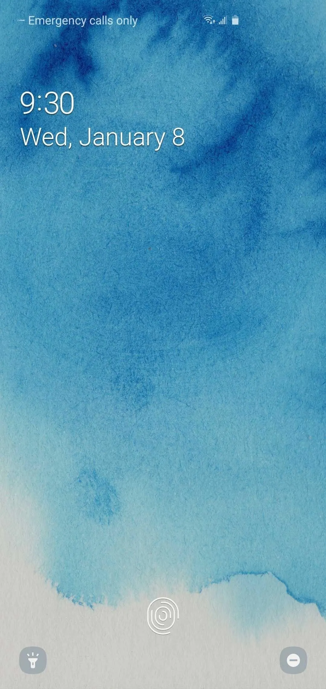
Your Galaxy gave you a wide range of apps to add as an app shortcut to your lock screen prior to One UI 2, but left out frequently-used tools and options like the flashlight and "Do not disturb" mode. One UI 2 has finally remedied this, and lets you set both on your lock screen and do away with the need to go into your phone's Quick Settings menu.


Cover image, screenshots, and GIFs by Amboy Manalo/Gadget Hacks







Comments
Be the first, drop a comment!