


With Android Pie beta now available for the Galaxy S9 and S9+, Samsung is well on its way to catching up to major competitors like the Google Pixel 3 in terms of giving its users the latest and greatest software Android has to offer. Of course, Samsung has added its own touches to the software to make Android Pie its own and set it apart from the rest of the crowd.
As with any significant updates, Android 9.0 brought a slew of new features and improvements to the Galaxy platform, such as new navigation gestures, the addition of a system-wide dark theme, and more. One UI — formerly known as Samsung Experience — got a much needed makeover with Android Pie, which you'll instantly notice once you get to your Galaxy's home screen.
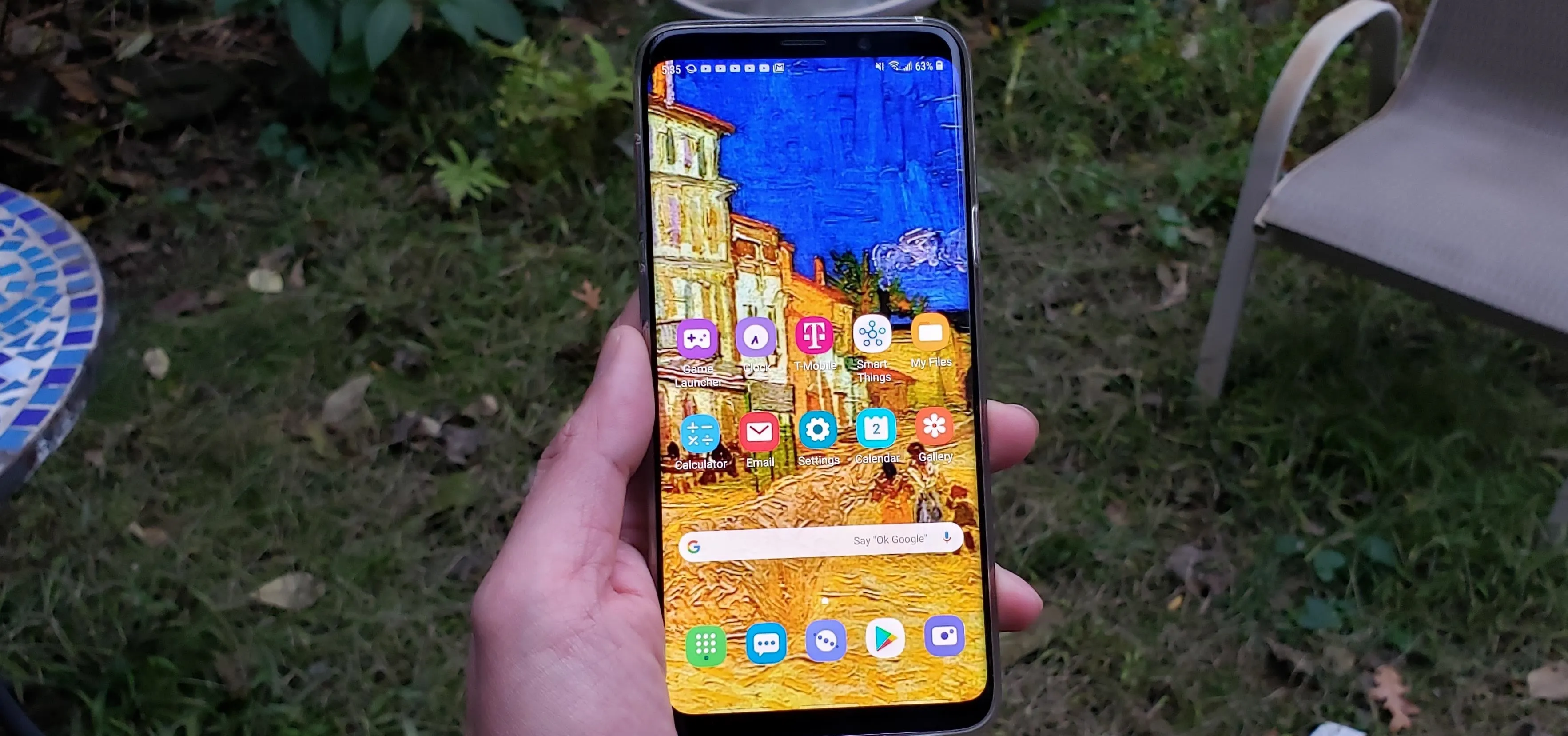
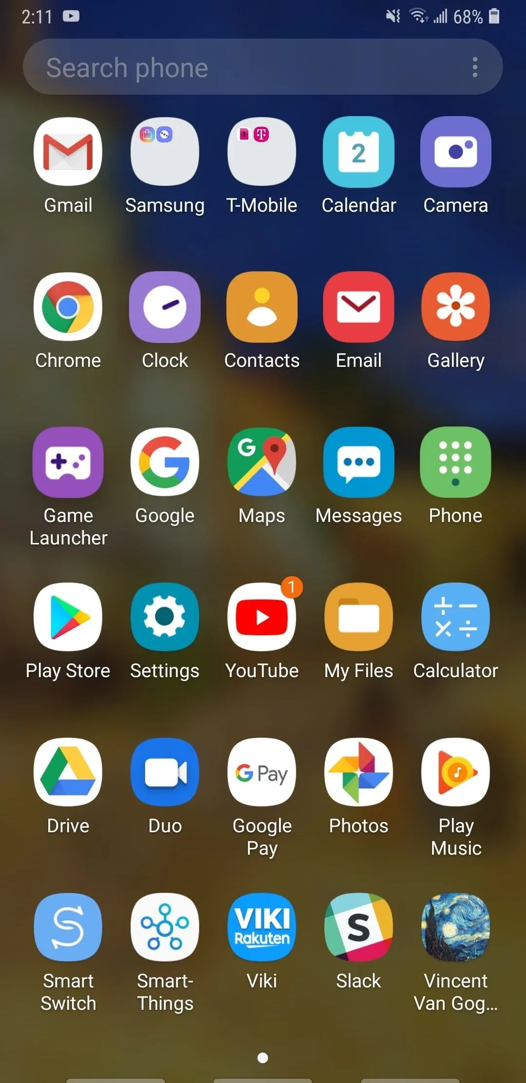
The most significant change is a set of completely redesigned icons for native apps like the Phone, Email, Camera, and Game Launcher, just to name a few. The new icons are visually appealing, and add a whole lot of color and life into the home screen, which is sure to complement your favorite wallpapers much more than the old icons ever could.

Redesigned home screen icons on a Galaxy S9+ on Android Pie
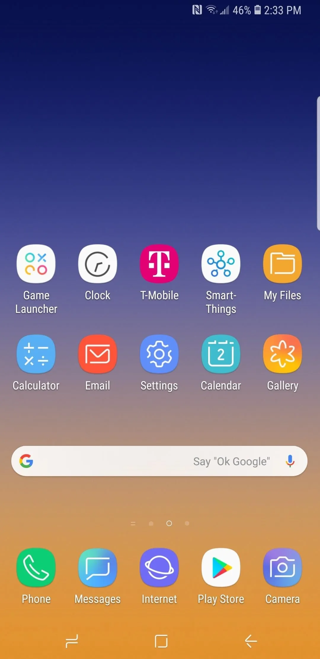
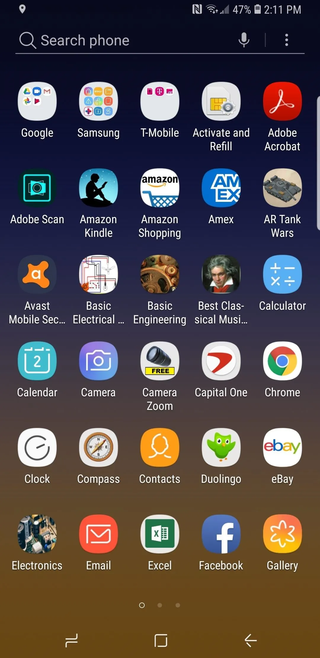
Home screen icons on a Galaxy Note 9 on Android 8.1 Oreo
Redesigned home screen icons on a Galaxy S9+ on Android Pie
Home screen icons on a Galaxy Note 9 on Android 8.1 Oreo
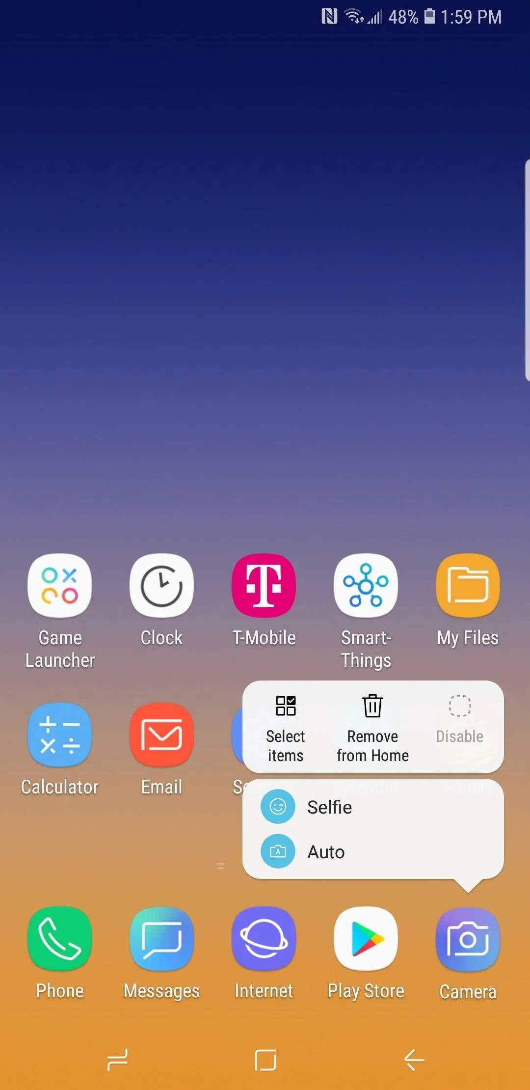
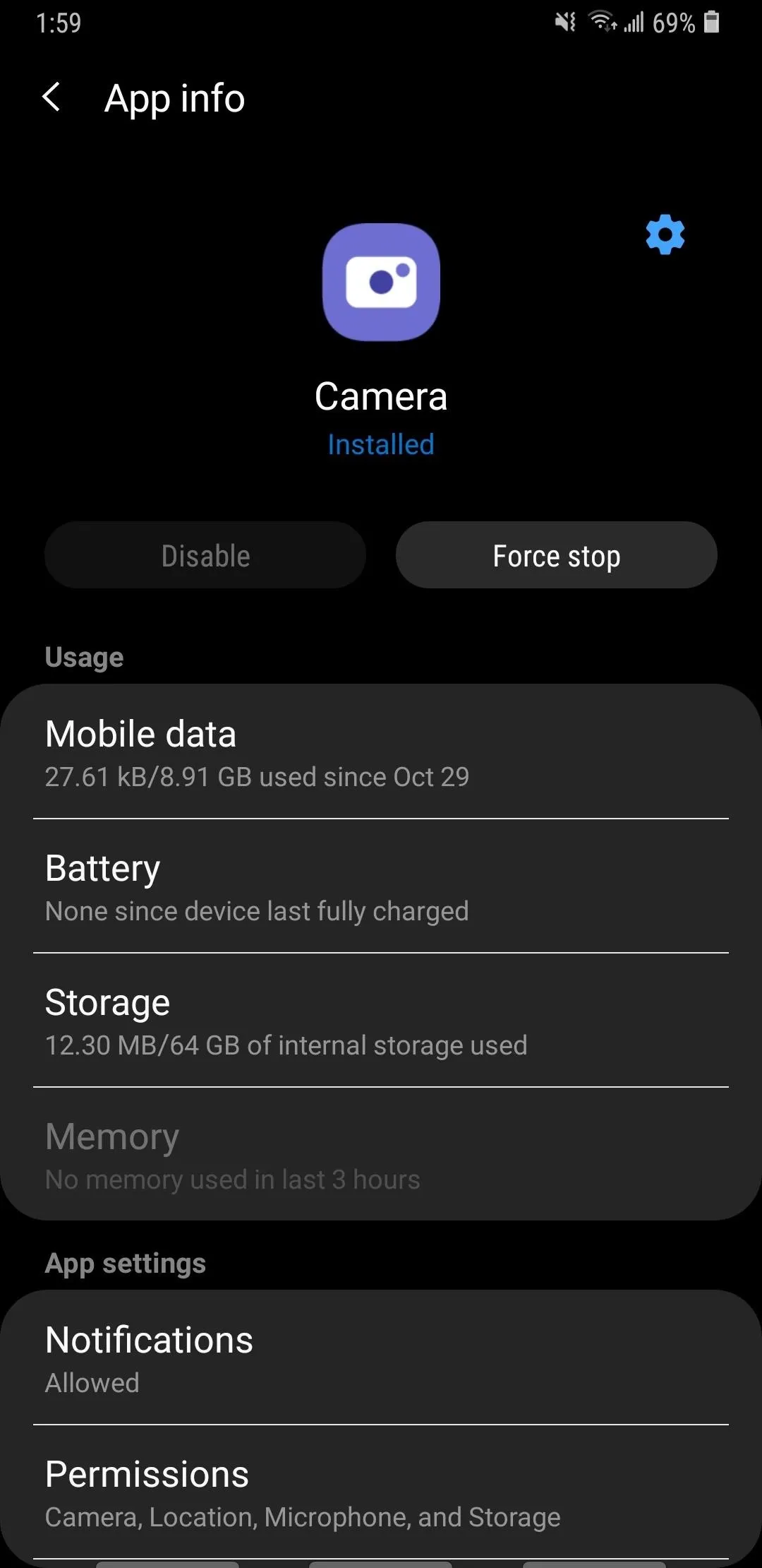
Besides the revamped icons, Android Pie has further refined the apps shortcuts feature introduced back in Android Oreo with the addition of a new "App info" option. Though minor, the new option is still very useful, as it gives you the ability to instantly go to the app's information and settings page for more options like performing a force stop or tweaking permissions, without having to dig through the Settings app.
App shortcut on 8.1 Oreo.
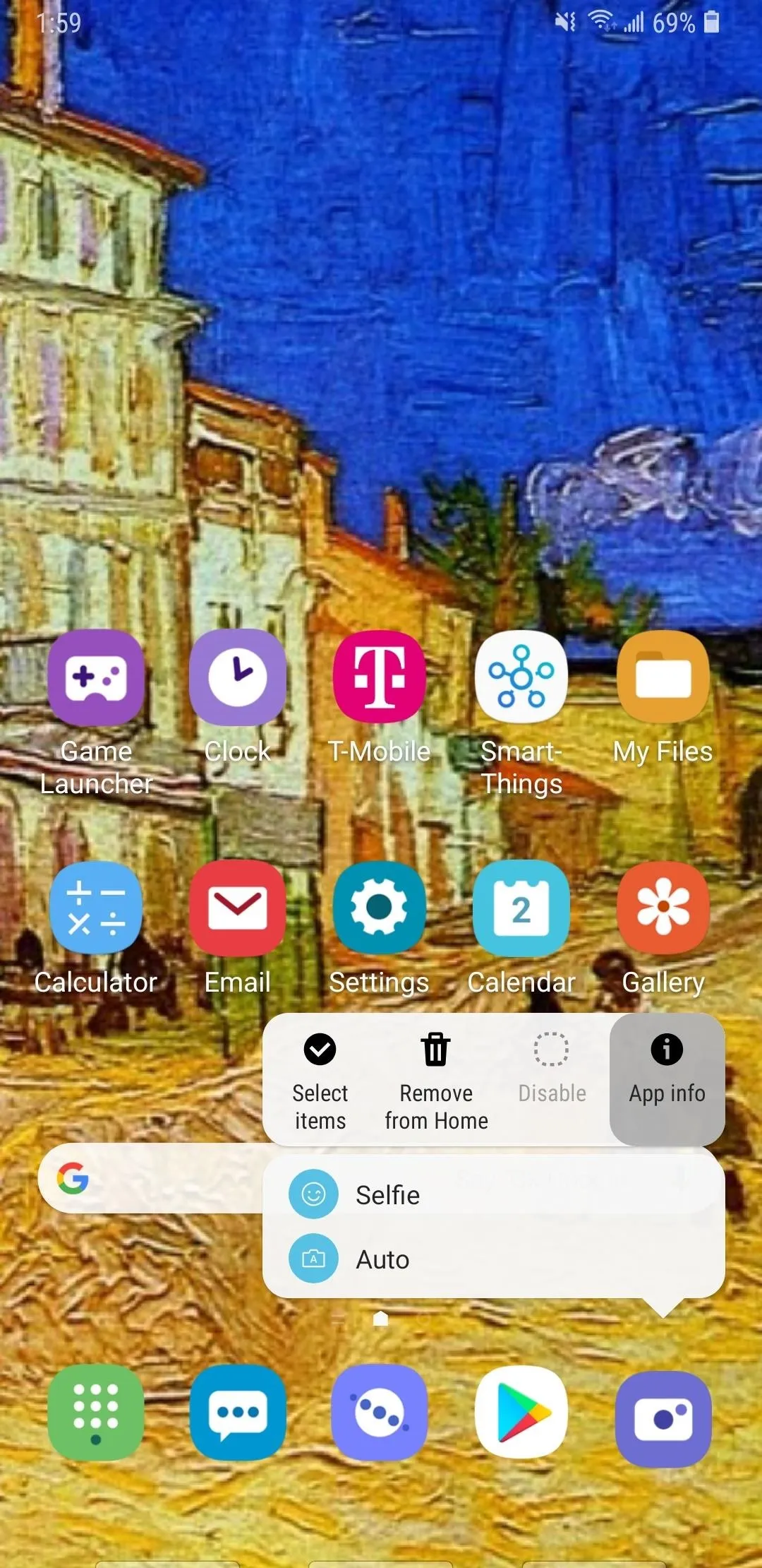
App shortcut with the addition of an info button on Android 9.0.
App shortcut on 8.1 Oreo.
App shortcut with the addition of an info button on Android 9.0.
The TouchWiz app drawer was also slightly revamped with Android Pie, and primarily redesigned the search function to a more modern and aesthetically pleasing enclosed box that also got rid of the voice input option. Apart from that, however, the app drawer has remained largely the same, and still utilizes the same semi-translucent background we've grown accustomed to.
In all, Samsung's new home screen appearance looks great overall, and will undoubtedly look even better on the upcoming S10 series of flagships once they're released next year. What do you think of the Galaxy's new look? As always, share your thoughts by posting on the comment section below.
- Follow Gadget Hacks on Pinterest, Reddit, Twitter, YouTube, and Flipboard
- Sign up for Gadget Hacks' daily newsletter or weekly Android and iOS updates
- Follow WonderHowTo on Facebook, Twitter, Pinterest, and Flipboard
Cover image and screenshots by Amboy Manalo/Gadget Hacks


Comments
Be the first, drop a comment!