



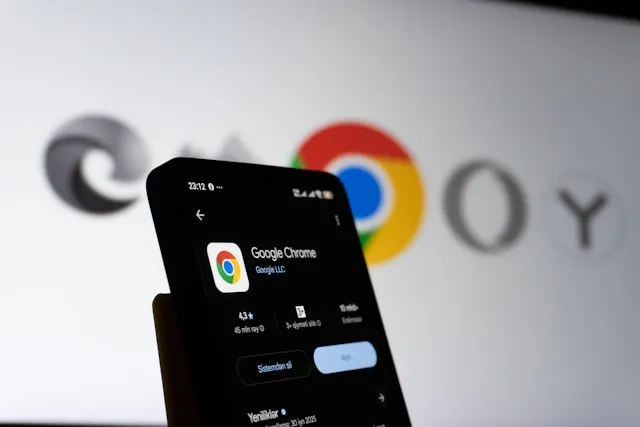
Chrome for Android is testing a redesign that finally puts core browsing controls within thumb's reach on today's tall phones, and in the same stroke adds a second persistent toolbar that crowds the screen with more interface than the browser has carried in years. That's the tension at the center of the Chrome Android bottom navigation bar redesign: a legitimate ergonomic fix wrapped around a feature nobody asked to have permanently on screen.
One reviewer at 9to5Google has liked how little Chrome's Android interface has changed since 2012, cycling through cosmetic refreshes while keeping the same basic idea: a single address bar, positioned at the top or the bottom, with nothing added around it. That restraint is ending. The redesign spotted rolling out last month adds a secondary bottom toolbar built around a dedicated Gemini button.
Google is right that thumb-reachable controls matter on modern, tall-screened phones. It's harder to defend expressing that fix as a persistent second bar built around an AI assistant, especially since Google already tried something close to this in 2020 and walked away from it once testers found it disorienting. The ergonomics case holds up. The execution doesn't.
What is the Chrome Android bottom navigation bar redesign, and why did Chrome need it?
Chrome began rolling out a bottom-aligned address bar option to Android's stable channel in June 2025, letting users toggle it on through Settings or a long press specifically to help one-handed reachability. That's worth separating from the 2012 claim above: the top-or-bottom flexibility itself is a recent addition, not a decade-old fixture. The logic behind it is simple. Putting the address bar and the controls around it lower on the screen keeps everything within easier reach on today's taller phones.
It wasn't Chrome's first run at this, either. The option existed as an experimental flag as far back as 2016, got dropped in Chrome 84 in 2020, and returned on iOS's stable channel in 2023 before finally reaching Android's stable channel last year. Nearly a decade of on-and-off tinkering, all in service of one specific problem: getting the address bar closer to a thumb.
That history matters. It shows Google already had a narrow, well-considered answer to a real ergonomic complaint, long before Gemini entered the picture and expanded the ambition of the redesign into something bigger and messier.
How the Chrome Android bottom toolbar gained a Gemini button
The redesign layers a second, persistent bottom bar on top of the address-bar fix: buttons for Home (which can be disabled), Gemini, New Tab, and the tab switcher, while the top bar keeps the URL field, a share button, a back button, and the overflow menu. The bar itself has grown physically thicker specifically to make room for the new Gemini shortcut.
The payoff isn't nothing. With the new button, Gemini in Chrome can pull content from multiple open tabs rather than being limited to whatever page happens to be active, closing the gap with the sidebar version of Gemini already available on Chrome's desktop app.
That capability explains why Gemini got a dedicated button rather than a smaller icon tucked into an existing menu. It doesn't explain why the button has to sit permanently on a toolbar that appears on every page, every time, whether a user wants an AI assistant open or not. That's a strategic choice about where to put Google's flagship AI product, not a requirement of the underlying feature.
Why Chrome's secondary toolbar feels like a step backward
Chrome's name, chosen when the browser launched in 2008, was meant to signal speed and a minimal graphical interface, "chrome" being industry shorthand for the visual scaffolding around the actual content. A second permanent toolbar cuts against that founding idea, and Google has been down this road before: the company came close to shipping a nearly identical dual-bar layout in 2020 and shelved it after testing showed "mainstream users" found it "disorienting."
The separate problem is that even the single bottom bar Chrome already shipped hasn't been executed cleanly, which suggests Google is adding new UI before finishing the old UI. In Android Authority's hands-on testing, tapping the address bar snapped it back to the top of the screen, dragging search suggestions, voice search, and Lens along with it, undercutting the entire point of moving the bar down in the first place. Core functions like bookmarks, downloads, history, and page info still live up top no matter where the address bar sits.
Two separate criticisms are worth keeping apart here. One is that the bottom-bar ergonomics Chrome already promised remain half-finished, a year after launch. The other is that Google chose to solve a screen-reach problem by adding a second bar rather than fixing the first one, and used that second bar to give Gemini permanent real estate. The first is a bug. The second is a decision, and it's the more consequential one.
When the Chrome Android navigation bar update might ship, and what should change
Chrome isn't the first browser to wrestle with this trade-off. Firefox, Samsung Internet, and Microsoft Edge already let users choose top or bottom address-bar placement, and Edge moves nearly everything to the bottom in one coherent move rather than splitting controls across two locations. Firefox isn't flawless either; it keeps the bar above the keyboard once tapped, but suggestions still stay pinned to the top of the screen.
Samsung Internet offers the cleaner counter-example. It tucks its AI assistant, Browsing Assist, alongside other shortcuts below the address bar in the same bar, proving an AI feature can be folded into an existing bottom bar without requiring a second one.
None of this is finished business on Chrome's end. One outlet found the new dual-bar UI showing up on only a single test device despite every device running matching software, and Google has offered no official word on scope, region, or final design. Google had originally said Gemini's Chrome rollout would begin at the end of June; that deadline passed without the feature materializing on schedule.
Because nothing is locked in, there's room to build something more coherent than what's currently rolling out. Here's what that would look like, offered as a design recommendation rather than a prediction of what Google will actually ship:
One configurable bottom toolbar, not two. Everything Chrome currently splits across a top and bottom bar, address field, Gemini, tabs, Home, overflow menu, belongs in a single strip a user can customize, the way Edge already handles it.
An expandable Gemini control instead of a fixed shortcut. A collapsed icon that expands into the full assistant on tap would preserve the multi-tab capability without permanently occupying screen space for people who never touch it.
A hard rule that typing, search suggestions, voice search, and Lens all stay reachable at the bottom once bottom navigation is turned on. Right now, tapping the address bar sends all of that back to the top, which is the single biggest reason the existing bottom bar still feels unfinished.
None of this requires Google to abandon Gemini's Chrome integration. It requires treating the address bar fix and the AI shortcut as two separate decisions instead of one bundled redesign, then giving users a switch for each.
One bar, not two
A bottom-aligned Chrome makes sense. A Gemini shortcut with cross-tab awareness makes sense. A second permanent toolbar that recreates a layout Google itself shelved as disorienting in 2020 does not.
Google has already shown it's willing to make part of this toolbar optional: the Home button in the new layout can be turned off. That's a reasonable starting point for extending the same choice to Gemini and to the secondary bar as a whole, not proof that Google has already built the mechanism to do so elsewhere.
Nothing about this is settled yet. The redesign is still rolling out slowly through the stable channel, showing up inconsistently across devices, and it's not clear whether Google has actually committed to shipping the interface as-is. That leaves an opening. The better version of this update treats Gemini as something users choose to open, not a permanent fixture on a toolbar that used to need only one bar to do its job.

Comments
Be the first, drop a comment!