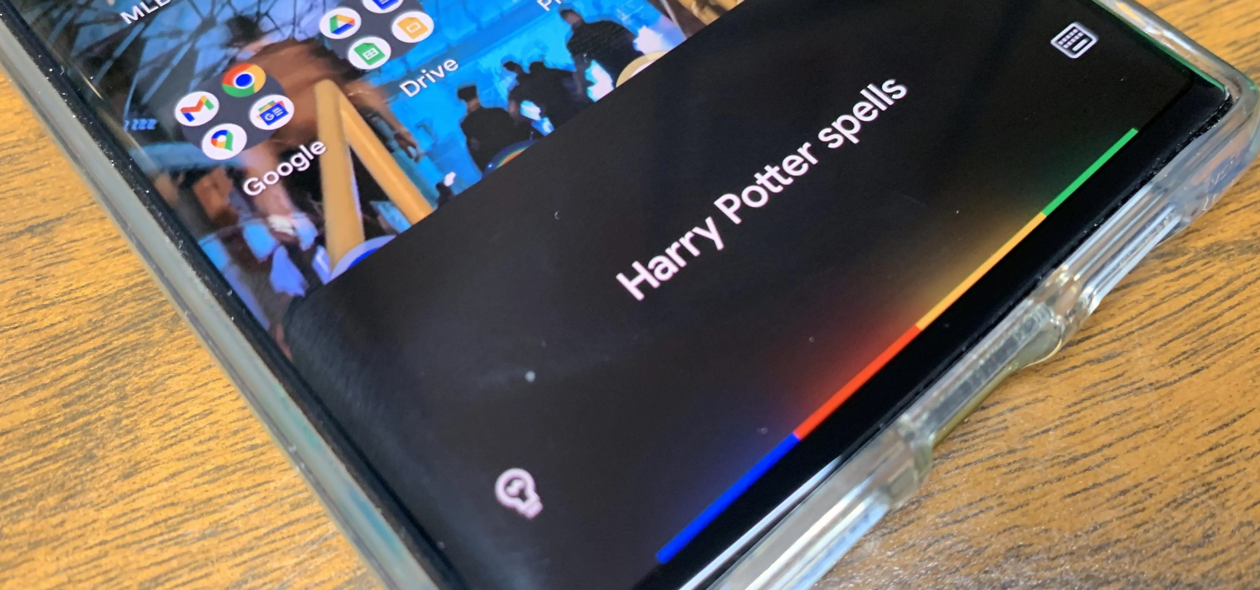
One of the better additions in the stock Android launcher is the Google Now page. Residing to the left of the home screen, this page presents a host of information based on the user's interests, which Google bases on analyzed data. Recently, the Google Now page design received a makeover which Nova Launcher users can now enjoy.
The user interface changes the layout from one long page to multiple pages organize by tabs. The default page is the feed, which displays articles that Google believes align with the user's interest based on previous searches, YouTube watch history, and other data collected by Google.

Before the update (left) and after (right).


Before the update (left) and after (right).

Unlike the previous design layout, the size of the images used in the article will vary, so they can now be displayed to consume a significant portion of the width of the display. They can also show up in small squares, placed to the right of the article headlines.


Additionally, related articles will be paired together, occupying the same card. The linked content will display under the main article, which can be scrolled through by swiping left.
Unlike the previous layout, cards aren't removable using a swipe. The only way to remove a card is to use the vertical ellipsis in the upper right of the card, then choose the option "Hide this story."
For additional cards, users can select the icon to the right of the search bar up top. The Upcoming tab will be displayed which includes cards containing more personal information such as commute times, stock information, and packages. By moving user information to this tab, Google helps hides its contents from unintended eyes.

Once switched to the Upcoming tab, a menu will display along the bottom which allows for further navigation. To return to the feed, select the home icon. To conduct a Google Search, choose the magnifying glass icon.
The fourth icon (the one to the left of the hamburger menu) will bring up a new tab called Recent, which returns to a previous search conducted within the Google app. Each search performed within the app will create a card displaying the search results which can be used to return to the search. Below the cards is the amount of time since the search was last conducted.

Upcoming (left) and Recent (right).


Upcoming (left) and Recent (right).

While this update adds little in the way of new functionality, the new methods of organizing cards improve navigation and increase customer usage. Adding the Upcoming also helps combat one of the main issues I've had with Google Now, which is how it displays private information. What do you think of the new update? Do you like the new look or prefer the old one? Let us know in the comment below.
- Follow Gadget Hacks on Facebook, Twitter, YouTube, and Flipboard
- Follow WonderHowTo on Facebook, Twitter, Pinterest, and Flipboard
Cover image and screenshots by Jon Knight/Gadget Hacks







Comments
Be the first, drop a comment!