Android 9.0 Pie has finally arrived for Galaxy devices like the Note 9, S9, and S8, in the form of One UI. Of course, we've had a good idea as to what Samsung had up its sleeve for some time, thanks in large part to beta versions of the firmware that leaked out well before its official debut. Nevertheless, it's still exciting to experience the new features the software has to offer — with all its kinks ironed out.
The Galaxy's all-important Settings app got a much needed overhaul on One UI, but despite the obvious visual changes, the interface has stayed largely intact to keep confusion to a minimum. In keeping with the new software's design philosophy, the app received several improvements to enhance overall accessibility.
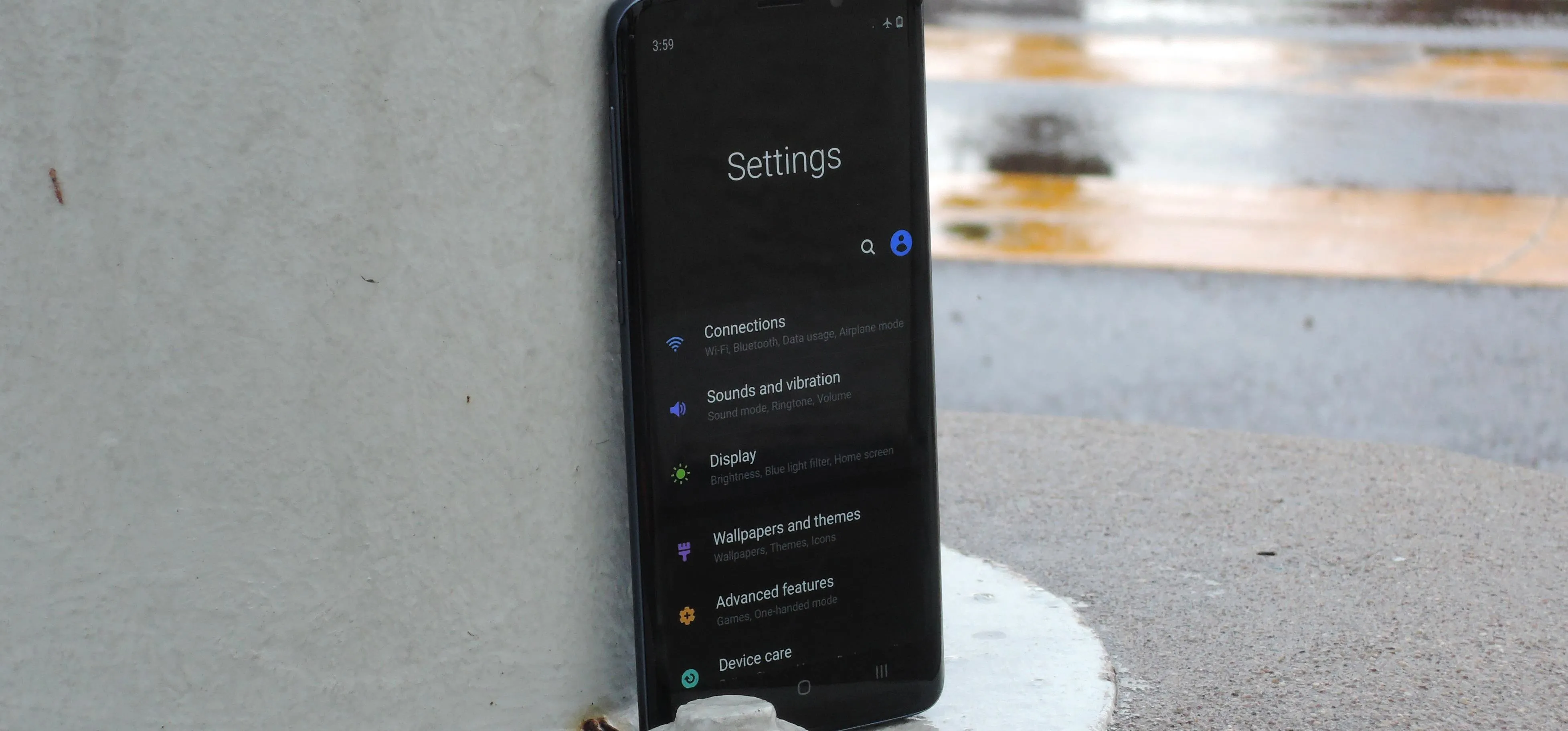
Upon opening Settings, you'll immediately notice the brand new layout, which has ditched the traditional list we've grown accustomed to, and rearranged the options and compartmentalized them into their very own sub-sections. Now individual settings like "Notifications" and "Apps" have been grouped together, which makes more sense, and makes navigating through the Settings app a lot easier.
Another noteworthy change comes by way of the icons, which have been filled in with different colors. This makes them pop out of the screen a lot more compared to the previous design, which makes them easier to spot and select. In addition, many icons have been redesigned and/or renamed to make it less confusing. "Device Maintenance," for instance, has been renamed "Device Care," and had its icon changed from a circle to a less confusing wrench.


As you delve deeper into the Settings app, you'll also find some small but important changes on One UI, with the system-wide implementation of the search function being the most noticeable of all. Besides that, many of the sections have been rearranged as well. For example, the "Do Not Disturb" option, which was previously found within "Sounds and Vibration," has been relocated to the "Notifications" page.


With a system-wide dark theme now officially available for Galaxy handsets on One UI, the Settings app can now be viewed in an aesthetically pleasing shade of black whenever Samsung's very own Night Mode is enabled. And thanks to its pure black background and dark gray boxes, not only do the colorful icons and texts pop out more, it also consumes less battery due to the screen requiring less lighting.


- Follow Gadget Hacks on Pinterest, Reddit, Twitter, YouTube, and Flipboard
- Sign up for Gadget Hacks' daily newsletter or weekly Android and iOS updates
- Follow WonderHowTo on Facebook, Twitter, Pinterest, and Flipboard
Cover image and screenshots by Amboy Manalo/Gadget Hacks













Comments
Be the first, drop a comment!