


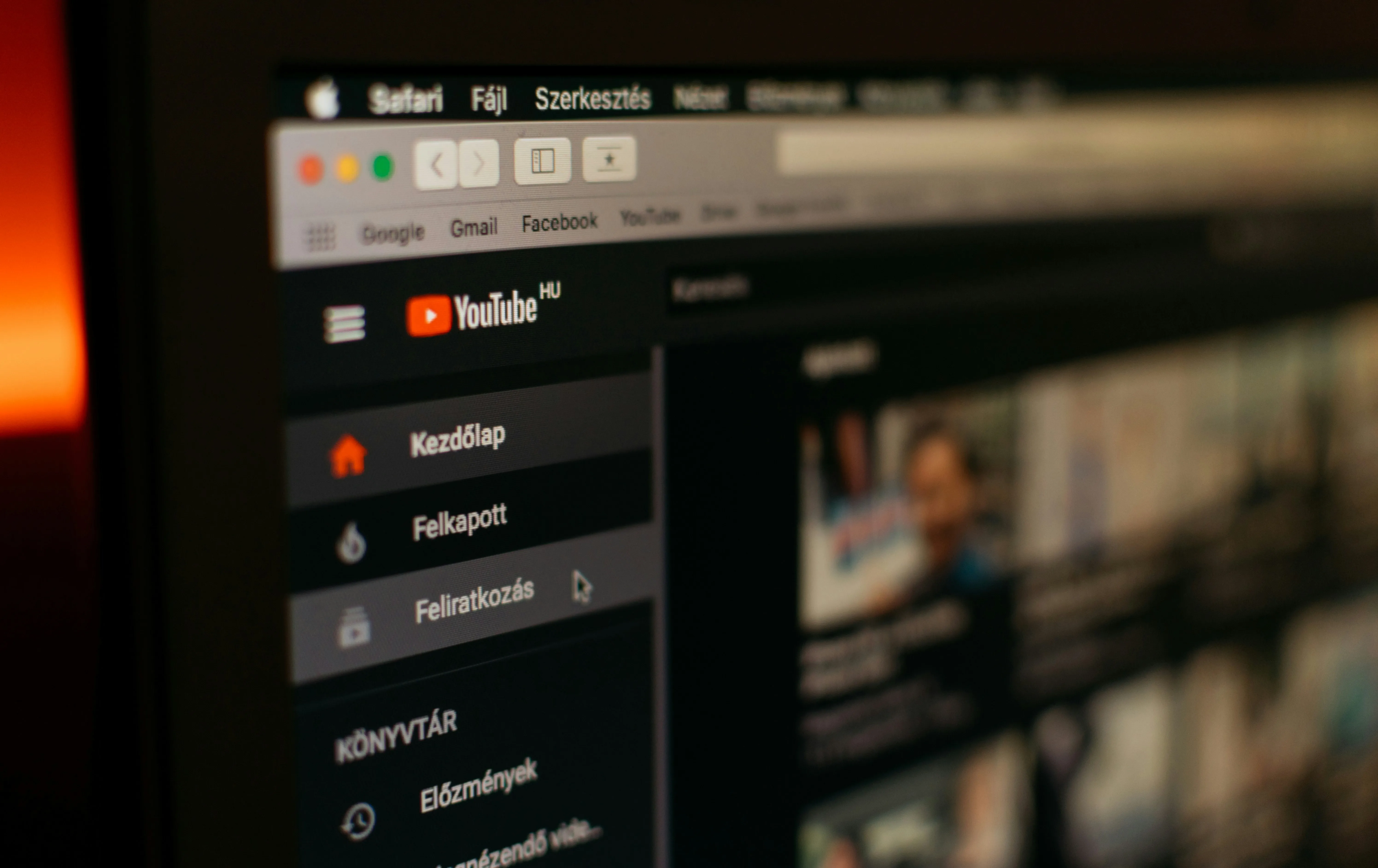
YouTube's transformation is happening right now, and it's bigger than most people realize. The platform has launched multiple interface updates that represent the most significant visual overhaul in more than a decade, according to Tom's Guide. The redesign touches everything, from player controls to how you save and browse, and it landed right after major mobile interface changes that rolled out less than two weeks earlier. The timing isn't a coincidence. YouTube is modernizing its entire ecosystem to create a cohesive experience across devices and platforms.
What's particularly significant is the strategic context driving these changes: TV is now the primary device for YouTube viewing in the US, with viewers watching over a billion hours of content daily on television screens. Design follows the screen. That shift is reshaping how YouTube approaches interfaces across platforms.
What's actually changing in the video player?
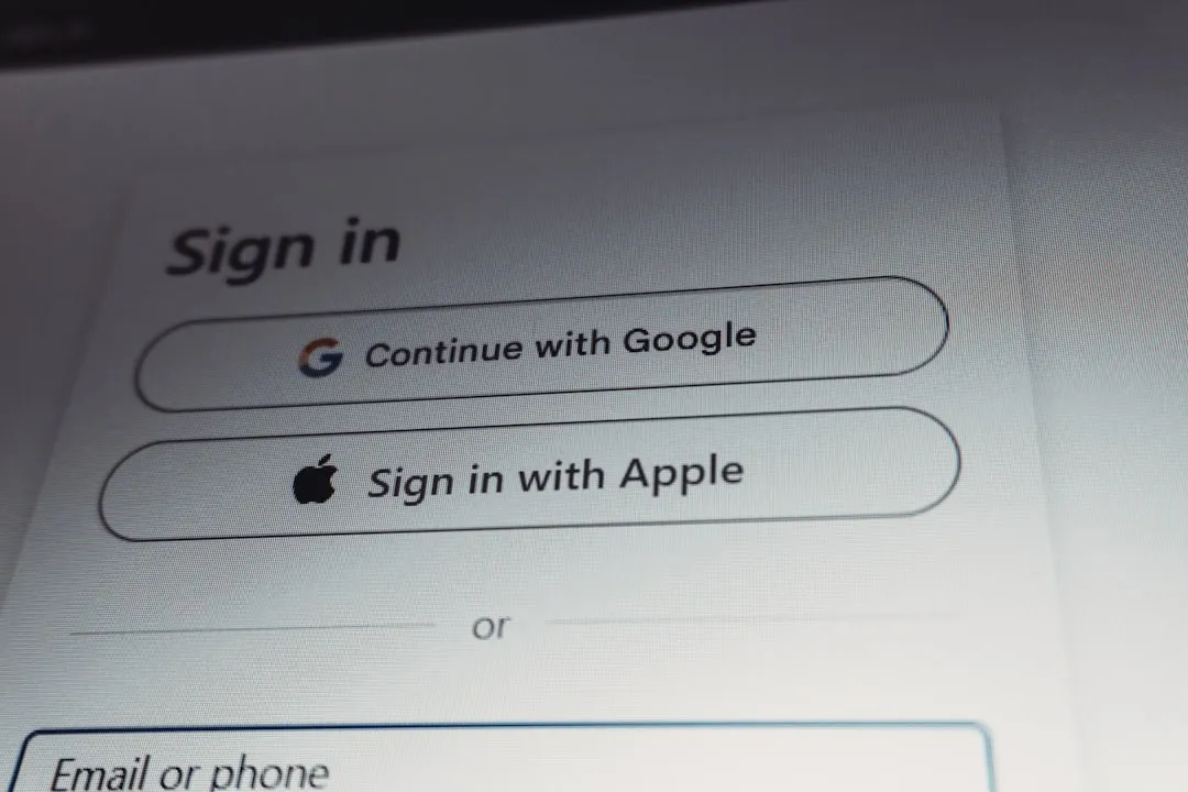
So what jumps out first? Redesigned icons and transparent elements that aim to create what YouTube describes as a more immersive viewing experience. The company calls the update a cleaner and more immersive player, as noted by Tom's Guide.
The new interface draws heavily from Google's Material Design 3 principles, with translucent backgrounds and capsule-shaped buttons that sit more neatly on top of video. The look shifts noticeably, trading flat bars for a more translucent, bubble-like style with clearer outlines.
Instead of simple icons floating on the player bar, controls now live inside distinct circular containers. That is a real break from nearly a decade of muscle memory. Seek controls also get a tune-up, with double-tap actions that YouTube says feel more modern and less intrusive than older methods.
PRO TIP: If you're still adjusting, the keyboard shortcuts you rely on stay the same, spacebar for play or pause and arrow keys for seeking.
YouTube has streamlined playlist management and Watch Later, cutting friction when you organize what to watch next. The changes are not just cosmetic. They reshape daily habits, especially as YouTube optimizes for a growing audience on TV screens.
How are users responding to these changes?
Reactions are split. Reddit communities are voicing confusion and frustration, mostly because familiar controls moved and long-standing workflows feel different.
There are bright spots. Some videos now trigger quick animations when you tap like. Music videos and sports clips show playful touches, and movie trailers swap the thumbs-up for a clapperboard animation.
We have seen this pattern before. Big interface shifts throw off muscle memory, then settle in. YouTube's extended testing and iteration point to a company that will tweak rough edges without abandoning the direction.
The goal is clear: make interactions feel more dynamic and tied to the video you are watching, then let familiarity grow over time.
What's happening with comments and community features?
YouTube has introduced threaded commenting that resembles Reddit's format, changing how conversations unfold under a video. Replies now stack into clearer chains instead of a flat list, so it is easier to follow a back-and-forth without losing the thread.
YouTube explains threading as a way to "provide a more focused reading experience within the replies panel." It is a meaningful shift that should improve quality and readability, especially when videos attract rapid-fire debates.
The redesign also reaches mobile, with tighter transitions between tabs and smoother navigation. It is part of a bigger push to make the experience feel consistent whether you are on a phone, laptop, or TV.
Will it take getting used to? Absolutely. But it tackles one of YouTube's longest-running pain points, messy comment organization.
Why is YouTube making these changes now?
The timing reflects a platform two decades in, adapting to a viewing world that looks nothing like 2005. YouTube has had the highest streaming watch time in the United States for two years running, according to Nielsen data.
This is the most comprehensive visual update since YouTube's early years, and it reaches beyond looks. Interaction patterns are shifting too. The approach lines up with broader Google changes, and we are seeing similar design philosophies in Google Drive, YouTube TV, and other Google products.
The rollout uses extensive A/B testing with limited user groups, so features can be refined or even pulled based on real use. That is standard Google practice. It also makes this wave of releases a strong signal of what will likely stick.
Bottom line, YouTube is aligning with the reality that TV viewing now dominates. That billion-hours-a-day habit on television screens sets the target. The redesign positions the platform for life on big displays, where interactions feel different than on desktop or phone.
Where does YouTube go from here?
This visual overhaul is the opening move, not the endgame. More updates are slated for smart TV interfaces and mobile apps throughout the year, all in service of a single, consistent feel.
With YouTube TV surpassing 8 million subscribers and YouTube Music & Premium reaching over 100 million subscribers, YouTube is operating as a full entertainment ecosystem, not just a video site. The interface work helps stitch those pieces together.
The commitment looks firm. Testing has been lengthy, refinements steady, and the company appears willing to smooth out rough spots while keeping its direction. Odds are these designs will become the default, even if early pushback stays loud for a while.
Expect user feedback from these first waves to guide what comes next. The strategy is obvious, YouTube is designing for a world where it is the primary video destination across devices, and these changes set it up for another decade of growth.
Takeaway: change stings at first. But with steady iteration and real-world feedback, these updates should end up helping more than they hurt once people settle into the new rhythm. The shift mirrors YouTube's evolution from a scrappy video site to the center of digital entertainment.


Comments
Be the first, drop a comment!