


Reviewed by Corey Noles
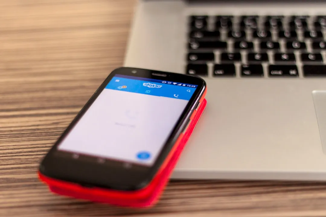
Something feels different when you type on Android lately—and I'm not talking about another autocorrect mishap. After months of testing Gboard's latest beta builds on my Pixel 8 Pro, that subtle shift in visual consistency finally clicked. This isn't just another incremental tweak buried in a server-side update. What we're witnessing is Android's most ambitious design overhaul quietly infiltrating the interface you touch hundreds of times daily.
Here's the thing: Google's research team spent three years and tested with over 18,000 participants to create Material 3 Expressive, and your keyboard has become the testing ground for Android's visual future.
What you need to know:
Gboard's latest updates finally unified those chaotic Dynamic Color themes into something that actually looks intentional
The changes hint at the broader Material 3 Expressive rollout coming with Android 16 later this year
Google's research shows users spot key UI elements up to 4x faster with expressive designs—and that speed boost starts with your keyboard
This seemingly minor keyboard refresh is your preview of a system-wide visual overhaul that promises to make Android feel more intuitive and emotionally engaging
Why Gboard's color chaos finally makes sense
Let's break down what's been driving Android users quietly crazy for months. Picture opening a quick text message: your brain subconsciously processes the letter keys in one shade, shift and backspace in another, the enter key in a third color, and the ?123 button in yet another. That's four different color schemes your visual cortex had to parse before you'd typed a single character—exhausting your mental bandwidth on interface navigation rather than actual communication.
Gboard's Dynamic Color theme previously embodied this exact problem. The keyboard felt like a committee of designers couldn't agree on basic color logic, which—let's be honest—they couldn't. After tracking Material Design's evolution since its 2014 launch, this represents the first time Google has systematically addressed the visual inconsistency that made even their flagship apps feel fragmented.
The latest beta version 14.7.10.x transforms this mess into something that actually improves your typing flow. All non-letter keys—shift, backspace, enter, and the rest—now share unified colors that create visual groupings your brain can process instantly. After two weeks testing this setup, the most striking change isn't aesthetic—it's cognitive. My typing rhythm improved because I wasn't subconsciously fighting four competing color schemes.
Even the 2×2 grid icon ditched its circular container for a filled design that matches the accent key family. It's the kind of systematic thinking that signals Google is finally serious about interface cohesion across their ecosystem.
The expressive revolution hiding in your keyboard settings
This keyboard refresh isn't random experimentation—it's your preview of Android's most ambitious design overhaul yet. Material 3 Expressive represents what Google describes as "the most-researched update to Google's design system, ever," backed by 46 separate studies involving over 18,000 participants worldwide.
What makes this different from previous Material iterations? It's specifically engineered for emotional connection. Google's research team discovered that expressive designs using strategic color, varying shapes, and thoughtful sizing help users navigate interfaces dramatically faster. In controlled testing, participants spotted key UI elements up to 4x faster compared to current Material 3 designs.
This 4x speed improvement isn't just about efficiency—it fundamentally changes how Android feels to use. Instead of fighting your interface to find the send button or settings toggle, expressive design guides your attention naturally to where it needs to go. The unified Gboard colors you're seeing implement exactly these research findings: creating visual hierarchy that works with human cognition rather than against it.
Material 3 Expressive introduces expanded color palettes, adaptive components, and what Google calls "springy animations" that make interactions feel more natural and emotionally resonant. Your keyboard's streamlined theming is preparing your muscle memory for these broader system changes.
More than colors: what's actually changing under the hood
The visual tweaks represent just the surface transformation. Recent Gboard beta releases have been testing more fundamental structural changes: pill-shaped keys replacing rectangular ones, updated animation physics, and experimental layouts like ClearFlow that puts space bars on both sides of the keyboard.
Version 15.1.05 introduced dramatically rounded, almost circular keys for beta users—a significant departure from the rectangular design we've used since smartphones began. The fact that there's currently no toggle to revert suggests Google is confident enough in this direction to remove user choice, at least during testing phases.
These represent more than aesthetic preference—they're testing whether Android users prefer iOS-style visual consistency over Google's traditionally flexible approach. The rounded keys, unified colors, and adaptive spacing align perfectly with Material 3 Expressive principles that emphasize shape variety and containment as key tools for creating more engaging interfaces.
After testing the rounded keys for several weeks, the transition feels surprisingly natural. The circular shapes actually improve touch accuracy on smaller screens, while the unified color system reduces the visual noise that made typing feel more effortful than it should.
When your keyboard becomes the canary in the coal mine
Here's the kicker: keyboards see more daily interactions than any other interface element—if unified theming works here, it'll work everywhere. Android 16 is expected to launch with full Material 3 Expressive integration, bringing these design changes to system UI, quick settings, and the notification shade.
We're already seeing coordinated testing across Google's app ecosystem. Gmail is experimenting with M3E redesigns and Google Messages is testing pill-shaped containers for message threads—the same visual language emerging in your keyboard.
Google's research found that expressive interfaces boosted brand perception significantly: 32% increase in "relevance," 34% boost in "modernity," and 30% jump in "rebelliousness." Translation: they're betting that bolder, more distinctive design will position Android competitively against iOS's design cohesion advantage.
The Android 16 QPR1 beta already shows updated notification tiles that can switch between compact and expanded layouts, plus new "Pixel Themes" that apply comprehensive visual changes with a single tap. Your keyboard's unified appearance is conditioning you for this more systematic approach to Android theming.
What this means for your daily Android experience
The Gboard refresh currently rolling out through server-side updates represents more than aesthetic polish—it's Google's commitment to interfaces that actually help you accomplish tasks faster. The research backing Material 3 Expressive demonstrates this isn't about looking different; it's about working better.
These subtle changes compound throughout your daily workflows. Unified colors reduce visual noise, letting you focus on content rather than parsing interface elements. The improved visual groupings mean less cognitive overhead when switching between typing modes, and the systematic approach to theming creates muscle memory that transfers across apps.
If you're running Gboard version 14.9 or later and haven't seen the unified colors yet, try force-stopping the app and switching between light and dark system themes to trigger the update. The changes feel subtle but meaningful—exactly the kind of refinement that makes daily interactions more fluid without disrupting familiar workflows.
PRO TIP: Keep an eye on your other Google apps over the next few months. Material 3 Expressive is planning coordinated updates across Photos, Gmail, and other first-party apps to match Android 16's new visual language.
This keyboard refresh offers your first taste of Android's more expressive future—one engineered to be more intuitive, more visually engaging, and finally, more consistent across Google's ecosystem. After years of fragmented Material Design implementations, it appears Google has cracked the code on unified visual experiences that actually improve how you interact with your device.


Comments
Be the first, drop a comment!