


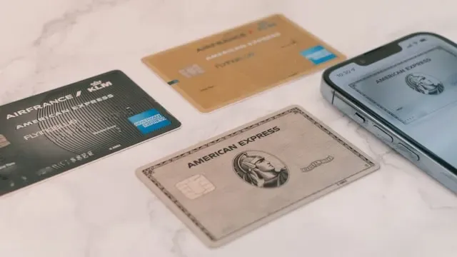
Looking at the sticker price for American Express's Platinum card, you'd expect some pretty impressive perks when you're shelling out nearly $900 annually. Free airport lounge access? Absolutely. Hotel upgrades and solid dining credits? You bet. What you probably wouldn't expect is that one of the "premium" features you're paying for is the ability to make your mobile app a slightly darker shade of blue.
Yet here we are. American Express recently bumped its annual fee to $895, up from the previous $695, and among the new perks is what it calls a "newly enhanced" mobile app experience. Platinum cardholders can now switch their app theme from navy blue to a darker black theme, essentially a premium dark mode that costs nearly $900 annually to access.
(AmEx says the new $895 fee applies immediately to new cardmembers and takes effect for renewals on Jan. 2, 2026.)
So, what does it say when Instagram, X (formerly Twitter), and most banking apps offer dark mode for free, while American Express treats it like a luxury?
The $900 dark mode: What you're actually getting
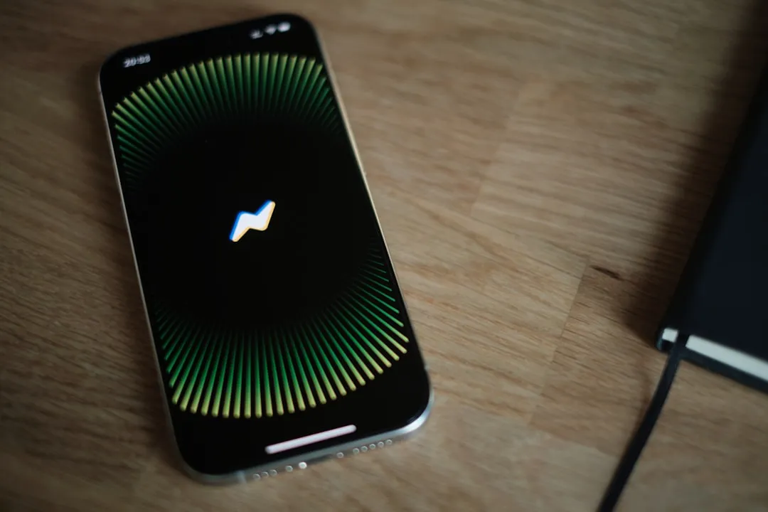
Let's get specific. American Express describes a new 'Premium Theme' that gives Platinum cardholders a true-black interface (a cosmetic, theme-only option tied to Platinum membership). According to reports, the change is subtle and easy to miss, especially if your phone is in iOS Light mode.
The reality check? Beyond background colors, there appears to be no other discernible difference. It is a cosmetic tweak, the darkness of your app, and nothing more.
But to be fair, American Express did not raise fees just for a dark theme. The new perks package includes a $300 Lululemon credit, a $400 Resy restaurant credit, a $120 Uber One credit, a $200 Oura Ring credit, and a hotel credit bumped from $200 to $400 per year. For many cardholders, those benefits alone can justify the annual fee.
Still, the positioning is telling. Chase, Bank of America, and Wells Fargo ship full dark modes as standard across mobile. Social apps like Instagram and X (formerly Twitter) did it years ago. By treating app theming as a Platinum differentiator, American Express is signaling that mobile customization is a competitive lever worth paying for.
The timing adds context. Apple and Google made dark mode official in 2019, and more than 80% of Android users use it regularly. What felt cutting-edge half a decade ago now reads as basic UX.
Why dark mode matters more than you think
Before writing this off as corporate theater, remember why dark mode stuck. People prefer choice. More than 65% of people want both modes available, and 82% use dark mode at least sometimes. In finance, that preference shows up in the numbers: Apps with dark mode see 18% better one-month retention, and websites with a dark option hold attention about 14.5% longer.
There are practical wins too. Dark mode can reduce eye strain by up to 65%, especially at night when people check balances and statements. On OLED screens, it can save 30% to 60% battery life, which matters if you dip into your credit card app all day.
Good dark mode is not just inverted colors. It takes nuance, from dark grays for backgrounds to softened whites for text, with brand colors tuned for contrast. A 2021 study from the University of Tübingen found reading speed can drop 20% to 26% in dark interfaces, especially for longer text, making implementation quality critical in financial apps where details matter.
That complexity might explain why American Express views its version as premium-worthy, but it also raises the question: Is this a luxury flourish or an accessibility baseline?
The broader trend in app monetization
American Express's move fits a larger shift in mobile strategy beyond tech companies. Studies show mobile app revenue is rising across segments, and most customers spend over 90% of their device time in apps.
Here's the twist: American Express is layering a freemium-style idea onto a premium card. The freemium model dominates popular apps, where the basics are free and extras cost money. Netflix gives you the app for free but charges for content. Spotify lets you listen for free but charges to remove ads. American Express gives a basic app to everyone and folds enhanced customization into an $895 annual fee.
Unlike traditional app makers, the company is not selling into a market where 97% of apps on the Google Play Store are free. It operates in premium financial services, where paying for an enhanced experience is already normal. The open question is whether app theming belongs in that tier.
There is also the retention angle. App monetization strategy now rides on user experience quality. A better app keeps customers and lowers acquisition costs. If exclusive app perks cut churn, the bet can pencil out, even if the features themselves do not feel worth $200 a year.
What makes this stand out is the competitive context. Many banks ship comprehensive mobile features at no extra charge, while American Express is testing whether customers will accept paywalled differentiation in areas that usually come standard.
What this means for Android users and the broader ecosystem
From an Android point of view, the move feels at odds with the platform's philosophy. Android supports broad customization and flexibility, and most in-app ads on Android tend to be non-intrusive and easy to tailor. Charging for a basic UI preference cuts against that open, make it yours ethos.
Which is why this lands with extra irony. American Express has a genuinely strong app. It ranked No. 1 out of 11 major issuers in the J.D. Power 2024 U.S. Credit Card App Satisfaction Study. The app covers the bases, account overviews, and bill pay, rewards management, digital wallet support, plus tools like "spending power" for pre-approving big purchases.
That quality makes the dark mode paywall feel odd, not justified. When about 76% of major websites offer dark mode by default, limiting a basic accessibility option reads like artificial scarcity.
There is a broader accessibility concern, too. With over 2.2 billion people worldwide living with some form of visual impairment, features that ease reading and reduce eye strain are not just nice to have. In financial apps, they are part of responsible service design.
Where do we go from here?
The American Express dark mode debate exposes a larger tension between premium branding and modern UX norms. Yes, the credit and travel benefits can justify the annual fee. Framing basic UI customization as Platinum only, though, points to a trend that is hard to cheer.
Dark mode has evolved from vibe to utility, a tool for comfort, accessibility, and efficiency. When established companies turn standard UX improvements into premium perks, they hint at a future where accessibility is an upsell.
Competitors will set the tone. If this lands without backlash, others may follow with their own gated features. If rivals emphasize full-featured, free app experiences, American Express risks having its dark theme seen as a limitation, not a luxury.
The bigger worry is the precedent for essential services. Finance apps are not entertainment; they help people manage real-life obligations. When usability and accessibility get segmented into paid tiers, that is a red flag for the industry.
For Android users in particular, it tests the platform's culture of open customization. Whether Google or the broader ecosystem pushes back is an open question, but it is one worth watching.
Bottom line, American Express can defend the price with rich travel and credit perks, but leaning on basic UI accessibility as a premium differentiator shows how standard UX gains are being recast as monetization opportunities. The math might work, but the message is another story.


Comments
Be the first, drop a comment!