Google's been using their "Material Design" look in Android for years now, but a change is coming up with "Material Design 2," their updated version focusing on new colors, icons, and spacing. Whether it'll be called "Material Design 2" or not remains to be seen, but you can try it out right now in Google Chrome on your Android device right now.
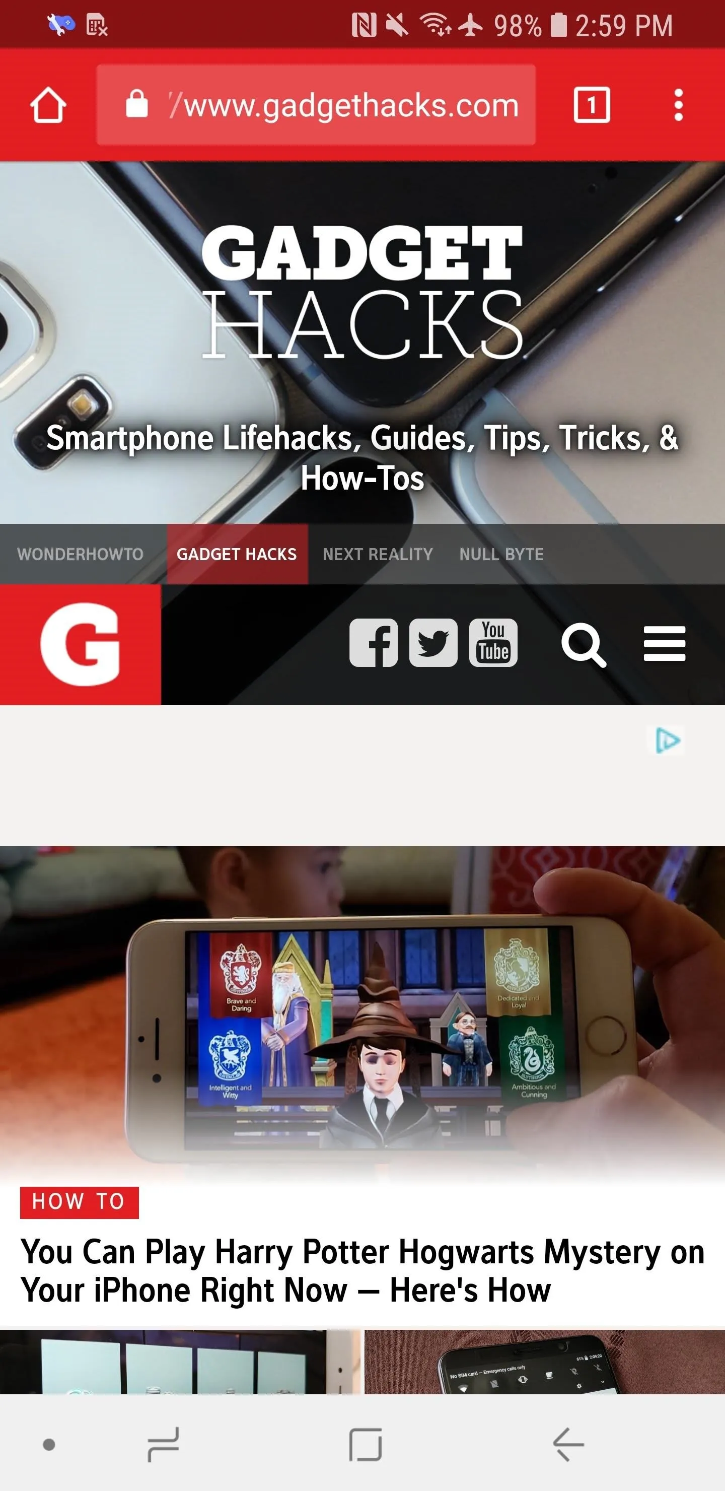
The new user interface design is being referred to as "Modern Design" right now inside Chrome, and it features rounded corners for certain elements such as the URL bar and icons, the status bar blends in perfectly with the current webpage's color, and there's a slightly revamped tab switcher.
You can expect this look to be pushed out to the stable version of Chrome sometime in the near future as the default look, but until then, you can unlock it right now on Android phones and tablets.
Previously, you had to install the beta, developer, or canary version of Chrome in order to unlock this feature, but the stable version of Chrome can now access it too — just make sure your Chrome version is 66.0 and higher. If you're still running a 65.0 build of Chrome, you'll need the beta, dev, or canary version instead.
Enable the Hidden Flag
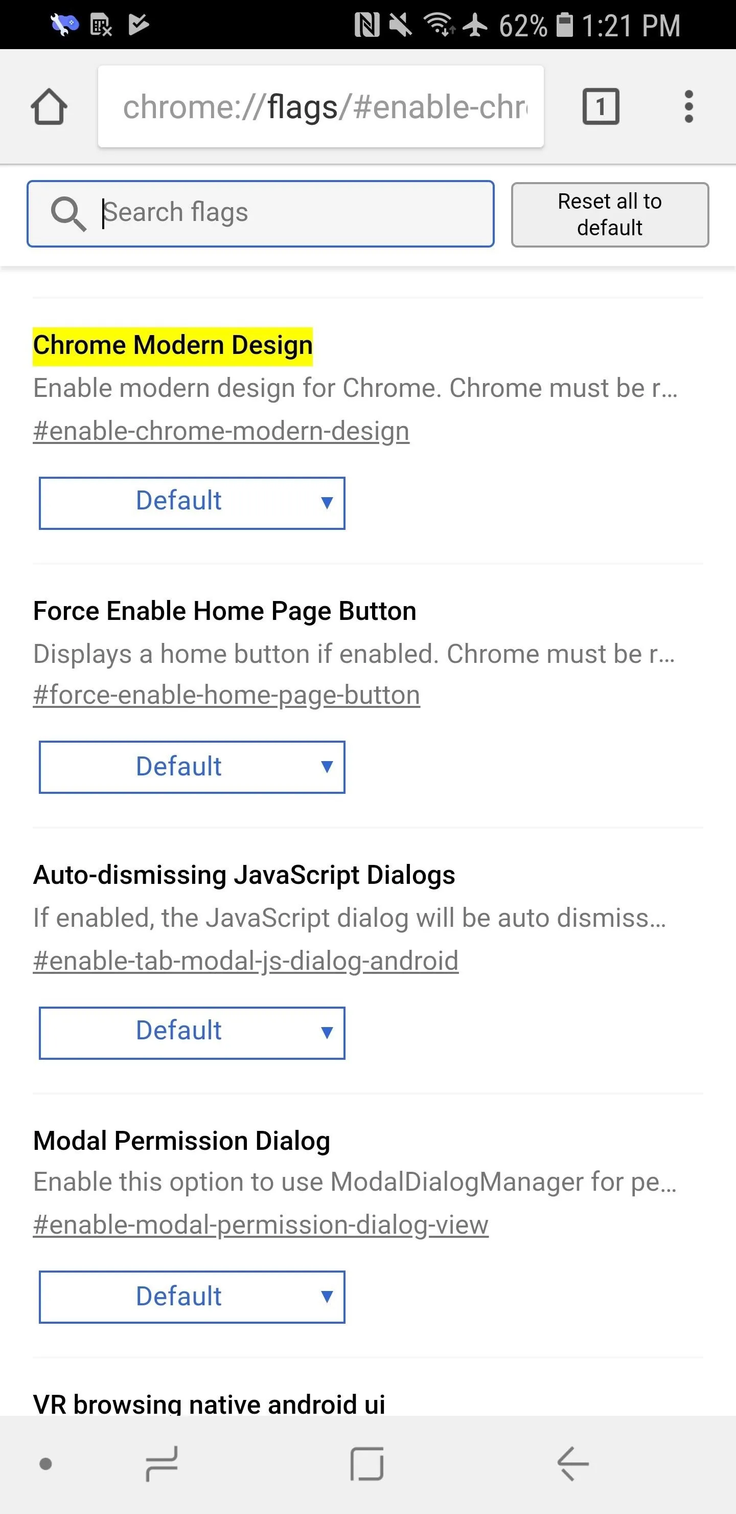
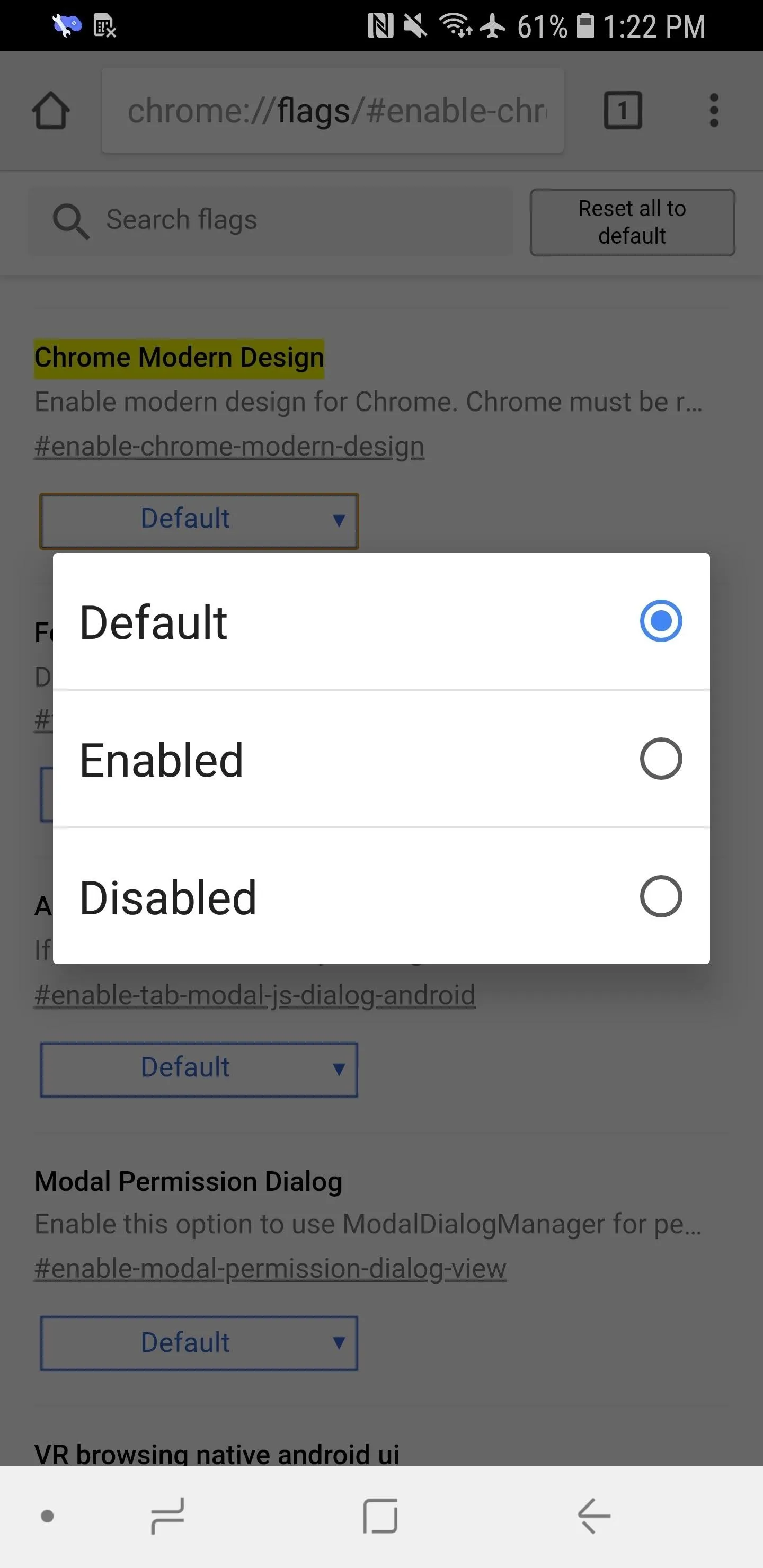
Open up Chrome on your smartphone, then find the "Chrome Modern Design" option in Chrome's flags menu. You can reach the flags menu by going to chrome://flags in the URL bar, then you can search for "Chrome Modern Design" from there. Alternatively, you can just go directly to the right flag with chrome://flags/#enable-chrome-modern-design. Under the option, tap on the drop-down menu that says "Default," then select "Enabled."


Relaunch Chrome (Twice)
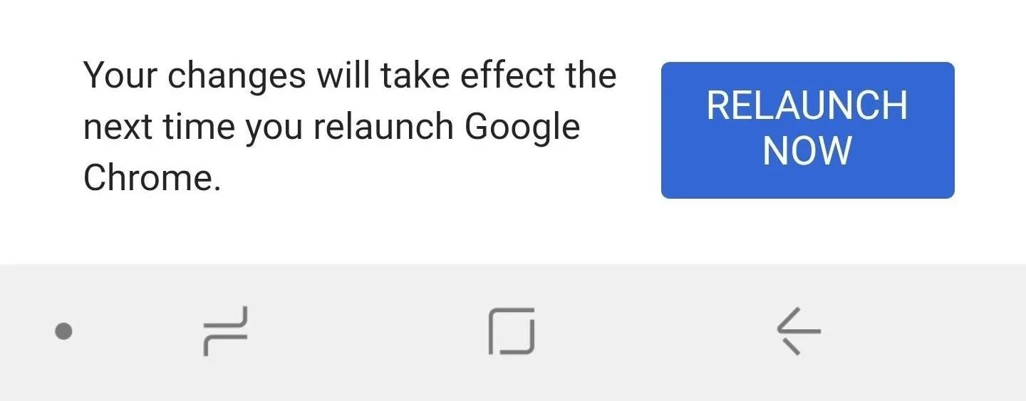
Afterward, tap on "Relaunch Now." After relaunching Chrome, you might not notice a change right away, and that's because this tweak actually requires you to restart Chrome twice. So close out Chrome from your app switcher, then open it back up, and you should see the new look right.
Because this is currently in the Beta channel, you can expect it to roll out to the stable version of Chrome in the near future. Keep in mind that if you have a variety of non-stable channels installed on your Android phone, you'll need to enable the look for each if you want.
What Changes to Look Out For
To give you an idea of what you'll be getting with the new "Modern Design" or "Material Design 2" look in Chrome, here's what a webpage looks like with and without it enabled. You can see the status bar is the same color as the page's color now, the URL bar is rounded, and the tab icon is also rounded.
Before applying the Material Design 2 look (left) and after (right).
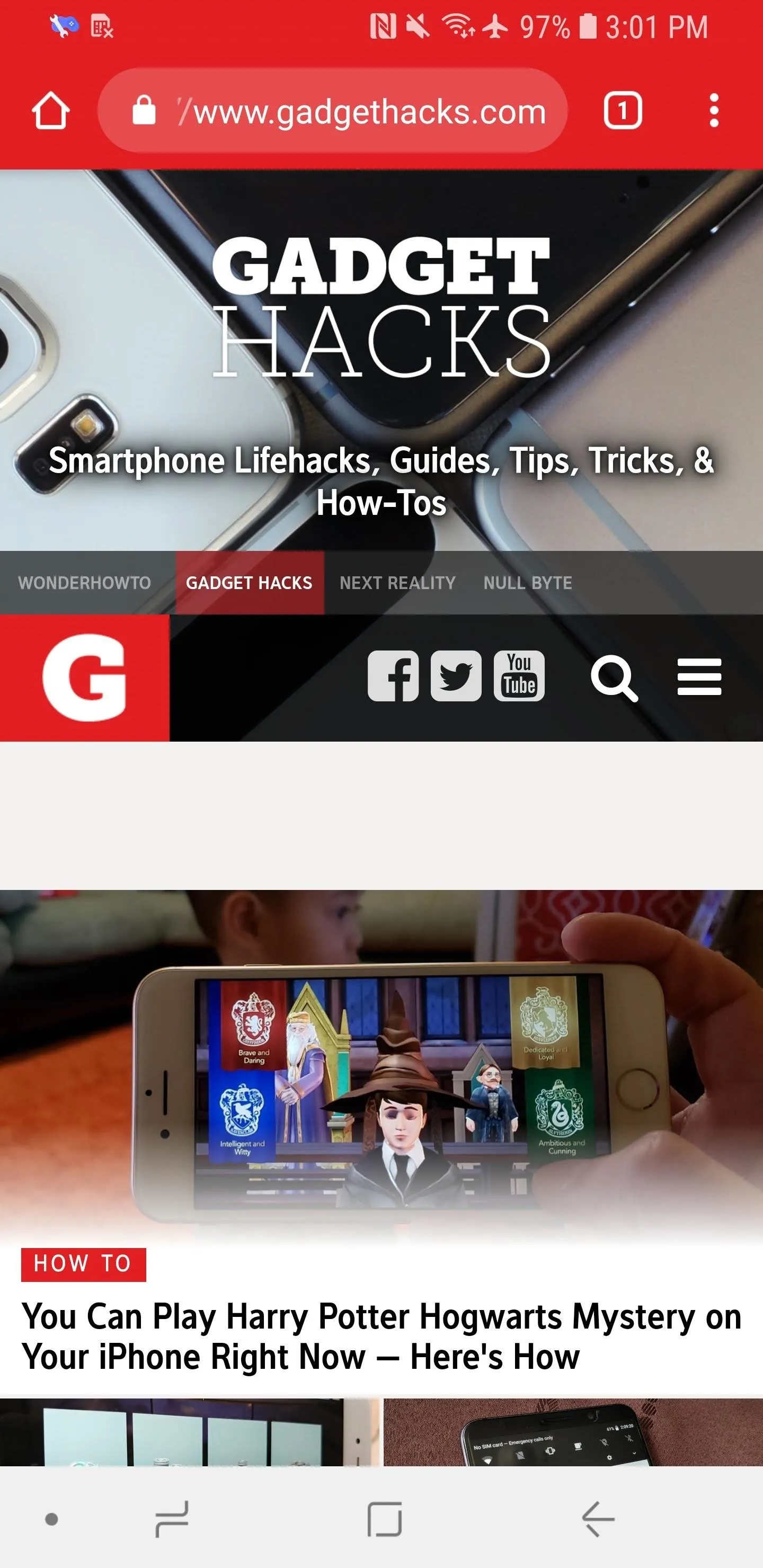

Before applying the Material Design 2 look (left) and after (right).

As for the tab switcher, it now has a white background (that also blends in with the status bar) instead of black, and the tabs button is rounded, just like as above.
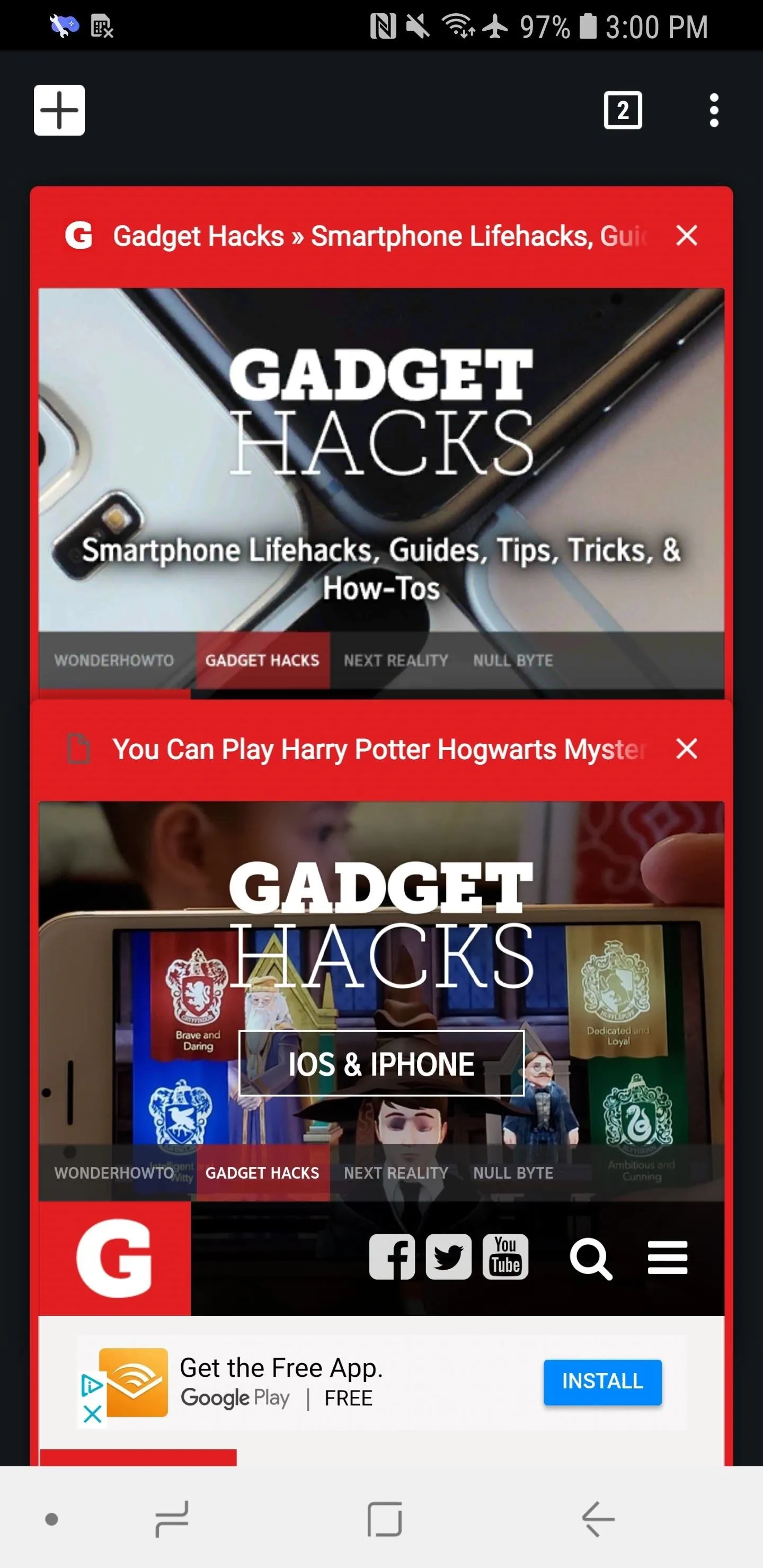
Before applying the Material Design 2 look (left) and after (right).
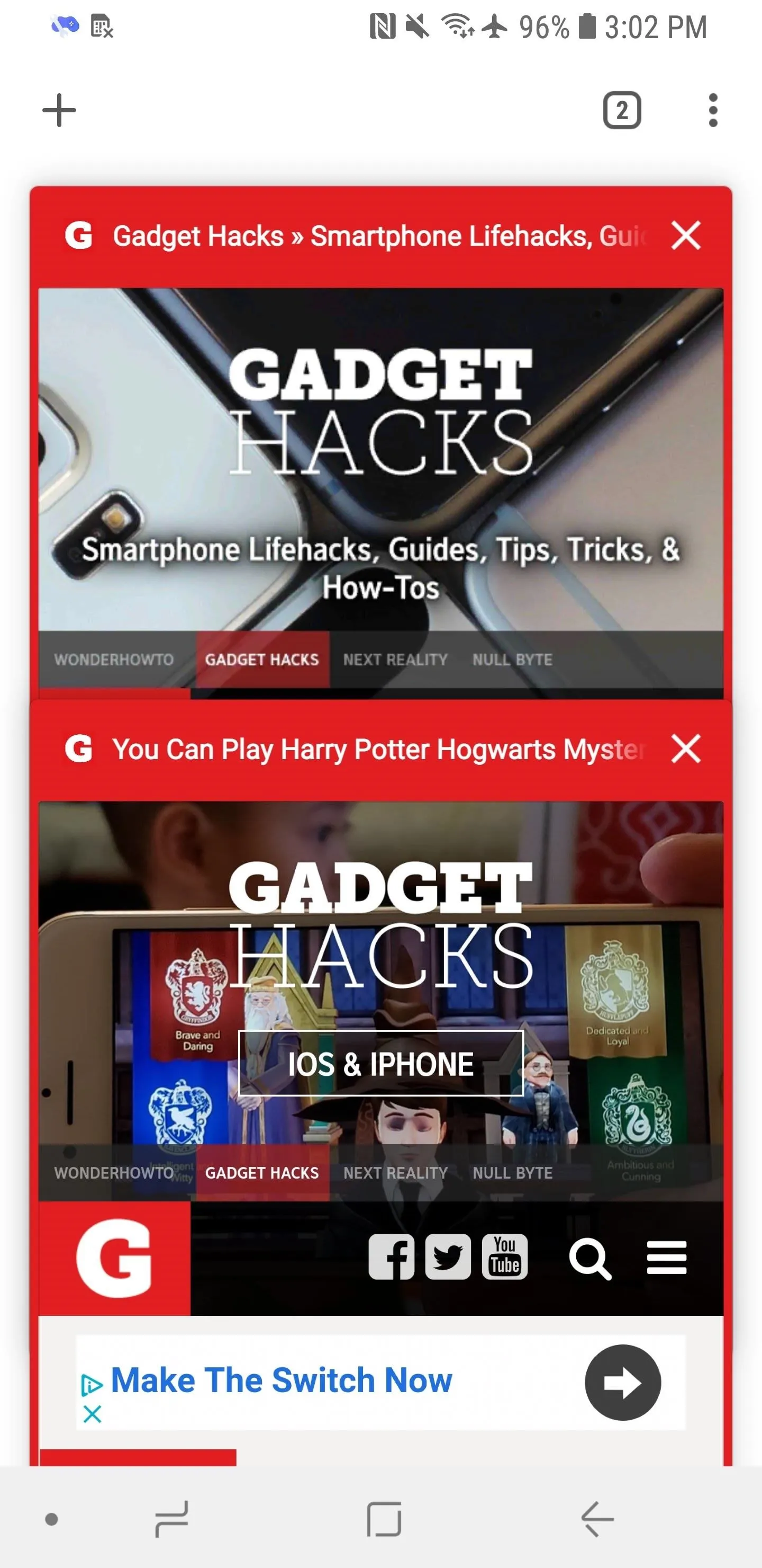

Before applying the Material Design 2 look (left) and after (right).

They aren't huge changes to the UI, but the changes are just enough to keep me happy. I actually hope this will be becoming the default look sooner rather than later, but only time will tell.
- Follow Gadget Hacks on Facebook, Twitter, YouTube, and Flipboard
- Follow WonderHowTo on Facebook, Twitter, Pinterest, and Flipboard
Cover image and screenshots by Brian Lang/Gadget Hacks







Comments
Be the first, drop a comment!