The Pixel 2 has finally arrived. Google unveiled their newest flagship phones on October 4th, and there's quite a few changes in store. For one thing, most of Google's official renders have already showed us something new: The Pixel 2 and Pixel 2 XL will have a Google Search bar at the bottom of their home screens.
With the search bar now integrated into the dock, you won't have to reach to the top of the Pixel 2 XL's rumored 18:9 aspect ratio screen when you want to search for something. Having it tucked neatly between your dock icons and the navigation buttons will make it a lot easier to access information.
The new Pixel Launcher hasn't leaked yet, but in the meantime, you can recreate its look and functionality using Nova Launcher. You'll have to reorganize a few things, and it's not a perfect replica, but I'll show you how it works below.
Enable the Swipe-to-Open App Drawer Gesture
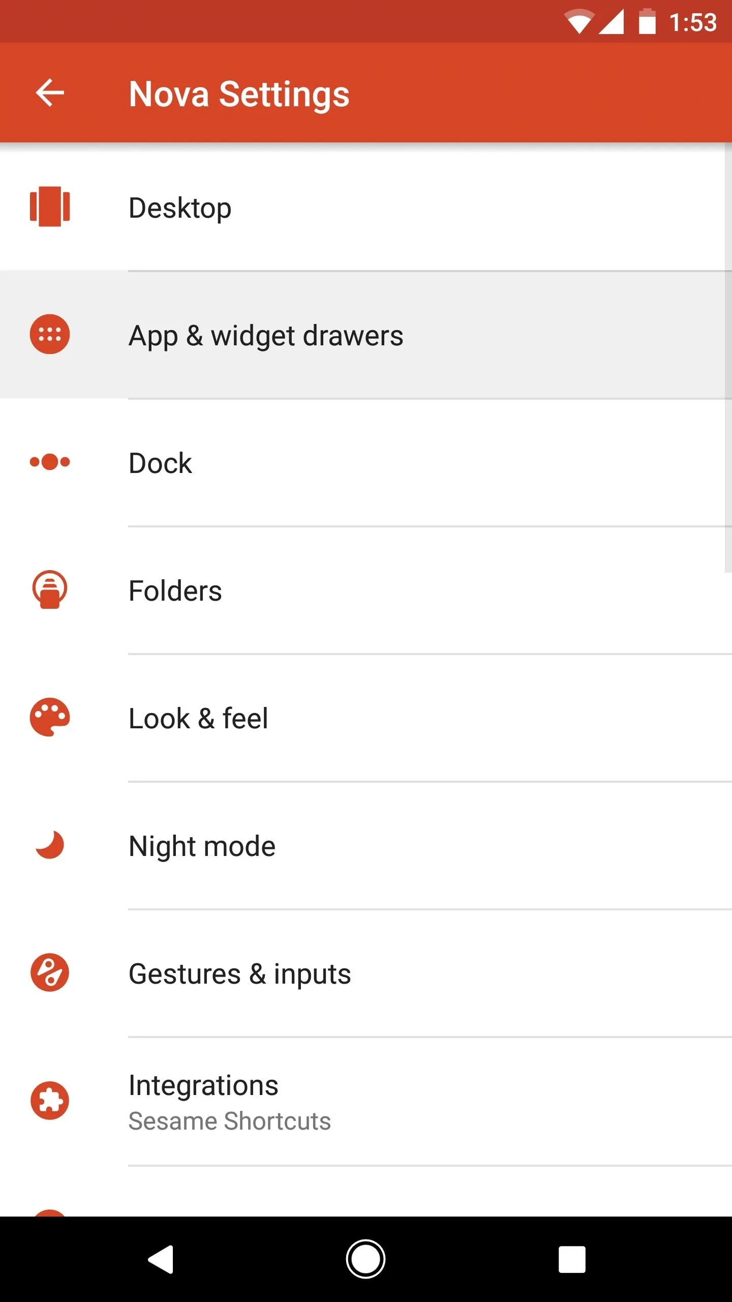
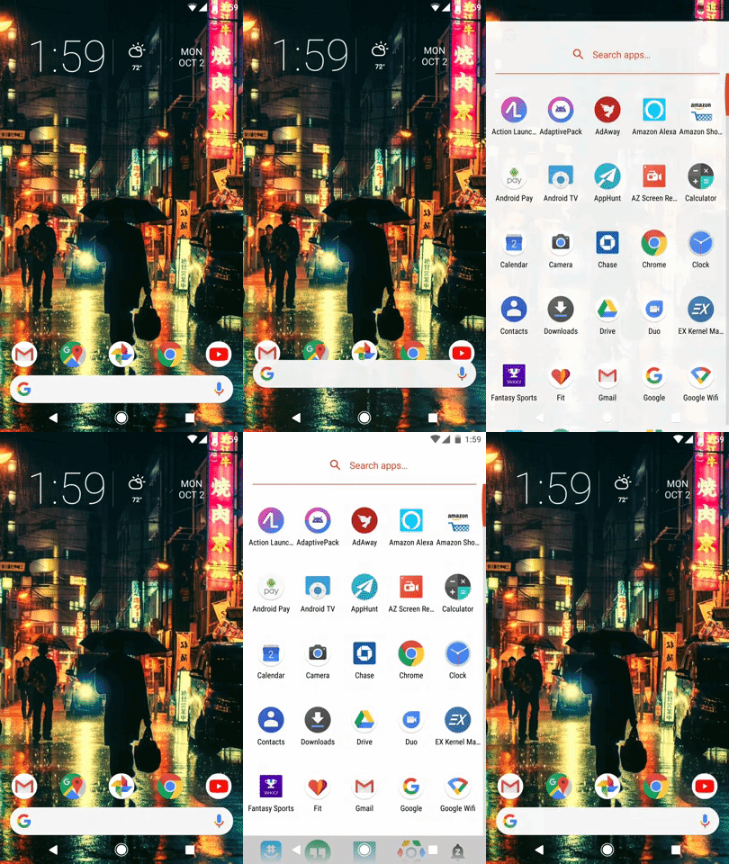
First, since the Pixel's new home screen doesn't have room for an "All Apps" button, you'll need another way to open your app drawer. The way the Pixel handles it is by swiping up from the dock, which is a really natural-feeling gesture. Nova actually has an option that lets you do just that.
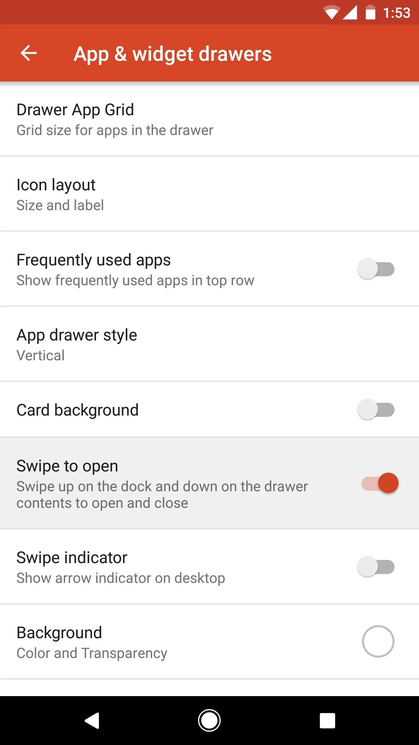
So long-press any empty space on your home screen, then tap the settings cog to head to Nova's main settings menu. From there, select "App & widget drawers," then scroll down and enable the switch next to "Swipe to open." While you're here, you'll probably want to disable the "Swipe indicator" option, too, since that would otherwise clutter the look of your revamped home screen.


Remove Icons from Your Dock & Delete Their Names
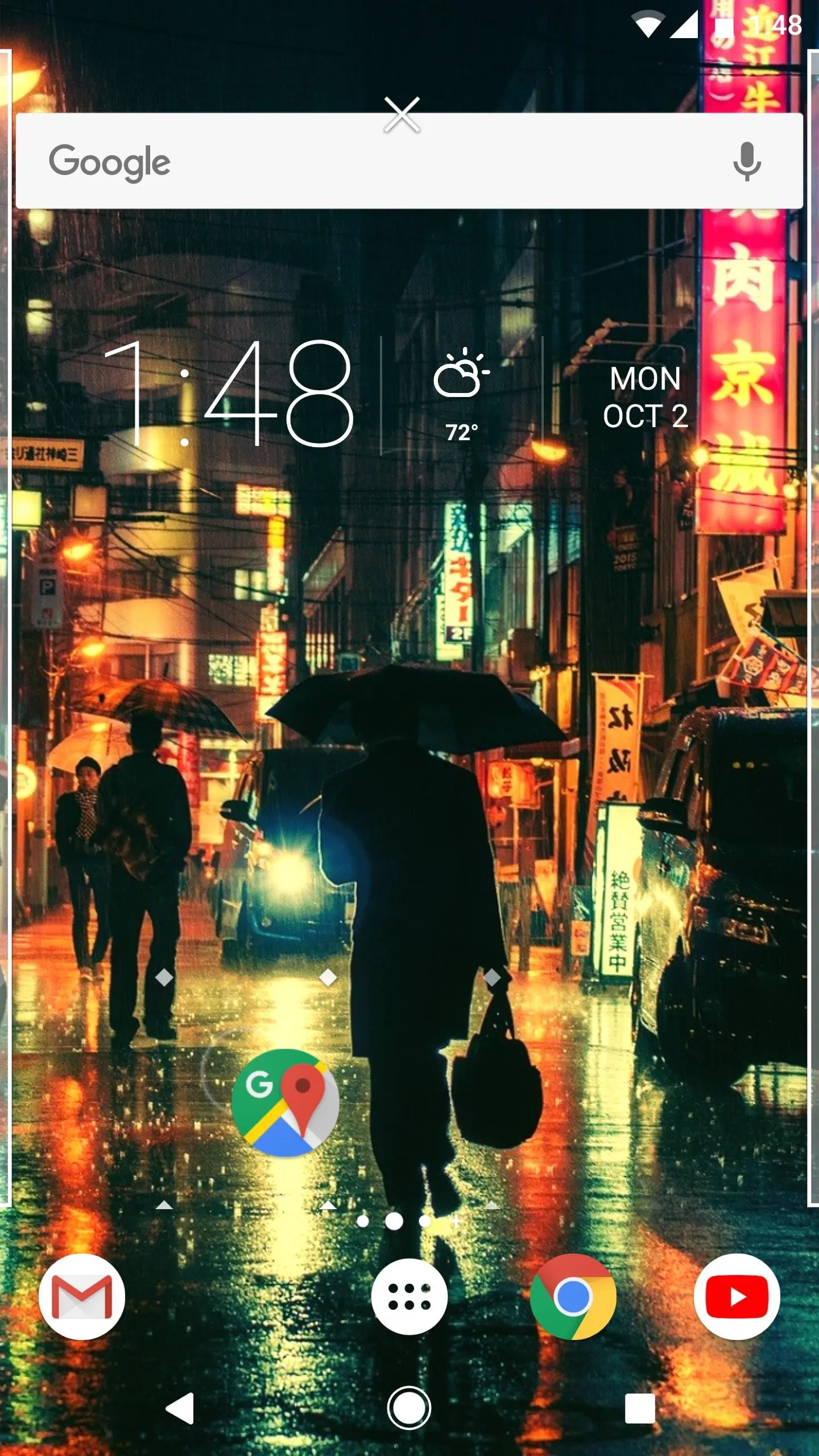
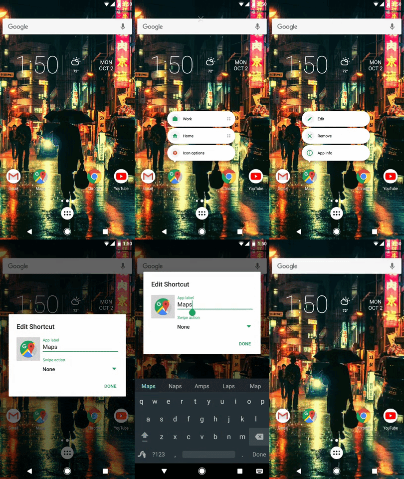
Next up, you'll need to remove all of the icons from your dock. So long-press each icon, then drag them all out one-by-one. When you're done there, long-press each icon again, but this time, choose "Icon Options" from the pop-up menu. From there, tap "Edit," then delete the name in the App label field.


Remove the All Apps Button
When you're done removing icons from your dock, you'll also need to get rid of the "All Apps" button. This one is slightly different from the rest — for some reason, you have to long-press the icon for a full three seconds before you see the pop-up menu. When you do, however, just press "Remove" to get rid of it.



Tweak the Search Widget & Move It to the Dock
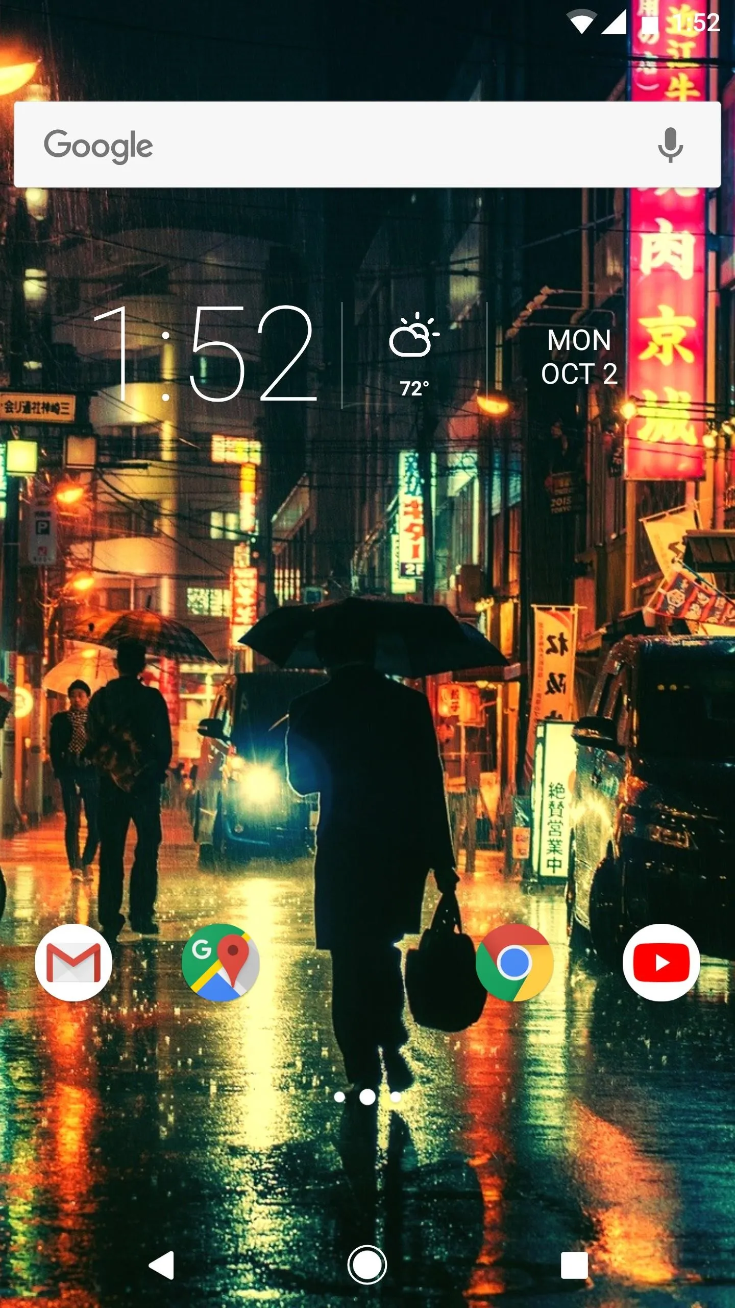
You may have noticed this in the renders at the top of this article, but the Google Search bar on the new Pixels is rounded with a colorful "G" logo. You can also emulate this in Nova.
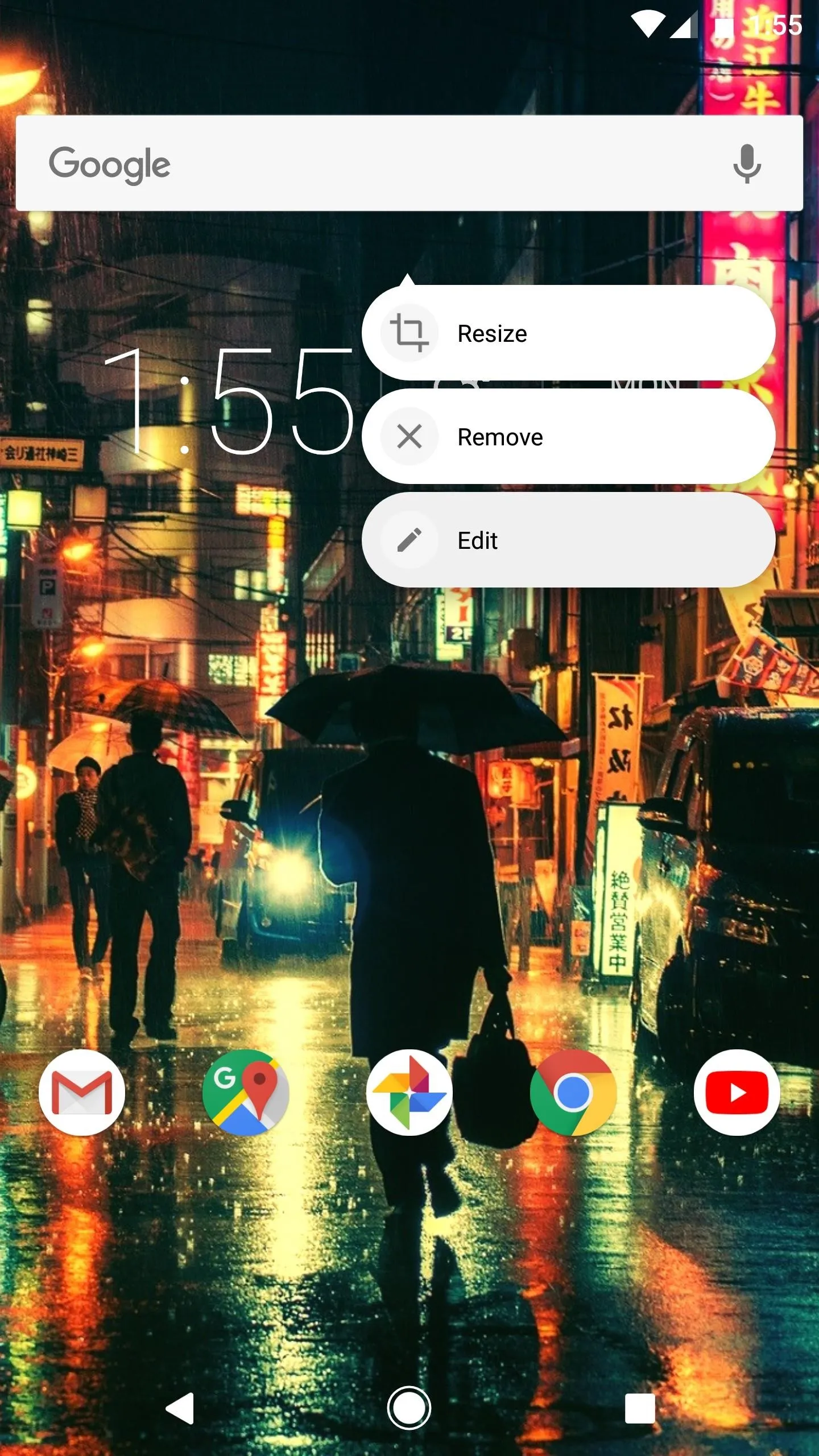
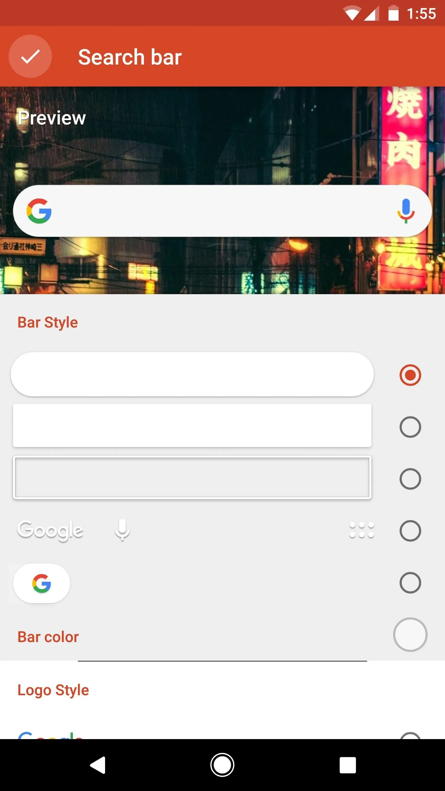
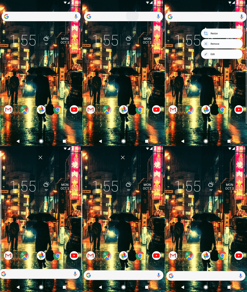
Start by long-pressing the search widget at the top of your home screen. From there, select "Edit" on the popup, then choose the rounded option under Bar Style and the colorful "G" logo under Logo Style. When you're done there, press the check mark, then long-press the widget on your home screen and drag it down to the empty spot you've created on your dock (where the icons you moved in Steps 2 and 3 once were).


Remove the Page Indicator
Like I said, this isn't a perfect replica of the new Pixel Launcher, so there's one minor quirk: The icons at the bottom of your screen aren't technically in the dock. This means that there will be a page indicator between the search bar and those icons right about now.
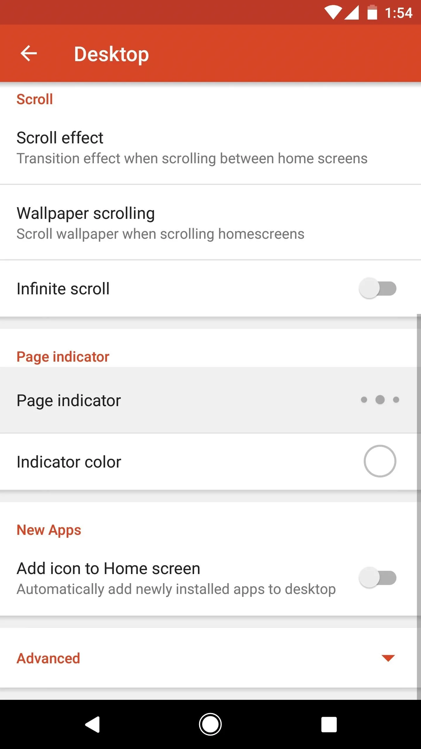
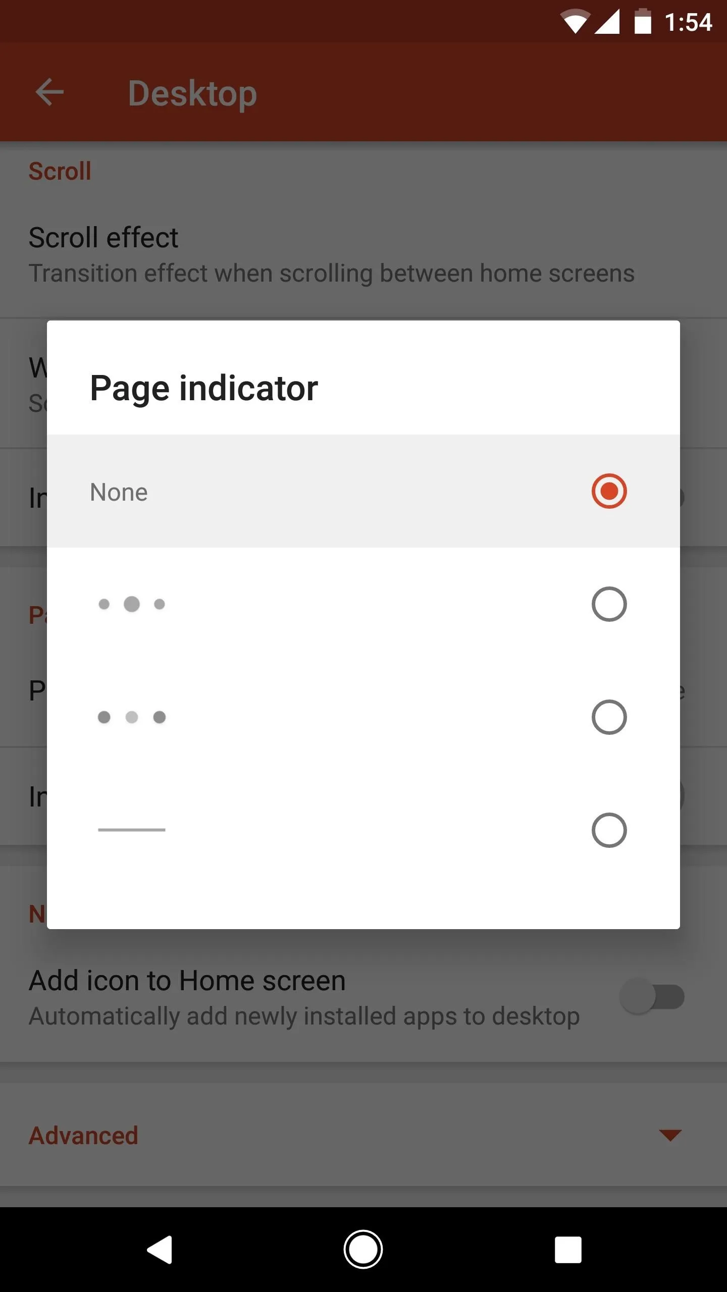
To remove this page indicator and get a more realistic look, long-press any empty space on your home screen, then tap the settings cog. From there, choose "Desktop," then scroll down and tap "Page indicator." Finally, choose "None" on the popup.



Adjust Icon Padding
At this point, you're pretty close to the finished product. But the spacing between the search bar in your dock and the icons at the bottom of your screen may look a little off.
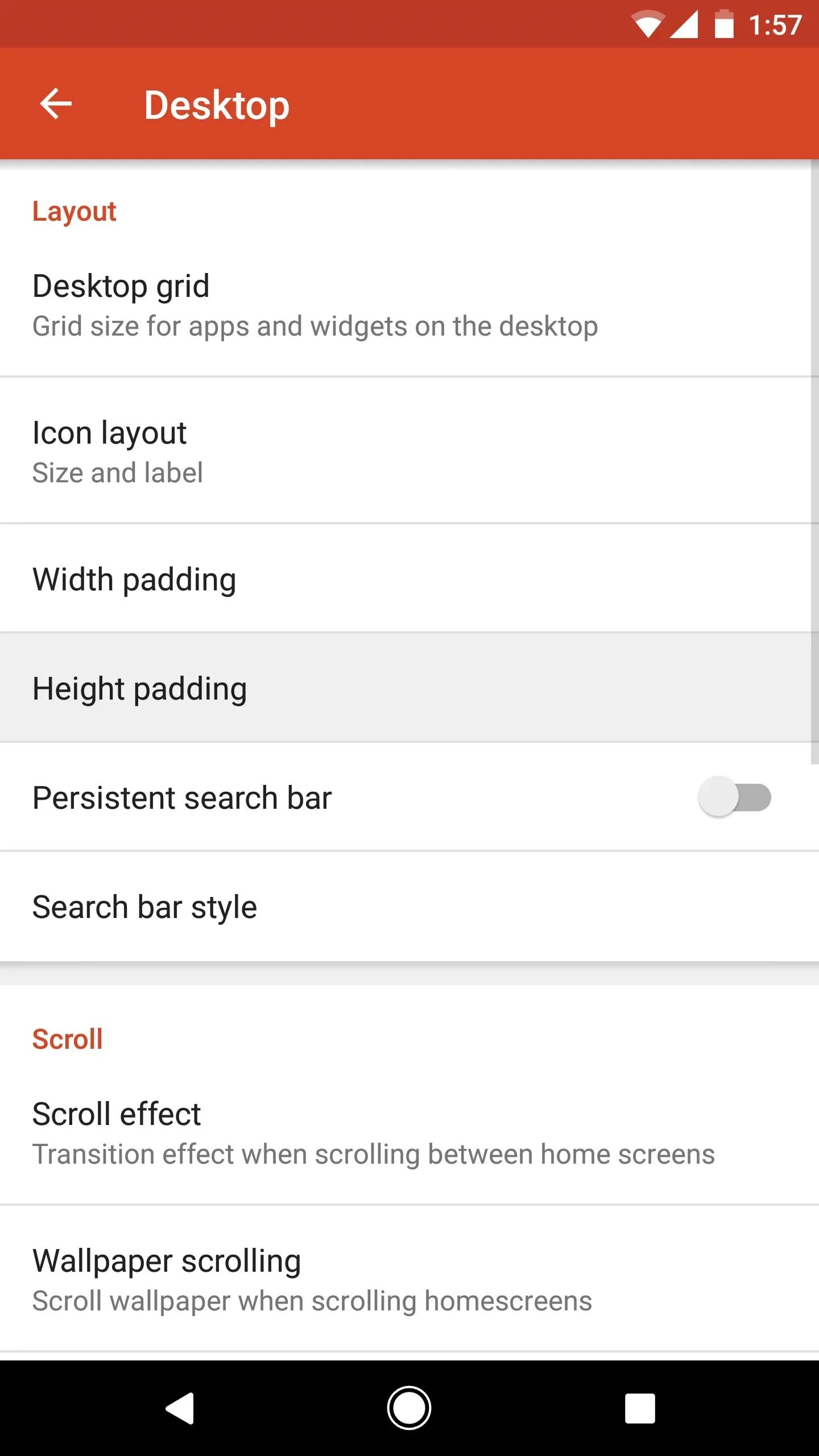
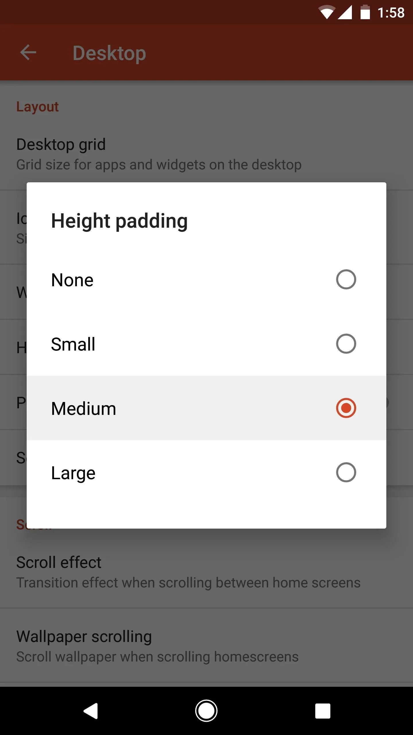
To remedy this, head to Nova's main settings menu again, but this time choose "Desktop." From there, select "Height padding," then set this option to "Medium."



Enable 'Dock as Overlay'
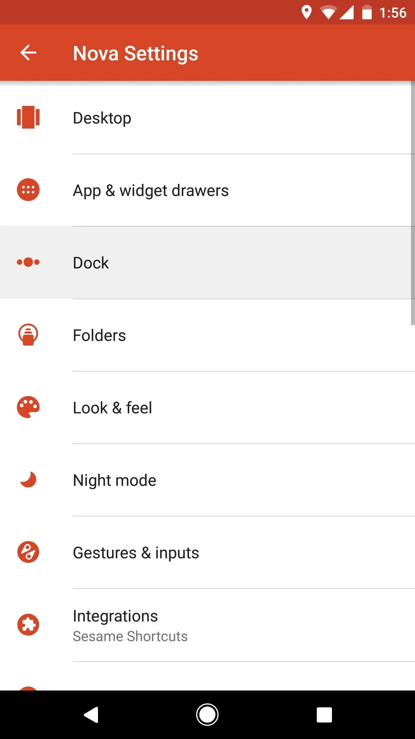
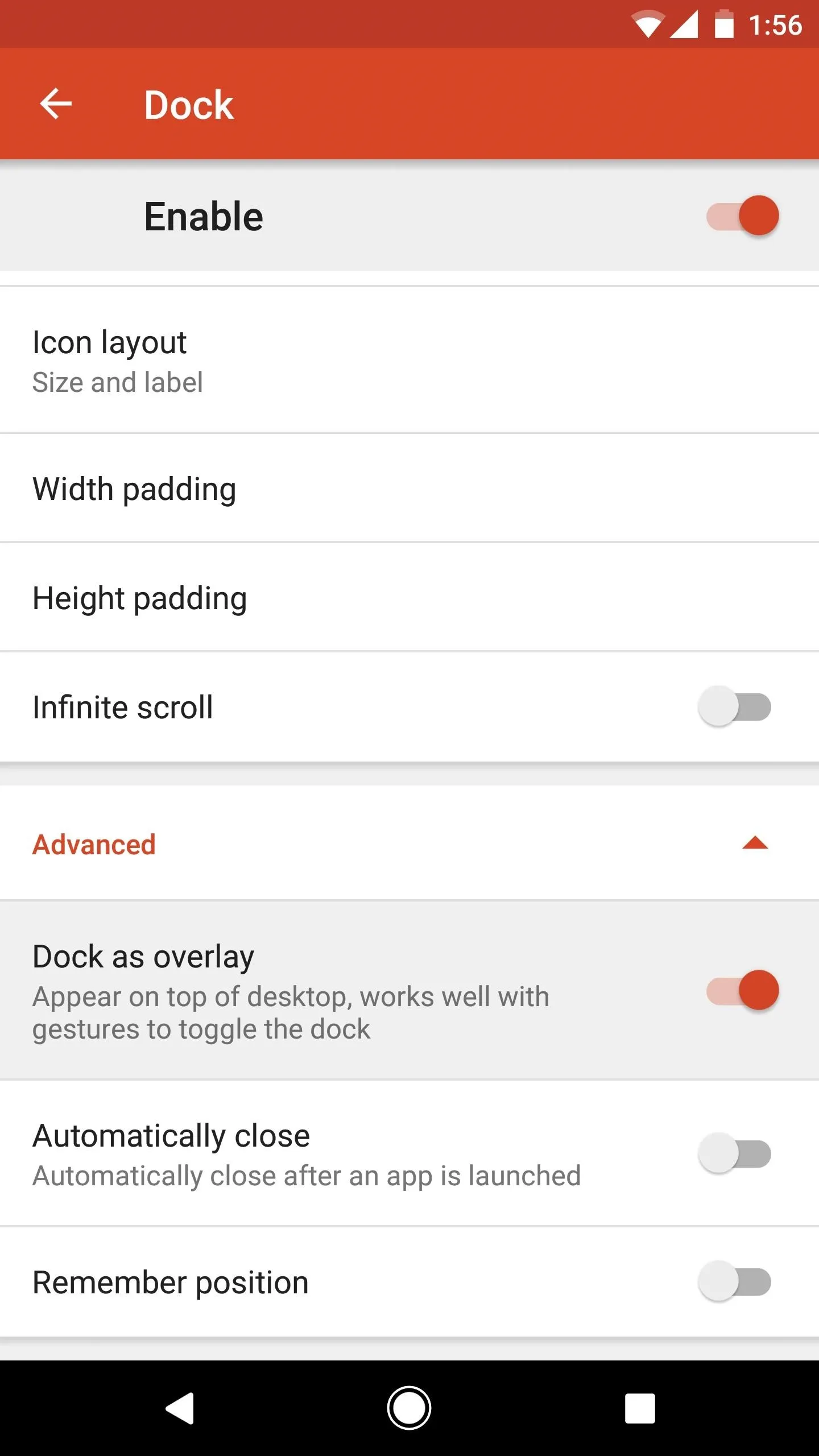
Next, head to the "Dock" section in Nova's main settings menu. From here, scroll down to the bottom and tap the "Advanced" button to reveal a few more options. Next, enable "Dock as overlay," which will remove most of the gap between the search bar and your bottom-most home screen icons.


Adjust Dock Padding
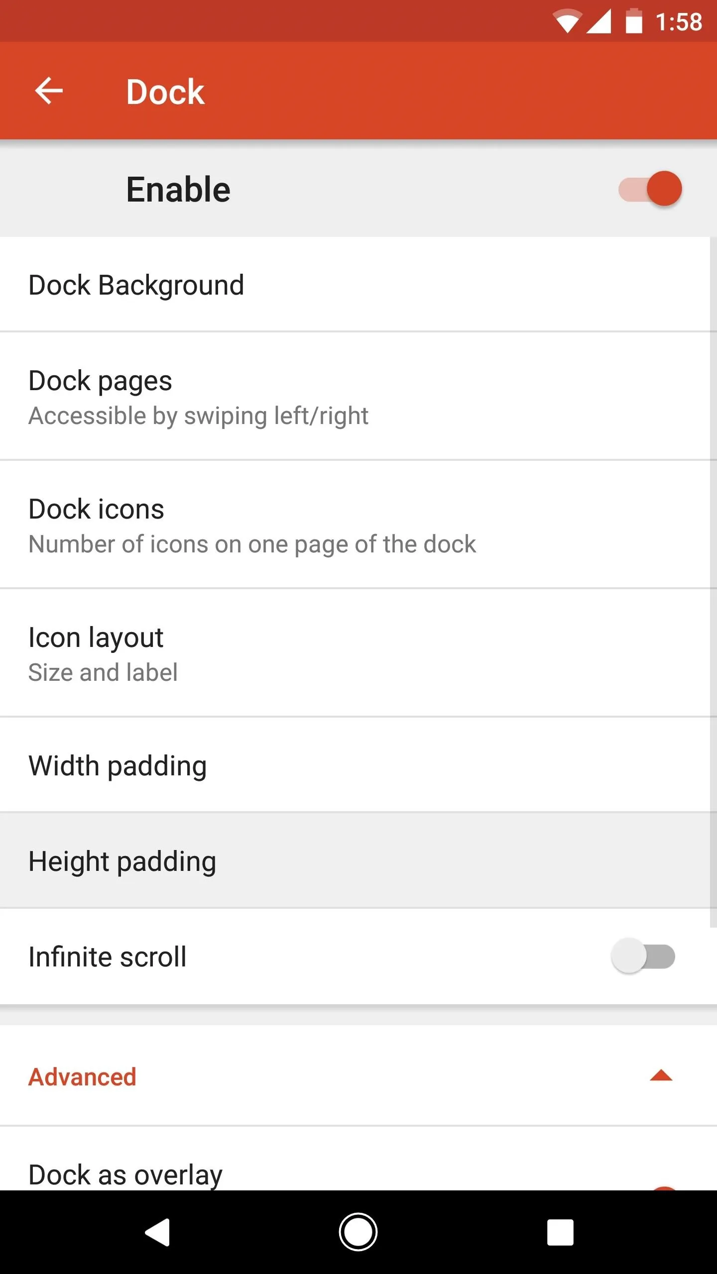
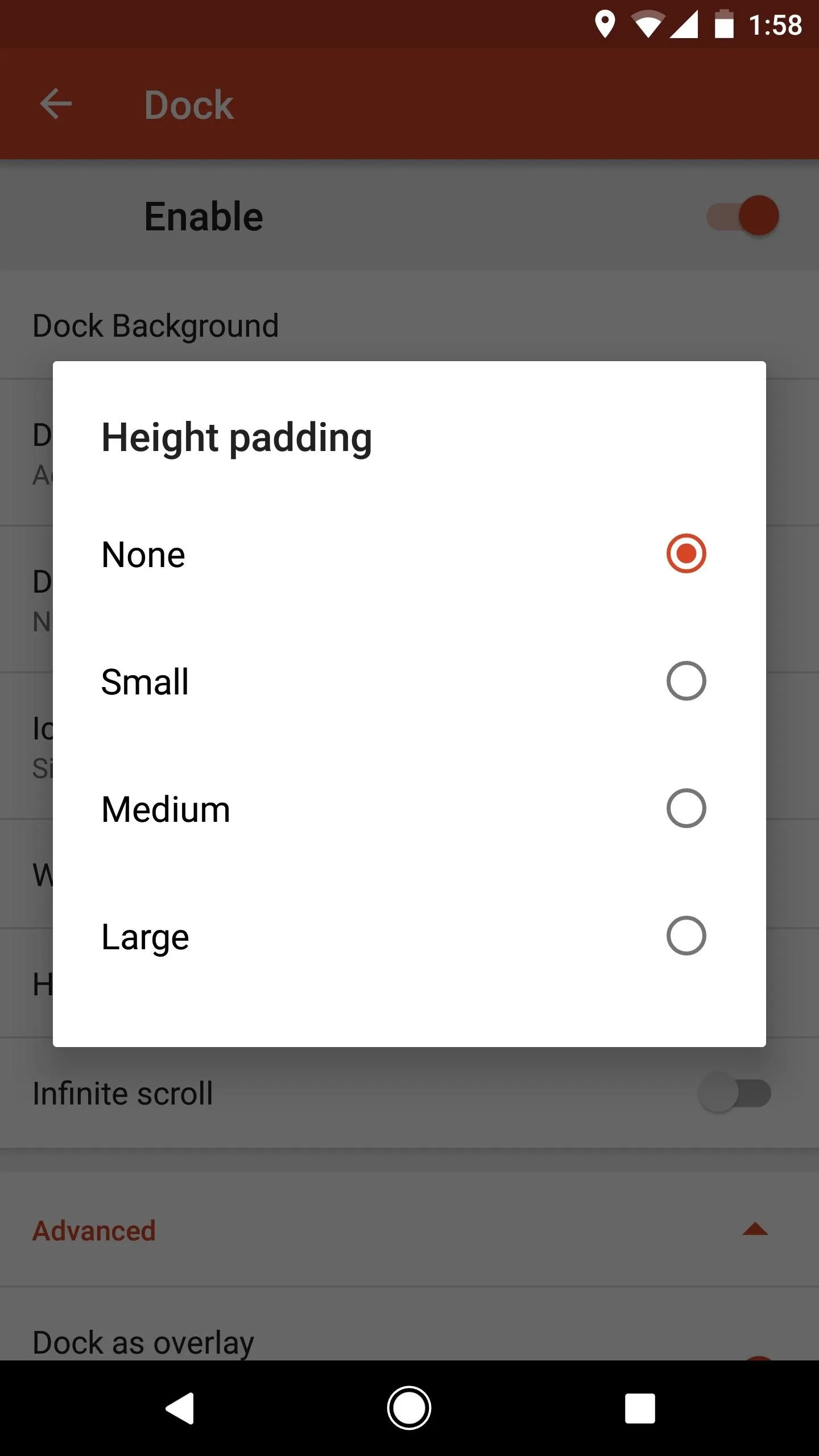
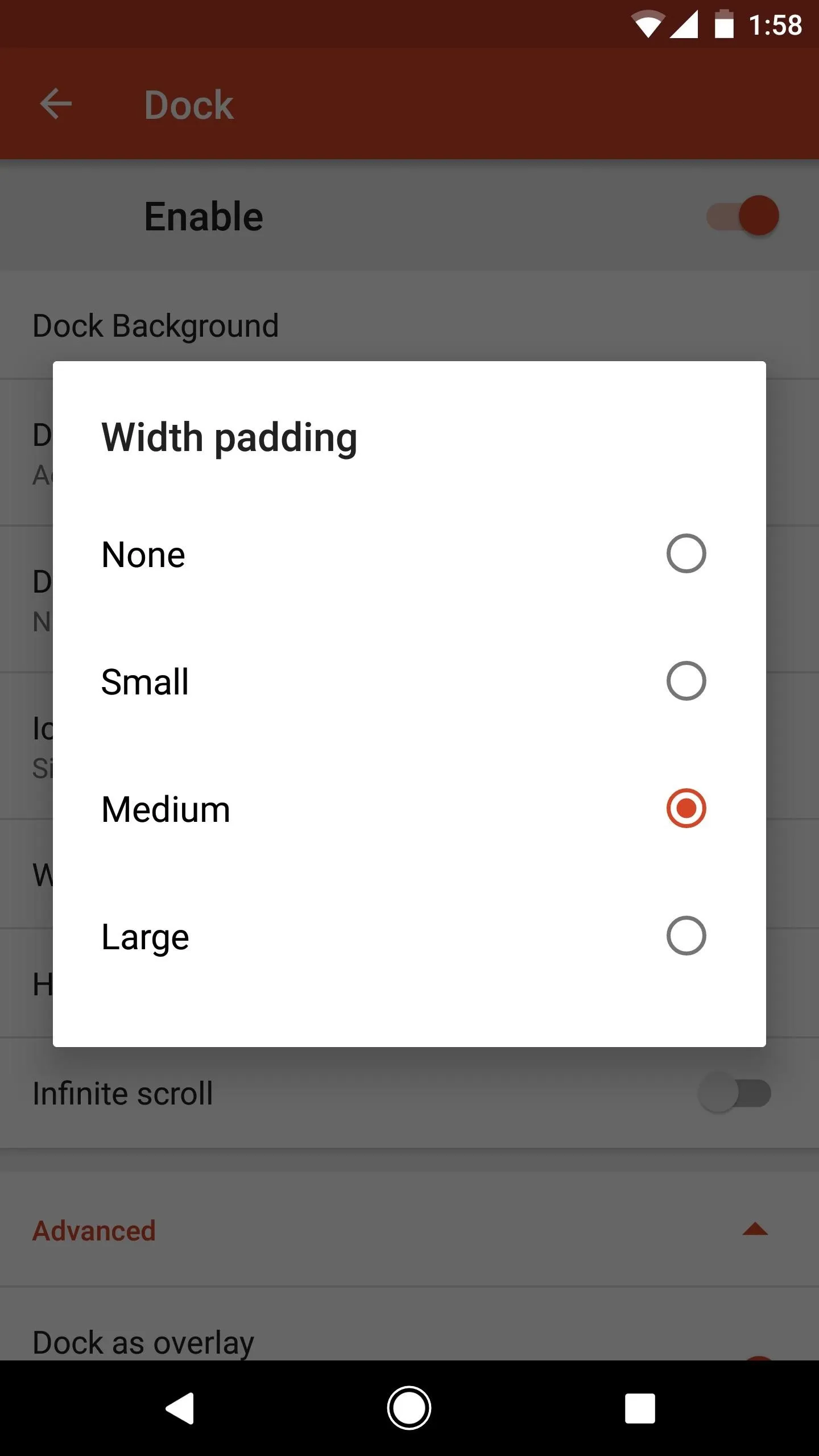
Finally, select "Height padding" from the Dock menu in Nova settings (as depicted in Step 7), then choose "None" on the popup. From there, select "Width padding" and set that to "Medium." This will align the search bar with the rest of your home screen icons rather nicely.


Try Your Pixel 2-Style Launcher
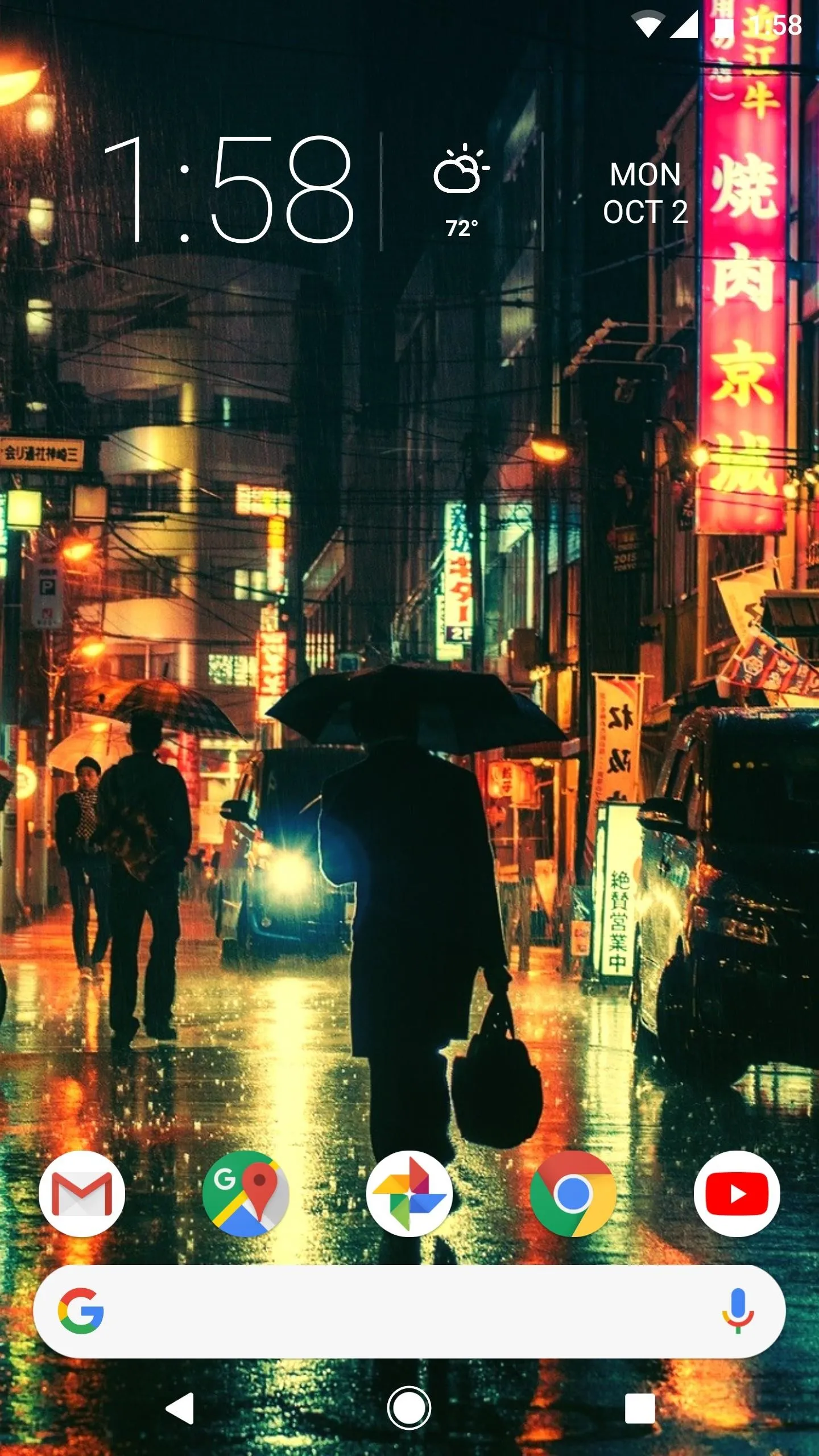
When you're done there, you're ready to try your new Pixel-style home screen. Just like the renders at the top of this article, you should now have a search bar at the bottom of your screen with five icons nested right above it.
Keep in mind that only the search bar is in your dock, technically. So when using the new swipe-to-open app drawer gesture, you'll have to start your swipe from over top of the search bar. Alternatively, you could set the swipe-up home screen gesture to open your app drawer, but either way you go, you've now got a near-perfect replica of the leaked home screen from the Pixel 2.


How are you liking this new layout? Will it take some time to get used to the search bar being at the bottom of your screen? Let us know in the comment section below.
- Follow Gadget Hacks on Facebook, Twitter, Google+, YouTube, and Instagram
- Follow WonderHowTo on Facebook, Twitter, Pinterest, and Google+
Cover image and screenshots by Dallas Thomas/Gadget Hacks










Comments
Be the first, drop a comment!