Chrome has just introduced some new UI elements for web exploration. The new URL bar is not intuitive. But once you get to grips with it, you will be so much more efficient in your address bar editing, pasting, and navigation.
I troubleshoot phone software for a living, but I still fumbled with Chrome's new UI at first. Whenever I mistyped a URL or needed to manually tweak a site's address, I started by tapping the address bar like I always did. But instead of letting me edit the text, I'm now redirected to a blank search field. I thought my only option was to tap the copy button, paste the URL into the search bar, then tweak the address manually before hitting enter. But now I know there's a much better way.
Learning the New UI
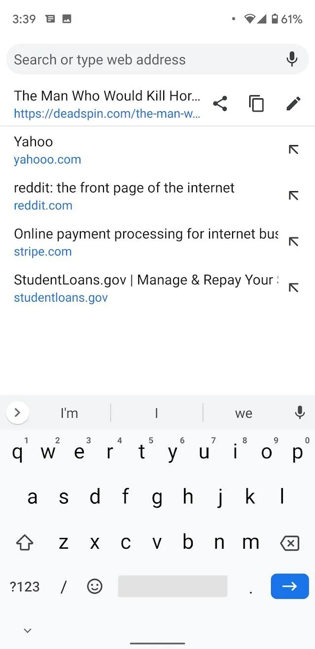
Open the Chrome app and launch any webpage. Tap into the address bar and you will see Chrome's new address bar UI. Here, you have four options that are not the same as before:
- The address bar will now appear empty. It's now only used for entering new websites or adding new search terms.
- If you wish to share your current website as a link, tap on the share icon.
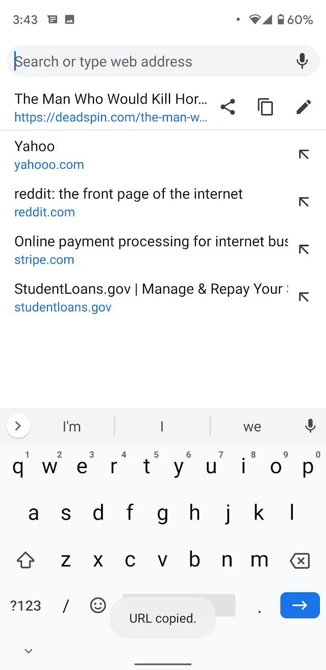
- If you wish to copy your current web address, tap on the copy icon.
- And where I was getting confused: If you wish to edit your current URL, tap on the pencil-shaped edit icon. When you do this, the URL will return to the address bar and you can edit at will.



So what may have initially felt like a regression in functionality is actually more feature-rich than the old version — you just have to know what you can do with it.
Cover image by Spencer Depas/Gadget Hacks











Comments
Be the first, drop a comment!