


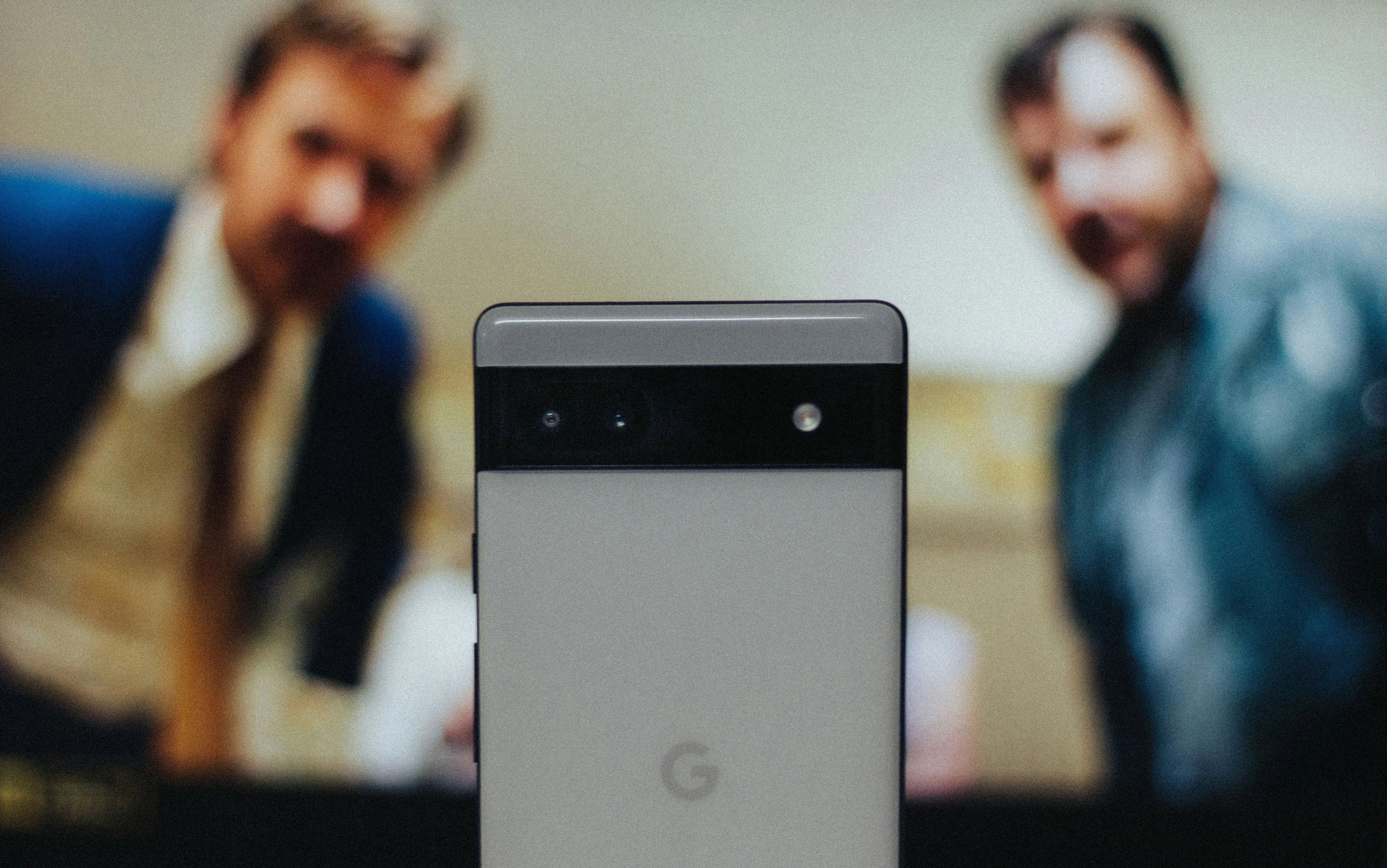
Your phone buzzes. You reach for it, fingers fumbling against the screen, and suddenly you've hung up on your boss. Or maybe your mom calls three times in a row, but the app groups them together so you can't tell if it was urgent or just her usual check-in routine. Sound familiar?
Google's research team has been listening to exactly these complaints. Through 46 separate research studies involving over 18,000 participants worldwide, they've discovered that users could spot key UI elements up to 4x faster with expressive designs. The Phone app is getting this treatment first as part of Google's broader push toward Material 3 Expressive—a design language that promises to make Android apps feel less boring and more emotionally engaging.
The changes are currently rolling out to beta users in version 180.0.771769344, and they're not just cosmetic tweaks. This is Google's most significant visual overhaul in years.
What you need to know:
- The bottom navigation bar drops from four tabs to just three: Home, Keypad, and Voicemail
- Call logs now show individual entries instead of grouping multiple calls from the same contact
- New horizontal swipe gestures for answering/declining calls based on user feedback
- Material 3 Expressive design brings bolder visuals and improved usability
Finally, a bottom bar that makes sense
The most immediately noticeable change is how Google has completely restructured the bottom navigation. Gone are the days of juggling between Favorites, Recents, Contacts, and Voicemail tabs. Instead, you get a cleaner three-tab setup: Home, Keypad, and Voicemail.
The new Home tab is where the magic happens. Your favorite contacts appear as bubbles at the top of the screen, replacing the dedicated Favorites tab entirely. Below that, you'll find your call history—but here's the kicker: calls from the same person are no longer grouped under a single expandable entry.
This chronological approach isn't just about visual simplicity—it transforms how you understand your communication patterns. When your mom calls five times in a row, you can now instantly see the timing gaps between attempts and spot when those calls shifted from casual check-ins to urgent. The same logic applies to work calls, missed connections, and those mystery numbers that keep trying to reach you.
The Keypad tab now sits center stage, replacing the floating action button that used to follow you around the app. This means one less visual distraction and more consistent navigation—the dialer stays exactly where you expect it every time.
Call handling that actually works
Google's convergence toward industry-standard call handling reflects a broader shift in mobile UI design. The new system offers two options for handling incoming calls: single tap or horizontal swipe, bringing Android in line with the interaction patterns users already know from iPhone and Samsung Galaxy devices.
With the single tap option, you get big "Answer" and "Decline" buttons that eliminate the guesswork of directional swiping. The horizontal swipe option introduces a pill-shaped slider that you swipe right to answer or left to decline—similar to how the Google Clock app handles alarms.
Both approaches replace the current swipe-up-to-answer, swipe-down-to-decline system that's been creating pocket dialing nightmares for years. Google says this change was based on user feedback specifically about avoiding accidental actions while retrieving phones from pockets or bags.
PRO TIP: The pill-shaped slider gives you tactile feedback as you swipe, making it much harder to accidentally trigger the wrong action compared to the old directional gesture system.
Beyond answering calls: smart history management
While Google simplified how you handle incoming calls, they've also upgraded how you manage what happens after. The new filtering system for call history addresses a pain point that's become increasingly critical as spam calls proliferate.
Google has added a horizontal row of filters at the top of the call log: All, Missed, Contacts, Non-Spam, and Spam options. These filters rolled out to beta users in version 162 and are appearing on all Android devices, not just Pixels.
The app remembers your last selected filter preference, creating personalized workflows for different users. Sales professionals might default to "Missed" to catch follow-up opportunities, while others might prefer "Contacts" to focus on known callers. The search bar above the filters has been redesigned to be taller and more aligned with Material 3 design language found in other Google apps.
This systematic approach to call management represents Google's recognition that the Phone app needs to be more than just a dialer—it's becoming a communication hub that needs to handle the complexity of modern calling patterns.
The trade-offs of streamlined design
The redesign isn't without compromises that reveal Google's philosophy about mobile interface priorities. The dedicated Contacts tab is completely gone, which represents a significant workflow change for users who relied on it for contact browsing rather than search-based discovery.
This elimination reflects a broader industry trend toward search-first interfaces, but it creates friction for users who prefer visual browsing over typed queries. The trade-off suggests Google believes most users either know who they want to call or can quickly search for contacts, rather than needing to browse through alphabetical lists.
The visual changes extend beyond functional modifications. Contact names and caller photos are much larger, and the app eliminates simple circular buttons in favor of larger, oval-shaped elements that change shape when pressed. The end call button is now pill-shaped and significantly larger—a small change that could reduce stress during emotionally charged conversations.
Google's research shows that Material 3 Expressive designs boosted user perception significantly: 32% increase in how "cool" people thought the product was, 34% boost in modernity, and 30% jump in rebelliousness perception. These metrics suggest Google is prioritizing emotional engagement alongside functional improvements.
What this means for the future of mobile interfaces
This Phone app redesign signals Google's broader strategy for competing in an increasingly crowded mobile ecosystem. By converging toward industry-standard interaction patterns while adding distinctive visual flair, Google is acknowledging that users want familiarity with personality—not revolutionary interfaces that require relearning basic tasks.
The Material 3 Expressive design language is set to debut on Pixel devices running Android 16, with a stable release expected in June. Google has confirmed that these app redesigns will be available on earlier Android versions too, indicating their commitment to broad accessibility rather than forcing hardware upgrades.
The Phone app has also gained complementary improvements recently, including real-time scam detection that uses on-device AI to flag suspicious calls, and a new "Lookup" feature that lets you search for unknown numbers directly from the call log.
The new Phone app interface is gradually rolling out to public beta users over the coming weeks. If you're eager to experience Google's vision for emotional interface design, you can join the beta program through the Play Store—just be prepared for the occasional bug as Google fine-tunes the balance between familiarity and innovation.
The bottom line: Google's Phone app redesign represents more than visual updates—it's a strategic repositioning toward interfaces that work intuitively while engaging users emotionally. Whether this approach resonates with real-world usage patterns will determine if other Android manufacturers follow Google's lead or chart their own course in the competitive landscape of mobile communication.


Comments
Be the first, drop a comment!