


Reviewed by Corey Noles
Google's research-backed design philosophy is transforming the humble Files app—and users are spotting key UI elements up to four times faster
Remember when Google decided that "clean and boring" wasn't cutting it anymore? Well, Google's Files app is now getting the full Material 3 Expressive treatment—and honestly, it's about time your file manager got some personality.
What you need to know:
Files by Google's Material 3 Expressive redesign is rolling out with centrally-placed FABs and wavy progress bars
The update stems from Google's most extensive design research ever—46 studies with 18,000+ participants
Users can now spot key interface elements up to 4x faster than before
This is just the beginning of a broader Android 16 design overhaul coming later this year
Here's the thing: this isn't just Google making things prettier for the sake of it. There's serious science behind why your file manager is getting more expressive.
Why "boring" design was actually slowing you down
Let's break down what Google discovered when they asked themselves a crucial question in 2022: "Why were all these apps looking so similar? So boring?" The answer led to the most comprehensive design research Google has ever conducted.
Through 46 separate research studies involving hundreds of designs and more than 18,000 participants worldwide, Google found something remarkable: expressive design isn't just more appealing—it's actually more functional. Participants were able to spot key UI elements up to four times faster in expressive designs, with interaction times decreasing by seconds across different apps.
The research revealed some eye-opening metrics too. Expressive designs scored 32% higher in "subculture perception" (making brands feel more relevant), showed a 34% boost in modernity, and delivered a 30% jump in rebelliousness—positioning products as bold and innovative rather than just functional.
Most surprisingly? M3 Expressive enabled older users to spot interactive elements just as fast as younger users across 10 different apps tested. That's inclusive design that actually works.
This research foundation directly informed Google's approach to the Files app redesign, where they applied these findings to specific interface elements that users interact with dozens of times daily.
What's actually changing in your Files app
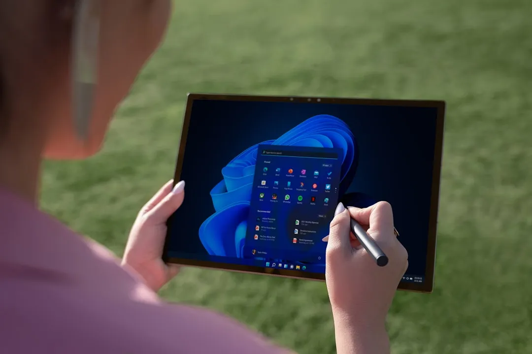
Sound familiar? If you've been using Files by Google (and with over 5 billion downloads, chances are good), you're about to see some notable visual shifts that directly leverage this research.
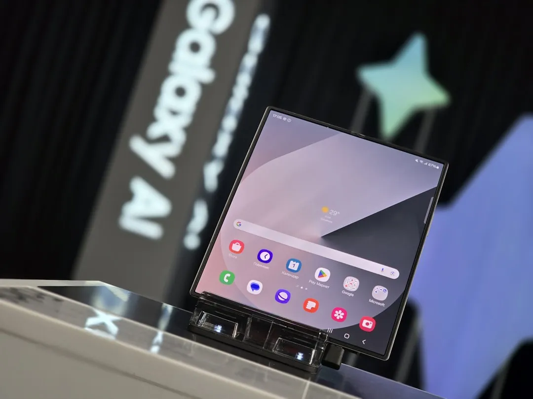
The most obvious change hits you right on the landing page. Those Quick Share and File Scanner floating action buttons that used to hang out in the bottom right corner? They're now sitting side-by-side in a pill-shaped UI element smack in the middle of the screen. These centralized FABs directly leverage Google's finding that users spot key UI elements 4x faster in expressive designs—placing the most important actions exactly where your eyes naturally focus.
It's the same treatment for Edit and Circle to Search FABs in the image viewer—everything's getting that centralized, unified look that makes essential functions more discoverable. But here's where it gets interesting: the thumbnails for your recent files are now larger, though Android Authority notes this makes things "a tad bit unsightly" in the current implementation. Google's clearly still fine-tuning the balance between expressiveness and practicality.
The progress bar is getting a complete personality transplant too. When you're installing an APK or compressing files into a ZIP, instead of that boring bottom-aligned progress bar, you'll see a wavy, centralized progress indicator that actually feels alive. It's powered by Google's new motion physics system that uses spring animations for more natural movement.
Even the sidebar changes connect to the broader expressiveness theme—the reduced size and increased spacing between elements reflect Google's research that strategic use of shape, size, and containment helps users navigate more intuitively through interface hierarchies.
The broader Android transformation that's coming
This Files app update is just the appetizer. Google announced that while Android 16's initial stable release next month won't include the full Material 3 Expressive redesign, a comprehensive rollout is planned for later this year via a Pixel Feature Drop.
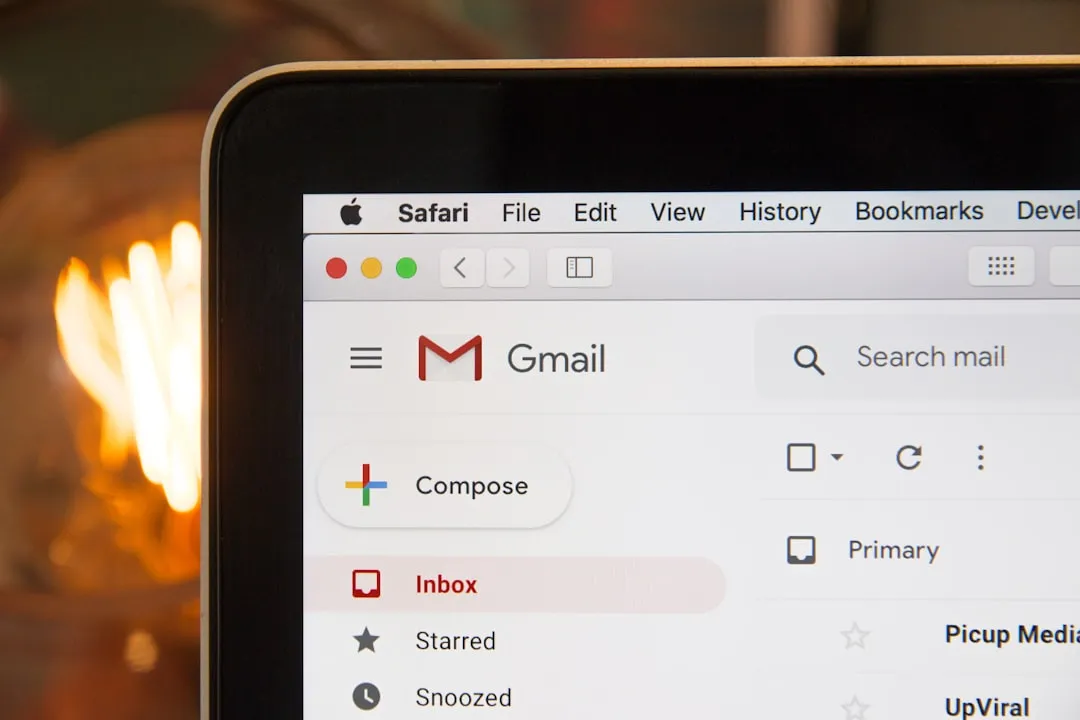
The transformation is already spreading across Google's app ecosystem. Gmail recently rolled out its Material 3 Expressive redesign with card-based UI and dynamic pill-shaped button animations. Google Calendar is testing redesigned FABs with rounded corners and the new Google Sans Flex font. Even Google Photos is preparing for significant visual updates with a revamped video player and search interface.
The rollout strategy becomes particularly smart when you consider the technical complexity involved. Rather than forcing everyone into a dramatically different interface overnight, Google is using server-side switches to gradually introduce changes while A/B testing real-world performance against their extensive lab findings. This gradual approach lets Google verify that the research showing users spot UI elements 4x faster actually translates to improved daily workflows across diverse user groups and hardware configurations.
This careful rollout becomes even more critical when you consider how Google's new motion physics system fundamentally changes how animations work. The shift from predefined duration values to physics-based spring animations means devices need to handle more complex calculations for every transition—making the gradual deployment essential for maintaining performance across Android's massive hardware ecosystem.
Where do we go from here?
The Files by Google redesign represents something bigger than aesthetic tweaks—it's Google betting that emotion-driven design can coexist with, and even enhance, functionality. The fact that their research shows overwhelming preference across age groups, with 87% preference among 18-24 year olds, suggests they've cracked the code on making interfaces both more expressive and more functional.
PRO TIP: If you're eager to try the new design, keep an eye on Files by Google beta updates—that's where Google is currently testing these changes before the broader rollout.
The real test will be whether this comprehensive research approach translates to better real-world experiences across the millions of Android devices worldwide. Early signs are promising, but the proof will be in how users adapt to these changes across the entire Android ecosystem as Google's physics-based motion system and expressive design principles reshape everything from file management to messaging. One thing's certain: your phone is about to get a lot more expressive, and based on Google's extensive research, that might just make it more useful too.


Comments
Be the first, drop a comment!