The iPhone vs. Android debate is almost as old as smartphones themselves. While there are a number of reasons to skew towards one operating system or the other, the Samsung Galaxy S9 models have a ton of great features that help set them apart from Apple's iPhones. The coolest feature, in my opinion, is the way notifications are handled.
I love my iPhone, I really do, but the way that iOS deals with notifications is overall clunky and passive. Apple prefers to allow notifications to just pass on by like a summer breeze, but Android gives me the option to take meaningful action on alerts if I choose to do so. To expand on this, I'll list all the reasons that the Samsung Galaxy S9 models beat iPhones in the notifications game.
And yes, to be fair, most of the points will apply to the way Android handles notifications as a whole, but the Galaxy S9 models offer the latest and greatest Android experience, and there are a few things that they have that Android as a whole doesn't.
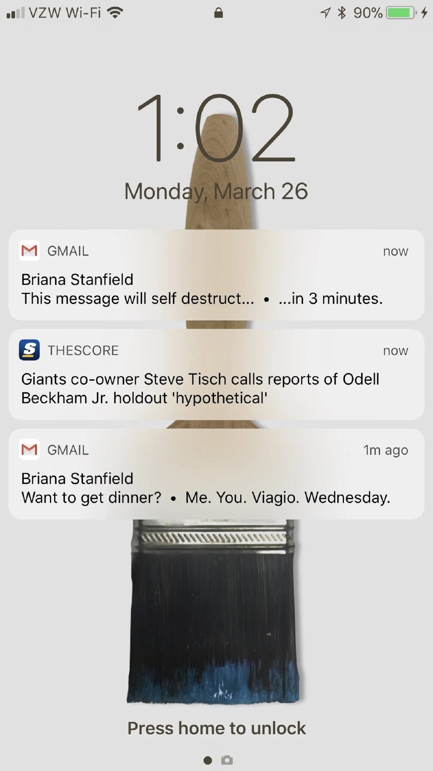
1. You Won't Forget About Notifications on the Lock Screen
For iPhone users, new notifications will pop up on the lock screen when locked, but once you go to the home screen or an app, then return to the lock screen, they're no longer obvious. They retreat to the Notification Center, which you can swipe up to see on the lock screen, but they're not in your face anymore.
On Android's lock screen, notifications can pile up, but this allows you to decide what you want to do with each one before it disappears like on iOS — a notification won't disappear just by unlocking your Galaxy S9.
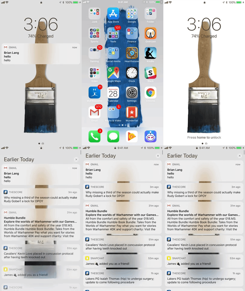
Lock screen alerts disappearing on iPhone (left) vs. persistent on the Galaxy S9 (right).
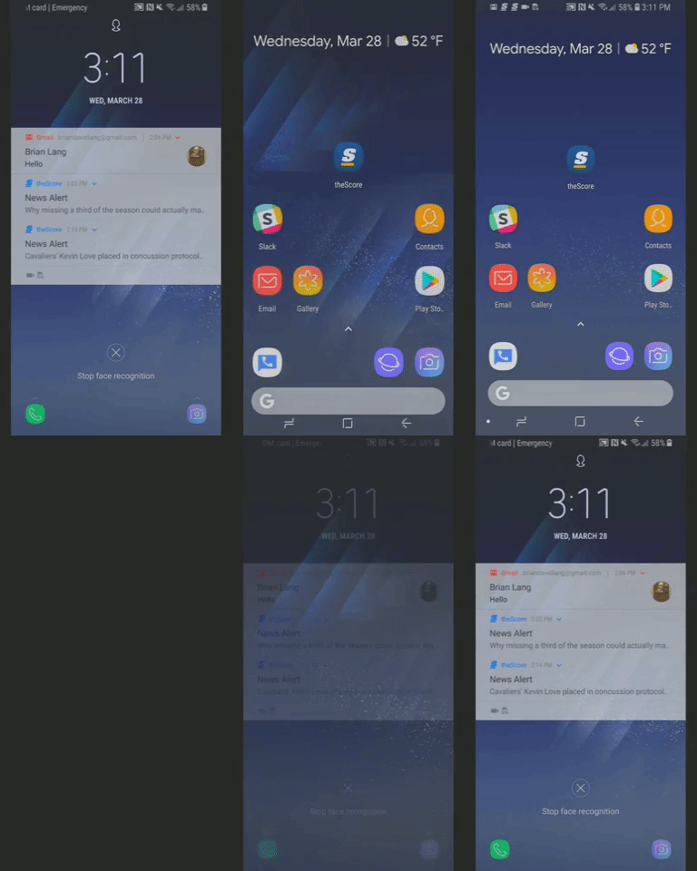

Lock screen alerts disappearing on iPhone (left) vs. persistent on the Galaxy S9 (right).

2. You Won't Forget About Notifications Everywhere Else
When unlocked, you can swipe down the Notification Center on an iPhone to view all of the notifications you ignored, but if you can't remember ignoring any, how would you remember to swipe down to view them? There's no visual indicator that there are notifications waiting to be looked at in iOS.
That's where the Galaxy S9, and Android overall, wins another one. Small icons hover inside the status bar up top, constantly telling you exactly which apps are trying to get a hold of you. Swipe down from the top to reveal the notifications drawer, and you can take action on any of those in the same ways that you would on the lock screen.
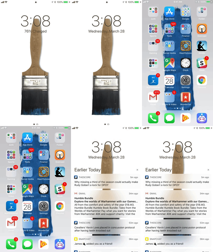
Nothing seen in the status bar on iPhone (left) vs. icons on the Galaxy S9 (right).
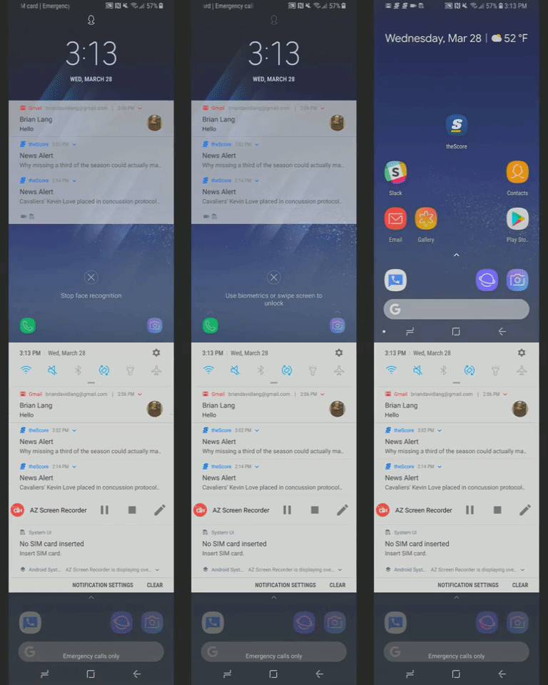

Nothing seen in the status bar on iPhone (left) vs. icons on the Galaxy S9 (right).

3. Notifications Are Grouped by App Name
Perhaps the most annoying part of iOS, for me, is that the notifications aren't grouped by apps (even though they used to be in iOS 9). What that means is that multiple notifications from the same application on iOS are treated as separate notifications, like they don't even know each other.
On Android, these notifications are "grouped" together, meaning all the notifications from one app are treated as a single notification. You can pull down on that notification to expand them, where you can take action on each notification one by one. It's a much more polished and organized approach.
Random order on iPhone (left) vs. grouped by app on the Galaxy S9 (right).
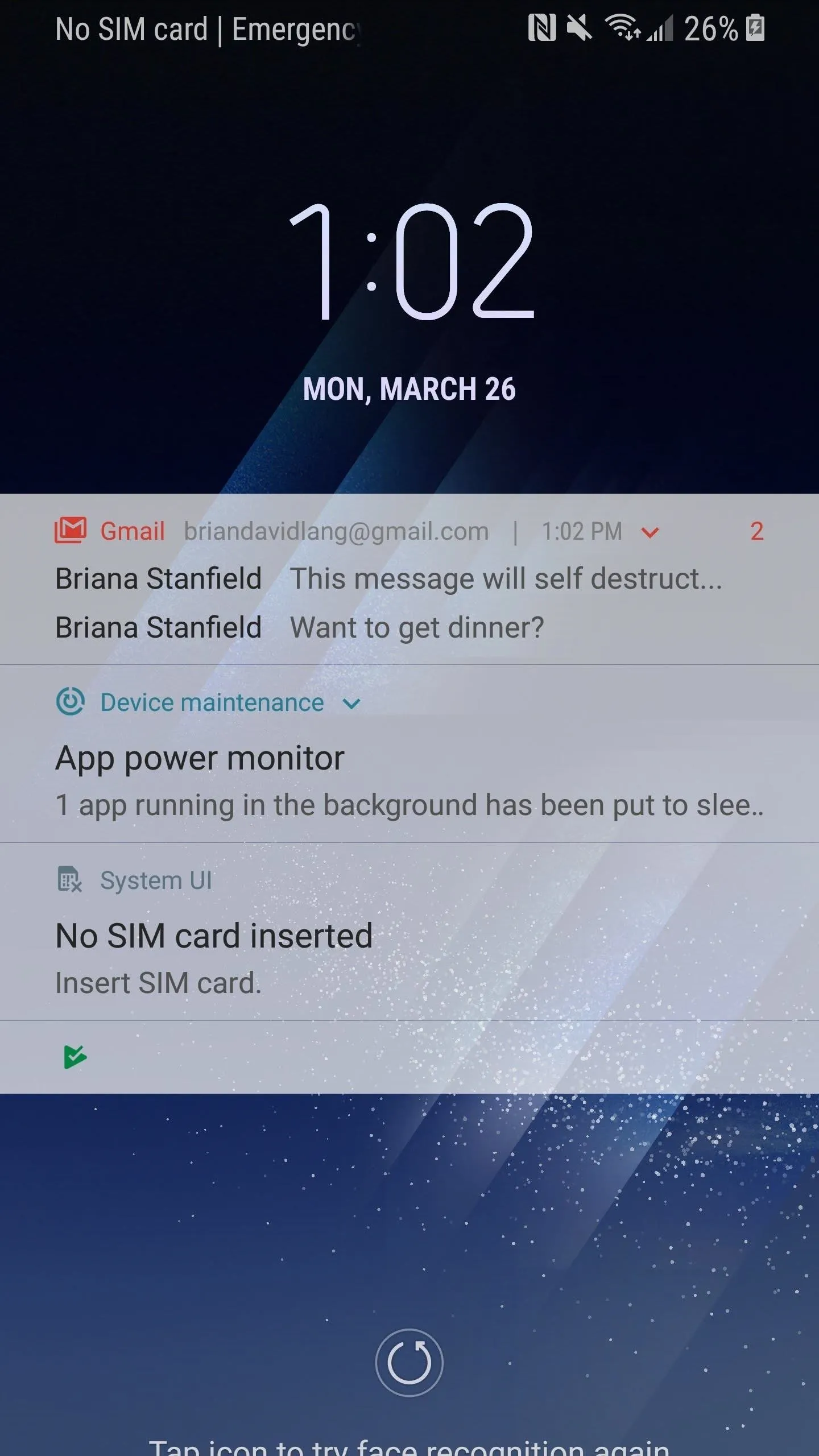

Random order on iPhone (left) vs. grouped by app on the Galaxy S9 (right).

4. There Are More Granular Controls
Apple does offer a lot of fine-tuning for its notifications in iOS. Stock apps like Calendar offer a ton in the way of customization, letting you change notification settings even for the type of Calendar notification. Third-party apps don't have access to this functionality, however, and are restricted to simpler controls like showing alerts (notifications) on the lock screen, in the history, and as banners.
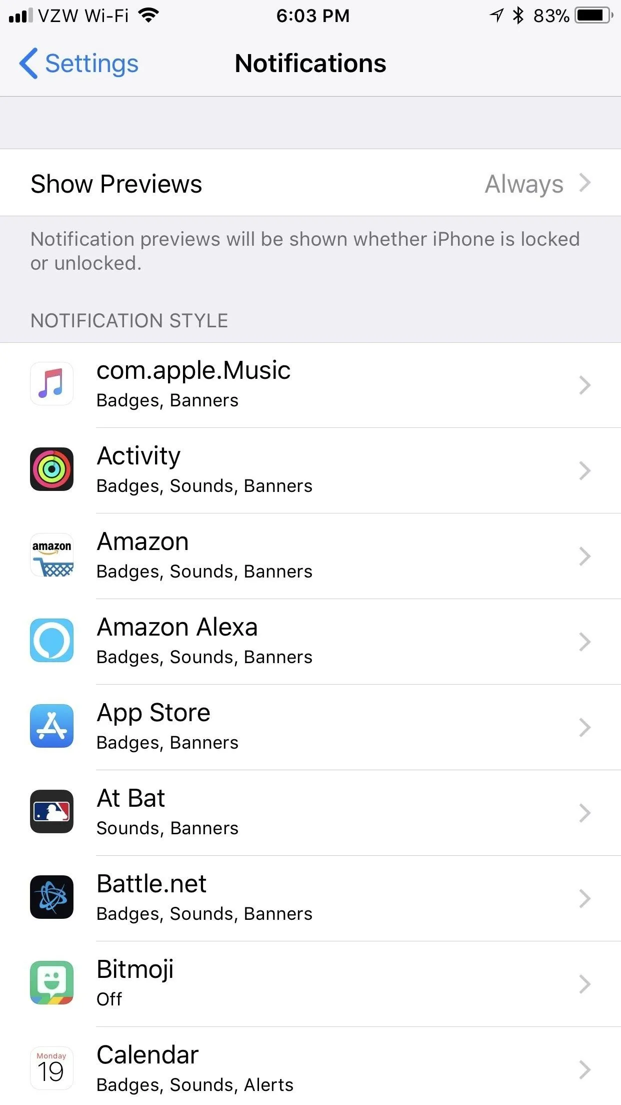
The "Calendar" app on iPhone has the most impressive alert options.
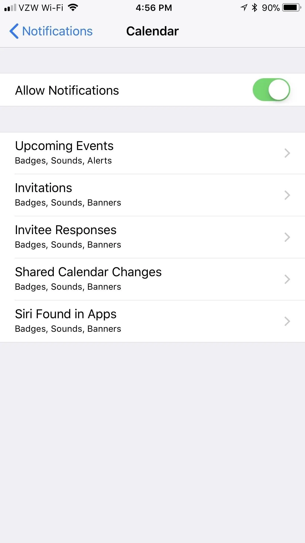
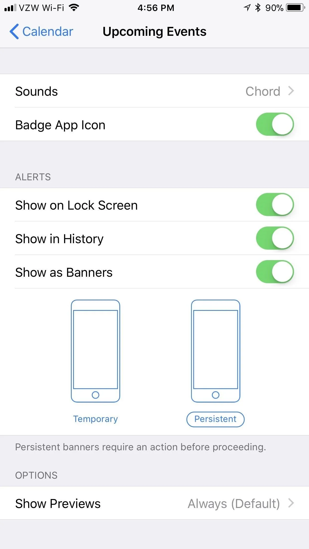

The "Calendar" app on iPhone has the most impressive alert options.


With Android 8.0 (which ships on Galaxy S9 models), developers are able to integrate notification channels which lets them really give users the ability to customize their notification experience. Just go to "Apps" in the Settings, then "Notifications," and choose an app to see if the developers are using the feature on your Oreo device.
In the Twitter app, for example, you can choose whether or not your DMs notify you, and the same goes for followers and contacts, as well as recommendations from Twitter. These types of controls aren't something you can get in iOS, and any developer can integrate this on Android.
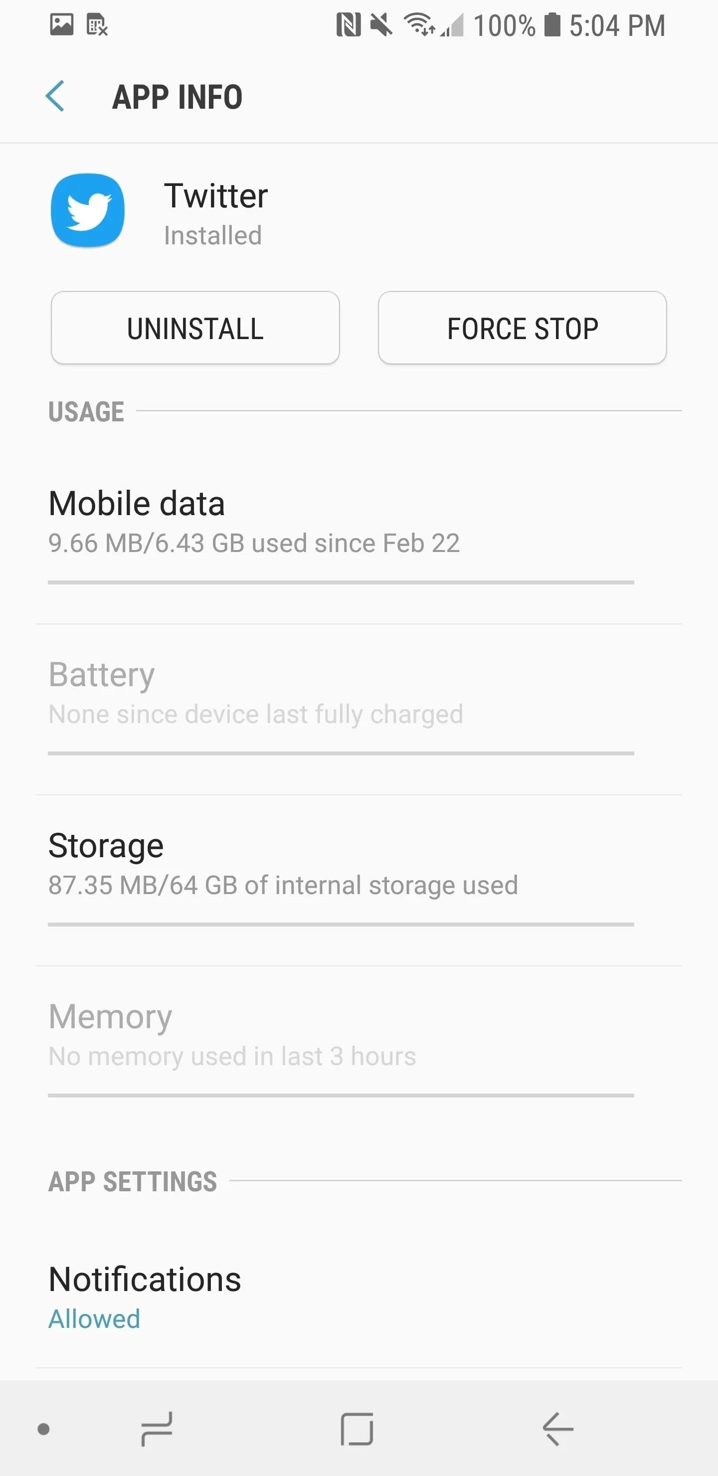
On the Galaxy S9, any app can fine-tune their notification alerts.
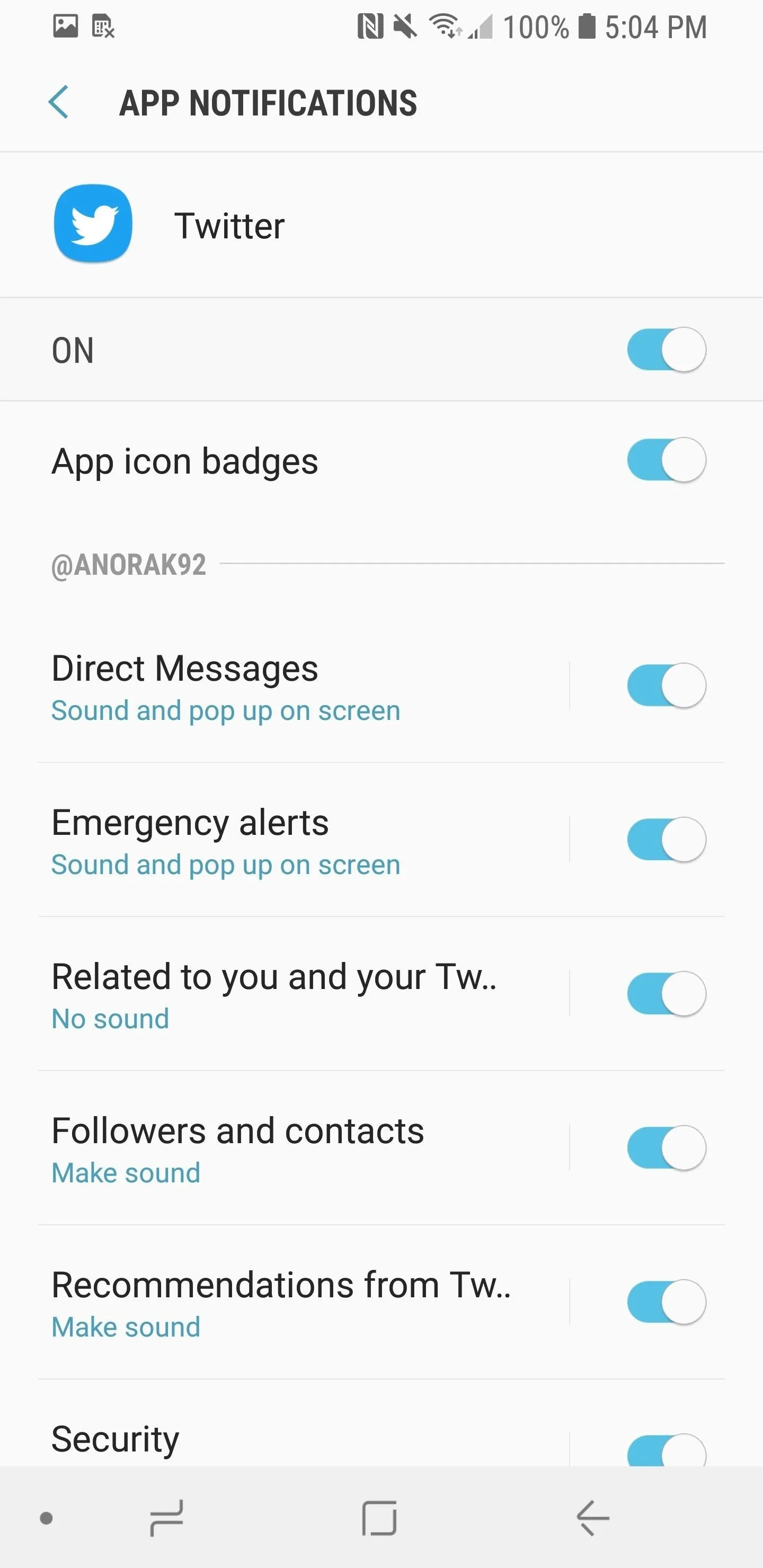
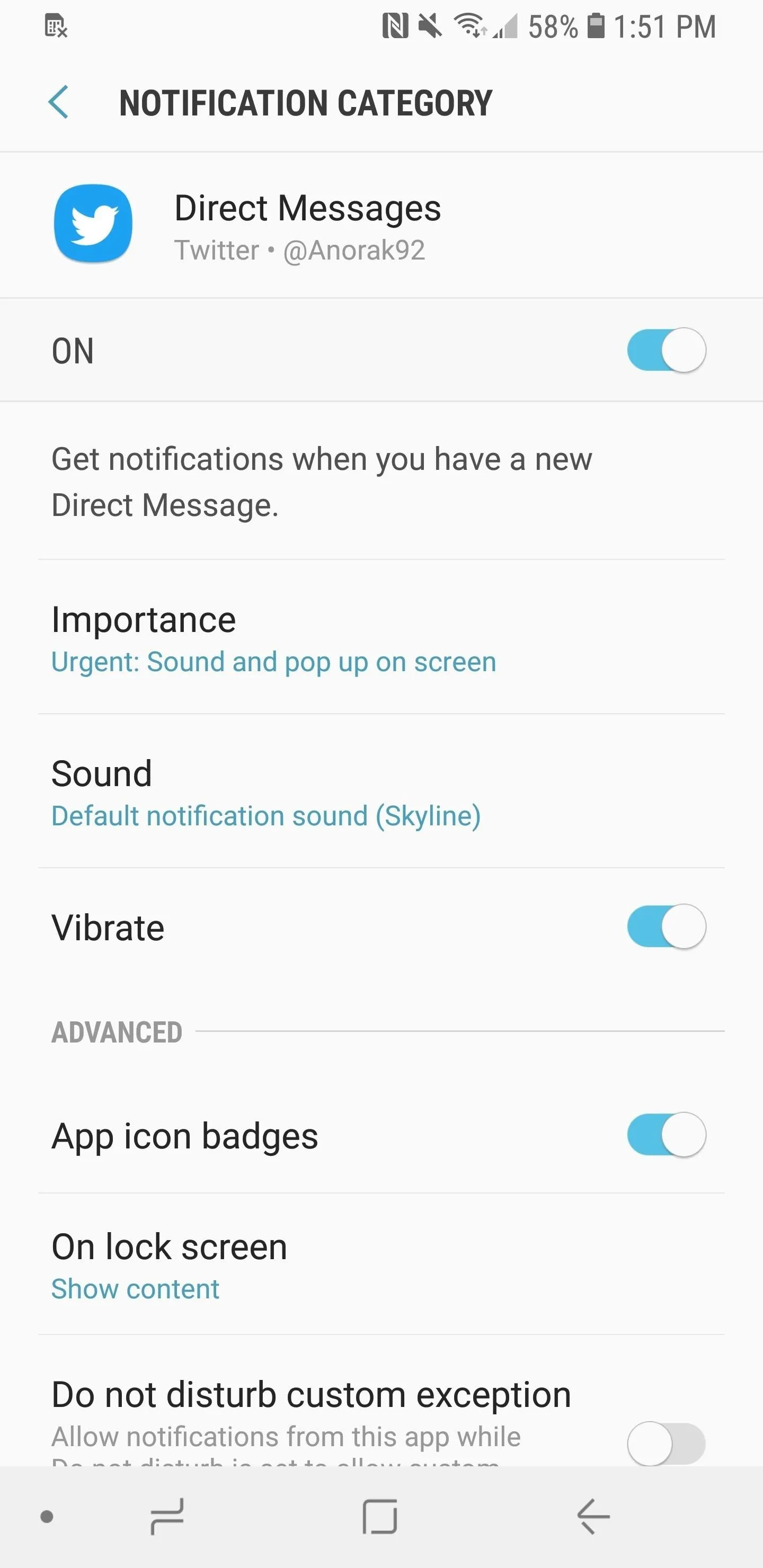

On the Galaxy S9, any app can fine-tune their notification alerts.


5. The Galaxy S9 Has an Always On Display
The Always On Display is more of a Samsung Galaxy feature, but Android has ways of implementing the feature across the operating system. On the Samsung Galaxy S9 models, you can double-tap any notification bubble to immediately open up the app that creates the notification. While it's not that much faster than simply waking your phone up, it is another way to interact with your notifications.
The iPhone X contends favorably with an Always On Display because a notification can pop up on the lock screen and wake it up. Once that happens, you can simply tap on it once to open up the app as long as you're looking at your iPhone (due to Face ID). The iPhone X is usually faster than a traditional Android always-on display, but not by that much. Both are fantastic at what they do and streets ahead of the competition.
However, the iPhone X is the only competition here. No other iPhone model has this, making not just the Galaxy S9 models a winner in this category, but the Galaxy S8 and S7 models as well, as well as any other Android phones that include such a feature. Plus, you can have a pulsating LED to keep reminding you have messages, while on iOS, you can only see LED flash alerts for the back of the device if you enable it.
6. You Can Do More in the Notification Drawer
While iOS makes you edit and share a screenshot right away, Android will let you edit and share it whenever you want from the notification drawer. You can also interact with phone calls from the notification drawer instead of in the app directly, and you can thumbs up or down songs in the media controls that live in the notification drawer.
When using Google Maps on a Galaxy S9, you can see directions and exit navigation from the notification drawer, while on iOS, you have to tap the blue bar (or bubble for iPhone X users) to go directly to the app to do anything.
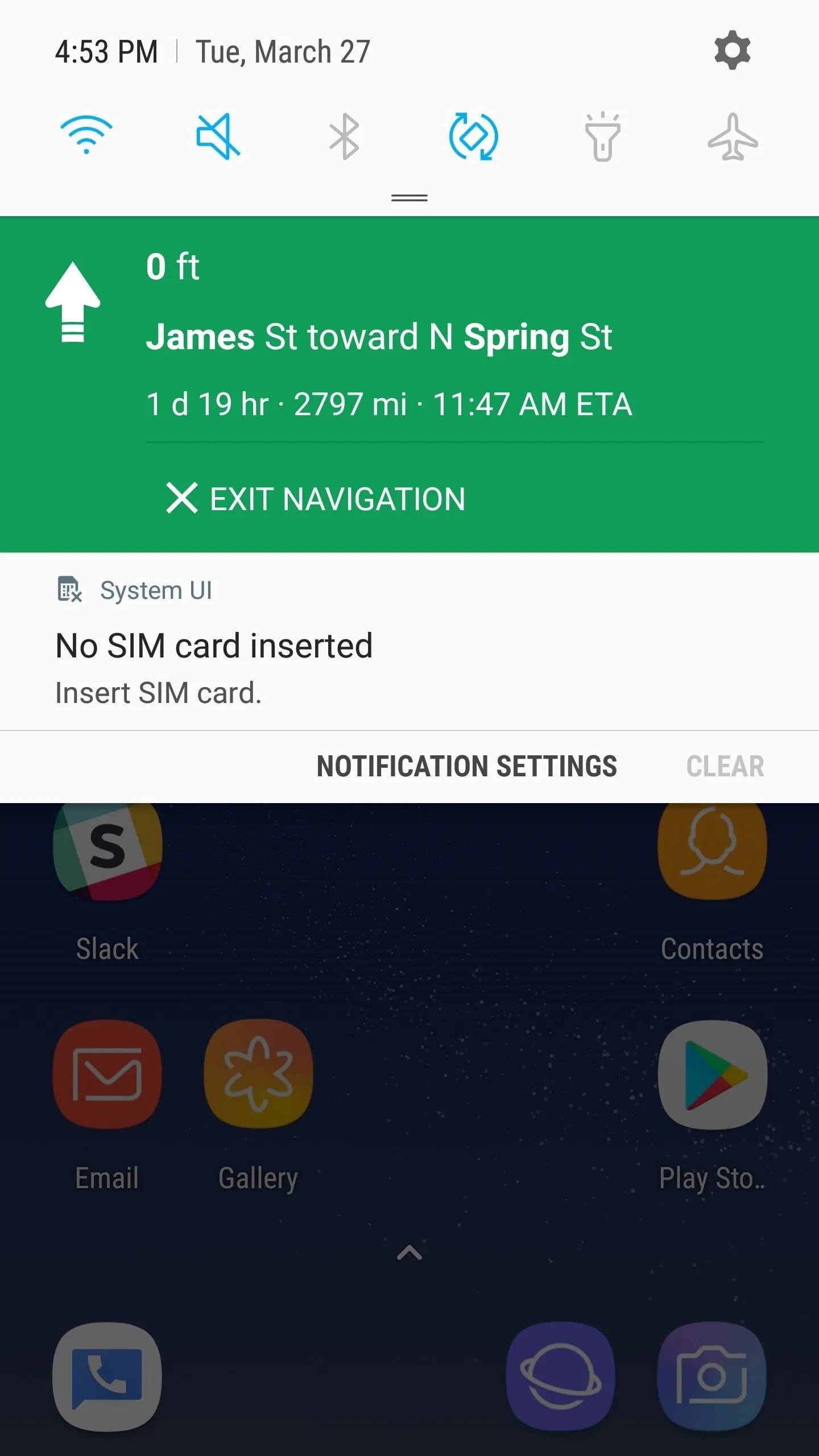
Google Maps notifications on the Galaxy S9 (left) vs. iPhone (right).
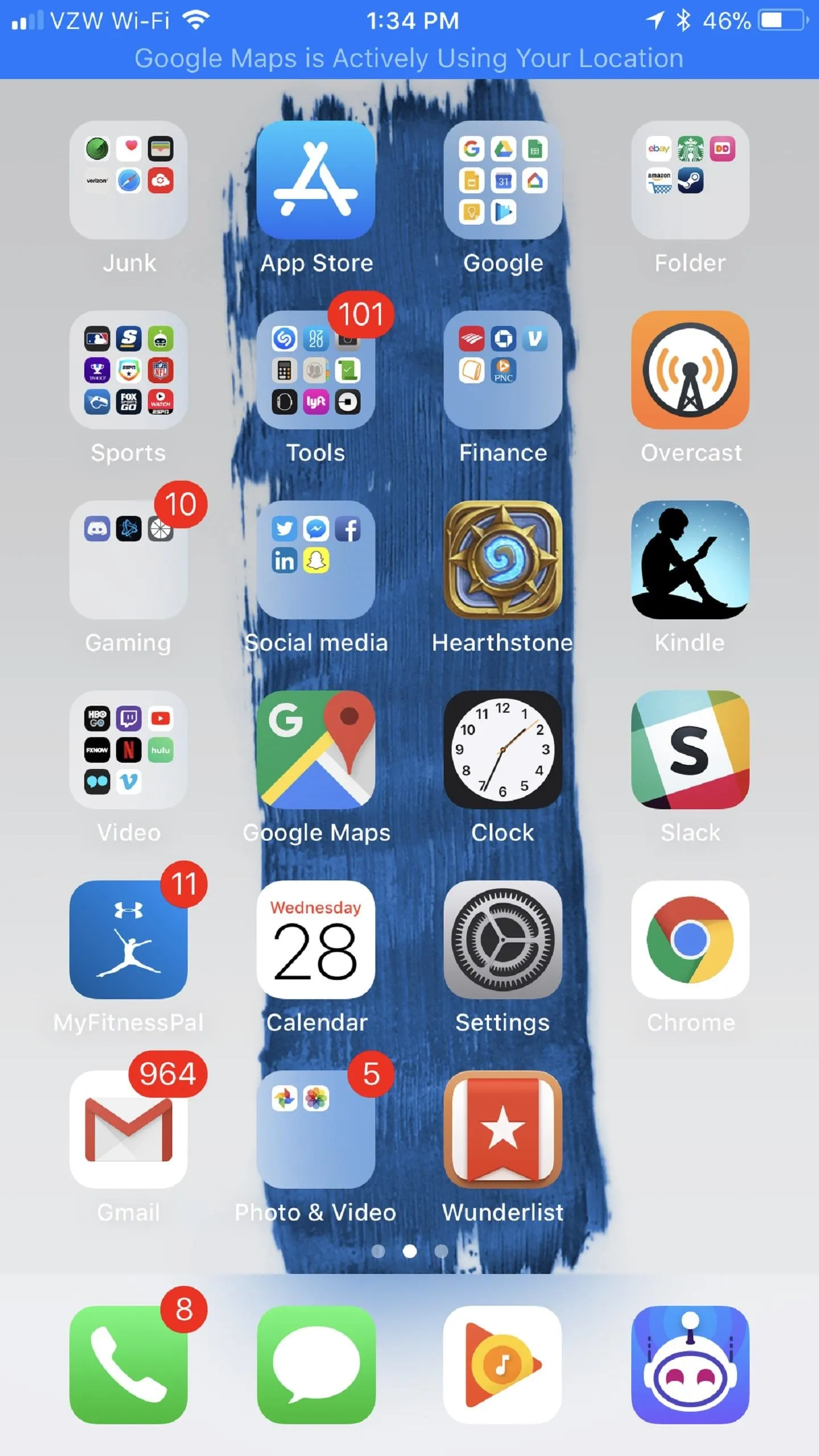

Google Maps notifications on the Galaxy S9 (left) vs. iPhone (right).

7. You Can Snooze App Notifications
On your Galaxy S9 (and all Android Phones), you can snooze all notifications. This means you're able to temporarily put a notification aside, and have it re-notify you after the designated time. Think of like snoozing an alarm clock. Swipe left on the notification to reveal a clock icon, then tap it and choose how long you want to snooze the notification for. Hit "Save" once you choose how long you want to snooze the notification for.
You can snooze certain iOS apps, but it's up to the developers to determine if they want to bake the functionality into their app. In my experience, few care to. Words with Friends is the only one that pops into mind right away. There's also no customization here, though, Apple apps like Reminders will give you a few options.
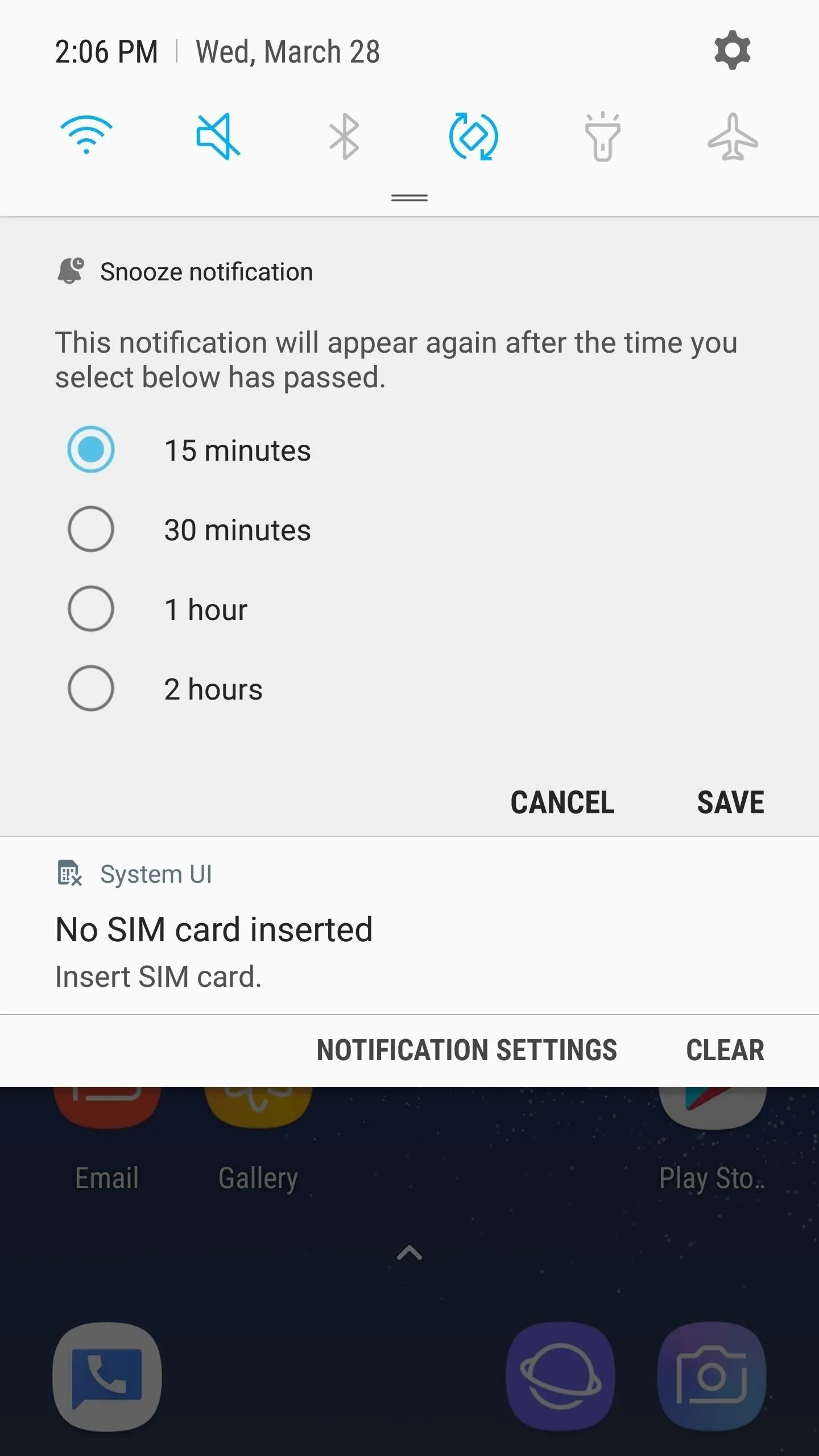
Snooze options on the Galaxy S9 (left) vs. iPhone (right).
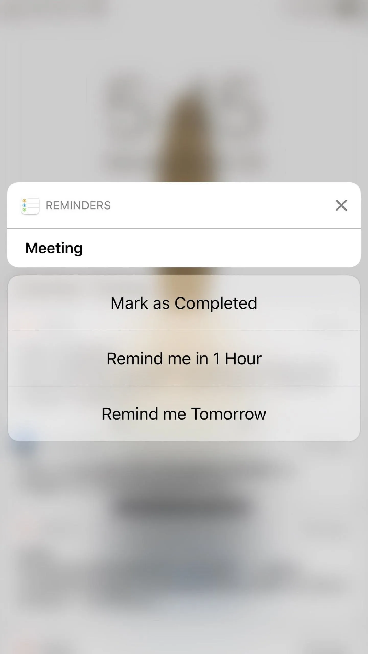

Snooze options on the Galaxy S9 (left) vs. iPhone (right).

The Galaxy S9 Is My Winner in the Notifications Game
Of course, this is all subjective. While how notifications are handled on the Galaxy S9 is one of my favorite features, it may not be yours, and you might actually prefer the iPhone experience. But there's no denying that developers on Android simply have more to work with than iOS developers when it comes to notifications.
- Follow Gadget Hacks on Facebook, Twitter, YouTube, and Flipboard
- Follow WonderHowTo on Facebook, Twitter, Pinterest, and Flipboard
Cover image and Screenshots by Brian Lang/Gadget Hacks








Comments
Be the first, drop a comment!