While millions eagerly await the arrival of the Galaxy S9 and all the new features it has to offer, we can actually get a glimpse of its capabilities right now — if we know where to look. The S9's home screen, in particular, is one such area that has new features we can preview now.
The Galaxy S9 is slated to come with a ton of nifty features, such as notification channels and a revamped Samsung keyboard, courtesy of Android Oreo. One key aspect we wanted to shine a light on was the S9's humble home screen, and the new options it brings to the table.
Please bear in mind that while it isn't firmly set in stone, these home screen optimizations have been tested and verified on an S8 that's running the Oreo beta. As such, these speculations shouldn't be too far off the mark, since both the S8 and S9 share similar designs, and as Samsung devices, use the same exact TouchWiz UI. That said, we'll be sure to update accordingly as as more concrete info emerges.
Landscape Mode
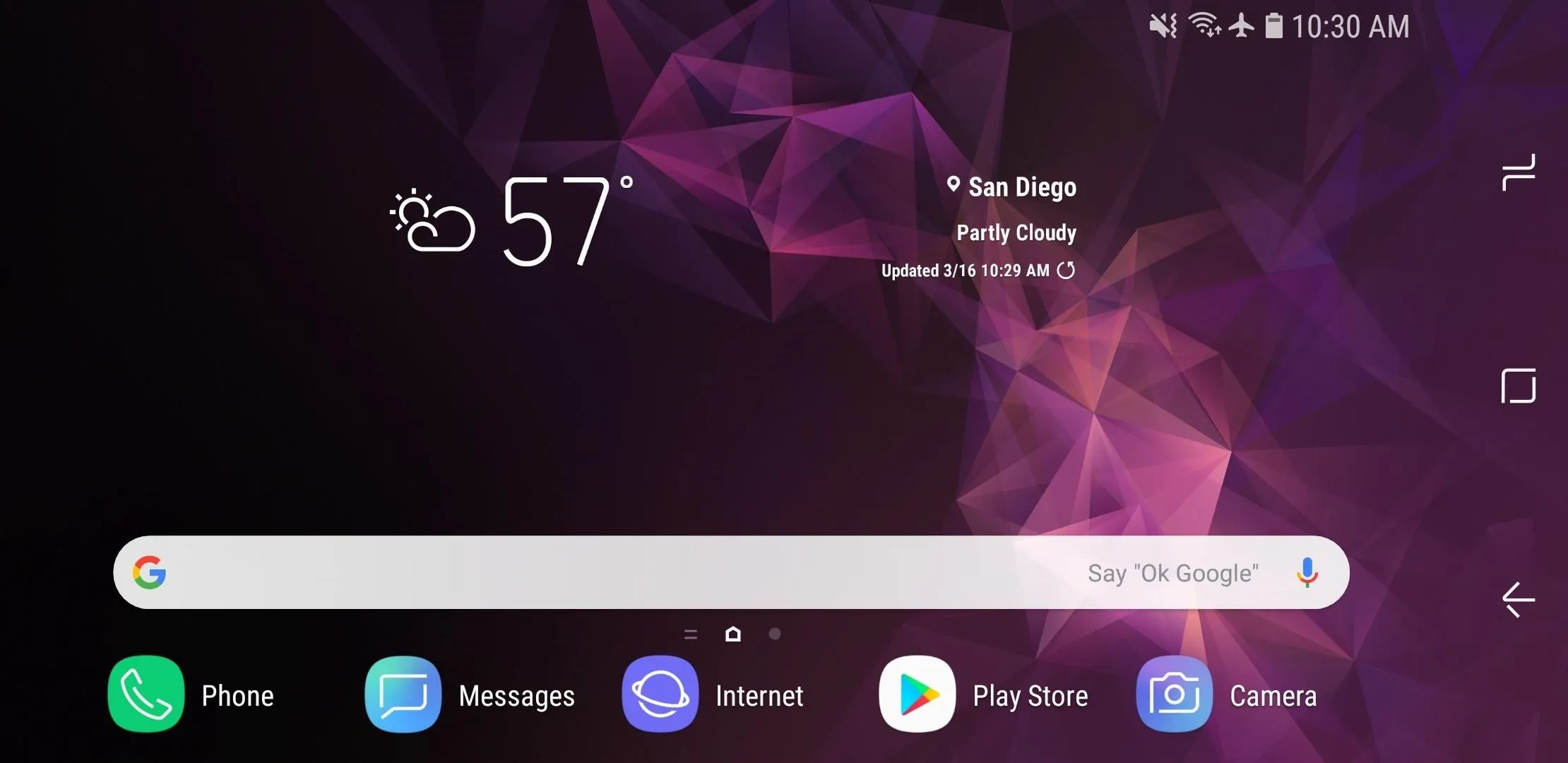
The stock launcher on the Galaxy S9 (TouchWiz Home) will now rotate into landscape mode when you're holding your phone sideways, but only if you've set things up. To try it out, long-press any empty space on your home screen, then tap the settings cog. From there, make sure to turn off the "Portrait mode only" setting.
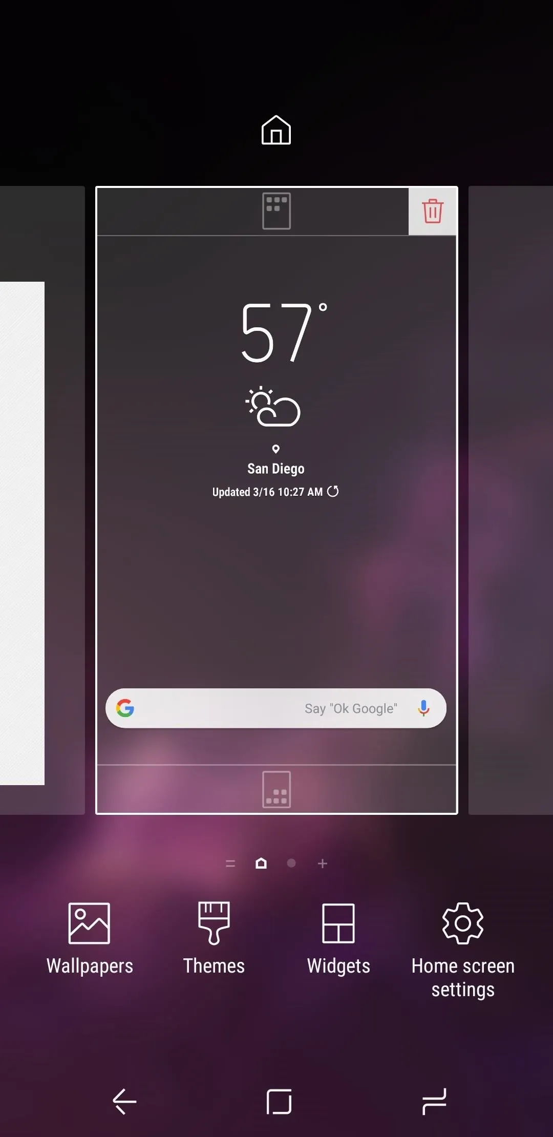
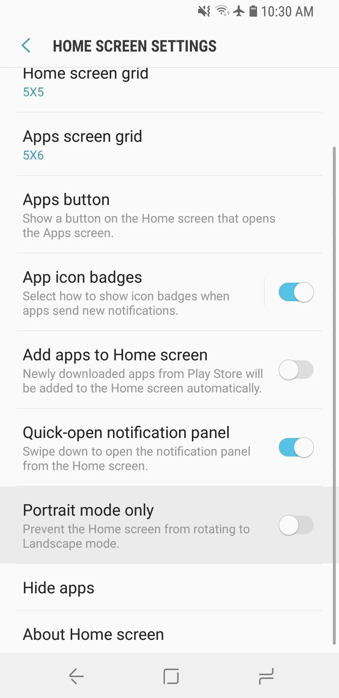


Other launchers, like Nova and Action, have had this feature for years, but it's nice to see it finally make its way to Samsung's home screen app.
Colored Folders
One of the biggest changes evident on the S9 is the colorization of Samsung's native UI. The latest Oreo-based TouchWiz includes a new feature that lets us customize folders on the home screen with a slew of colors to choose from. This option can be accessed through an icon on the top-right once a folder is expanded.
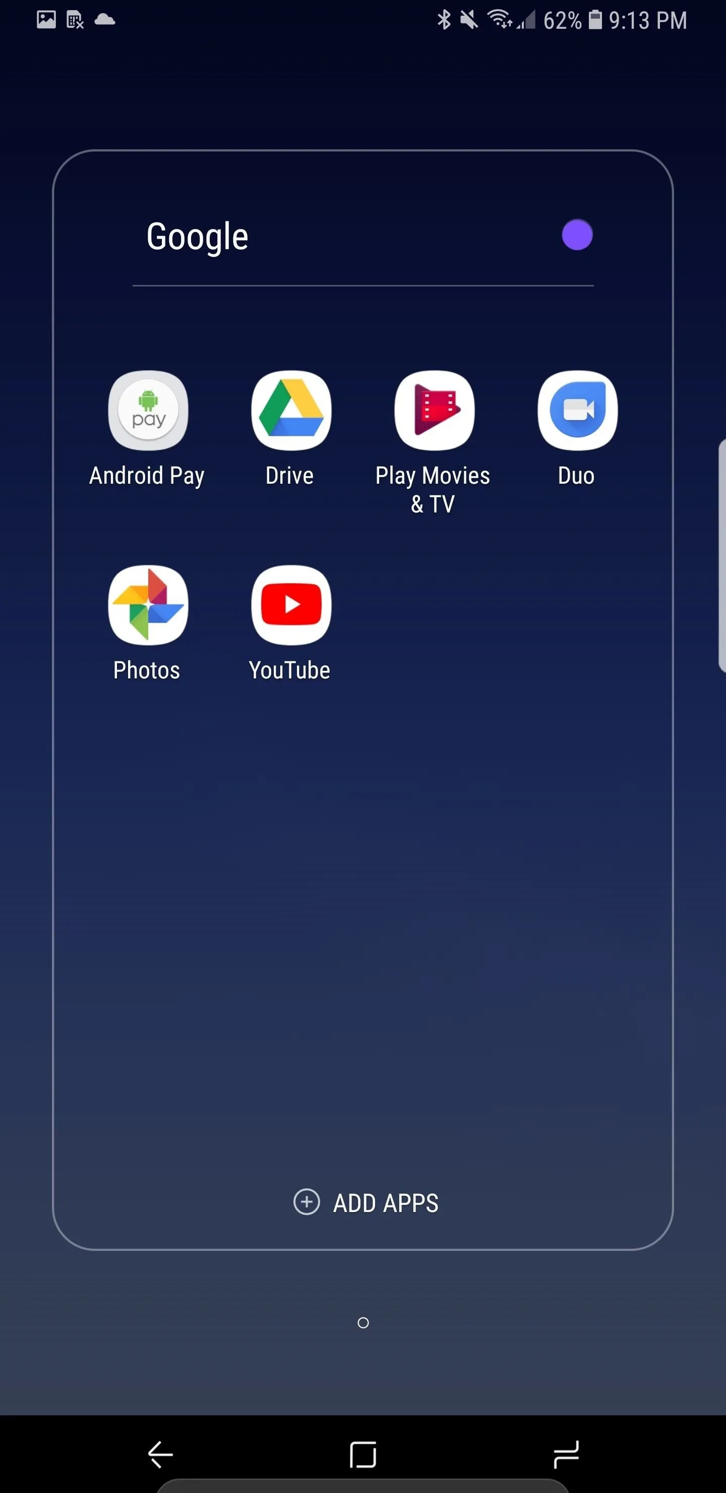
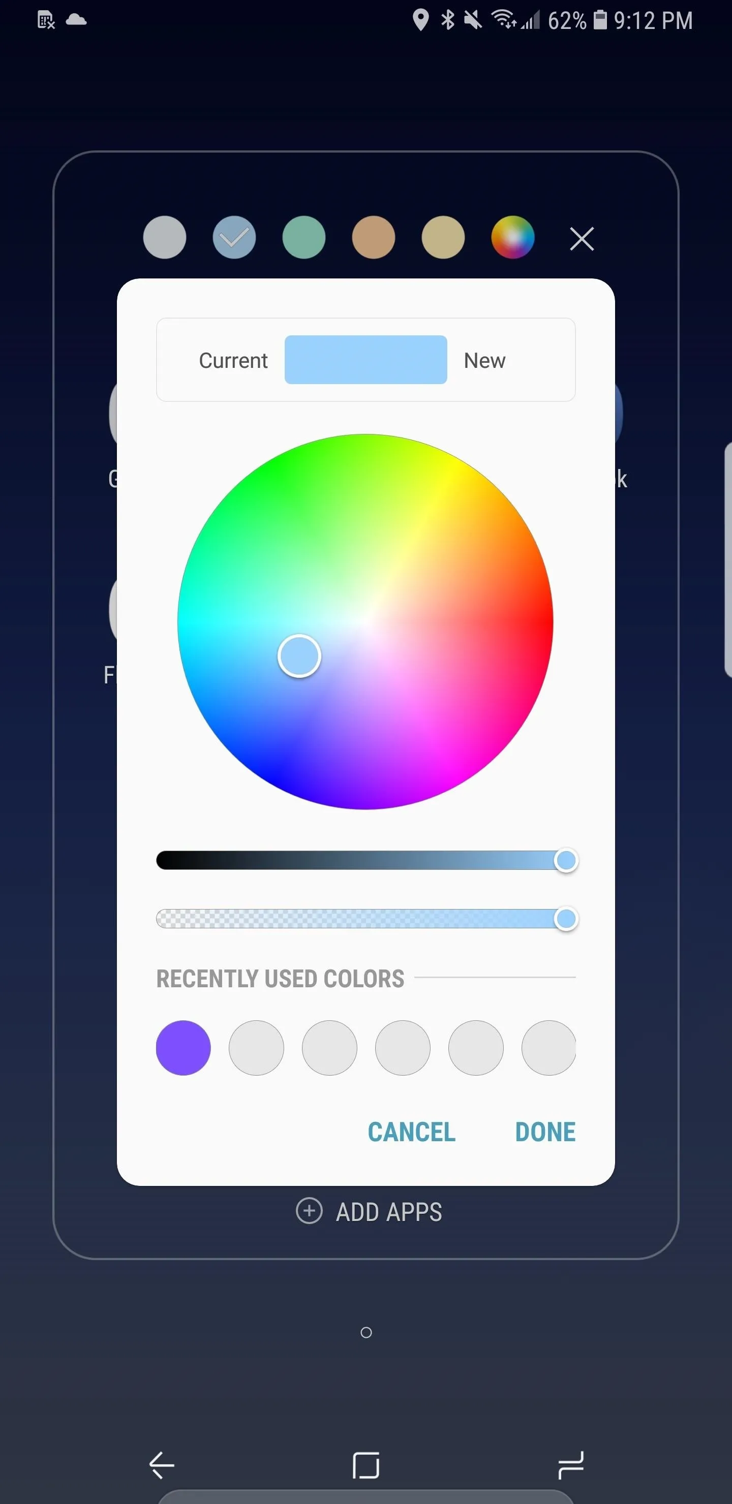
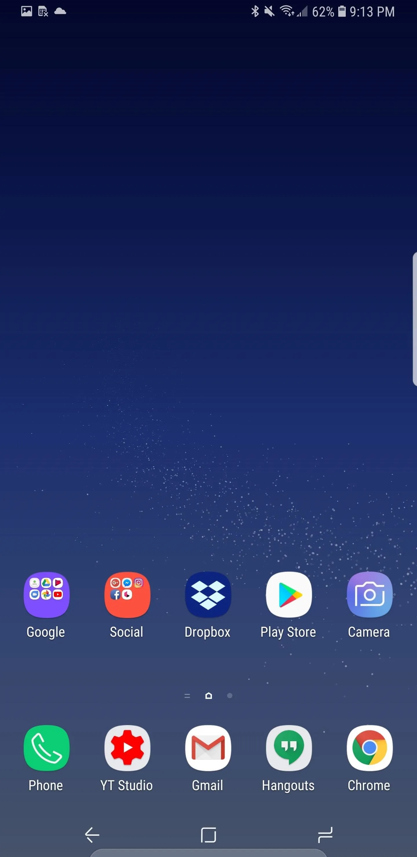


In addition to this, you can also change the opacity of the color, view a history of your selections, and see a list of recommended colors for your theme. Keep in mind, however, that using a custom theme will limit color selection. While using the default theme lets you pick from any color on the color wheel, enabling dark themes may restrict your choices to black or grey.
App Shortcuts
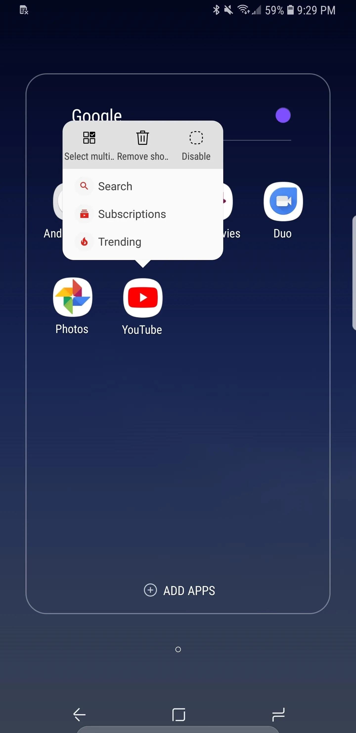
The other important change to the S9's desktop is the arrival of app shortcuts, which is very similar to 3D Touch shortcuts on the iPhone. Each app is allowed up to 5 contextual shortcuts, accessible by long-pressing on the icon. It's worth noting that apps will need to be updated to add support for this new feature, so if a particular app doesn't have it yet, it'll most likely arrive in a future update..
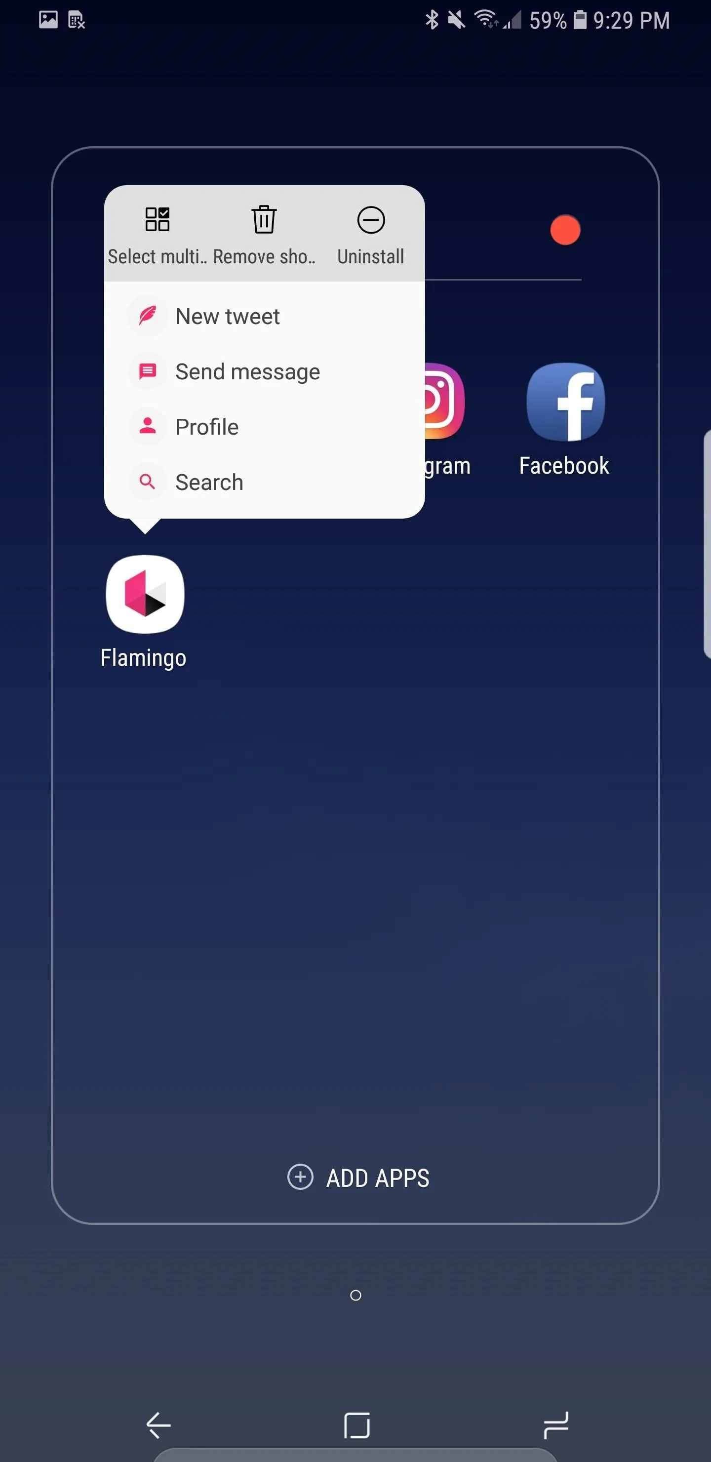
Thanks to Oreo's app shortcuts, you are able to go to specific pages or even perform a task even before you open an app. With YouTube, for example, you can now head straight to your Subscriptions page or check out what's trending. In popular social media apps like Twitter clients, you can launch directly into composing a new tweet, direct message, or search.
To remove a shortcut, simply tap on either "Remove Shortcut" for one or "Select Multiple" for two or more on the menu section on the top of the app shortcut. From here, you also have the ability to completely delete the app by selecting "Uninstall."


- Follow Gadget Hacks on Facebook, Twitter, Google+, YouTube, and Instagram
- Follow WonderHowTo on Facebook, Twitter, Pinterest, and Google+
Cover image by Dallas Thomas/Gadget Hacks, screenshots by Jeff Springer/Gadget Hacks









Comments
Be the first, drop a comment!