


Reviewed by Julianne Ngirngir
Your phone's file manager just became a whole lot more interesting. Google's quietly rolling out a complete Material 3 Expressive makeover for its Files app, and honestly? It's about time this workhorse got some love.
What you need to know:
Files by Google is getting the full Material 3 Expressive treatment with bolder buttons, centered FABs, and larger thumbnails
The redesign includes a new wavy progress bar and streamlined interface elements that make navigation clearer
This update is part of Android 16's broader UI overhaul, though it's rolling out gradually to users now
Google's been busy giving its entire app ecosystem the Material 3 Expressive treatment — you know, that "bold new direction for design" backed by research with over 18,000 participants. After testing the beta for two weeks, the changes feel more dramatic than Google's typical iterative updates—this is the kind of refresh that actually changes how you use the app daily. Files by Google has crossed five billion downloads earlier this year, making it one of Google's most widely-used utility apps.
Why your humble file manager is getting the VIP treatment
Here's the thing: Files by Google has always been the reliable utility truck of Android apps. It does the job, keeps your storage clean, and doesn't ask for much attention. But Google's latest research shows that expressive designs help users spot key UI elements up to four times faster — and for a file manager where users often hunt through folders under pressure—trying to find that PDF before a meeting or locating photos to share—these speed improvements translate to real daily frustration reduction.
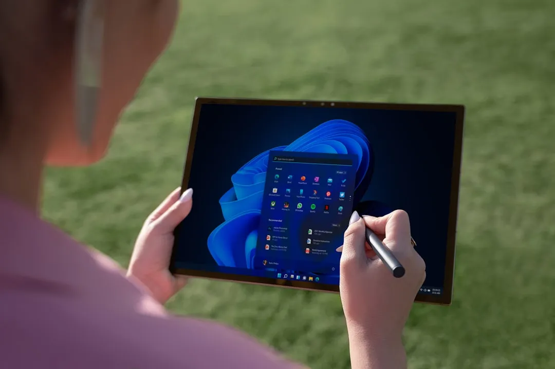
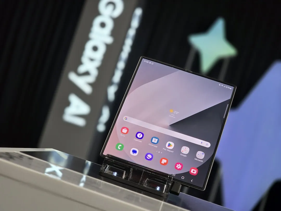
The beta version reveals some significant changes to how you'll interact with the app. Those Quick Share and File Scanner floating action buttons that used to hang out in the bottom right corner? They're now sitting side-by-side in the center, housed in a sleek pill-shaped container that's way easier to tap.
This centered approach isn't just about aesthetics—Google's research found that users prefer this positioning because it's more accessible for both left and right-handed users. The company's applying the same logic across Messages, Calendar, and other core apps as part of a broader strategy to create consistent, intuitive experiences across Android.
What's actually changing in your daily file management
The visual updates go deeper than just button placement. Thumbnails for recent files are now larger, making it easier to identify photos and documents at a glance. Having navigated through countless file management sessions, the larger thumbnails address one of my biggest daily annoyances—squinting to distinguish between similar-looking documents or trying to identify photos by tiny previews.
When you're installing an APK or compressing files, you'll see a new wavy progress bar that appears center-screen instead of lurking at the bottom. It's a small change that makes the process feel more visually engaging and easier to track.
Google's also working on some behind-the-scenes improvements that should make the app more intuitive. The company is planning to eliminate the Category filter and instead show different file types directly on the main screen. Plus, there's a new filter option coming that'll let you toggle between internal and external storage — finally addressing one of the most common user requests.
The sidebar is getting trimmed down too, taking up less screen real estate while organizing privacy policy and terms of service options more logically at the bottom. This creates more room for your actual files while cleaning up the interface hierarchy.
Getting the new look on your phone
This redesign is part of the broader Android 16 Material 3 Expressive rollout that's happening alongside the upcoming Android 16 QPR1 beta. While the full expressive treatment won't hit stable Android 16 immediately, Google's been testing these updates across multiple app versions.
The Files by Google v1.7528 beta contains the code for these Material 3 Expressive components, and reports suggest the changes are starting to appear for more users. Since this is a server-side rollout, you might see the changes appear unexpectedly during your normal phone use—a pleasant surprise rather than requiring you to hunt for updates.
PRO TIP: Check your Files app — if you're seeing centered FABs and larger thumbnails, you're part of the early rollout. The changes should be pretty obvious once they hit your device.
Where Files by Google goes from here
This isn't just about making things look prettier — though Google's research shows that expressive designs scored 32% higher on "subculture perception" and 34% higher on modernity. For a file manager that's been relatively unchanged since its modest beginnings in 2017, this represents the biggest visual overhaul yet.
These usability improvements position Files by Google to handle more complex workflows—potentially challenging dedicated file manager apps that have traditionally offered more power-user features. With Files by Google working on Android 5.0 and up and consuming less than 1MB of storage, making it more intuitive and visually appealing should help users take better advantage of features like Safe Folder, built-in file sharing, and the automated cleanup suggestions that have been core to the app since day one.
Expect to see these changes rolling out more broadly over the coming weeks, with the full Material 3 Expressive experience likely arriving with Android 16's first quarterly platform release later this year.


Comments
Be the first, drop a comment!