Google's got a hit on its hands with this one. Android 5.0—AKA "Lollipop"—will be making its official debut next month, but a new preview build has given us a glimpse into the future, which looks brighter than ever.
New accents, beautiful animations, and a lighter overall color palette mark some of the more dramatic user-facing changes, and more robust features and options push the whole experience forward. If you're curious to see what Google's been up to this past year, we've got you covered here with an overview of the changes.

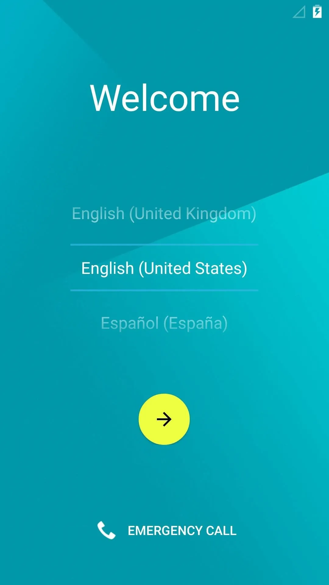
New Initial Setup Menu
As soon as you power a Lollipop device on for the first time, you'll immediately notice the visual updates. Gone are the days of the drab black and gray setup menu, with the interface now colorful and bright.
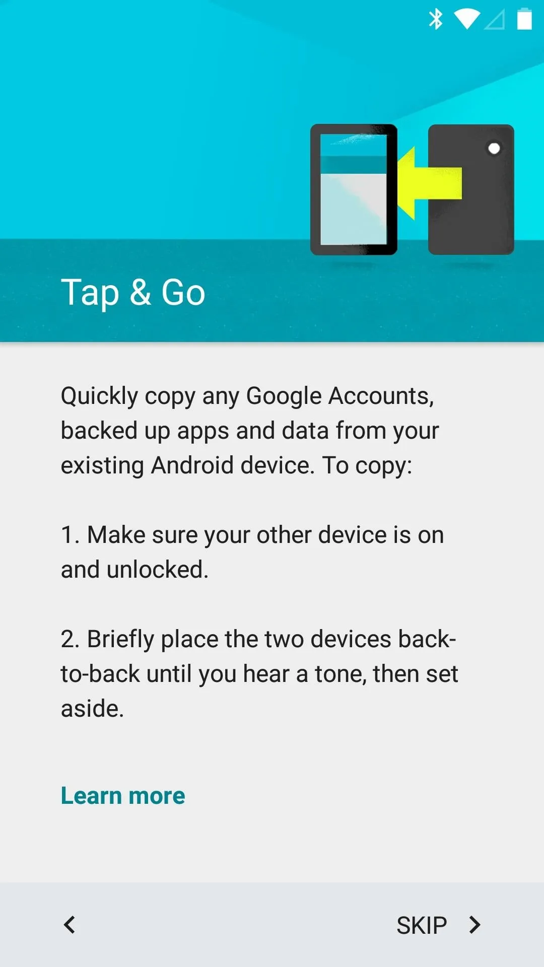


A new Tap & Go feature lets you easily transfer apps, data, and account info from your old device. Just touch two NFC-enabled devices together, and the rest of setup will take care of itself.
Revamped Home Screen & App Drawer
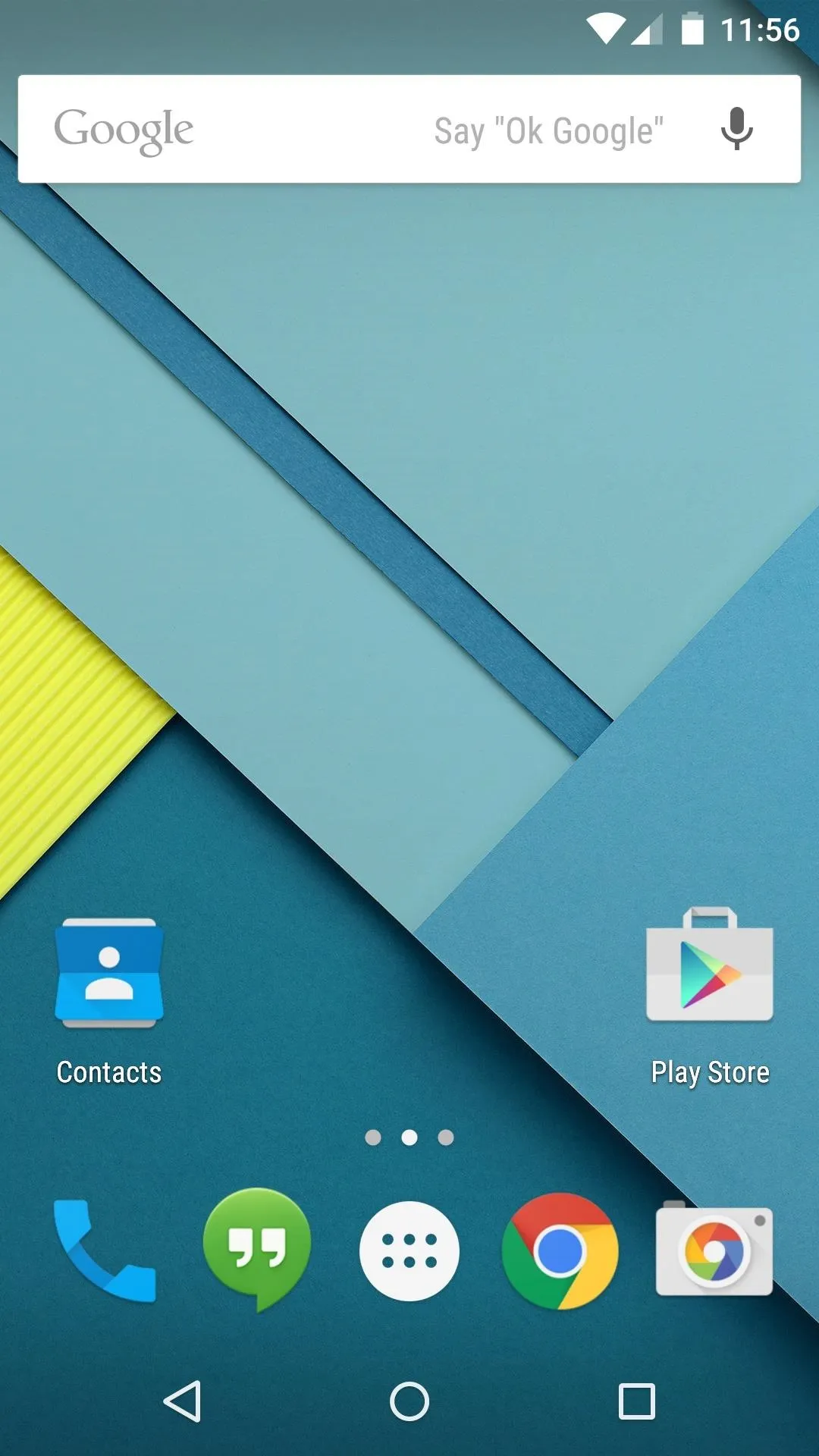
The stock Android home screen has been retouched in version 5.0, with Material Design elements added to most of the stock icons.
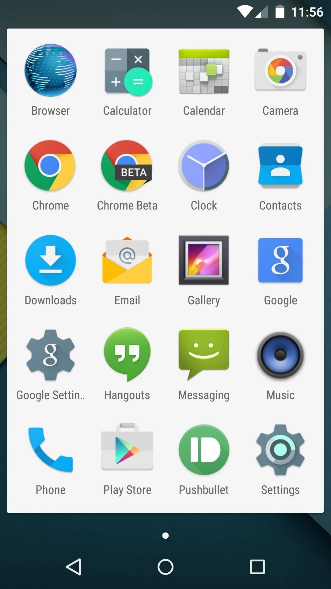


The App Drawer is now presented in a paginated, windowed format, and the background color has shifted from black to white. A new transition animation occurs when you open App Drawer button, with the list of apps expanding outward from the All Apps button.
Tweaked Google Now Interface
As the leftmost home screen page on Nexus devices, Google Now remains a central part of the UI.
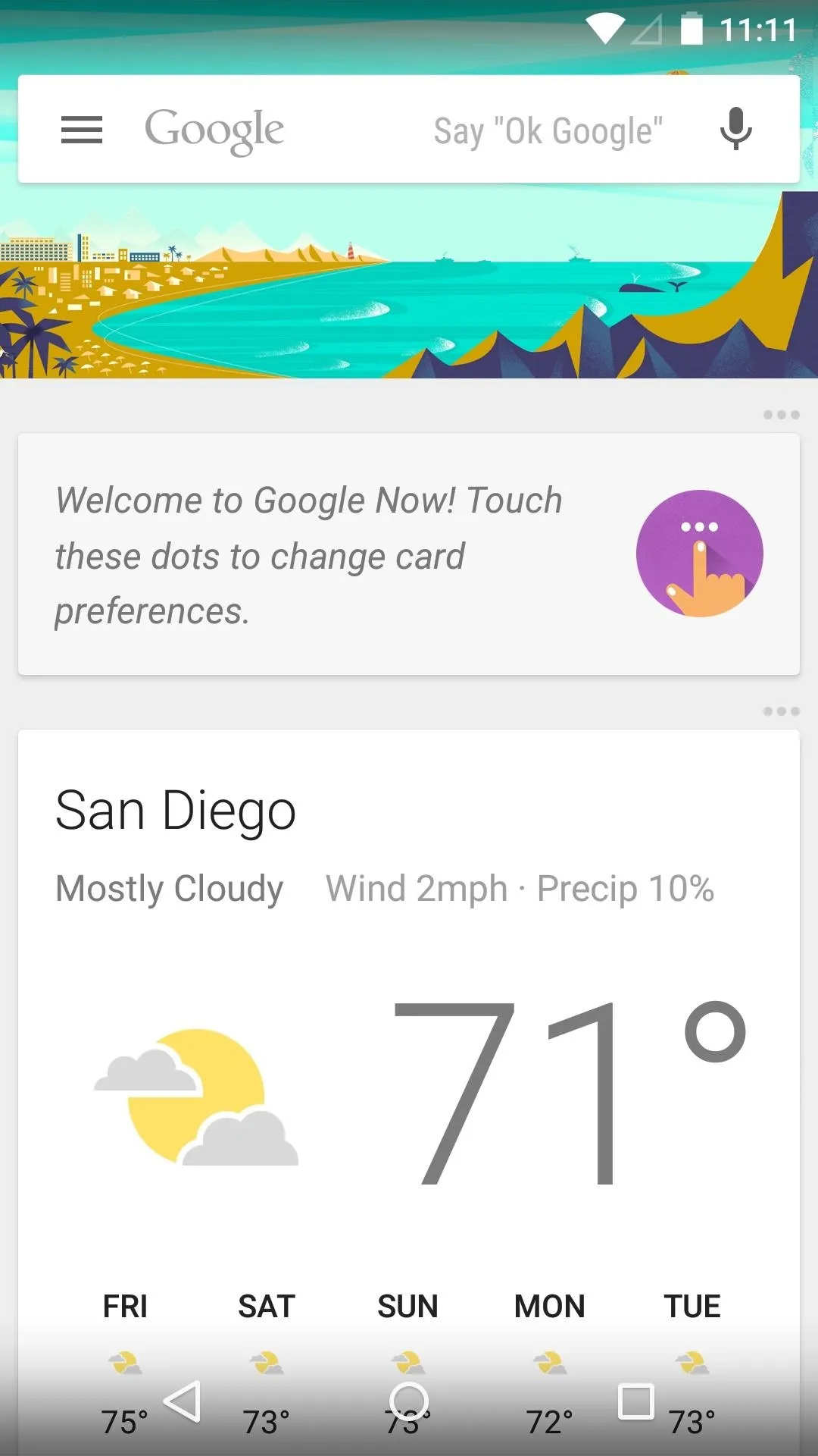
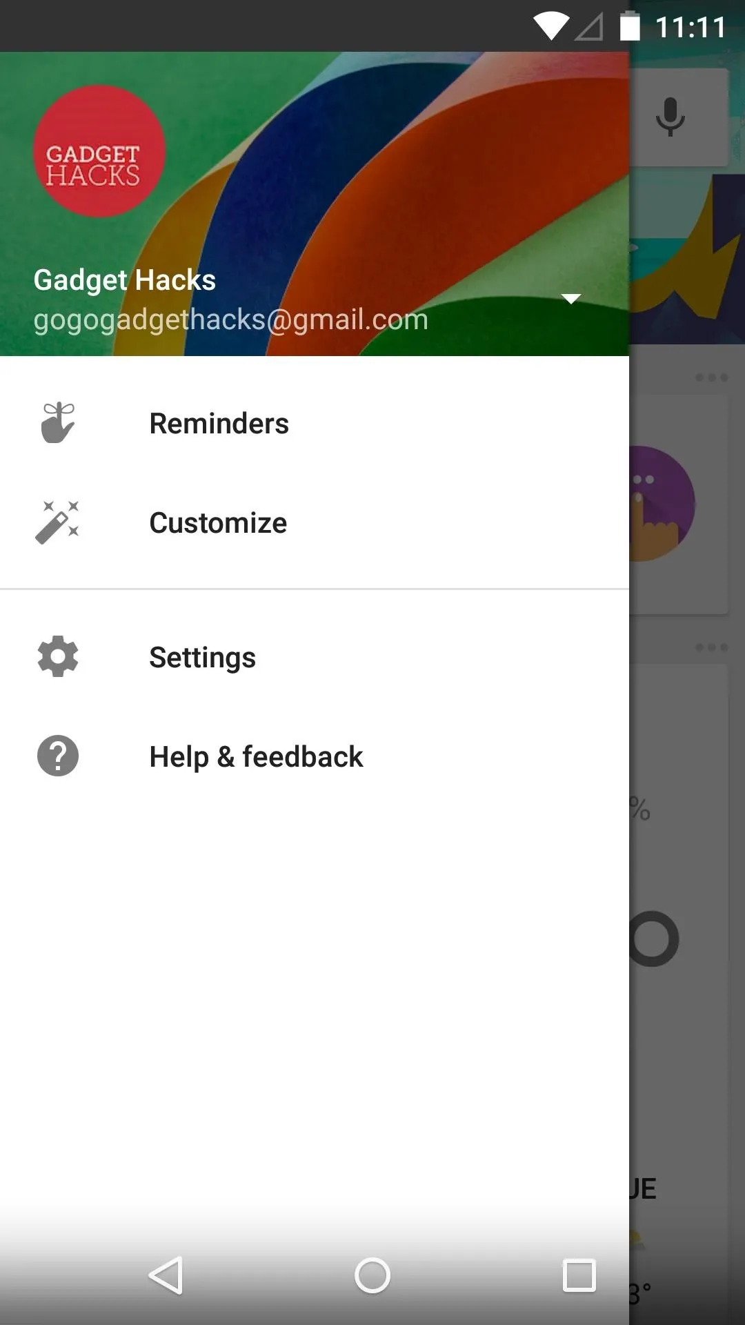


Now has been updated to include a slide-out navigation drawer in 5.0, keeping with the new Android design guidelines.
Updated Lock Screen
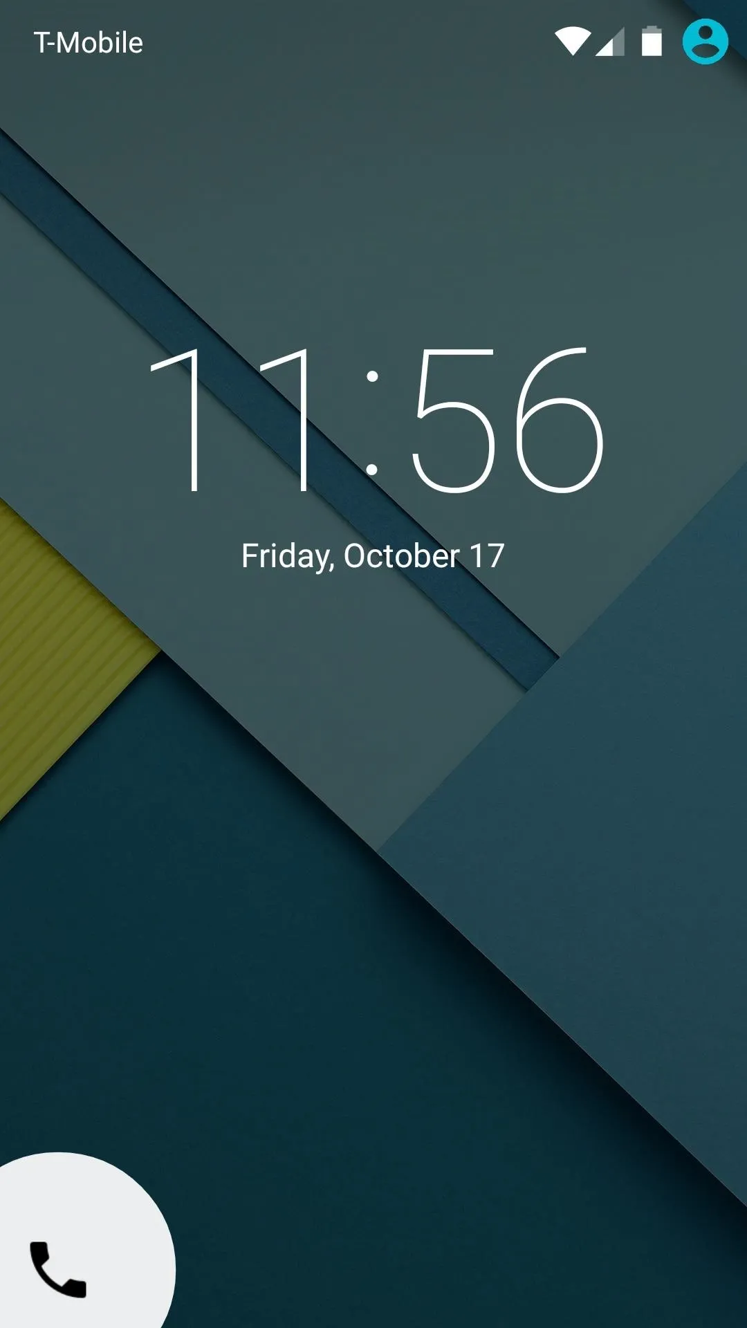
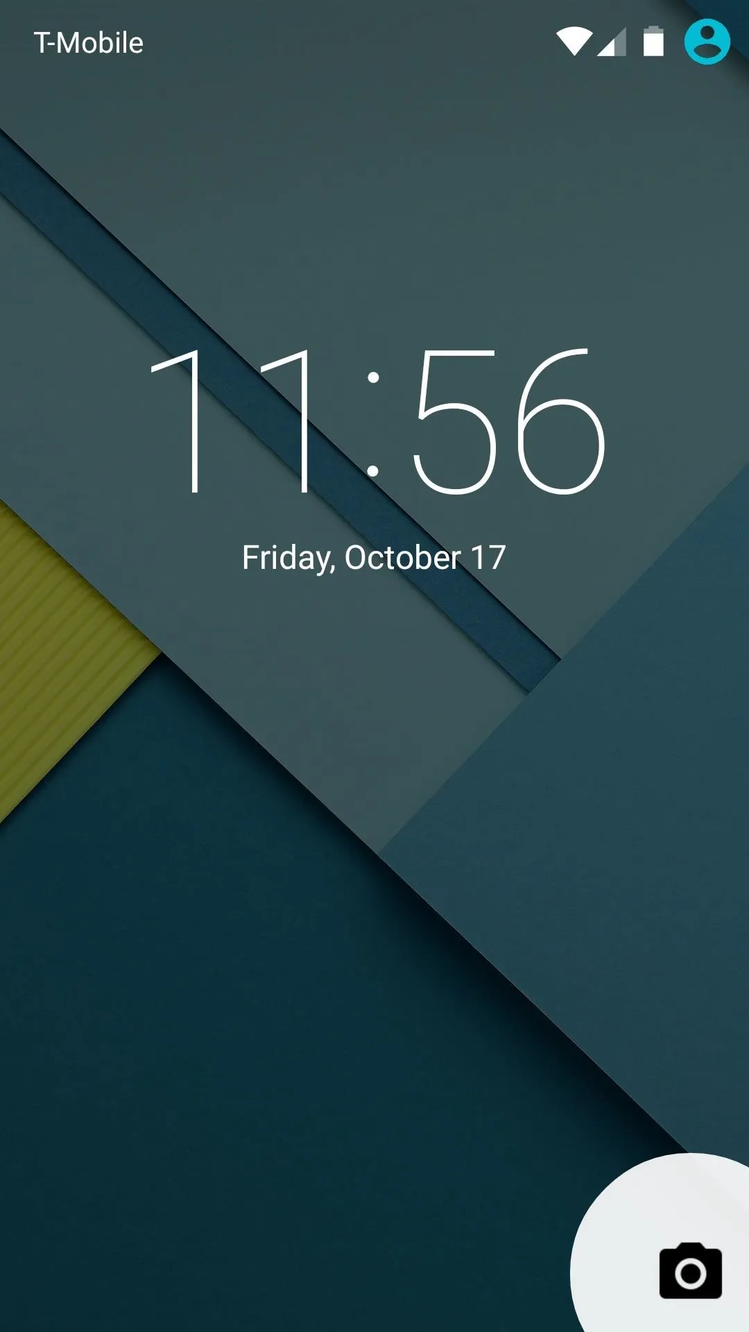
Android 5.0's lock screen ushers in new form and functionality. It's clean look is reminiscent of KitKat's lock screen, but notifications can now be viewed without unlocking the device.
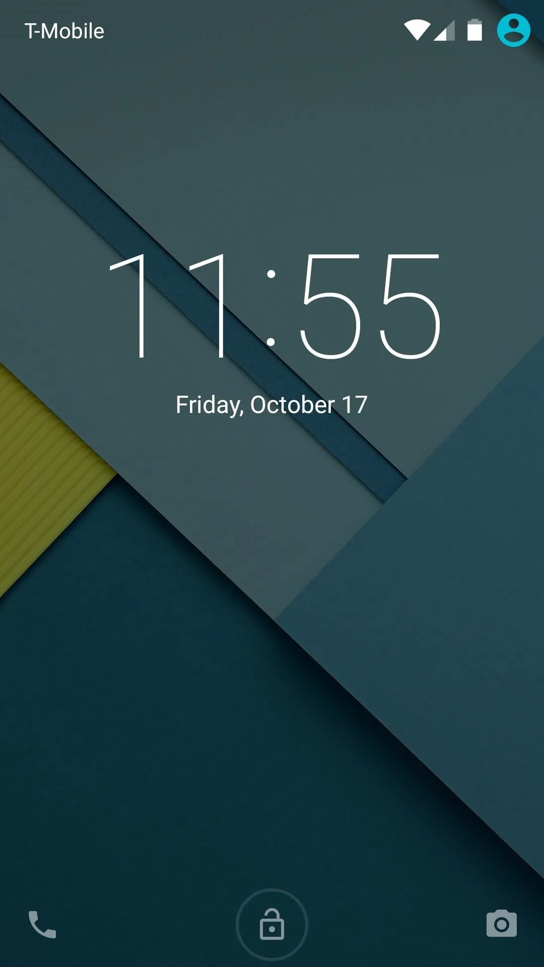
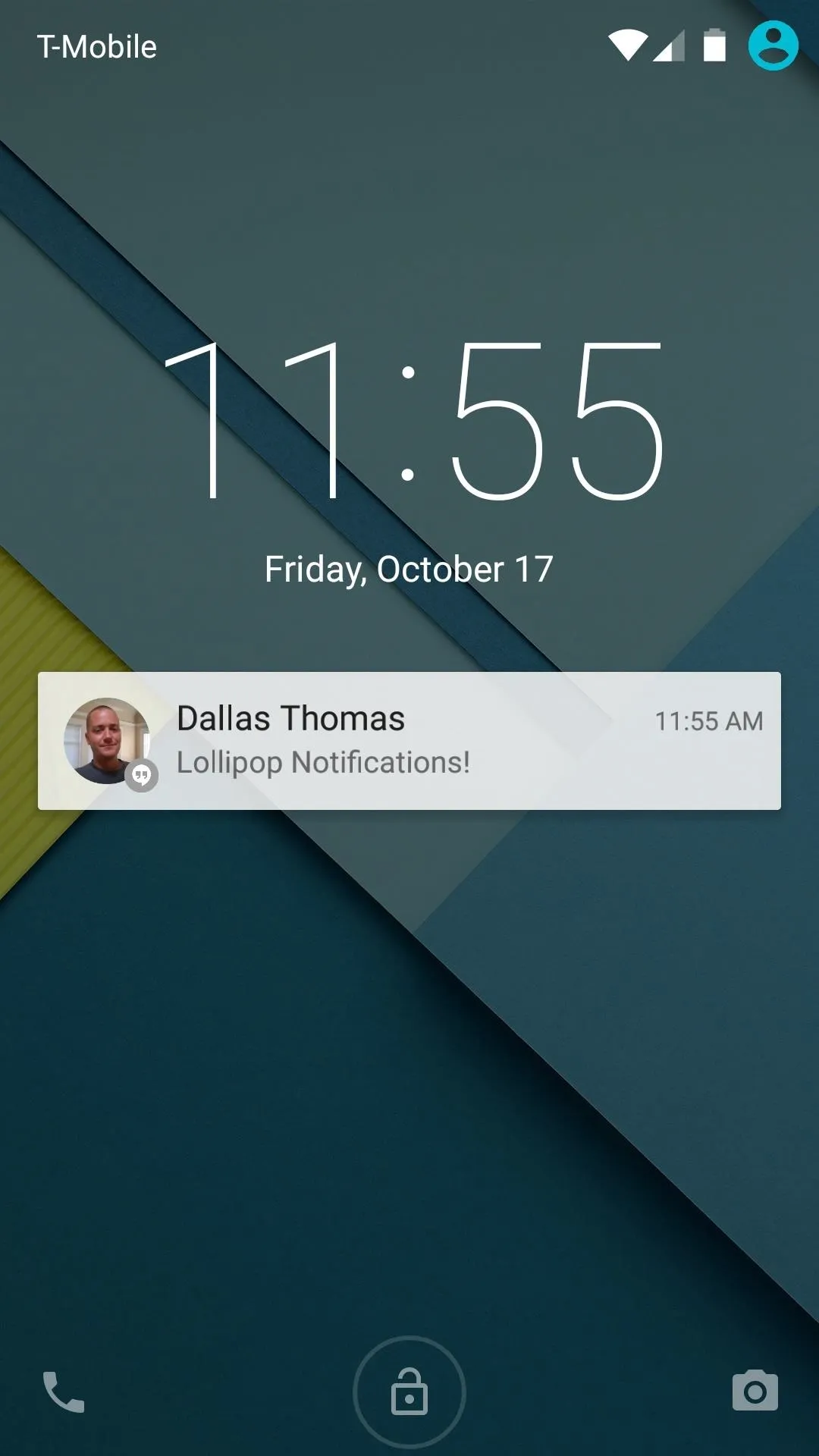


The camera shortcut still resides at the bottom-right corner, but a new Phone icon now sits opposite of it. The screen is unlocked by swiping upward, but swiping left or right from any point takes you directly to these commonly-used apps.


Refreshed 'Recent Apps' Menu
Lollipop's Recent Apps menu models itself after Chrome for Android's tab view. This is no coincidence, as Chrome tabs are now integrated directly into the Recent Apps view.
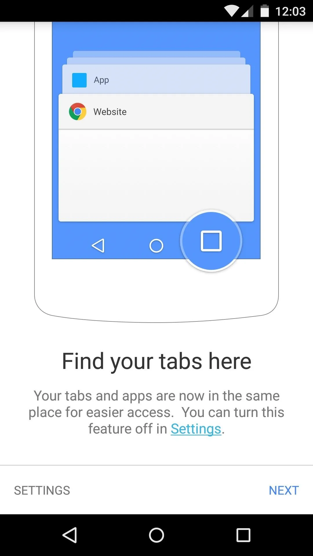
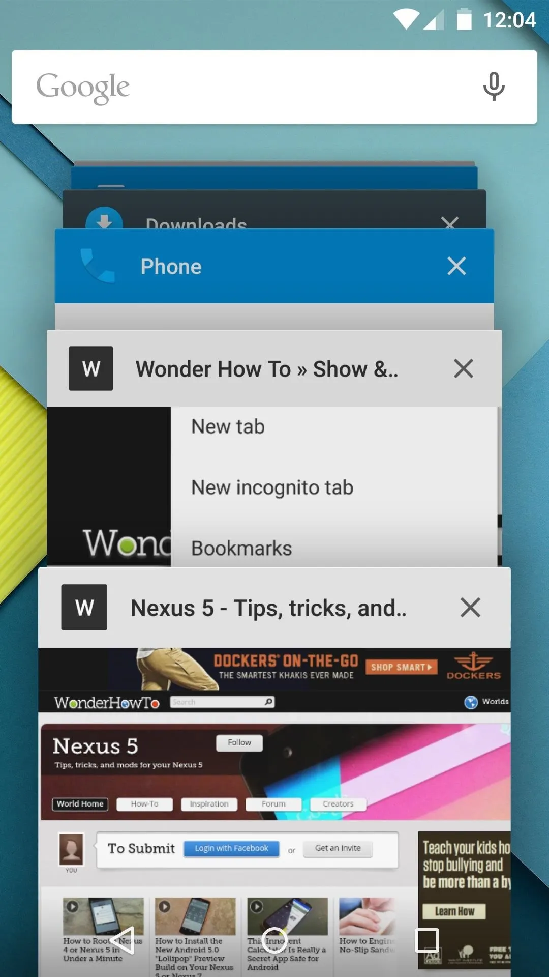


The title bar on each of the recent apps can now be set to match a given app's color scheme. This feature will require an update to existing 3rd-party apps, but is already included on most stock apps.
Redesigned System Menus
Notifications have been re-imagined in Android 5.0, featuring a new "Head's Up" mode that won't steal focus when you get an incoming call while using your device.
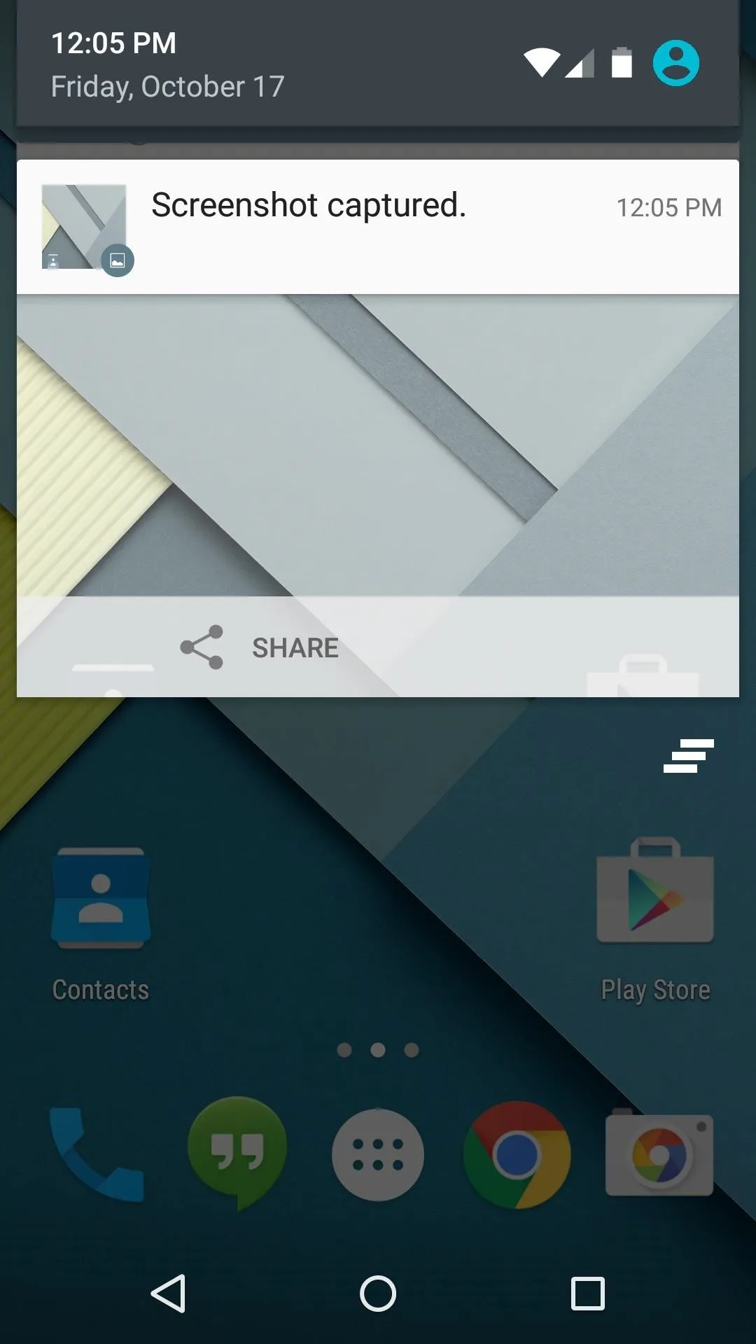
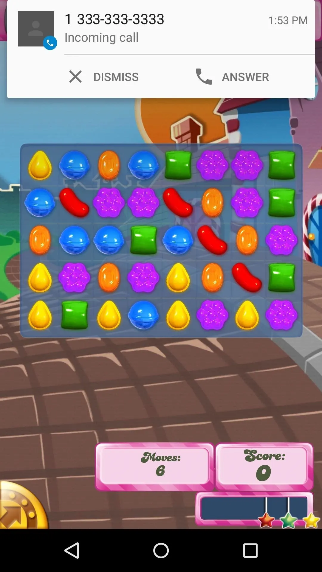


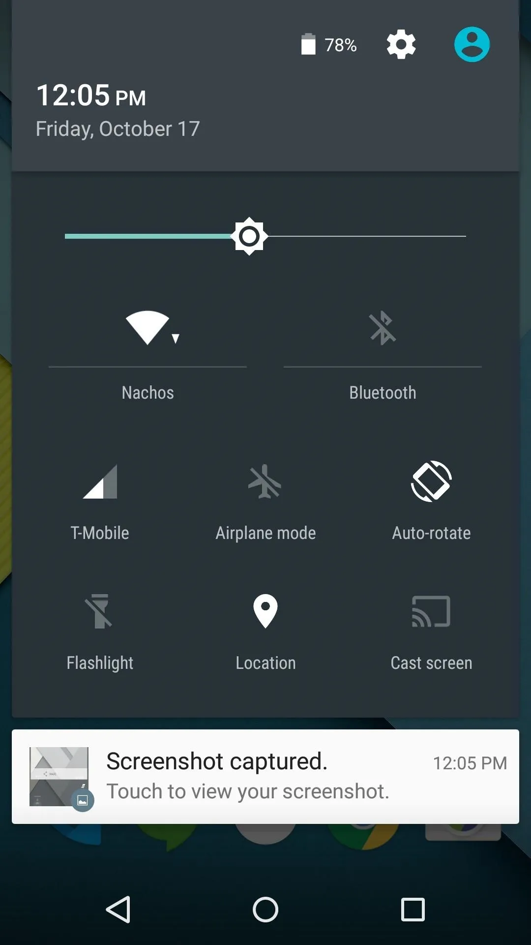
Pull down from the top of the screen once, and you'll get to your notification panel as usual. But pull down again, and you'll find the new Quick Settings menu, complete with new toggles like Flashlight and Auto-rotate.
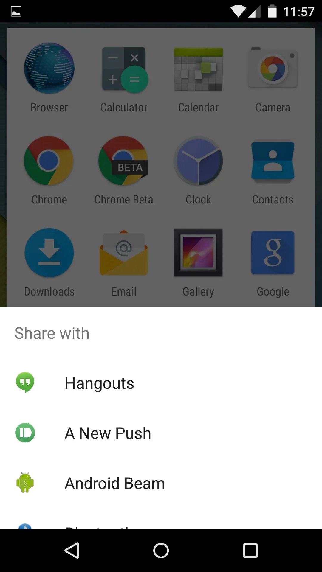


Other system menus have been updated as well, including a new dialog box that expands from the bottom of the screen.
New Settings Menu & Battery Options
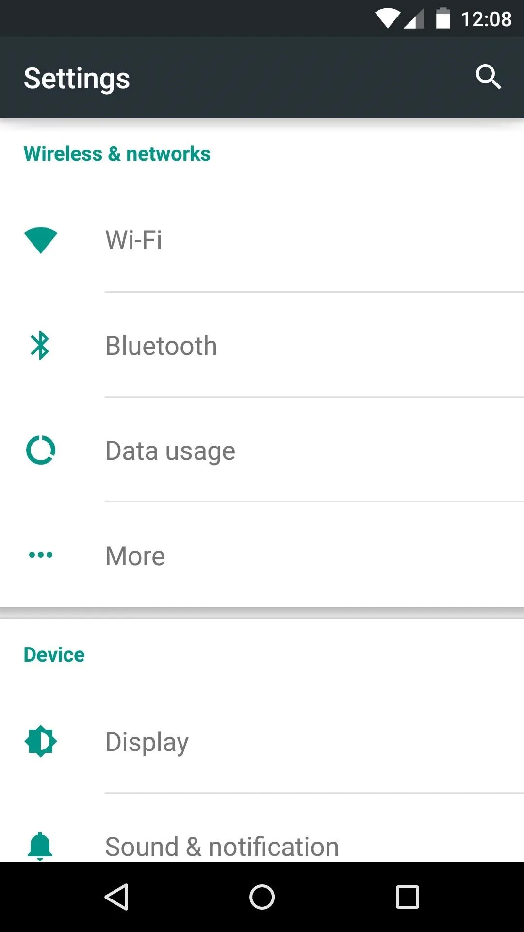
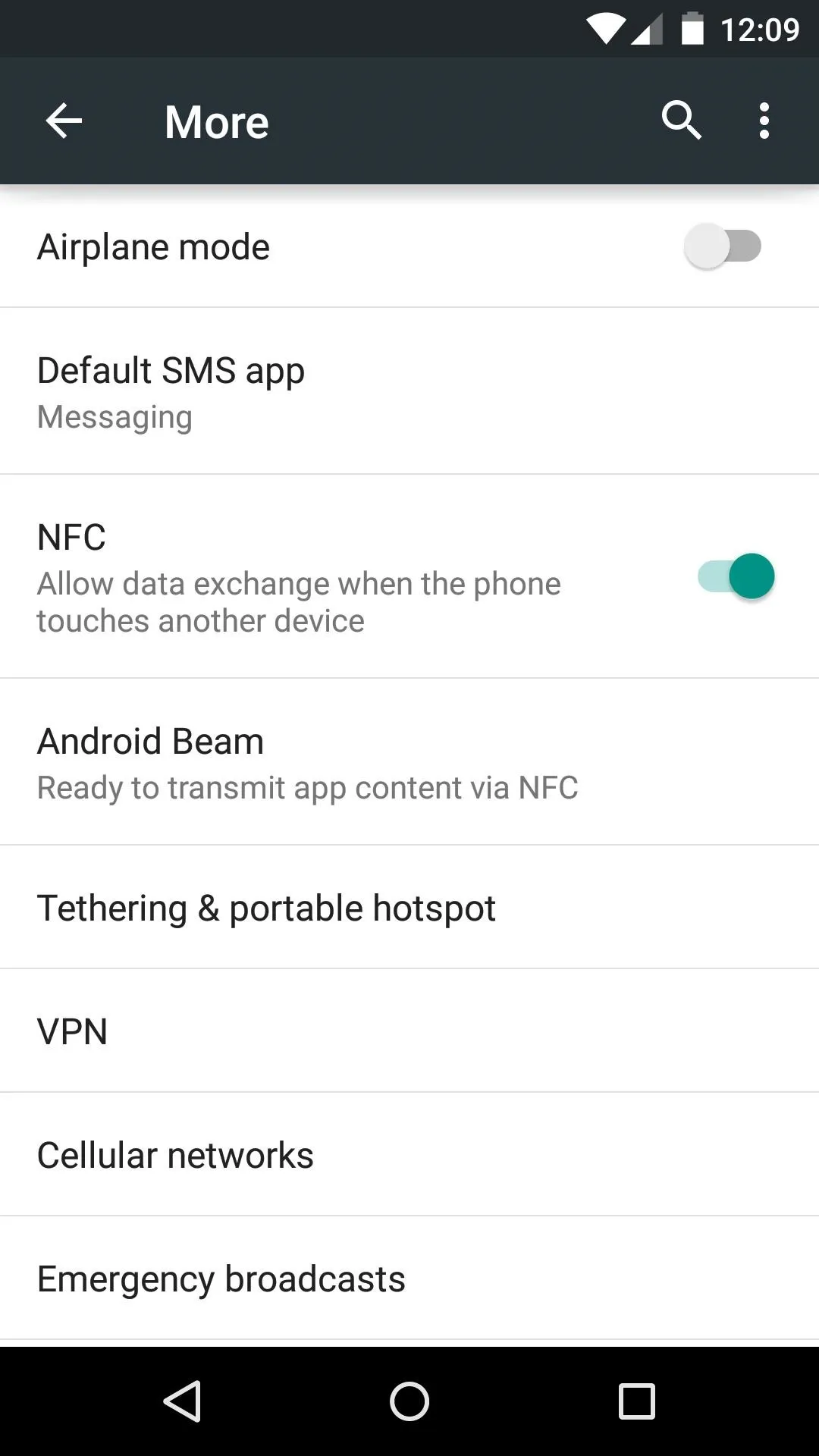
Android's settings menu has a bright background and a touch of color now. Green accents and simplified switches look to make the experience less intimidating for new users.


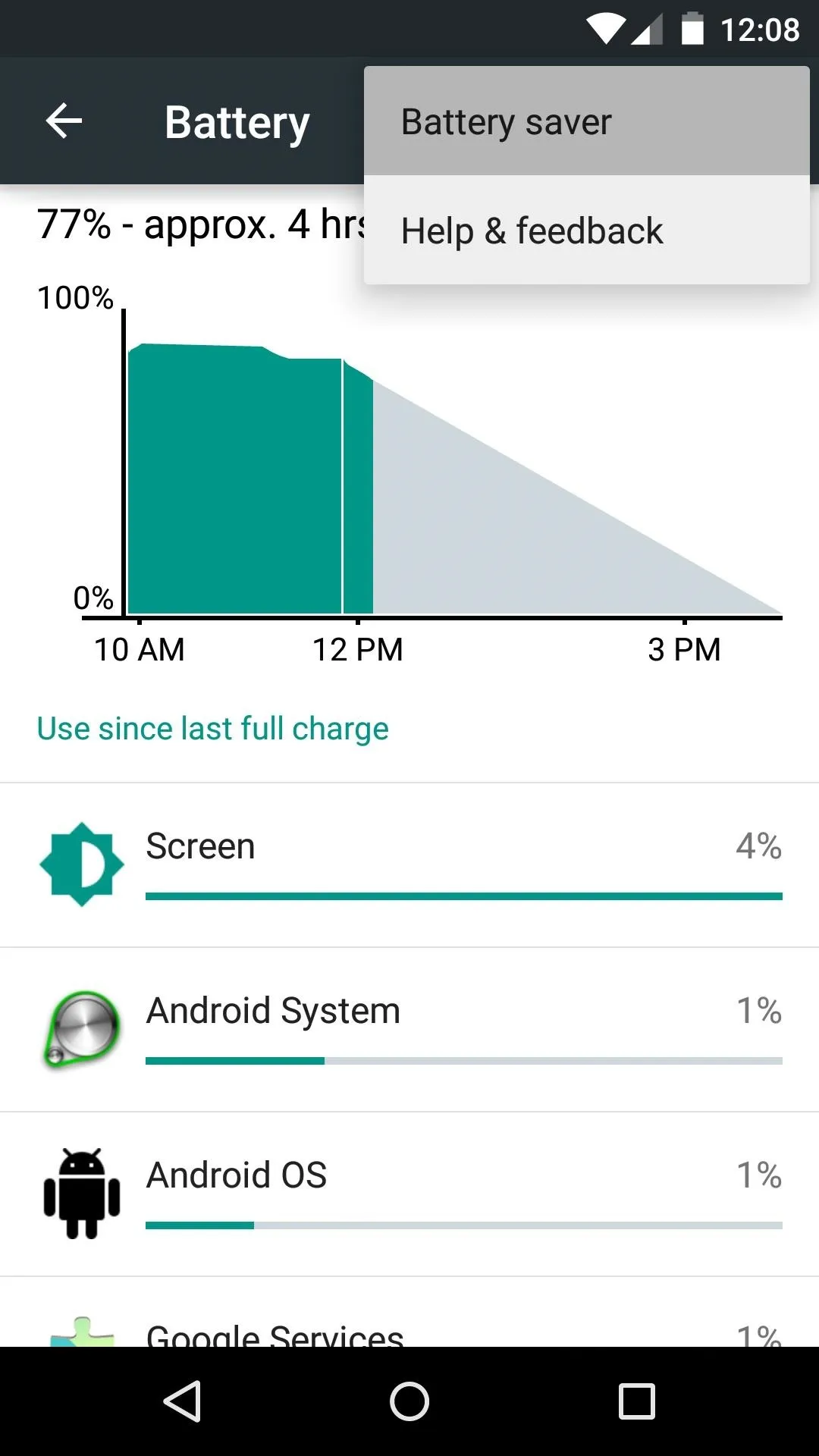
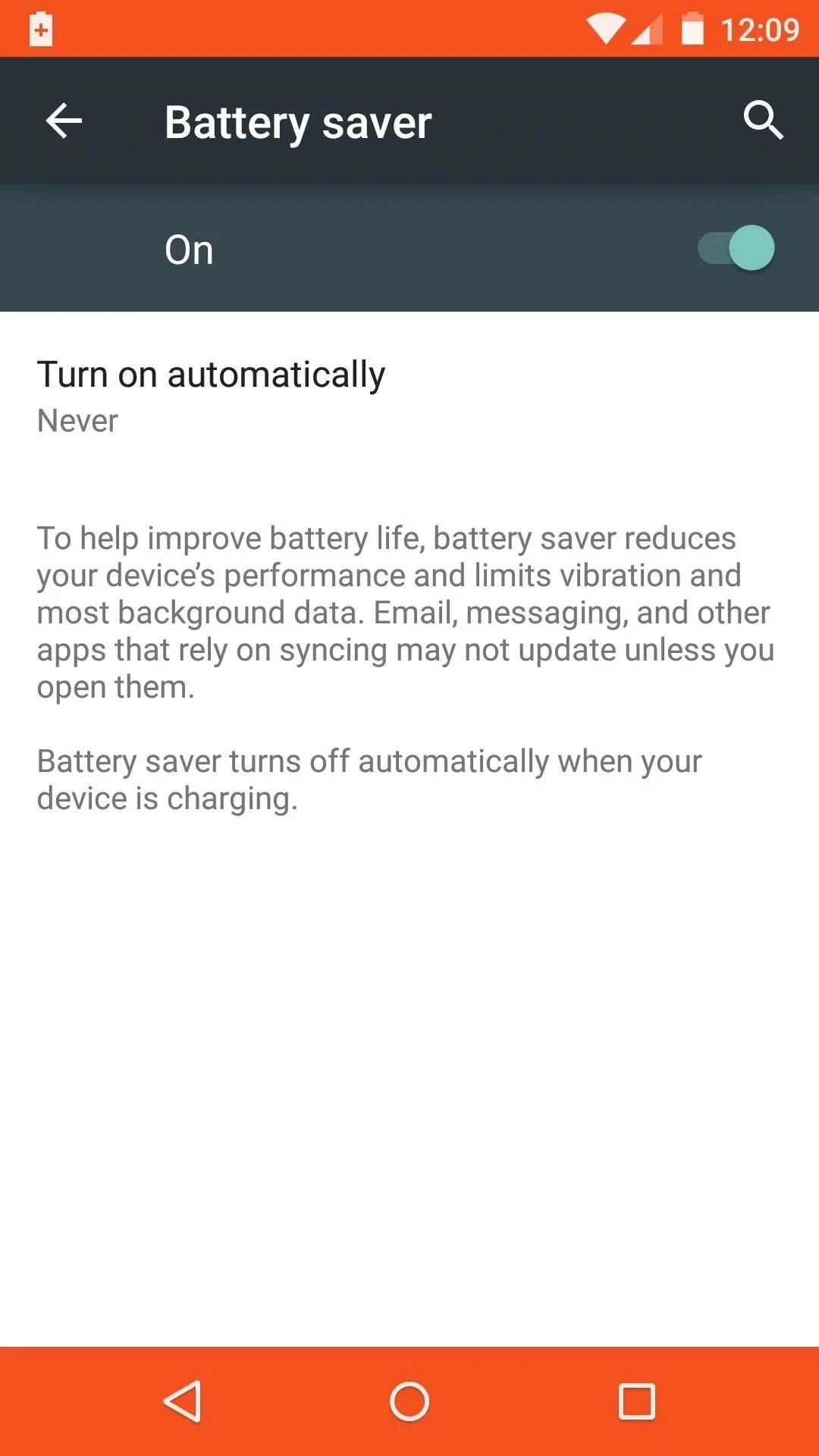
The battery submenu now displays remaining charge in hours and minutes, and a new Battery Saver feature restricts background processes to help squeeze up to an additional 90 minutes out of your device.


Material Design System Apps
Several stock apps have already been made over in the new Material Design style. The brightly-colored Phone app is one of the most noticeable changes here.
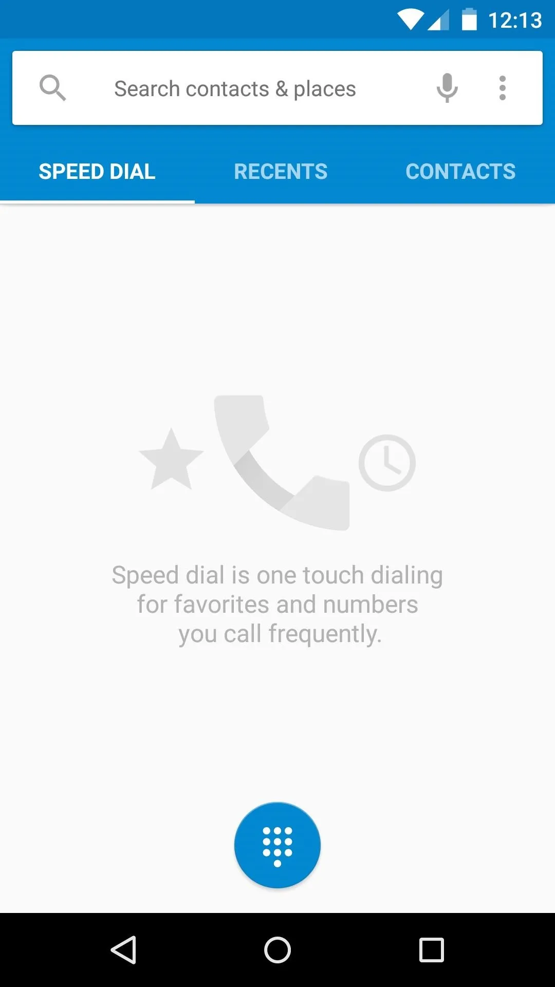
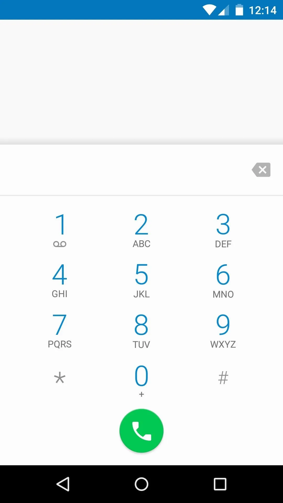


New transition animations permeate throughout the experience, and this can be seen when using the new Phone interface.
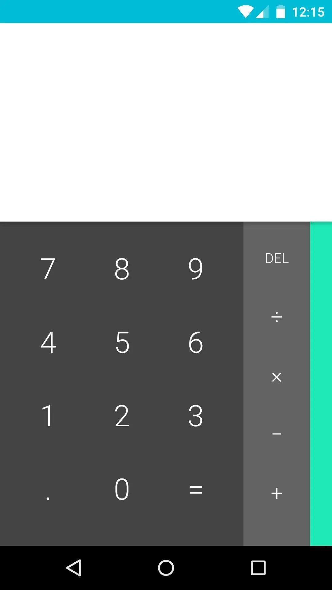
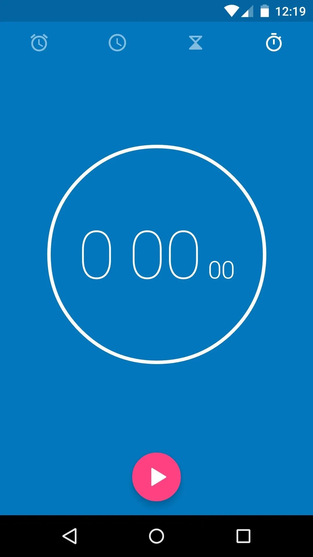
Other system apps have been refreshed as well. Staple apps Calculator and Clock are much more visually exciting in 5.0.


Flappy Bird Easter Egg
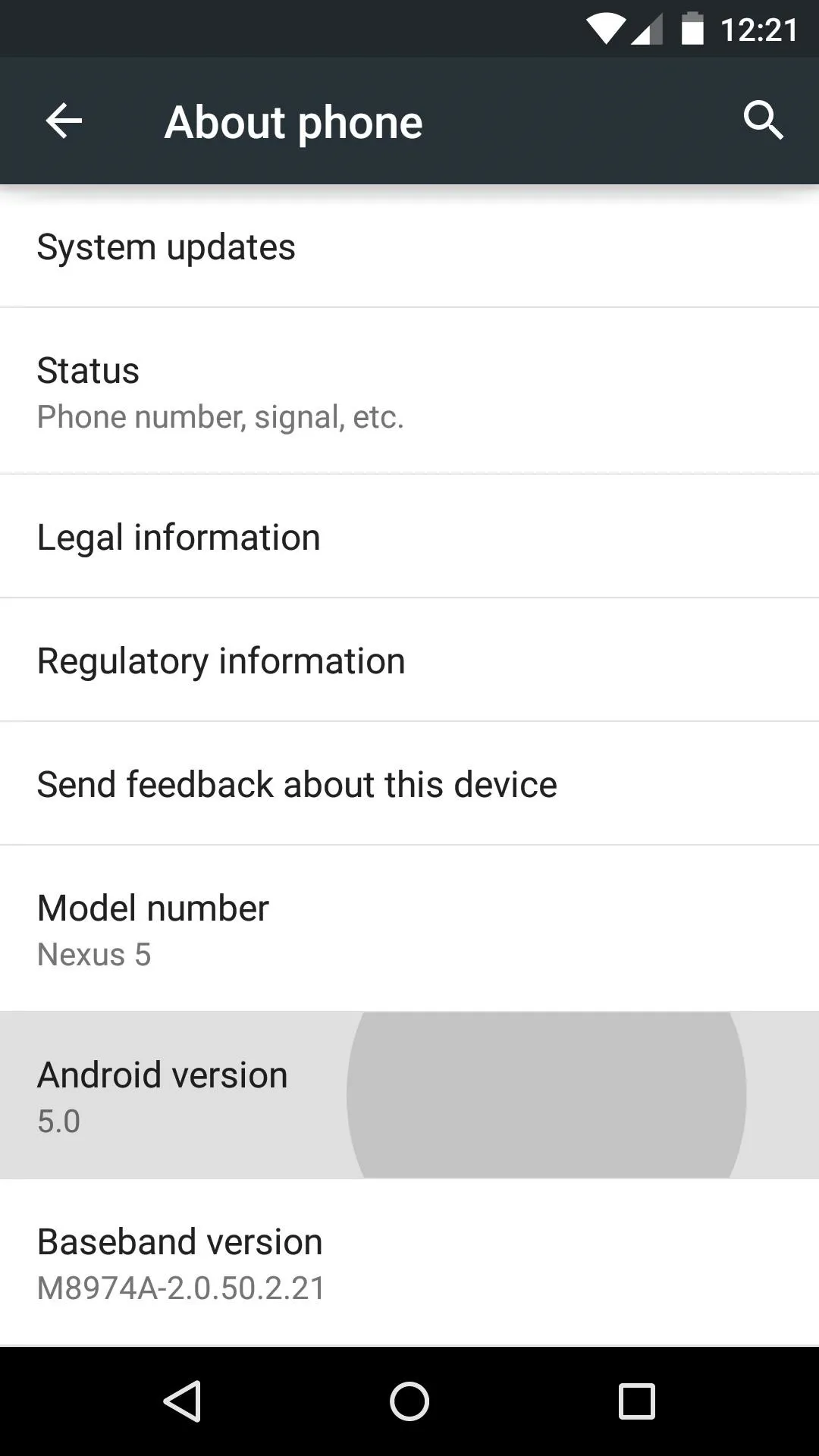
It wouldn't be a new version of Android without the good old Version Number Easter egg. In the main settings, under About Phone, tapping the Android Version entry rapidly unveils a hidden animation, and this time it's interactive.
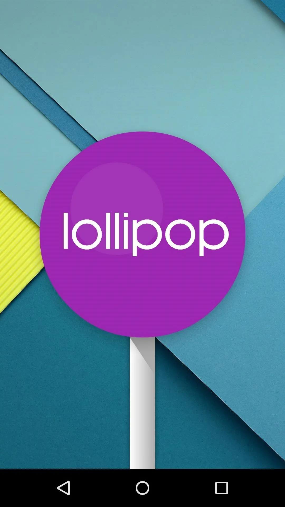
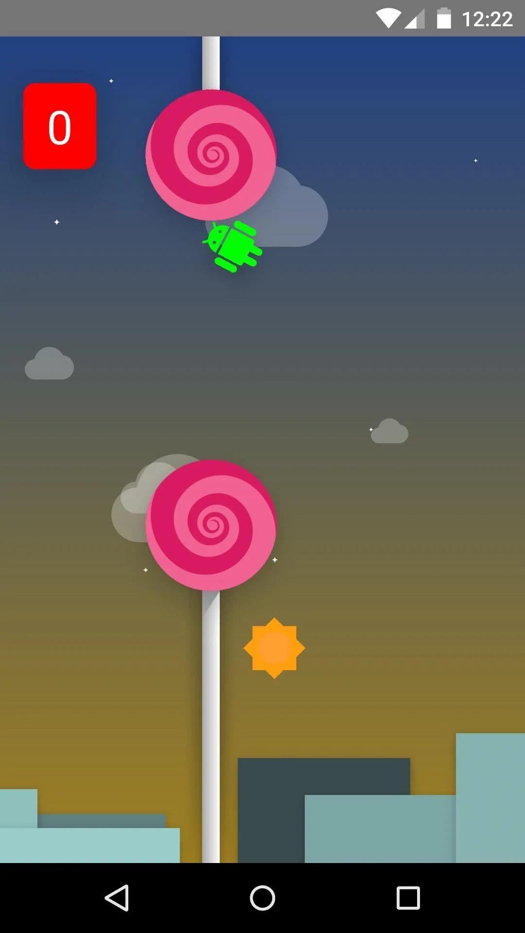


After long-pressing the Lollipop logo that appears, a Flappy Bird-clone mini-game takes over the screen. Tap the screen, and you'll be guiding an Android logo through a forest of lollipop obstacles.
Google has definitely refined its mobile OS with Lollipop, and the end result is both beautiful and fluid. What are your favorite new features? Let us know in the comments section below, as well as on Facebook and Twitter.
Cover images sourced from Android.com








Comments
Be the first, drop a comment!