Google's Material Design guidelines have finally brought some consistency to the look and feel of Android apps, bringing most of the user experience on par with what you would see on iOS. However, some developers are still using non-compliant home screen icons, even though Material Design calls for specific padding, size, and layouts.
Icons that don't adhere to Material Design standards will stand out as larger or smaller than the rest of the icons on your home screen, and if you're meticulous about the way things look, this can be really annoying. When compared to the identical, square-with-rounded-corners look that Apple apps use across the board, this is one area where Android still lags behind.
But unlike iOS, Android allows for custom home screen icons, so inconsistently-sized icons can easily be replaced. And now, thanks to a new app from developer Oxo, we can create consistent Material Design icons in as little as one tap. Your creations can be used as a makeshift icon pack with a custom launcher, or the app can add them directly to your stock home screen, so this is one that anyone can use.
Install Materialize
To get started, the first thing you'll need to do is install the app, which is called Materialize.

Create Your Own Home Screen Icons
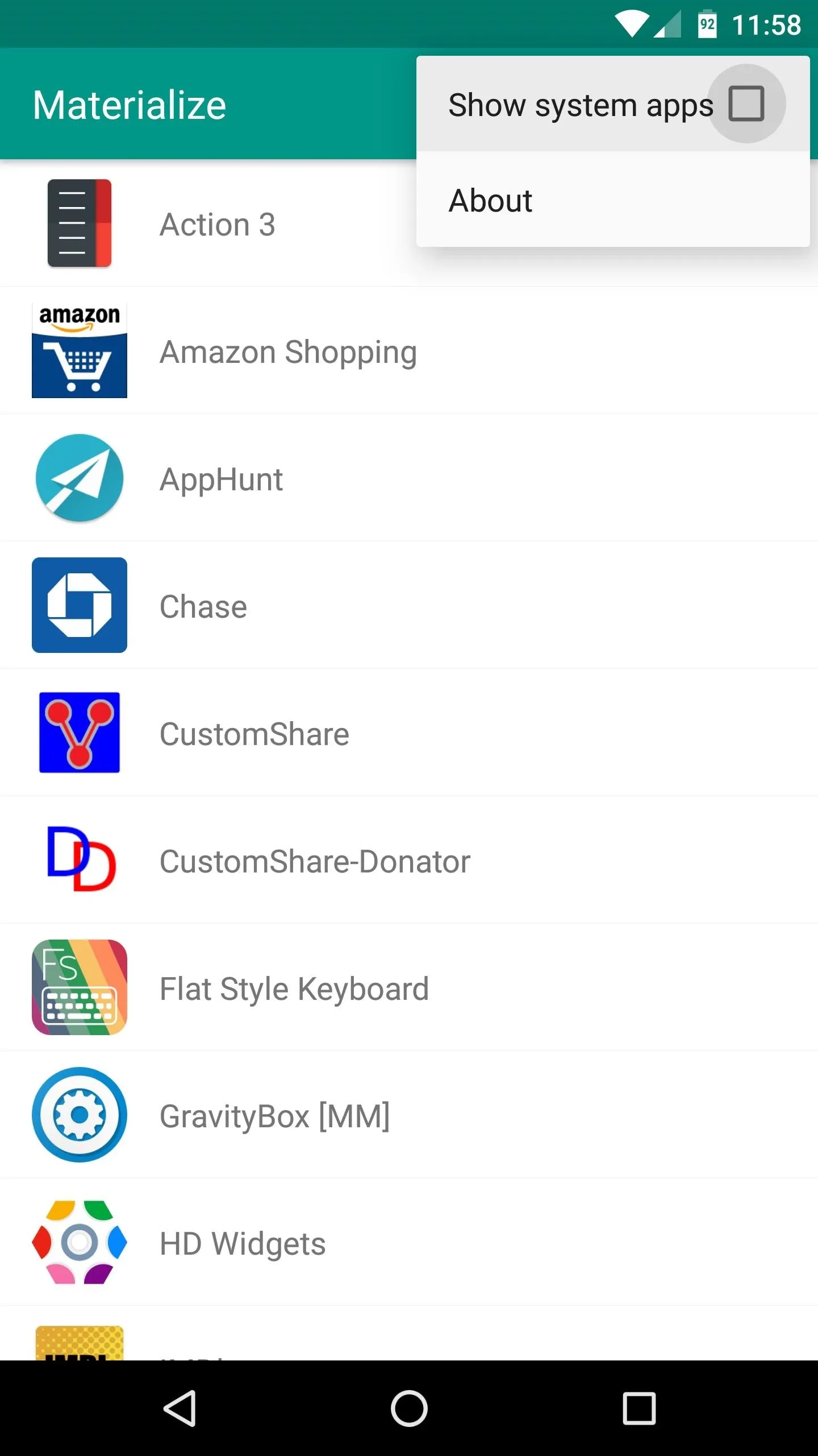
When you launch Materialize, you'll see a list containing most of your installed apps. The only exceptions here are Google's apps, which already use Material Design anyway, and your pre-installed system apps, which should be using Material Design. If they aren't, you can create a custom Material Design icon by simply tapping the menu button at the top of the screen, then enable "Show system apps."
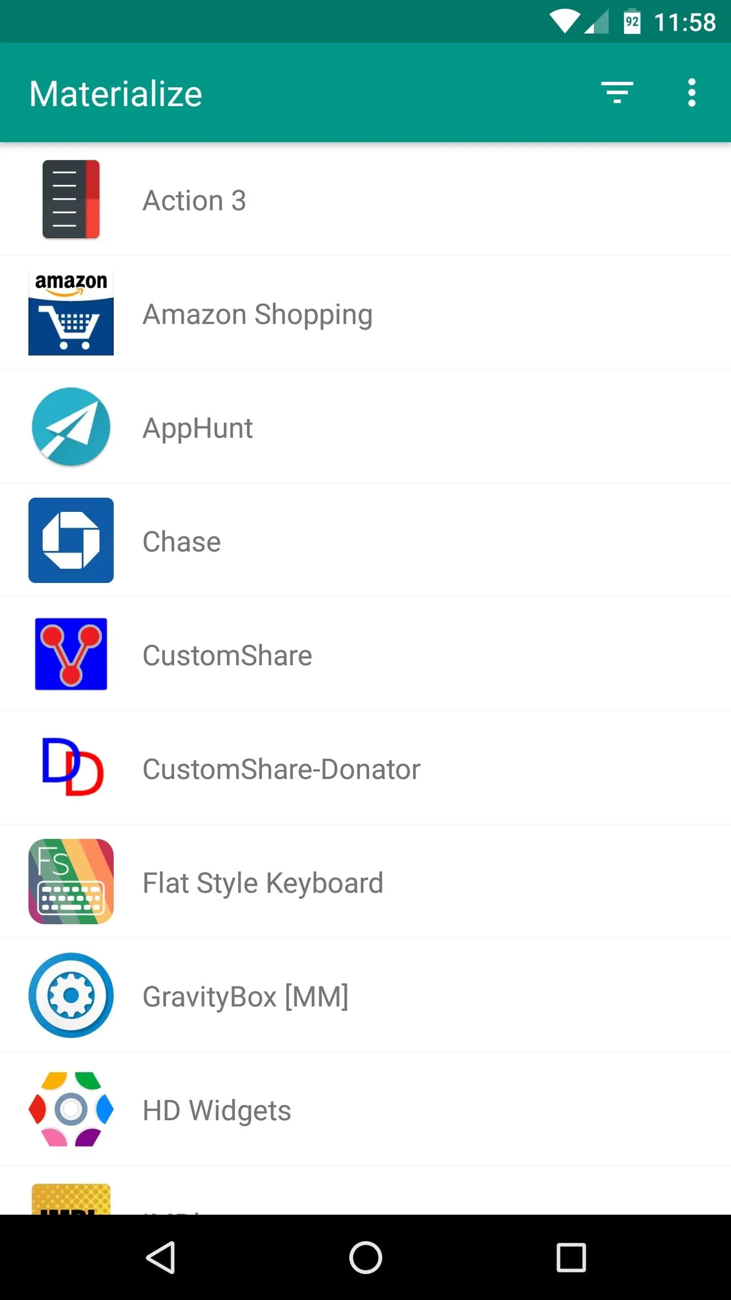


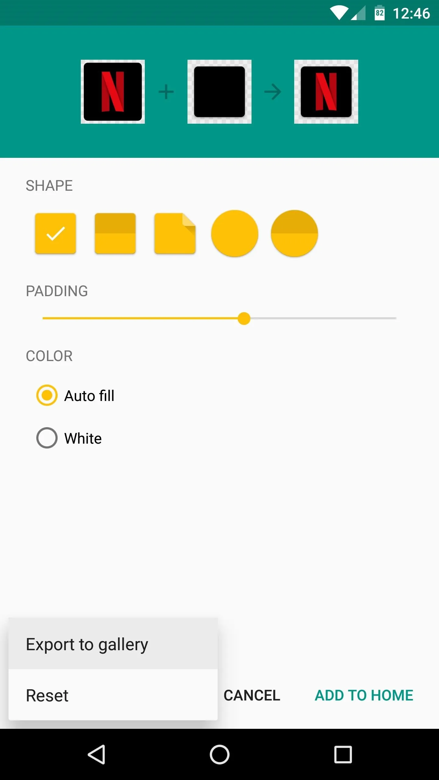
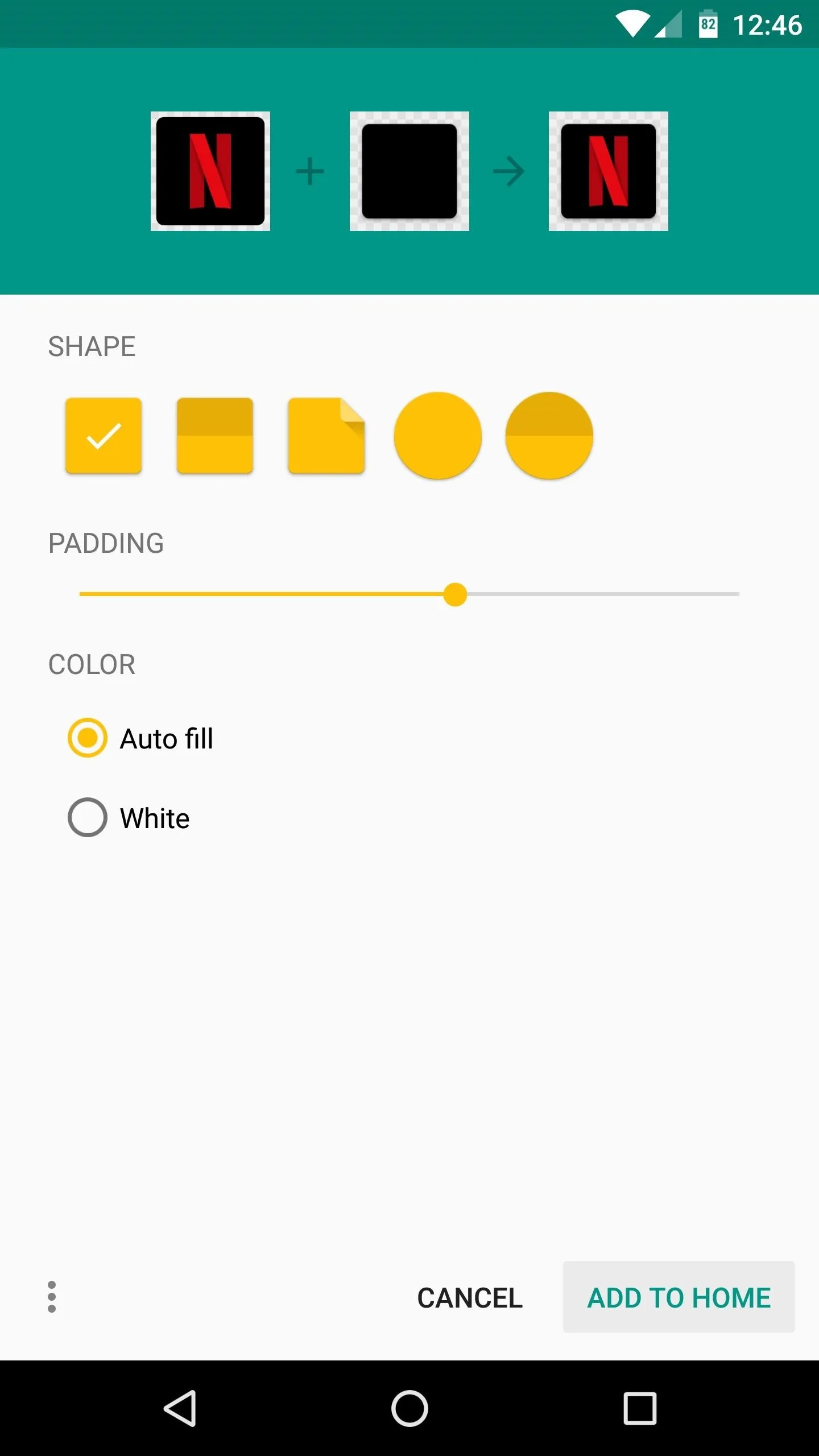
Next up, just select the app whose icon you'd like to theme, then Materialize will automatically generate a square Material Design icon. If you wanted to, you could just tap "Add to Home" on this screen, and you would have created a Material Design icon in one tap.
However, this menu gives you the option to theme the icon a bit more. For starters, you can change the shape by picking one of the templates towards the top of the screen, and you can adjust the icon's padding with the slider beneath that. Then, if there's any empty space left over, you can have Materialize "Auto fill" the area by matching the icon's primary color, or you can simply fill it in with "White."
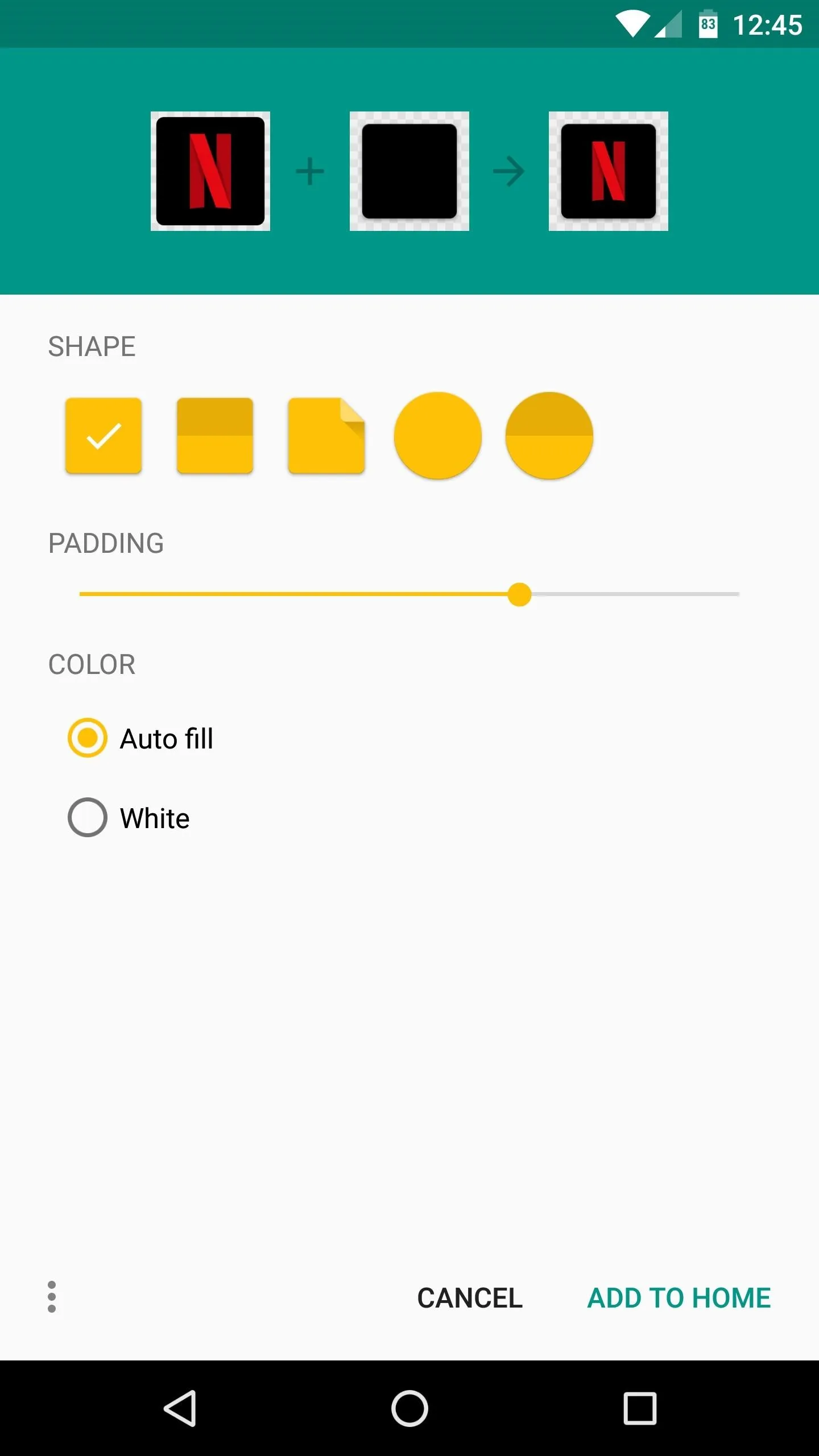
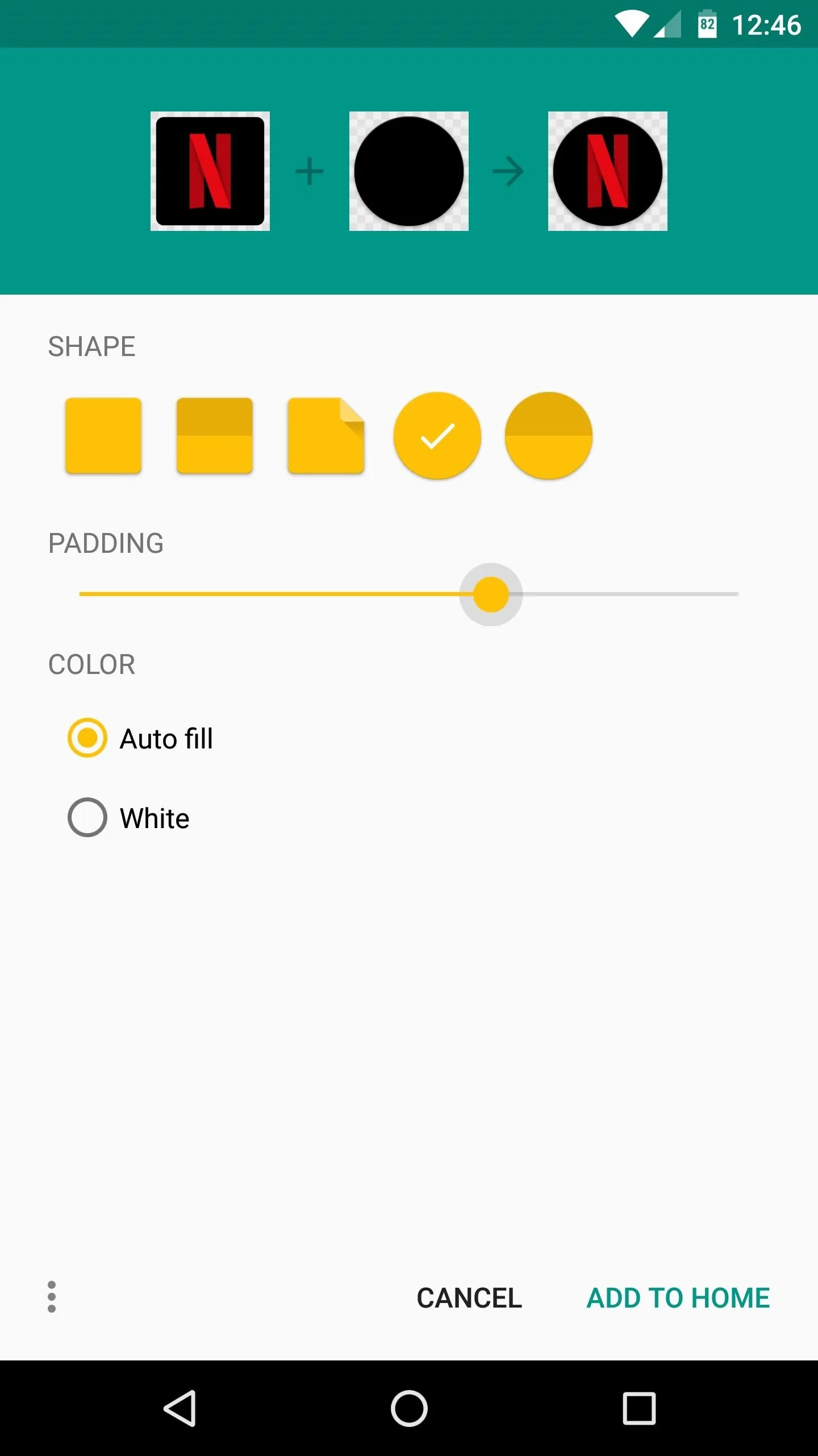


Once you're satisfied with the way your icon looks, you've got two options for adding it to your home screen. First, you can tap the three-dot menu button at the bottom of the screen, then choose "Export to gallery" to save the icon as an image that can be loaded into most custom launchers. Or, you can add the icon directly to your home screen with the "Add to Home" button at the bottom of the screen.


Enjoy Consistent Material Design Icons
At this point, you'll see your Material Design compliant icon on your home screen. One of the best parts about this is that it ensures consistent size and padding with all of your home screen icons. Take the Netflix icon for example (pictured below)—it's normally a lot bigger than app icons that actually follow Material Design standards, but once you've "Materialized" it, it will match perfectly and your icon rows will look tighter.
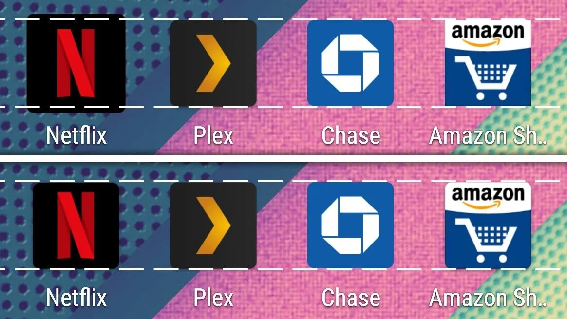
Top: Regular Netflix icon; Bottom: Netflix icon created by Materialize
Android app design has definitely come a long way, but these icon size discrepancies demonstrate that they're still lagging behind their iOS counterparts. Nonetheless, Android's strengths in the customization category allow you to fix these issues easily, and Materialize is a great example of this.
- Follow Gadget Hacks on Facebook, Twitter, Google+, and YouTube
- Follow Android Hacks on Facebook, Twitter, and Pinterest
- Follow WonderHowTo on Facebook, Twitter, Pinterest, and Google+
Cover photo and screenshots by Dallas Thomas/Gadget Hacks











Comments
Be the first, drop a comment!